(Re)introducing Skin & Bones
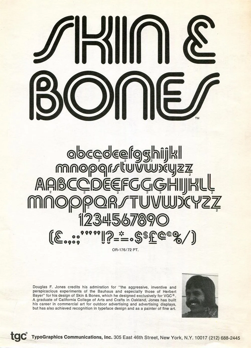
Skin & Bones is an unusual font release for me. It’s not only a revival, it’s a designer-authorized revival. It was originally designed by Douglas F. Jones and released as a 2” film font in 1972 by VGC (Visual Graphics Corporation, now defunct). I got to know Doug by email in 2017 after a friend of his saw him mentioned in a Notebook post of mine from 2013. He agreed to do an interview as a follow-up to that post. You can read the interview here, which I recently published in anticipation of the release of my revival of Skin & Bones.
While we were doing the interview, I noted that there was no official digital version of Skin & Bones—and the free, unauthorized version which has been around for a while is not only very poor, but incomplete. It’s missing the alternate characters that Doug designed for the 1972 film font. When I proposed doing a proper, fully-modern digitization of Skin & Bones, Doug was all for it.

Doug no longer had any of the original artwork, so my digitization is based mainly on available samples from vintage VGC catalogs, promotional brochures, and even the unauthorized Chartpak lettering sheets.
VGC film fonts had a pretty limited character set by modern standards—uppercase and lowercase (sometimes with alternate characters), figures, basic punctuation, and a few symbols (usually $, ¢, £, an asterisk, and an ampersand). (You can see the entire character set in the image above.) Often, there weren’t even accents or “foreign” characters, which kind of made sense at the time since the primary market was the U.S., Canada, and Britain. The unauthorized version did have a few accents and as well as Æ, æ, Œ, œ, and ß, but they weren’t very good and didn’t follow the design logic of Skin & Bones.

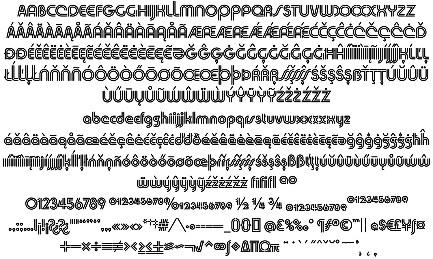
After I digitized the existing characters as faithfully as I could and got Doug’s approval, I expanded it to modern standards. This included designing a full set of diacritical characters to cover most Western-, Central-, and Eastern-European Latin-based languages, as well as small figures (for superscript, subscript, and fractions), a full set of punctuation and delimiters (parentheses, brackets, and braces), and the standard range of symbols and currency marks.
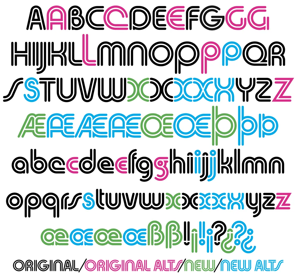
Beyond this, I added a few new alternate characters, including variations of Æ/æ/Œ/œ based on Doug’s original alternates for A, E, and e. My most significant additions are the alternate S/s, which follow a more conventional form, rather than the “lazy S” style that Doug used, and alternate full dots on the i, j, !, and ?.

I did make one change to Doug’s original design in the X/x, which I thought (and Doug agreed) could be made more consistent with the design logic of the alphabet. His original X and x are available as stylistic alternates for completeness, plus three new variations I came up with. If you’re setting anything with an X, you’ve got lots of options.
Unlike the original VGC film font, the digital version of Skin & Bones is carefully spaced and kerned so it automatically sets perfectly. It includes support for OpenType features like Named Stylistic Sets (to make it easy to use the alternate characters), Localized Forms, Subscript and Superscript, Fractions, and Ligatures.
To sum up, Skin & Bones is a classic early-seventies Bauhaus-inspired display typeface, expertly remastered and extended for modern use.
The royalties for the sales of Skin & Bones will be shared with Doug, who made a total of $240 after it was originally released by VGC. I expect he will do better this time.
You can purchase the font here.
