Web Design
New Site Design
Welcome to the first major redesign of my website since 2013.
The site was long overdue for a refresh, so earlier this year the team of Scott Kellum (design director), Kelsey Scherer (designer), and Roel Nieskens (developer) set about to redesign and rebuild it from the ground up.
Paraphrasing Scott, “The aesthetics felt dated. I also really wanted the new site to highlight the typographic range of Mark’s work instead of leaning on Proxima Nova.”
I met with them in April to discuss directions and suggested bringing back some of the pre-2013 aesthetic, back to something closer to the spirit of my original site design.
In spite of the fact that I was only involved in a few brief early meetings, they managed to pull it off. It feels like something I might have designed myself, and picks up a lot of my early branding—including the black/pale yellow/white color scheme and the spinning starburst on the logo. And yet it feels thoroughly modern. I’m incredibly pleased with the results.
How Did We Get Here?
In 2000, when I launched the website for Mark Simonson Studio, I designed everything myself.
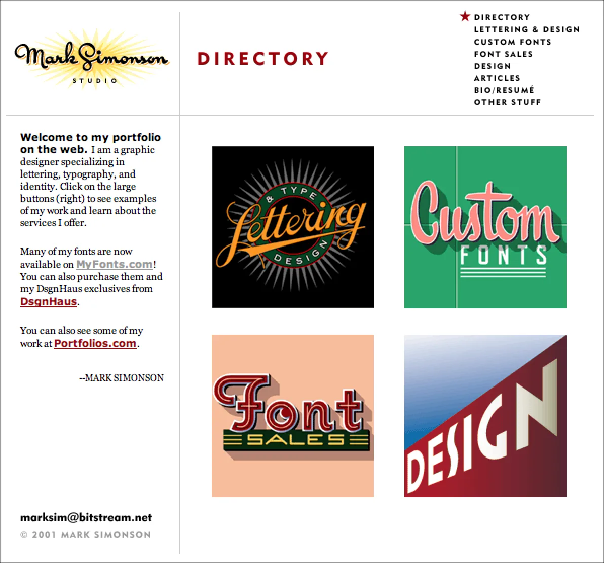
The inaugural design of my site, which I used from 2000 to 2004. Fonts were not yet a full time business for me. Archive.
In the early days, I used a website design app called Freeway. It worked like QuarkXPress or InDesign, but for websites. You could create an entire site with no coding. It was easy to use, but didn’t much give control over the code that it generated, and sometimes you needed that.
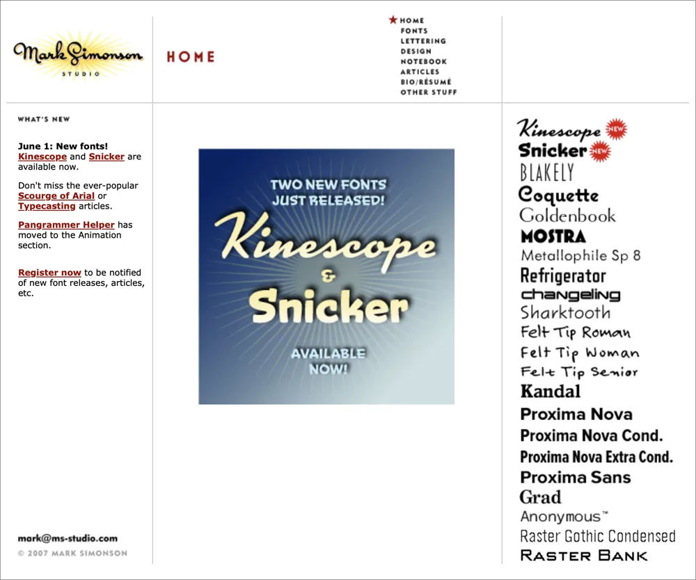
The site design I used from 2004 to 2007. The biggest change was the addition of the font index on the right. Also, I had started Notebook—my blog. Archive.
Nevertheless, I was using CSS and Javascript on the site by 2003 and integrated a cool free content management system (CMS) called TextPattern that I used for Notebook, while continuing to use Freeway for the rest of the site.
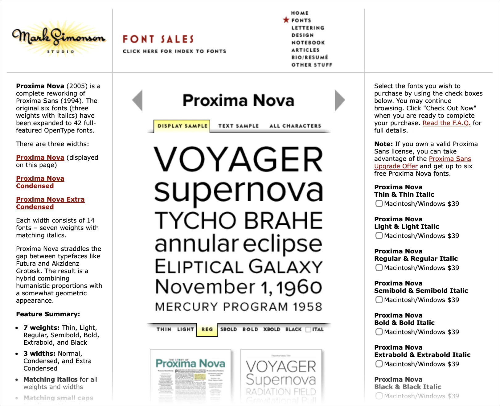
A font page from 2007. The tabbed section in the middle was interactive, letting you easily see different samples and styles, albeit as low-res GIFs. Archive.
In 2007, I redesigned and rebuilt the entire site in BBEdit—hand editing HTML, CSS, and Javascript—after fully embracing the Web Standards movement, popularized by Jeffrey Zeldman’s book Designing With Web Standards, and leaving the ignorant bliss of Freeway behind.
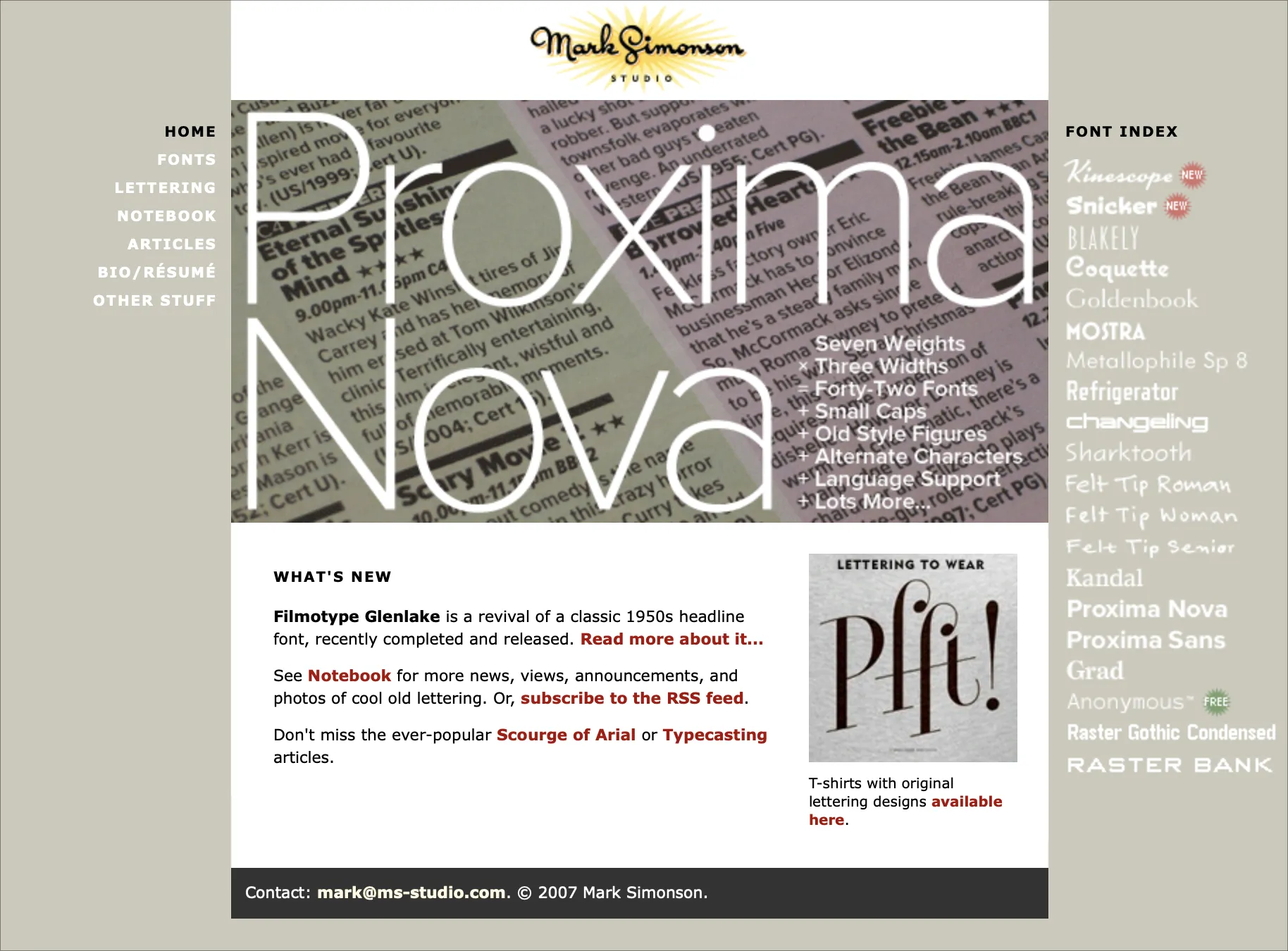
The redesign, which I used from 2007 to 2013. Archive.
But by 2012, I was having trouble finding the time to keep up with the latest web development techniques—things like responsive design and (embarrassingly) web fonts.
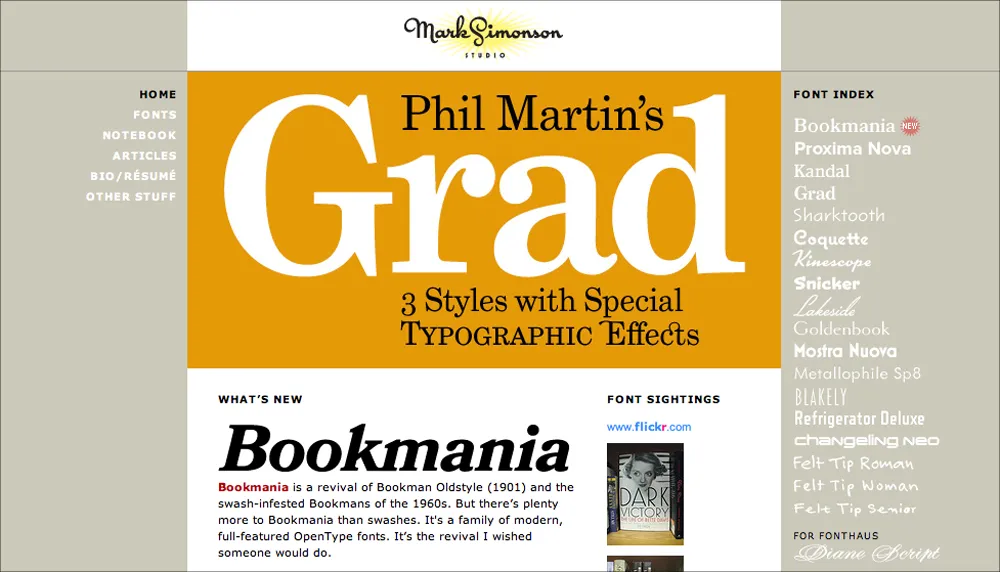
My site in early 2013—the last version I designed and coded myself. Archive.
I realized that coding and maintaining the site was becoming a burden, and taking too much time away from my main activity—making fonts. So I hired the web design firm of Paravel (Reagan Ray, Dave Rupert, and Trent Walton) to completely redesign and rebuild the site to modern standards.
It launched in March 2013.
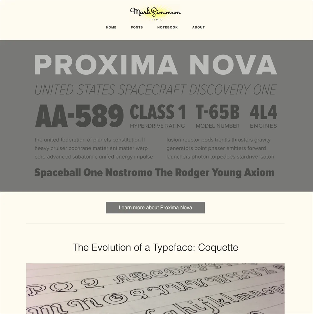
The 2013 redesign by Paravel. Archive.
It looked and worked great, although I felt that some of the spirit and personality of my earlier design was lost. Plus, while Paravel were top-tier web designers, the font banners they created lacked typographic pizzazz.
In 2015, I replaced the original banners with new and improved ones designed by Aesthetic Apparatus in Minneapolis. They added the element of whimsey and playfulness I wanted, while doing a better job of showing off the fonts. A few of them even made it into a Communication Arts design annual.
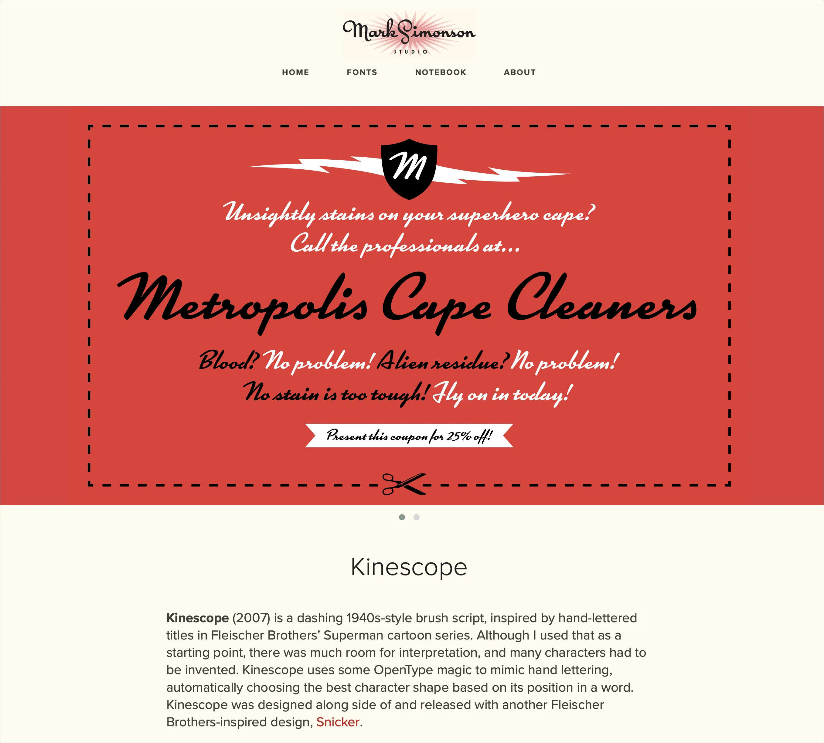
One of the new font banners in 2015. Archive.
The site got small updates and improvements here and there, and cool things like the Etna minisite, designed by Nick Sherman in 2020. He also designed some of the banners and an e-newsletter that, unfortunately, only got sent out a few times.
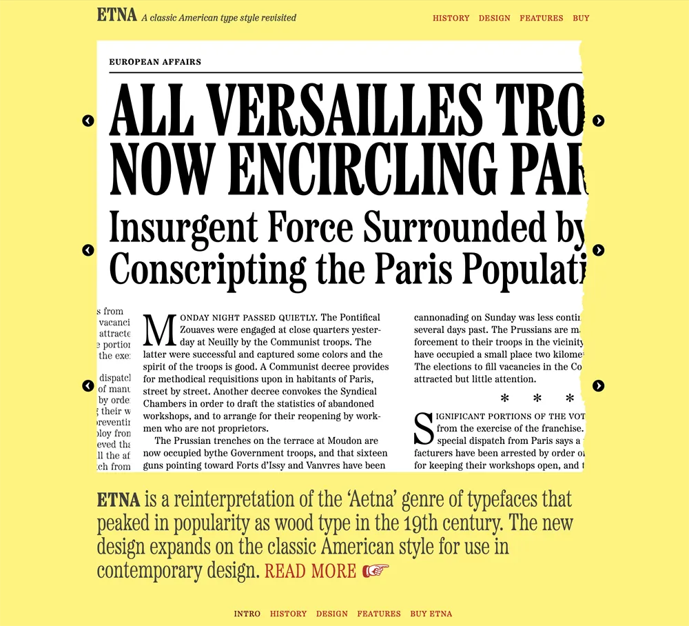
The Etna minisite is the reason Etna and all my fonts since have dingbats.
After I sold my font business to The Type Founders in 2021, they started rebuilding things under the hood, adding the ability for customers to purchase fonts directly (something I had dropped around 2007), providing live, editable previews of all the fonts, and making the site load faster and be easier to find on search engines.
And now I’ve caught up to the present, with the launch of this new look for Mark Simonson Studio on the internet.
I couldn’t be happier with the new design. It feels like home to me already.
 Permalink
The Bookmania Cookbook
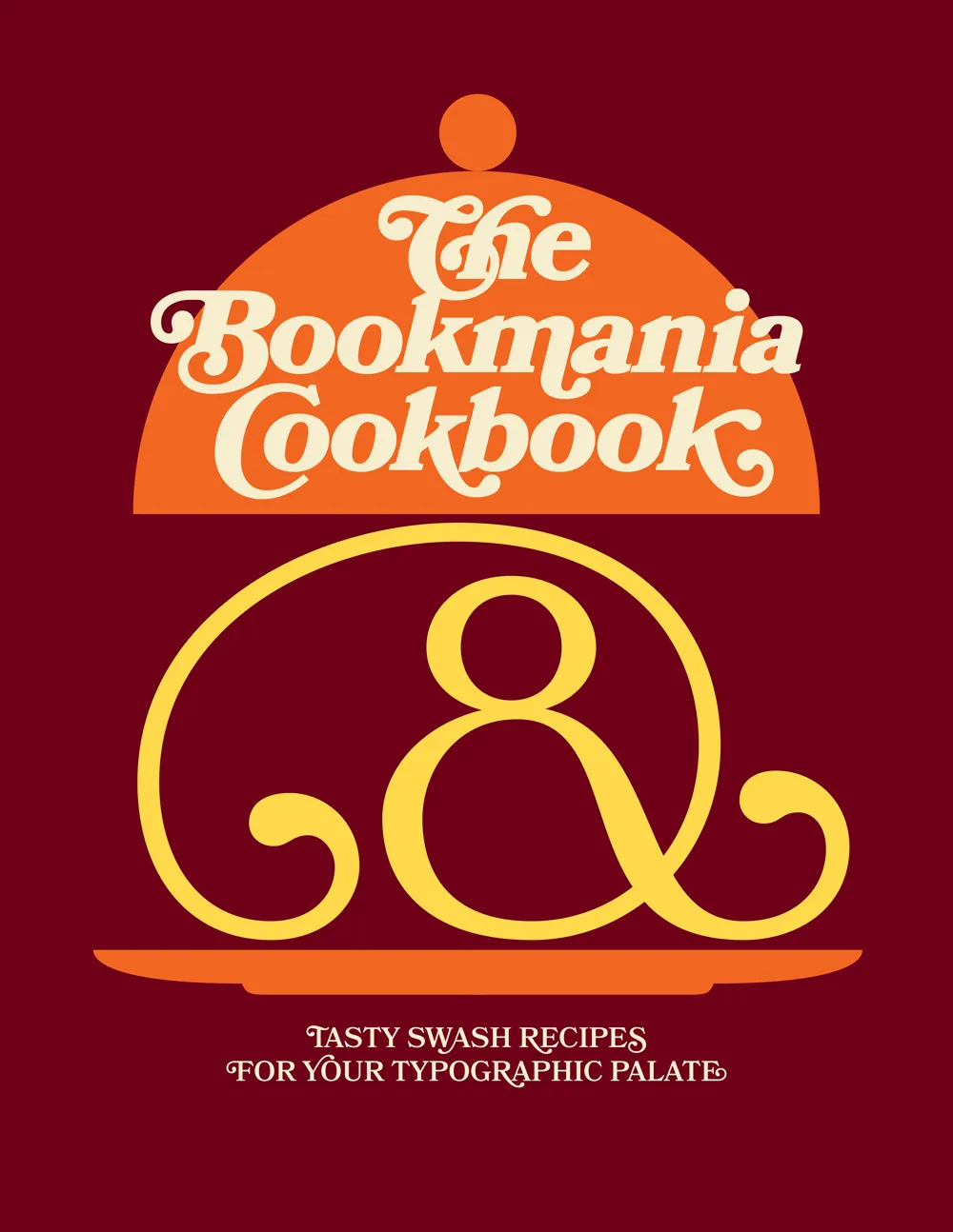
Ten years ago, when I first released Bookmania, I mentioned in the specimen book that there would be a user guide showing how to take advantage of the hundreds of swash and alternate characters. While the concept was clear in my mind from the start, it became one of those projects that were perpetually on the back burner, the kind of project I procrastinate about in order to get other things done.
But recently, after getting yet another email from a user asking how to access Bookmania swashes, I finally found the time and energy to finish The Bookmania Cookbook.
It starts with an overview on how to access swash and alternate characters in desktop apps and in CSS for the web. It then goes over some of the do’s and don’ts of using swashes.
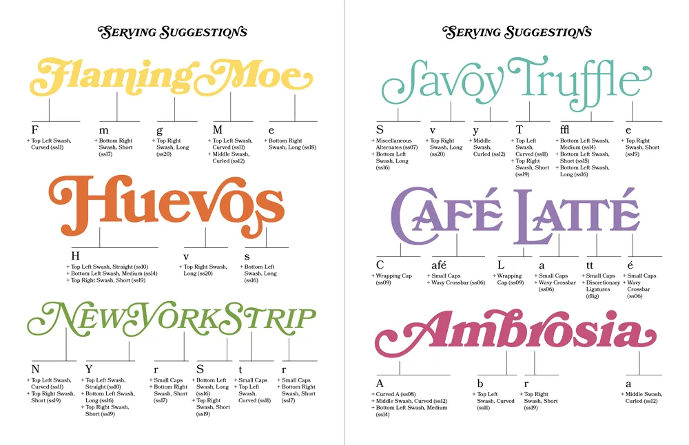
This is followed by a “serving suggestion” section where I prepared over a dozen examples of Bookmania swashes in use to give you some ideas and inspiration for your own designs.
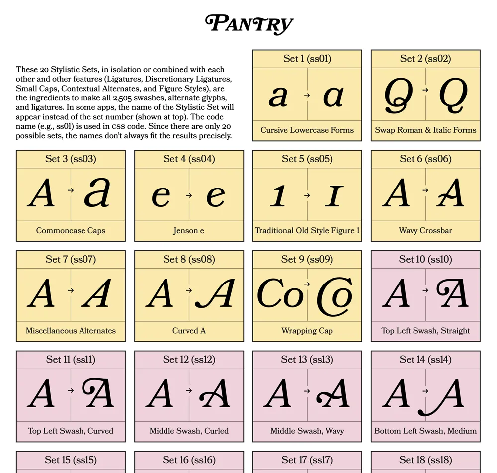
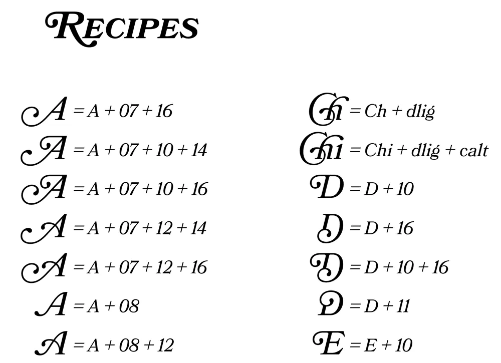
Finally, there is a reference section which includes a table of Stylistic Sets and a complete “recipe” section that shows you how to produce every swash and alternate character using Stylistic Sets and other OpenType features, which is especially useful on the web.
Sorry it took so long to put this together. If you’re a Bookmania user, I hope you will find this “cookbook” helpful. You can download it here.
The Quagmire of Print-Think
In the late seventies, personal computers were starting to emerge and generate interest among some people. I was mildly interested, but I had no idea what I would do with one. Suggested uses were things like: storing recipes, an electronic address book, or maybe play computer games like Star Trek. Mostly it seemed to be about writing programs in BASIC to, say, store recipes. Anyway, none of this really got me excited enough about computers to actually buy one.
All that changed when I came across a copy of a book by Ted Nelson called Computer Lib / Dream Machines. He wrote the first edition in 1974. The copy I bought was the 1980 edition. In it, Nelson presented a vision of computers as tools to enhance and expand human intelligence and creativity. One of the big ideas he talks about in the book is hypertext, a term he coined. Hypertext is, of course, one of the foundations of the Web, as in HTML, or Hypertext Markup Language. When you click on a link, that’s a kind of hypertext.
But, to Nelson, hypertext was much more than simple links to other documents. He envisioned a new kind of non-linear, dynamic form of literature, with variable levels of detail and hierarchy, tailored to the variable needs of authors and readers, all made possible by computers, which could do things that would be impossible on the printed page. After reading Computer Lib, I had to have a computer. I wanted to be part of this future.
Of course, it didn’t happen right away, this vision of Ted Nelson. When the Mac came out, everyone (including me) was astounded by its point-and-click graphical user interface. However, as I recall reading in one of the computer magazines of the day, Nelson was unimpressed. While he agreed that it was a good start, he criticized the Mac’s WYSIWYG presentation of text and graphics as being too limited, too static and bound to the ink and paper media of the past. The desktop publishing revolution, as amazing as it was for the print publishing world, fell far short of what was possible with this new digital medium.
In a few years, we got the World Wide Web. But, as Gerry Lieonidas tells in his talk (below), we are still in many ways stuck in print-oriented concepts, just as Ted Nelson was complaining back in 1984. When I saw Gerry’s talk earlier this evening, it immediately made me think of Ted Nelson and these ideas that got me excited about computers in the first place.
Gerry, I think you’re onto something.
Above: Gerry Leonidas on The Newest New Typography from Clearleft on Vimeo.
Lost World’s Fairs
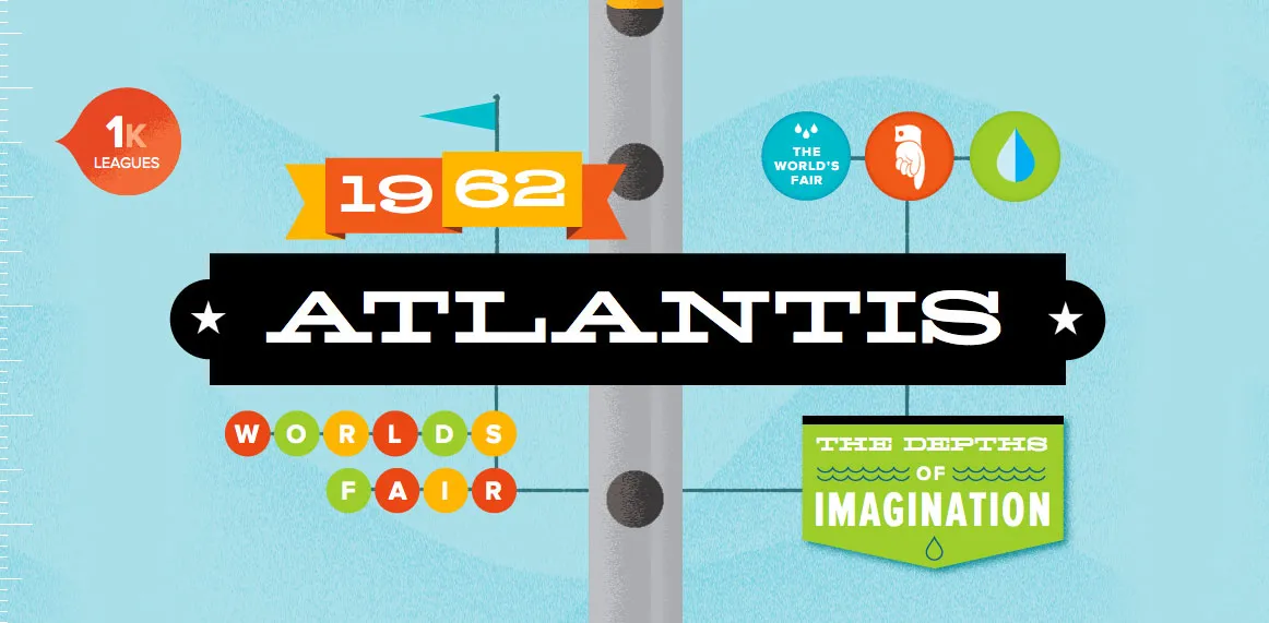
I know I’ve been lax in posting items to Notebook lately. Somehow, between Twitter, Typophile, and making fonts (mostly), I forget it’s here.
Anyway, a really cool thing happened last Wednesday: Lost World’s Fairs. It demonstrates the support of web fonts in the new Internet Explorer 9 for Windows, but it works equally well in most other desktop web browsers (not on mobile phone browsers yet, as far as I can tell). You can read about how it was put together on Jason Santa Maria’s blog.
The big surprise for me was that all three of the demo pages feature fonts designed by me, served via Typekit. Many of my fonts have been available for web use through Typekit for a while, but recently also through Extensis’ WebINK service, Fontspring, and Fontdeck. Note: WebINK and Fontdeck ceased operation in 2015 and 2016 respectively.
Ars Technica on WOFF
Chris Foresman, at Ars Technica, has written a nice, informative piece about WOFF (Web Open Font Format).