While I was visiting Omaha this past summer (I spoke and did a workshop for AIGA Nebraska), I spotted this curious bit of typographic design:
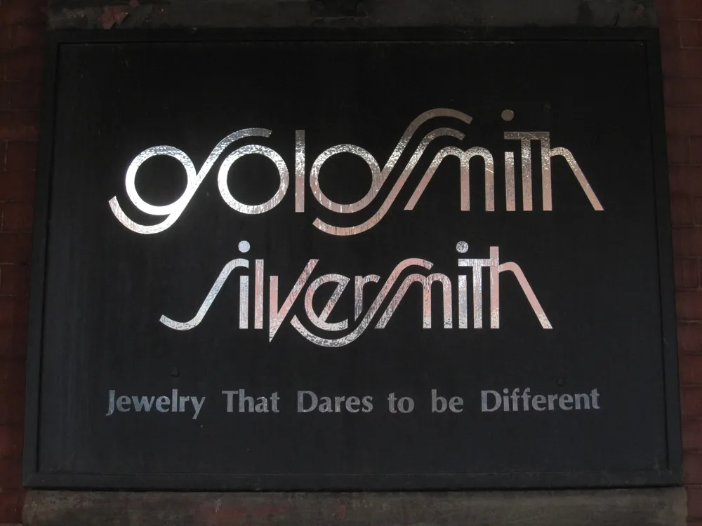
Looks like the artist was going for a Lubalin-style solution—Avant Garde with Swashes. It’s attractive, but not very easy to read, especially the “g”.
I wonder how long it’s been in use? I can’t decide if this is a design from the seventies or eighties, or if it’s a recent design imitating that period. I’m leaning toward the former, mainly because of the use of Optima in the tag line.

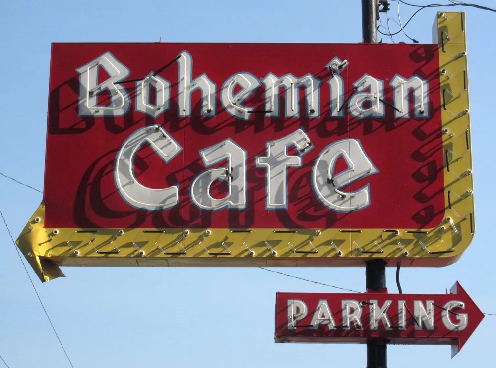
The Bohemian Cafe in Omaha, Nebraska. Shot on August 23, 2011.
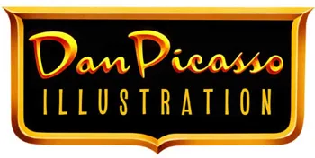
I just discovered today that my old pal, illustrator Dan Picasso, has a new website. danpicasso.com. Back in the eighties, Dan and I worked together at MPR and later shared an office together as freelancers. We’ve drifted apart since then.
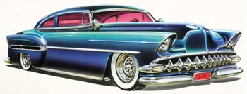
Dan uses a real airbrush in his work—none of this Photoshop nonsense. Most of the works displayed on his site are new to me. He’s done some amazing pieces of lettering design. He definitely had an influence on my taste for lettering and type. And I love the car paintings. I don’t think I’ve seen them before.
I used to draw a lot more when I was young and got to be pretty good by the time I was in college. I might have had a career as an illustrator if I hadn’t taken a detour into graphic design and art direction.
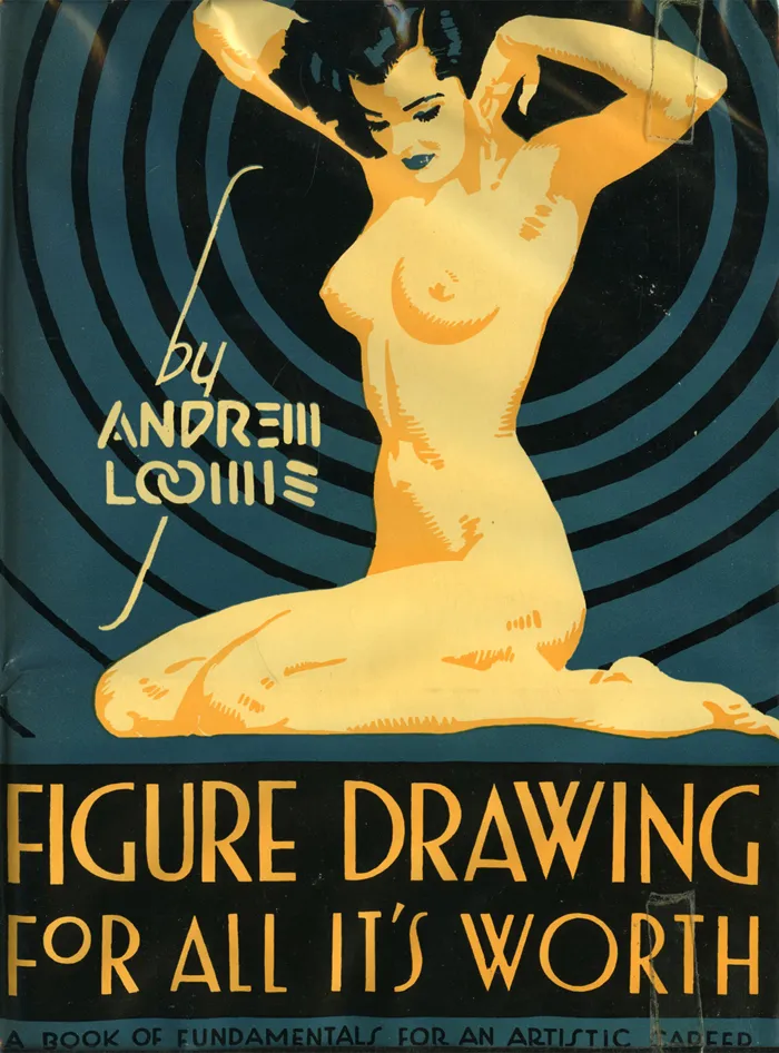
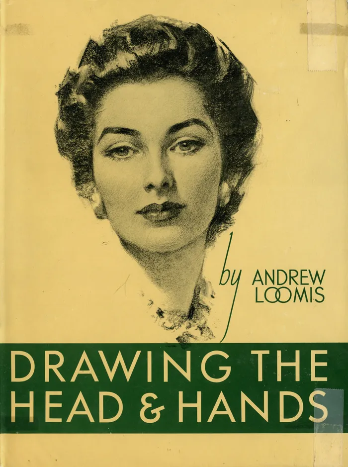
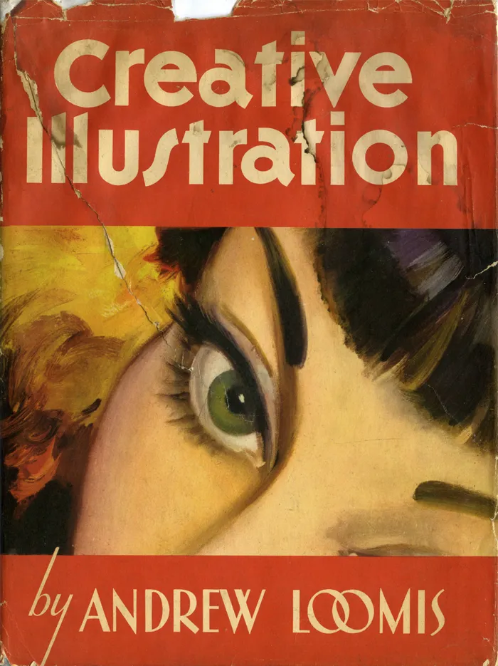
For the last few years, I’ve been trying to get back into drawing again, but more for enjoyment than anything commercial. Not long ago, I discovered the books of Andew Loomis, who died in 1959. He was a commercial illustrator who did a popular series of books on drawing and painting, starting in 1939 with Fun With A Pencil.
Loomis’s facility for drawing was astonishing. One thing I’ve never been good at is figure drawing without referring to a live model or a photo. Loomis lays it all out clearer and with more depth than anything I’ve seen before. Where were these books when I needed them?
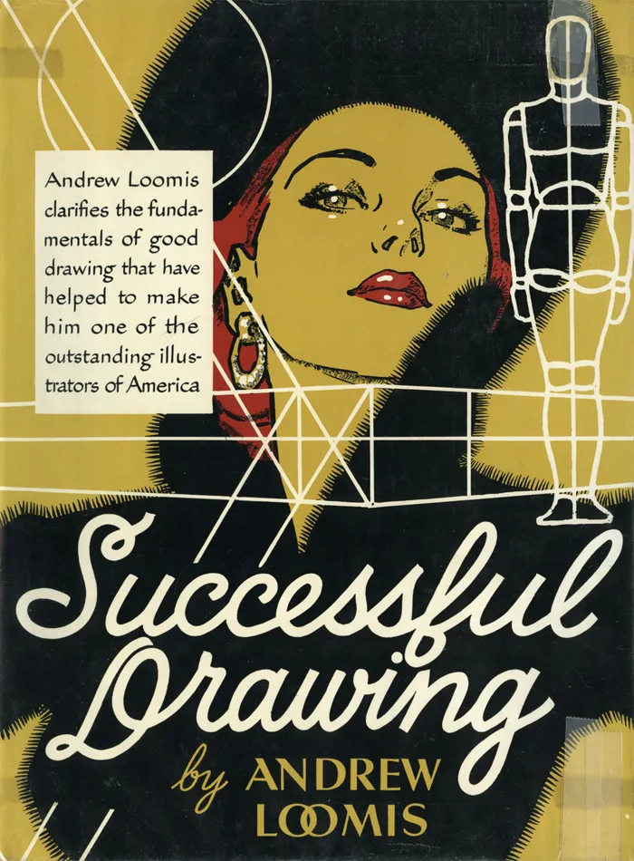
I don’t know if I have the time or patience to begin again with these books, but I’d love to try. More likely, they’ll be fuel for day dreams, and I’ll stick to doing what I do—type and lettering. Speaking of which, aren’t the covers terrific?
By the way, don’t write asking what fonts are used on the covers. Except for some Futura on the first cover, it’s all hand-lettered, presumably by Loomis. There’s lots more lettering inside, too, for title pages and illustration captions.
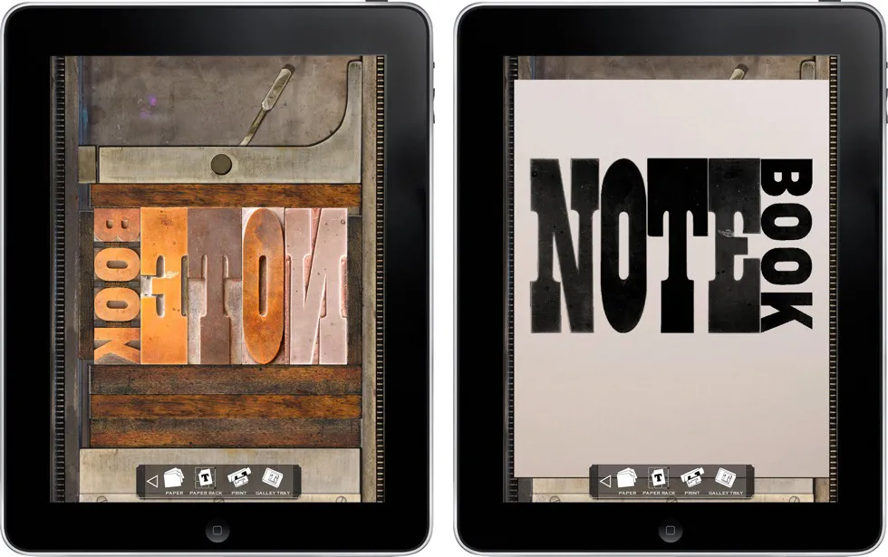
LetterMPress is a virtual letterpress app for the iPad—at least that’s the idea. The project is using Kickstarter to raise funds to complete the app and to acquire wood type fonts to include (virtually) in the app. More info on Kickstarter.
I think it’s a neat idea. Not only will you be able to make compositions on a virtual press bed with virtual wood type, mix and apply virtual ink, and make virtual prints, if all goes according to plan, you will be able to send them your design and have it all done for real, with real wood type, ink, and paper.
Some letterpress purists may scoff, but I think it has the potential to introduce the joys of letterpress printing to a much wider audience.
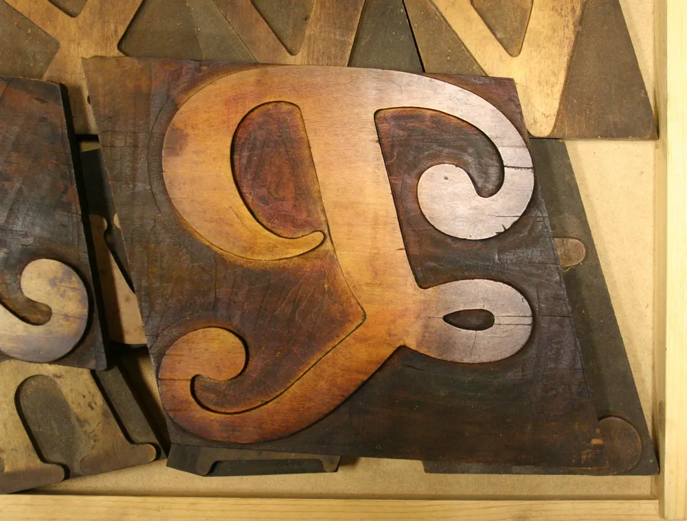
Large (about 6 inches tall) wood type “P”, seen at the Hamilton Wood Type & Printing Museum, Two Rivers, Wisconsin, on March 31, 2009.