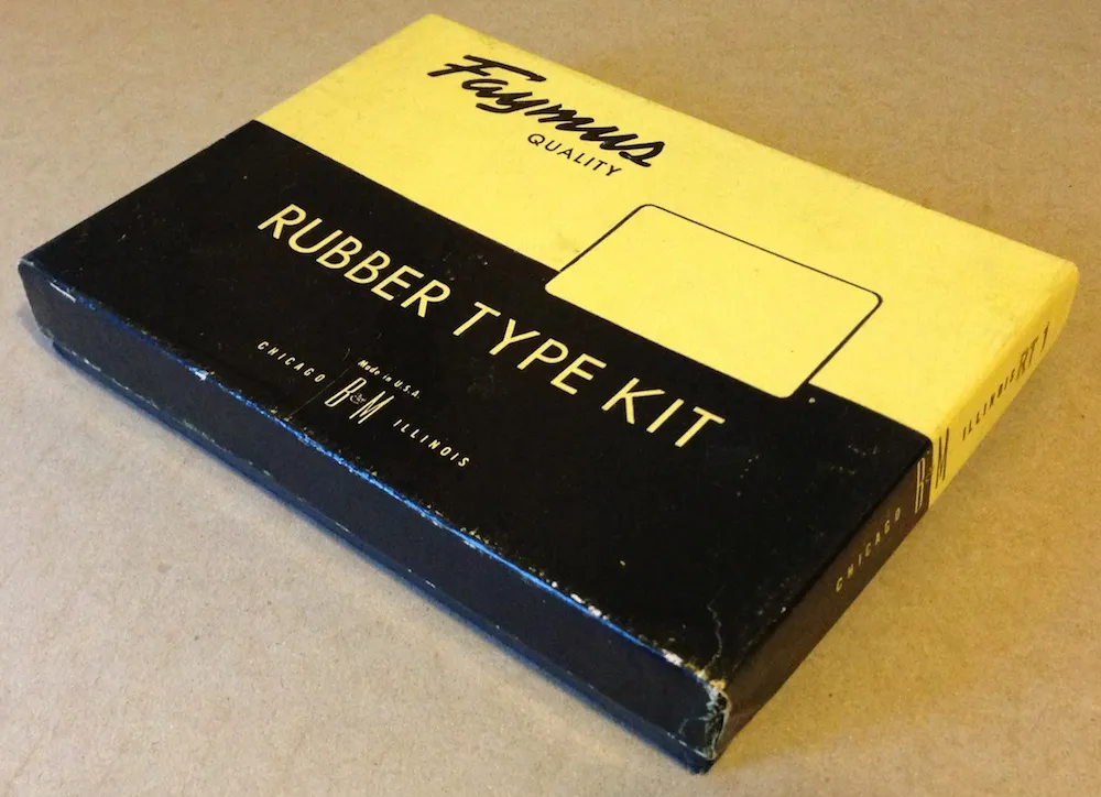
I ran across this today in my studio while searching for something else. Given today’s big Typekit announcement (with which I’m participating), I thought it would be fun to post a photo of it. With this Type Kit, you only got one font.
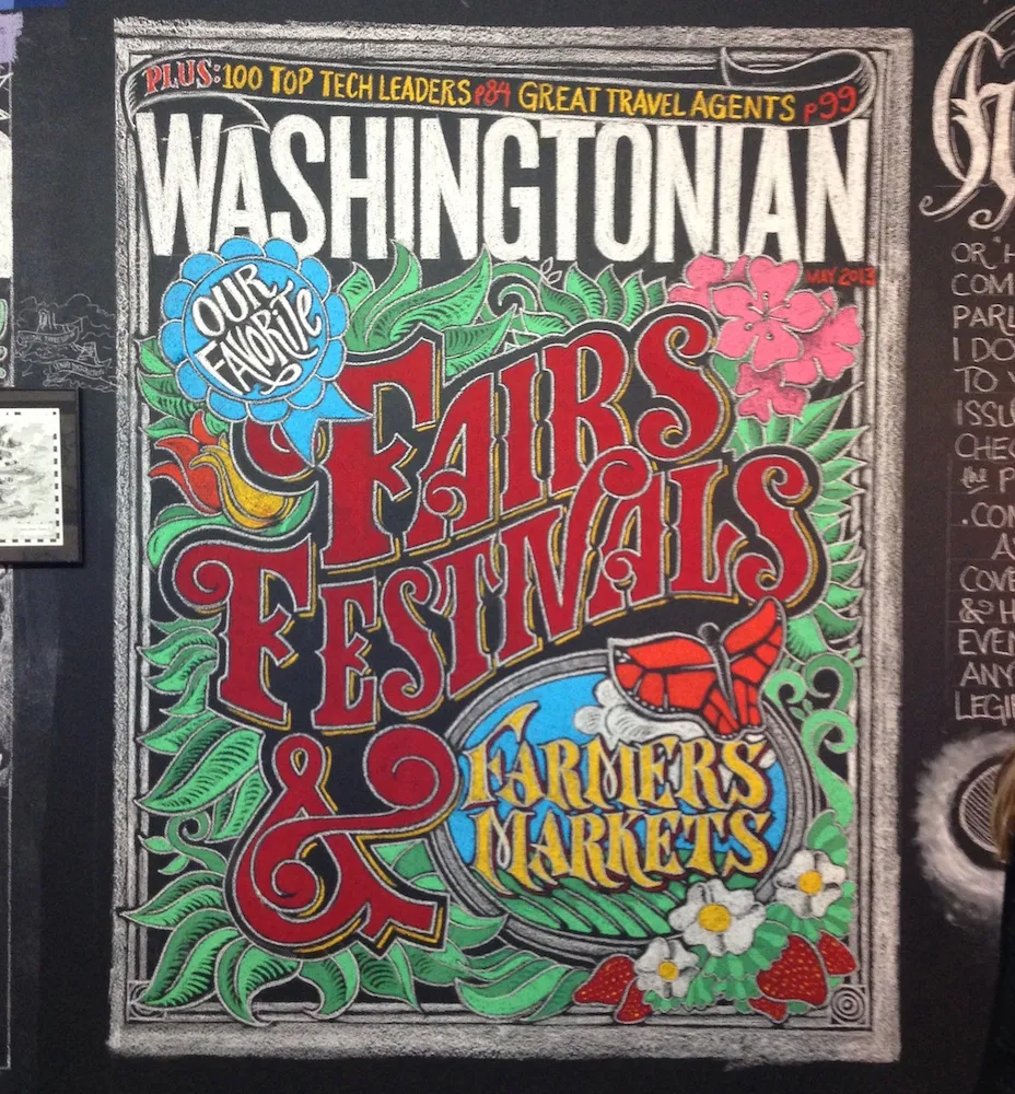
This last Saturday night, I stopped by the annual Saint Paul Art Crawl. It takes place in the Lowertown area of downtown Saint Paul, where former warehouses have been turned into artists’ lofts, starting back in the 1980s. I don’t go to The Crawl every year, but I’m glad I did this year.
One of the artists who had work on display was a guy named Jeff Nelson. Lately, Jeff has been doing wall-sized chalk murals of lettering and illustration at area restaurants. I first noticed one a month or so ago at The Cheeky Monkey in Saint Paul. I didn’t notice who did it at the time, but I knew as soon as I stepped into Jeff’s studio Saturday night. Nice work, Jeff!
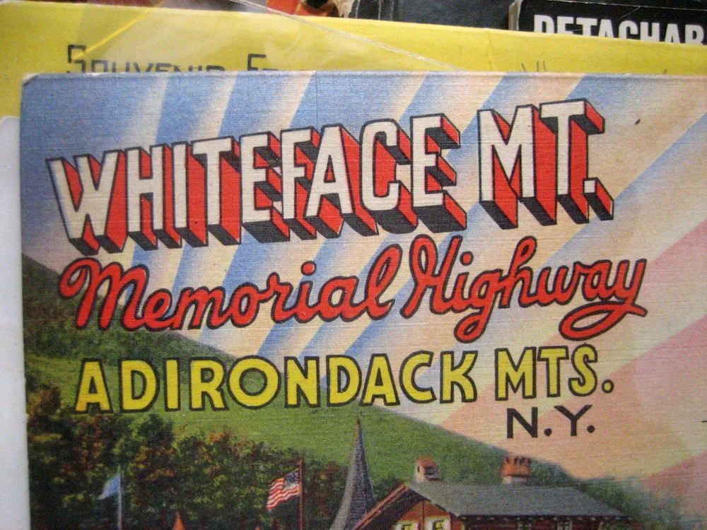
Seen in an antique store (a former dress factory) in Oneonta, New York, July 7, 2007.
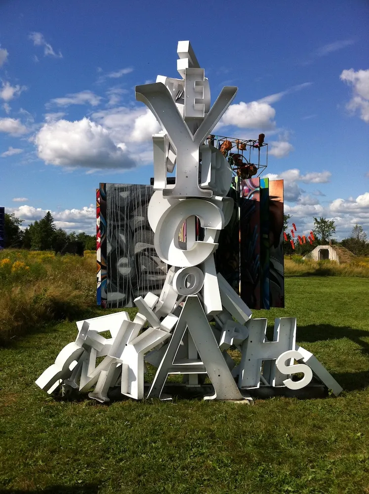

Saw this sculpture by an artist named “Peyton” at the Franconia Sculpture Park, Franconia, Minnesota, back in August 2011.
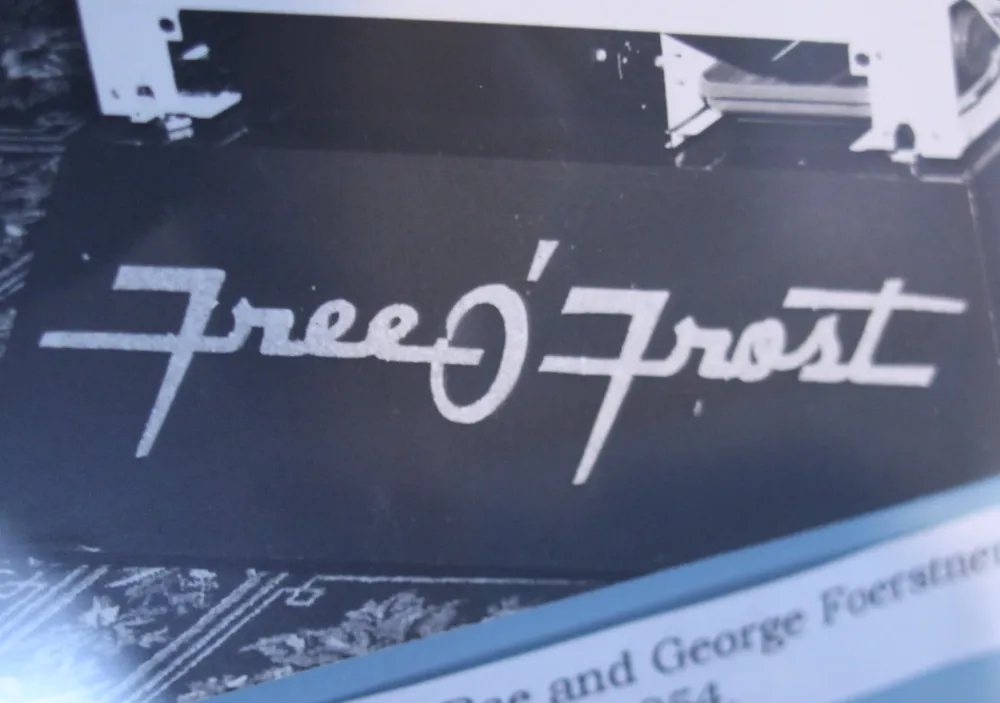
I love this old lettering, c. 1954. Seen in the Amana Heritage Museum, Amana Colonies, Iowa, March 19, 2012.

