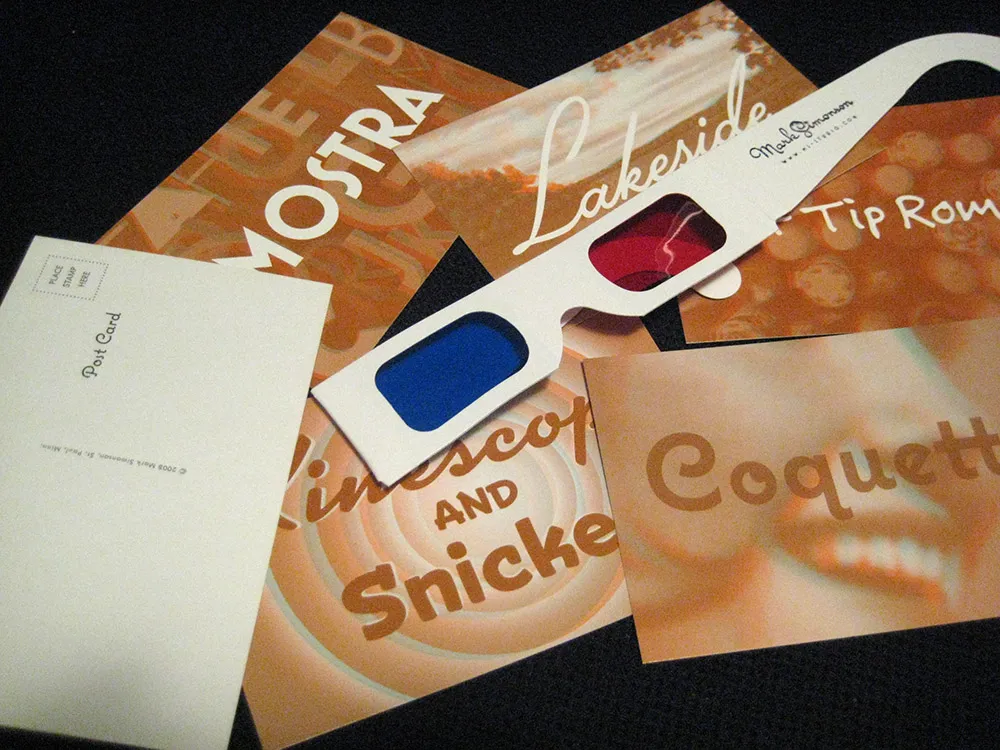
I’ve finally had a chance to settle down after this year’s TypeCon, which was one of the best I’ve attended. As promised, here is the set of 3D postcards I contributed to the goodie bag for those who were not able to attend:
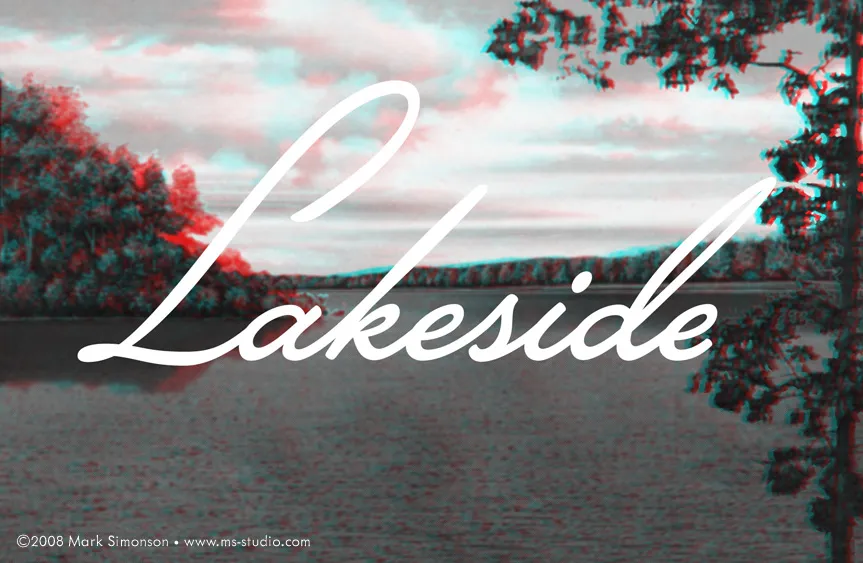
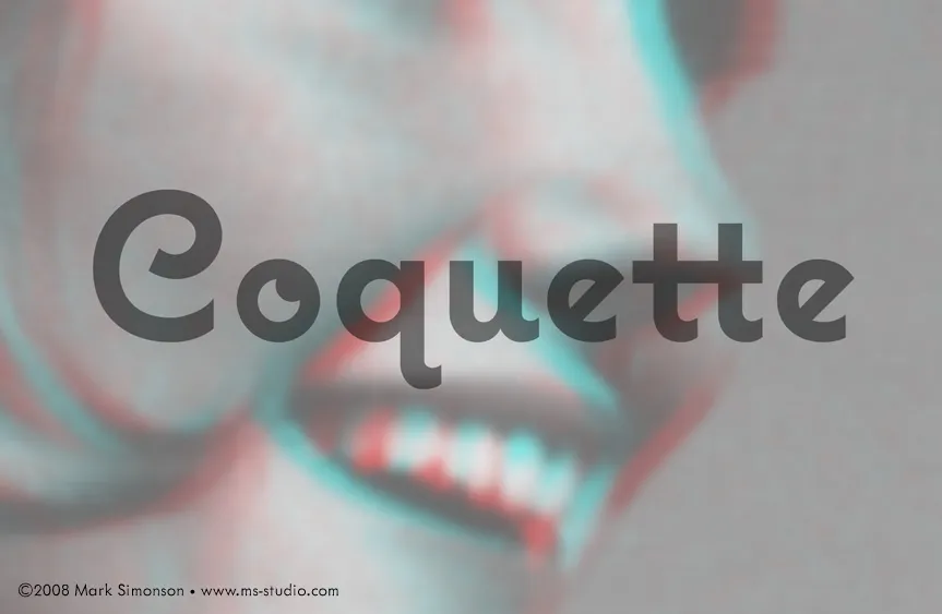

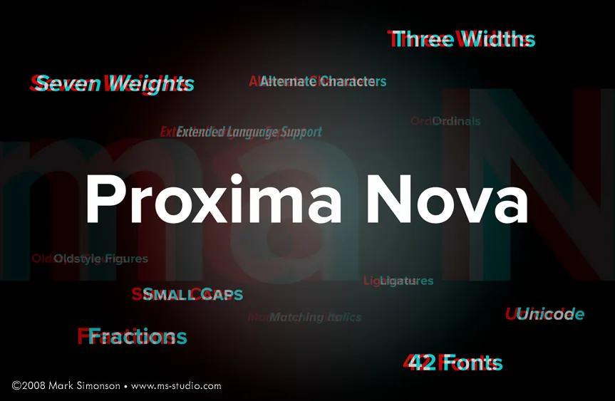
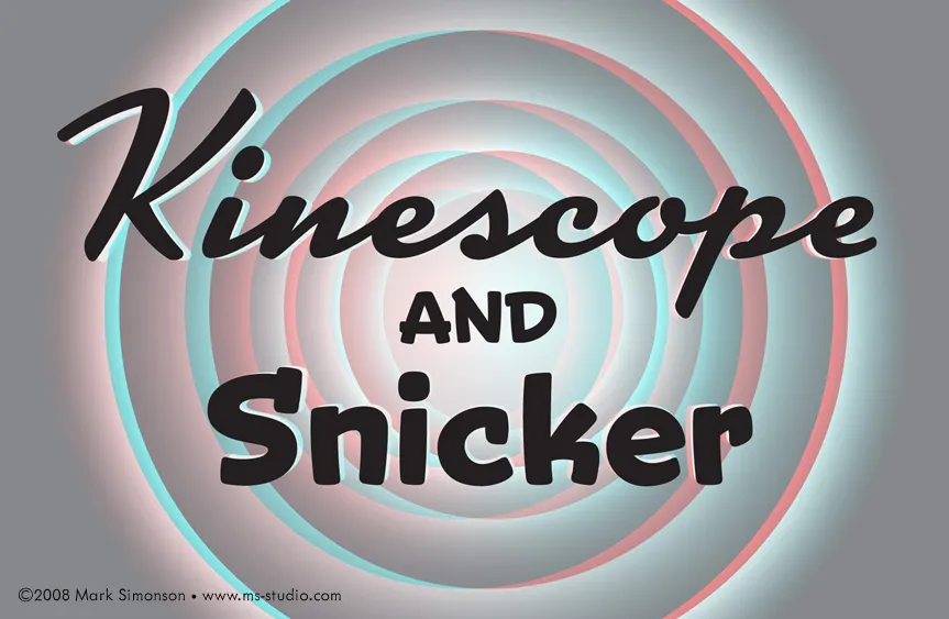
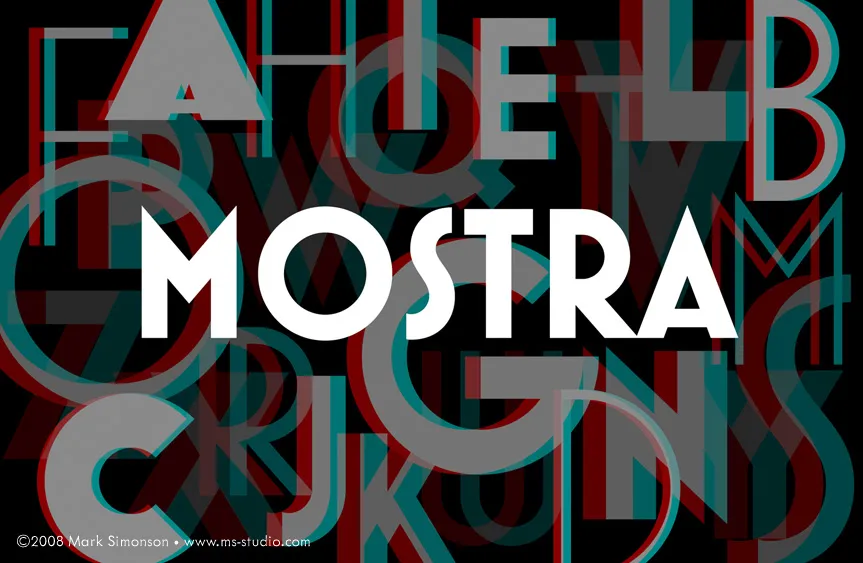
Of course, you will need a pair of anaglyphic glasses with red and blue filters to experience the illusion of depth.
In fact, these RGB images work even better than the printed postcards for the 3D effect, probably because the colors are made with pure light. On the other hand, they are not as easy to mail.
I’m en route this weekend to TypeCon 2008 which is being held in Buffalo, New York, home of Buffalo Wings, Ani DiFranco and P22 (the type foundry). The workshops start on Tuesday and the main program kicks off on Thursday evening.
I’m a 24 Point sponsor this year which, among other things, lets me add something to the goodie bag that each of the attendees receives. Since this year marks my fifth anniversary of attending TypeCon, I decided to make it something special to mark the occasion.
In the middle of 2002, I was just barely in the font business, selling a few fonts a month on MyFonts.com, which had just started up about a year before. I did a graphic on my website to promote one of my fonts, Refrigerator. It was an “anaglyphic” image, meaning that if you viewed it with a set of those goofy glasses with the red and blue filters like they used for 3D movies in the ’Fifties, the image would appear to have depth. Here is the image:

I don’t know whether it got anyone to buy a font, but not long after I posted it, I got an email from a guy named Stuart Sandler wanting to know how I did it. I sent him a full explanation of the process (which I posted here later in How to Make 3D Anaglyphs). He thanked me and, by the way, would I be interested in getting involved with TypeCon 2003, which was to be held in Minneapolis?
Stuart was (and is) the proprietor of the Font Diner, at the time operating out of Fridley, Minnesota, and was also on the board of SOTA, the organization responsible for TypeCon. My type design activities at the time were limited. I worked alone and didn’t really know anyone in the business. Getting involved with TypeCon 2003 opened a whole new world to me. I met type designers and developers from all over the world and for the first time had an inkling that I might actually be able to this for a living.
And now, five years after my first TypeCon, I’m a full-time type designer. And I can trace it all back to that 3D picture of a refrigerator. So, to commemorate the occasion, I have produced a set of six 3D postcards (glasses included) for each of the attendees of TypeCon this year.
Before the end of TypeCon, I will post the images on my site so everyone else can enjoy them. (You’ll have to provide your own glasses, though.)
 This is something I’ve been meaning to post for a while.
Last summer, at TypeCon in Boston, Adrian Frutiger was honored with SOTA’s 2006 Typography Award. Mr. Frutiger couldn’t attend, but several SOTA board members travelled to his home in Switzerland to present the award to him. I was among the people who gave a presentation during the ceremony in Boston. The others were Akira Kobayashi, Bruno Steinert (both of Linotype) and Mike Parker (formerly of Linotype), who each shared personal anecdotes; and Tiffany Wardle and Jon Coltz, who shared the stage in a deeply philosophical rhapsody.
I was asked by SOTA to say some words about Mr. Frutiger, even though, unlike Akira, Bruno, or Mike, I had never worked with him, and in fact I’ve never even met him. Even worse, I had never given a talk at a conference before. But Tamye Riggs (from SOTA) pointed out that it only needed to last about ten minutes and that it would be nice to get a perspective from somebody who was not an “insider.” So, I said “okay” and jumped into the deep end.
In spite of my nervousness and minor technical nightmares (“sorry, we can’t change the screen set up to a dual display just so you can read your notes off the laptop on the podium while the presentation plays on the big screen”) it went fine and was well-received.
If you missed it, or want to see it again, I’ve made a PDF from the Keynote document, which can be found here:
Adrian Frutiger: A Personal Perspective
If you have a slow internet connection, please note: The PDF is pretty image-heavy and weighs in at 17.6MB.
About the formatting: The text you see at the bottom of the screens is my actual script—the words I was saying while the image above them was being shown. I formatted it to make it easy for me to read and not mess up the phrasing. I know that some people recommend against using a script when giving presentations, but, having never done it before, I couldn’t take the chance.
Okay, I was originally going to post one or two more detailed reports about the conference. But it’s kind of old news now. Suffice it to say, I had a blast and met lots of interesting type people I hadn’t met before—Chester (Thirst & Village), Yves Peters (Typographer.org, etc.), Steve Jackaman (International Type Founders), David Berlow (The Font Bureau), Akira Kobayashi (Linotype), Mario Feliciano (a very talented type designer from Portugal), Peter Bain (Incipit), Gerry Leonidas (Reading/UK), Stephan Hattenbach (MAC Rhino Fonts, Sweden), Carol Wahl, (Type Directors Club), Rodrigo X Cavazos (Psy Ops), Dan Reynolds (Linotype), and too many others to mention—as well as catching up with previous acquaintances again.
Several cool things happened that I have to mention:
The weekend before TypeCon started, I was mentioned in an article about small type foundries in the Sunday New York Times Magazine. I knew this article was coming out because, of course, the reporter talked to me a few weeks before. There wasn’t much about me in the article, but I think I gave the writer some good leads.
My new Proxima Nova was reviewed in a “keepsake” limited edition booklet put together by Typographer.org. (More about it here.)
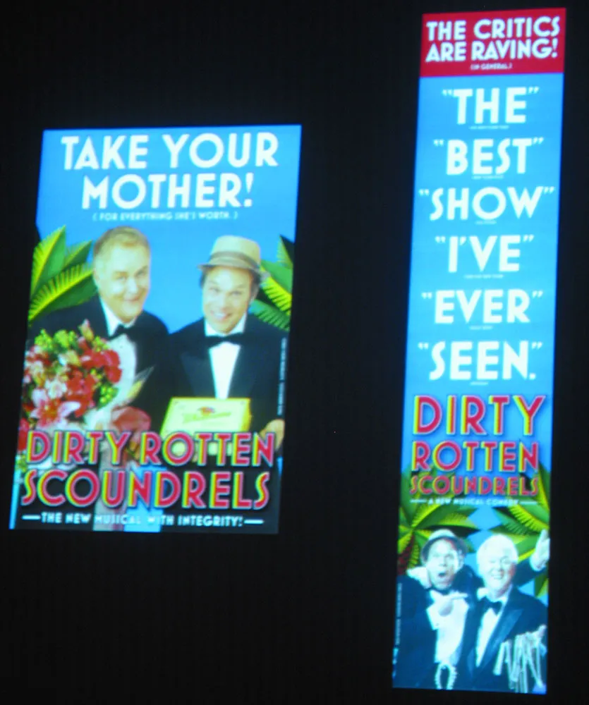
Finally, on Friday morning there was a presentation by SpotCo, a design/advertising studio in New York that does nothing but Broadway publicity work. I hadn’t heard of them before, but recognized some of their work (most famous of which is probably their campaign for “Rent” in the mid-90s). All very nice work. But I did a double-take in the middle of it when they showed the slide shown at right. Mostra Bold on Broadway. How cool is that? I’m not the only one: They used Eric Olson’s Bryant for the Lennon show.
So, that’s it for TypeCon2005. Now back to our regular programming…
Thursday morning we wandered around mid-town Manhattan and wound up at the New York Public Library where we saw the Declaration of Independence (including some of Jefferson’s drafts, which were surprisingly legible) and one of the few existing Guttenberg bibles. That was pretty cool.
I didn’t attend any of the workshops, but the presentation sessions commenced in the afternoon, starting off three full days of TypeCon for me. (I won’t go into the talks in detail here—if you’re curious, try this page.) What I learned:
- PostScript Type 1 fonts are dead. The future (and present) is OpenType. (Actually, I did already know this, but maybe you didn’t.)
- Fontographer is not dead, but I don’t care anymore. (There are people who do care, though.)
- Adding Greek and Cyrillic characters to my fonts will not be a simple matter, but I think I will enjoy doing it.
The highlight of the day was Paula Scher’s keynote address in the evening. Paula is one of the most talented graphic designers of the last two decades and, even though she basically just walked us through her portfolio, her energy and humor made it thoroughly entertaining and enjoyable, even thought provoking at times. (Here’s a QuickTime movie by Hillman Curtis about Paula if you don’t know who she is.)
The Typophile Film Festival topped off the evening. It was a bit shorter than last year’s. It had some good things in it, but nothing to top last year’s Helvetica It Hurts, in my opinion. Although, Strange Attractors’ Little Yellow Writing Hood was close (and funnier).

It’s been two days since I left New York City and TypeCon2005. I thought I would be writing reports from the conference, but I found NYC and the conference itself more stimulating than sitting at my computer keyboard. But, now that I’m back and well rested…
As I mentioned in my previous report, I brought my family with me. We spent a blisteringly hot Monday in Brooklyn, getting there by crossing the Brooklyn Bridge on foot. By afternoon, we made our way to Coney Island and spent some time there. My mother visited Coney Island when she was young and risked her life on the famous parachute ride they used to have there. They no longer have that ride, but I did accompany my daughter on the next best thing, the Cyclone. It’s nearly 80 years old, which made me all the more apprehensive about taking a ride on it, but I survived as I knew I would.
The pre-conference workshops started on Wednesday and I helped conduct an all-day one for FontLab with Ted Harrison (of FontLab), Adam Twardoch (also of FontLab), and Brian Sooy (a fellow type designer). This was the first workshop like this I’d ever participated in so I wasn’t sure what to expect. It turned out that I was the only one of us actually in NYC before Tuesday evening, so it was up to me to see if FontLab had been or could be installed on the Macs at Parsons School of Design where the workshop would be held. The folks I talked to at Parsons didn’t seem to know anything about TypeCon or the workshop and informed me that nothing could be installed on their computers without 30 days prior notice. Oops. We got it straightened out and the workshop went very well.
