When I decided to sell the rights to my library of fonts to The Type Founders in 2021, one of the big reasons for me was the ever-growing burden of maintaining and developing that library.
As a one-person studio, there was only so much I could do. Proxima Nova had become very popular since I released it in 2005, and I regularly got requests to expand its language coverage.
At first, I did this task myself, adding support for Greek and Vietnamese in 2009 and Cyrillic in 2010. Even though I can’t read languages that use these writing systems, they were close enough to the Latin alphabet that I felt sufficiently confident to design them. But I’ve always felt out of my depth as a type designer even thinking about designing non-Latin fonts.
Still, I could see that adding even more language support would make a lot of sense for such a popular type family. Theoretically, I could hire other designers and production people to help, either as employees or as contractors. But that would mean managing those people, something I know I’m not very good at.
I like working by myself, and I would rather spend my time working on new typefaces.
It was around the time I was thinking about these problems back in 2019 that I was approached by Paley Dreier (now Managing Partner of The Type Founders) about selling my font library. It was something I’d never thought about before, but I eventually realized that it would be a neat solution to my problems. I would be relieved of the burden of maintaining and expanding my existing fonts, giving me time to focus on designing and releasing new fonts—which is what I’ve been doing for the last few years, with the release of Proxima Sera, Dreamboat, Proxima Nova Wide and Extra Wide, Viroqua, Cheesecake, Madcap, Gertie, and Skin & Bones. In fact, I’m currently working on a new sans serif family, the first since Proxima Nova, if you don’t count display faces.
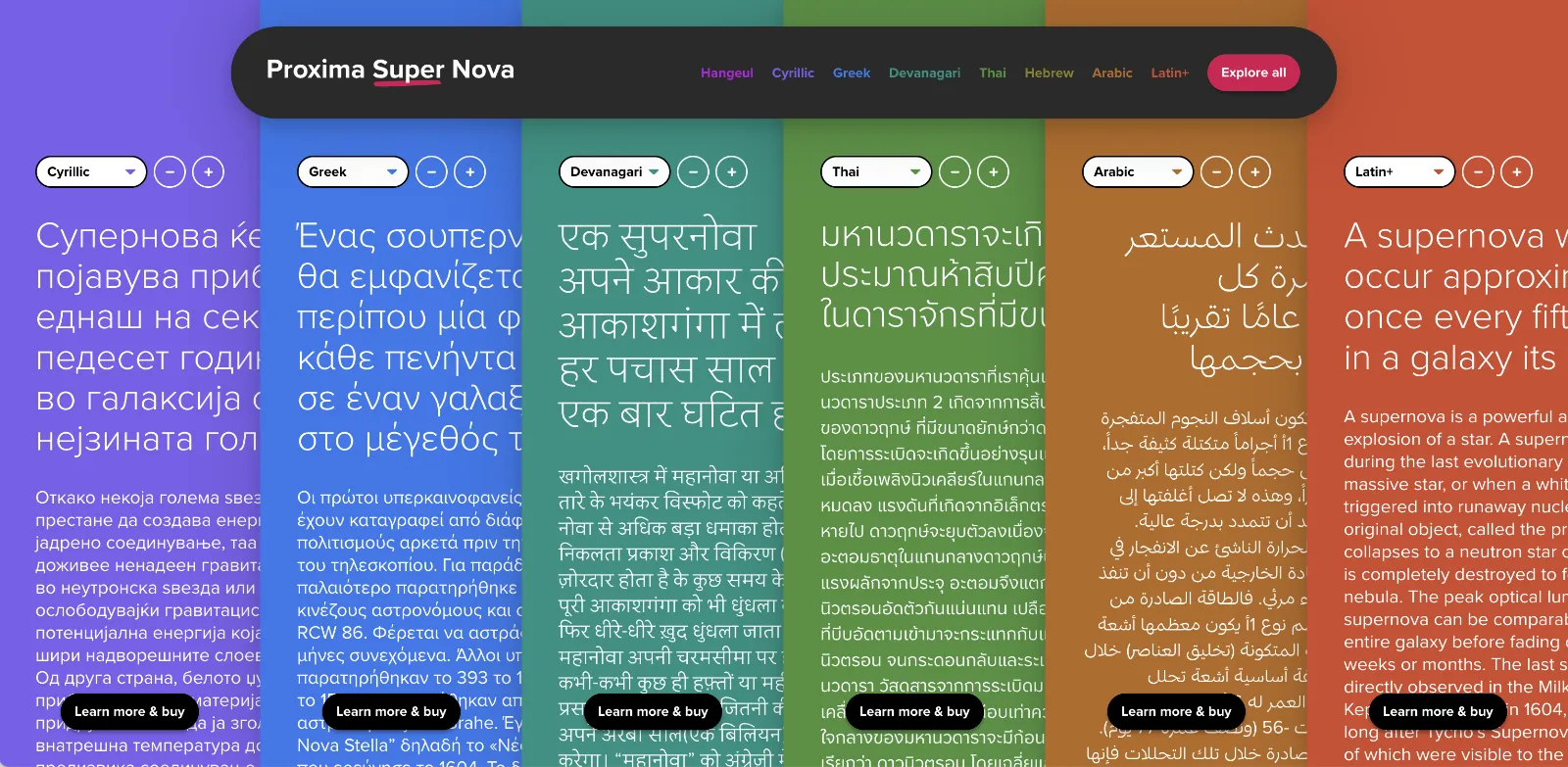
In the meantime, The Type Founders has been working to expand language support for Proxima Nova, with the aid of some really talented type designers from around the world. We’ve dubbed the fruits of this effort Proxima Super Nova.
In addition to most Western and Eastern European Latin, Greek, Vietnamese, and Cyrillic, Proxima Nova now supports Arabic, Devanagari, and Thai (both looped and loopless). More writing systems are in the works, including Hebrew and Hangeul.
Check out the Proxima Super Nova mini-site to find out all about it.
If you have any questions, are interested in extended or enterprise licensing, or need additional language support or customizations, get in touch! Send a note to info@marksimonson.com
A big thanks to the following people:
Proxima Nova Thai: Smich Smanloh of Cadson Demak
Proxima Nova Devanagari: Vaibhav Singh and Alessia Mazzarella of Typeland
Proxima Nova Arabic: Khajag Apelian and Wael Morcos
The mini-site: Elliot Jay Stocks (site design and content development) and Roel Nieskens (site development)
Project management and production support: Glenda Bellarosa and Dyana Weissman
In the late seventies, personal computers were starting to emerge and generate interest among some people. I was mildly interested, but I had no idea what I would do with one. Suggested uses were things like: storing recipes, an electronic address book, or maybe play computer games like Star Trek. Mostly it seemed to be about writing programs in BASIC to, say, store recipes. Anyway, none of this really got me excited enough about computers to actually buy one.
All that changed when I came across a copy of a book by Ted Nelson called Computer Lib / Dream Machines. He wrote the first edition in 1974. The copy I bought was the 1980 edition. In it, Nelson presented a vision of computers as tools to enhance and expand human intelligence and creativity. One of the big ideas he talks about in the book is hypertext, a term he coined. Hypertext is, of course, one of the foundations of the Web, as in HTML, or Hypertext Markup Language. When you click on a link, that’s a kind of hypertext.
But, to Nelson, hypertext was much more than simple links to other documents. He envisioned a new kind of non-linear, dynamic form of literature, with variable levels of detail and hierarchy, tailored to the variable needs of authors and readers, all made possible by computers, which could do things that would be impossible on the printed page. After reading Computer Lib, I had to have a computer. I wanted to be part of this future.
Of course, it didn’t happen right away, this vision of Ted Nelson. When the Mac came out, everyone (including me) was astounded by its point-and-click graphical user interface. However, as I recall reading in one of the computer magazines of the day, Nelson was unimpressed. While he agreed that it was a good start, he criticized the Mac’s WYSIWYG presentation of text and graphics as being too limited, too static and bound to the ink and paper media of the past. The desktop publishing revolution, as amazing as it was for the print publishing world, fell far short of what was possible with this new digital medium.
In a few years, we got the World Wide Web. But, as Gerry Lieonidas tells in his talk (below), we are still in many ways stuck in print-oriented concepts, just as Ted Nelson was complaining back in 1984. When I saw Gerry’s talk earlier this evening, it immediately made me think of Ted Nelson and these ideas that got me excited about computers in the first place.
Gerry, I think you’re onto something.
Above: Gerry Leonidas on The Newest New Typography from Clearleft on Vimeo.
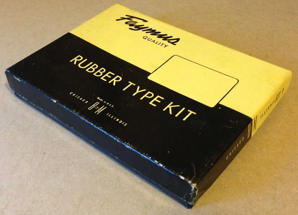
I ran across this today in my studio while searching for something else. Given today’s big Typekit announcement (with which I’m participating), I thought it would be fun to post a photo of it. With this Type Kit, you only got one font.
Chris Foresman, at Ars Technica, has written a nice, informative piece about WOFF (Web Open Font Format).
Mozilla announced today that it is going to include support for WOFF fonts, a font format designed for use on the Web, in Firefox version 3.6. I support this format and plan to allow my distributors to license WOFF fonts to customers.
At this point, Firefox is the only browser to support this format, so it’s not quite ready for prime-time yet. But there is a lot of support for this in the font industry, and hopefully the other major browser makers, Apple and Microsoft, will join in soon.
The results of a survey on the meanings of the words typeface and font among both “type industry professionals” and graphic designers, conducted by Thomas Phinney. My opinions on the matter fall squarely with the “type industry professionals” for the most part.
(via Typophile.com.)