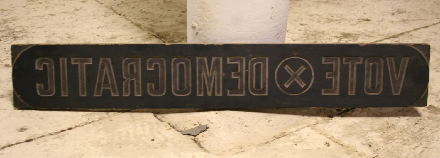
On one of the many times I have visited the Hamilton Wood Type & Printing Museum, I got a peek at the hundreds of “cuts” they had stored in the back. These are large wood and linoleum plates made mainly for posters. Most of them came from Globe Printing in Chicago. I think they had arrived fairly recently when I saw them.
One in particular caught my eye. I recall that it was about two or three feet wide. On one side was this design, obviously intended for use on political posters:
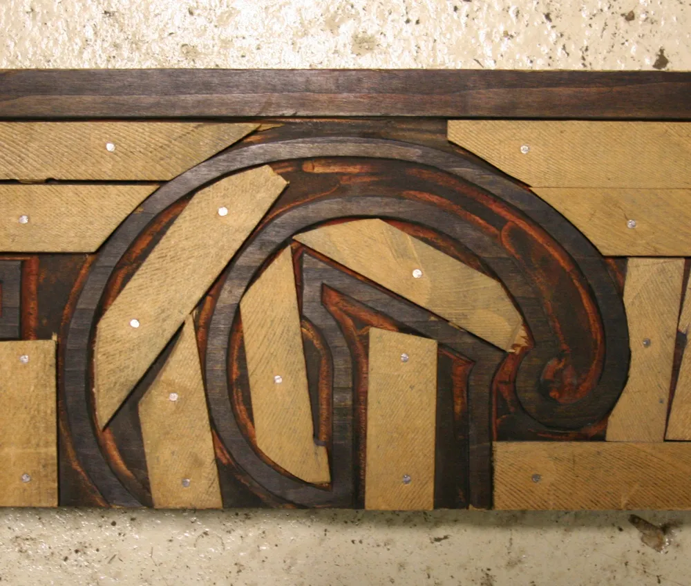
But on the reverse side was this amazing piece of craftsmanship and ingenuity:
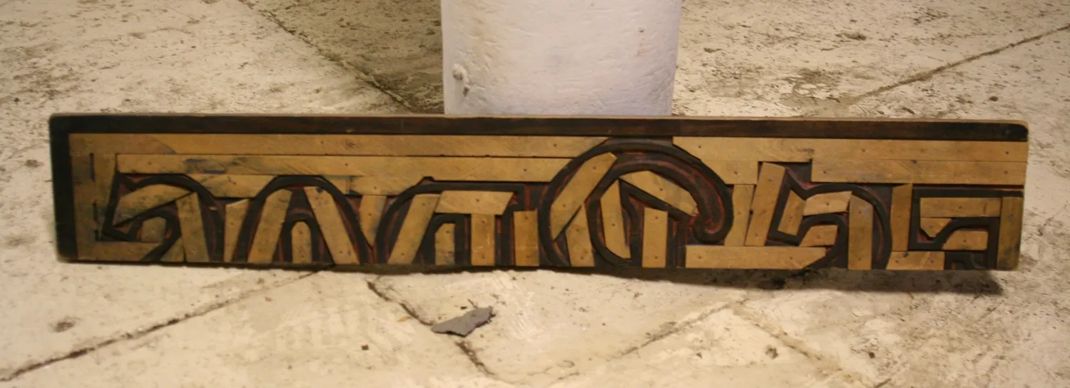
Apparently, cuts were reused when they were no longer needed. In this case, a larger plate was cut down. Not only that, but the open areas were filled in, mosaic fashion, to ensure an even impression for the new cut on the other side. To my eye, the discarded design was the more interesting one. It looks like it read “…ES BROS.” I really like the design of the “B”:
(Photos taken in Two Rivers, Wisconsin, on March 30, 2009.)
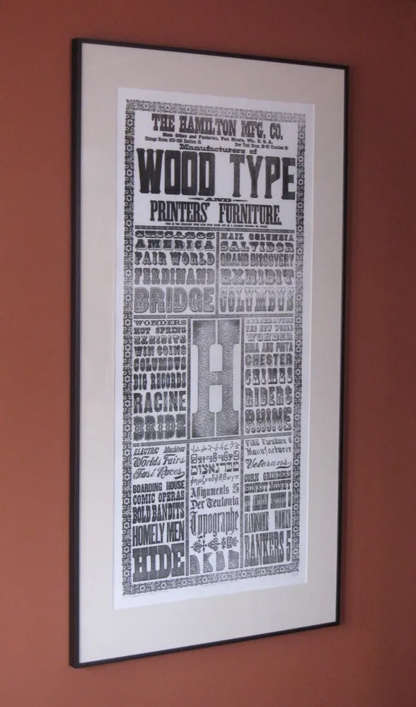
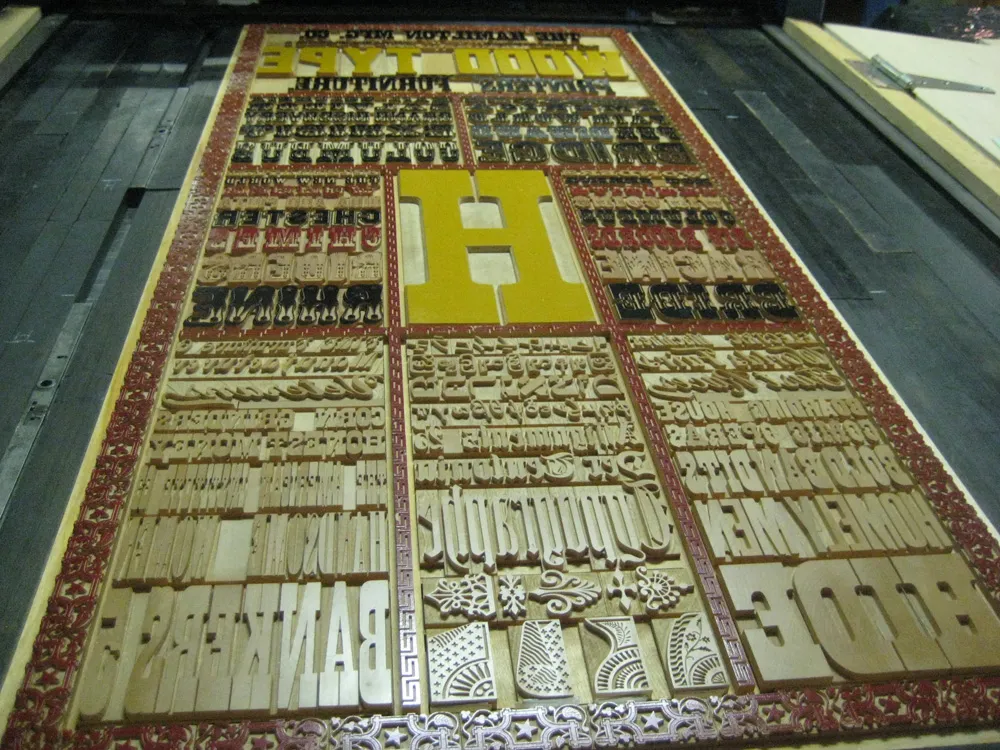
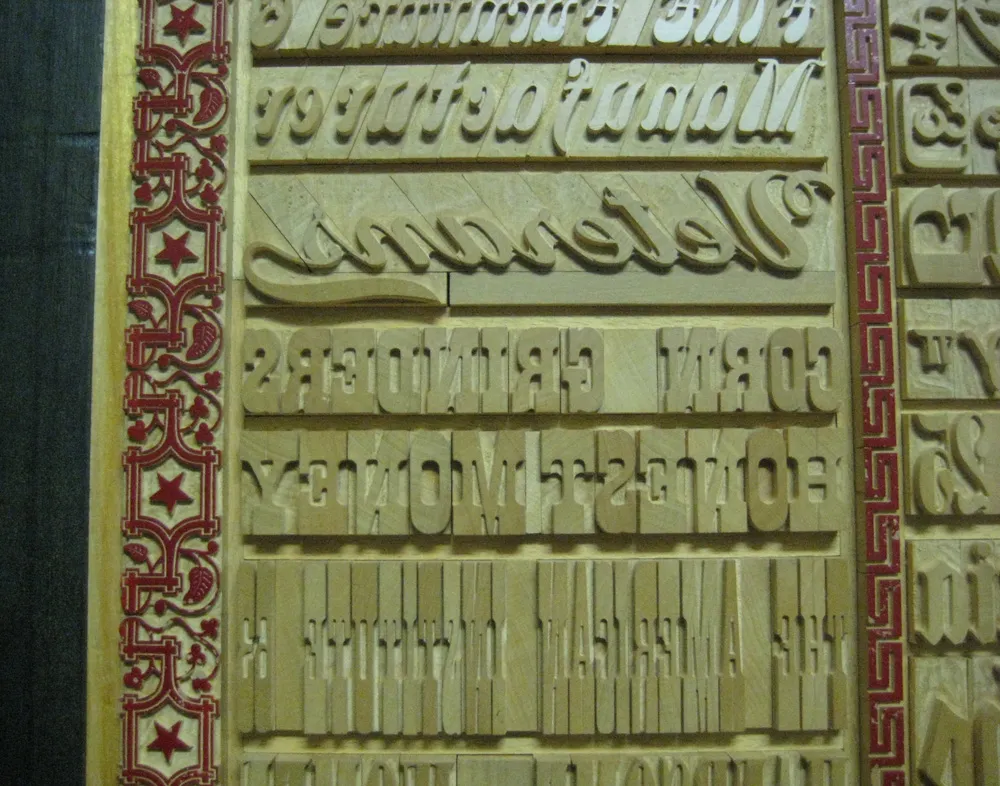
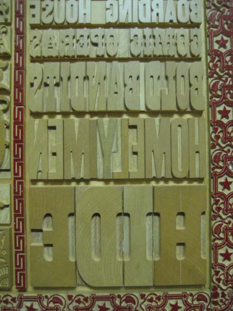
I finally got around to framing the beautiful commemorative print I got from the Hamilton Wood Type & Printing Museum back in 2009. To give you an idea of the size, the frame is five feet tall. By far the biggest thing I’ve ever had framed. Here are a couple close-up shots:
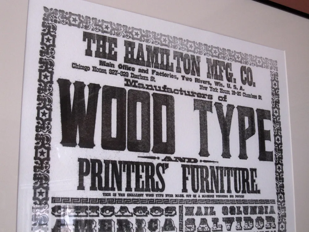
I love the part below the big heading where it says, “THIS IS THE SMALLEST WOOD TYPE EVER MADE, OUT OF A MACHINE WEIGHING 950 POUNDS”.
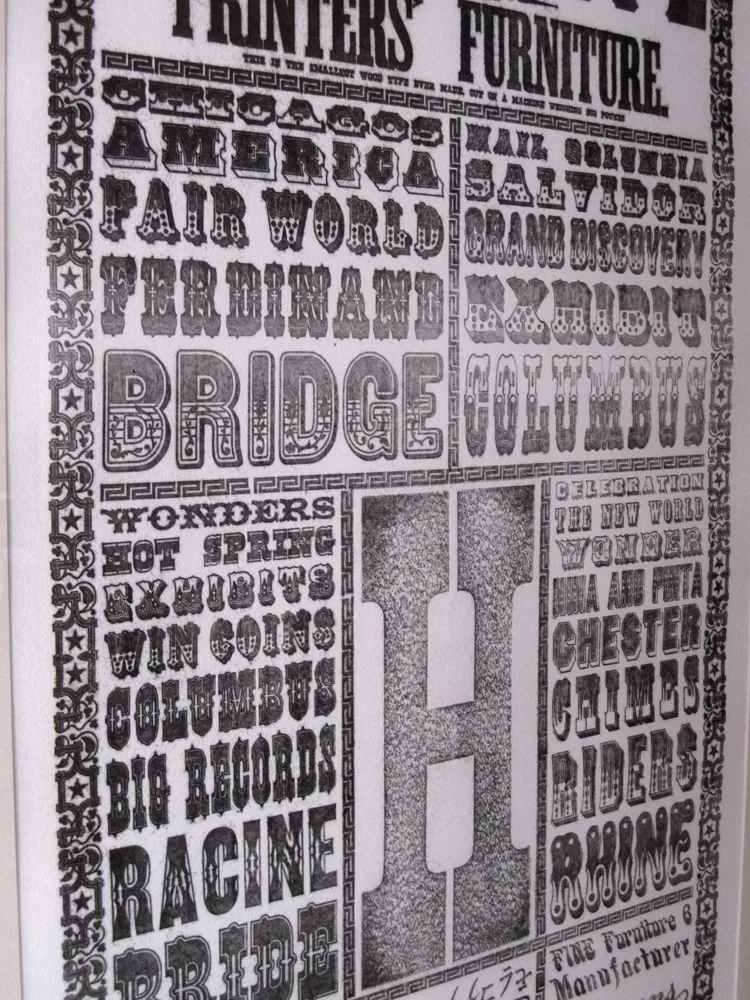
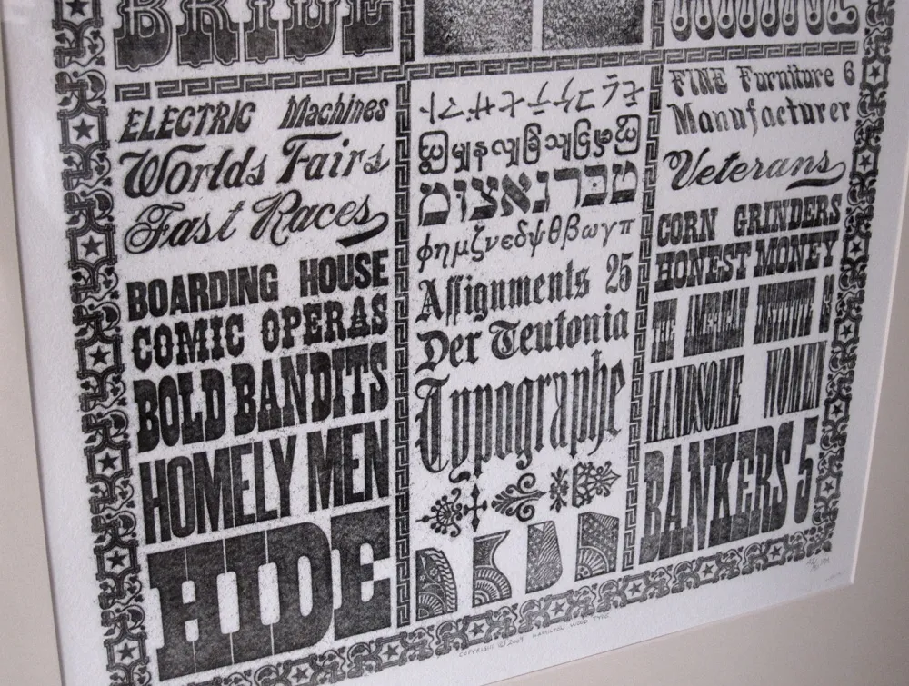
The print was taken from a literal showcase of Hamilton Wood Type made for the 1893 Columbia Exposition in Chicago. It’s composed of virgin (never used for printing) wood type, some of it painted. If you have seen wood type before, it’s usually dark brown in color, stained from use. This is what the stuff looked like when it was brand new.
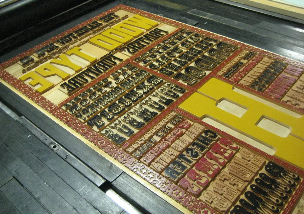
The curators of the Hamilton were able to pull prints from the showcase without getting a bit of ink on it. The display was taken out of its protective case and wrapped in 3M window insulator film. The film was inked and the prints were pulled from that. It’s not as crisp as a print taken directly from wood type, but it’s the first time any kind of print was made from this old type in over 100 years.
More photos here. If you’re at all interested in type, wood type, or letterpress printing, I highly recommend paying a visit to the Hamilton Wood Type & Printing Museum. It’s in Two Rivers, Wisconsin, about a couple hours by car north of Milwaukee.
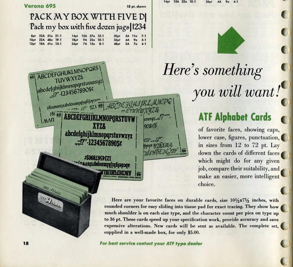
While looking for some obscure typographical thing this morning, this ad in a 1955 ATF (American Type Founders) catalog caught my eye:
I have several boxes like the ones shown in the photo. I acquired them with a bunch of other stuff some years ago when the University of Minnesota Journalism School revamped its graphics lab. Here’s one of them:
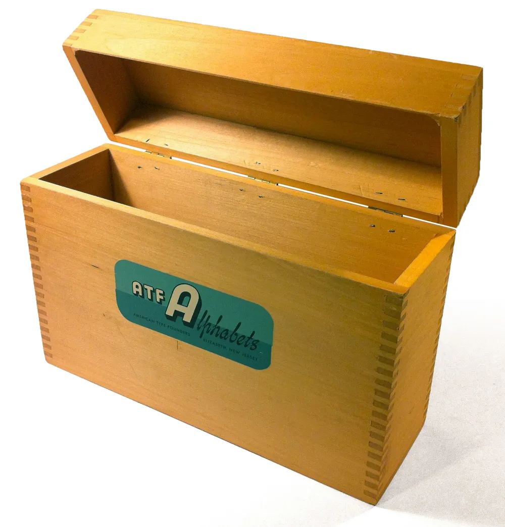
The silk-screened label is beautiful:
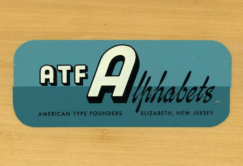
It’s too bad I don’t have any of the type sample cards they were designed to hold. “Here’s something you will want!” Still true, even in 2012.
Postscript: An Etsy page with photos of what went in these boxes. Thanks to Joel for the link, and thanks to Kathy for sending me a complete set of the cards.
After posting my follow-up on Sunday, my uncle sent me some more details about the CCA calendars:
“Most of the calendars during the late sixties and early seventies were designed at the CCA Corporate Design Center, which was located in downtown Chicago. It was run by John Massey who was head of all CCA corporate design and promotional material. He had two brothers that worked for him. We referred to them the Kalfus brothers (not sure of the spelling). They did many of the calendars. John Massey used Helvetica type only on everything they designed. Bill Bonnell came later and may have designed some of the last calendars CCA did.”
Somebody ought to do a site about CCA’s design history. So many things like this are virtually non-existent on the web.
That “Edikit” image I posted yesterday was just one piece of the whole kit, the only part I still have that’s intact. It’s the cover of a 28-page booklet of half-size layout grids printed on one side of each page in non-photo blue (light blue) ink. The only text is printed on the inside front cover in 24-point Century Schoolbook, centered, capitalization as shown:
**put your ideas
down here because
this is where you
begin.**
And that’s how I actually used it. I did a thumbnail layout on every available page, and sometimes a drawing or doodle on the reverse side, including these typeface ideas, drawn with a red Sharpie on the inside back cover:
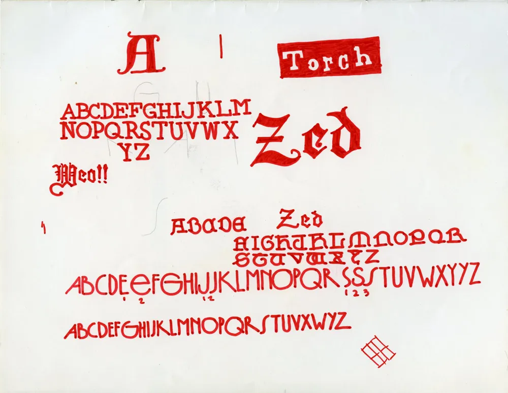
The one near the bottom was probably inspired by seventies art deco faces like Washington or Epic. It even has tiny numbers indicating alternate characters, just like in the specimen books.
Regarding the CCA calendar, I contacted my uncle, Knut Simonson, who I mentioned was a designer at CCA in the sixties. He doesn’t have the red can that the 1968 CCA calendar came in anymore, but he does still have the calendar itself. He shot these two photos of it for me:
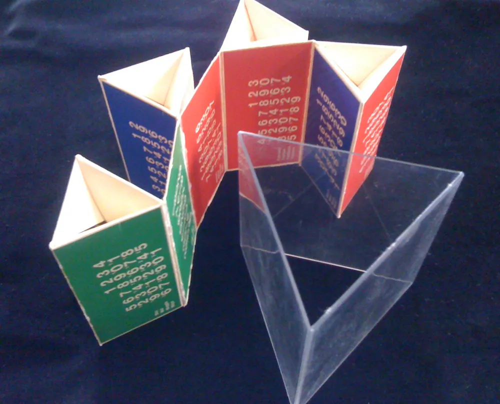
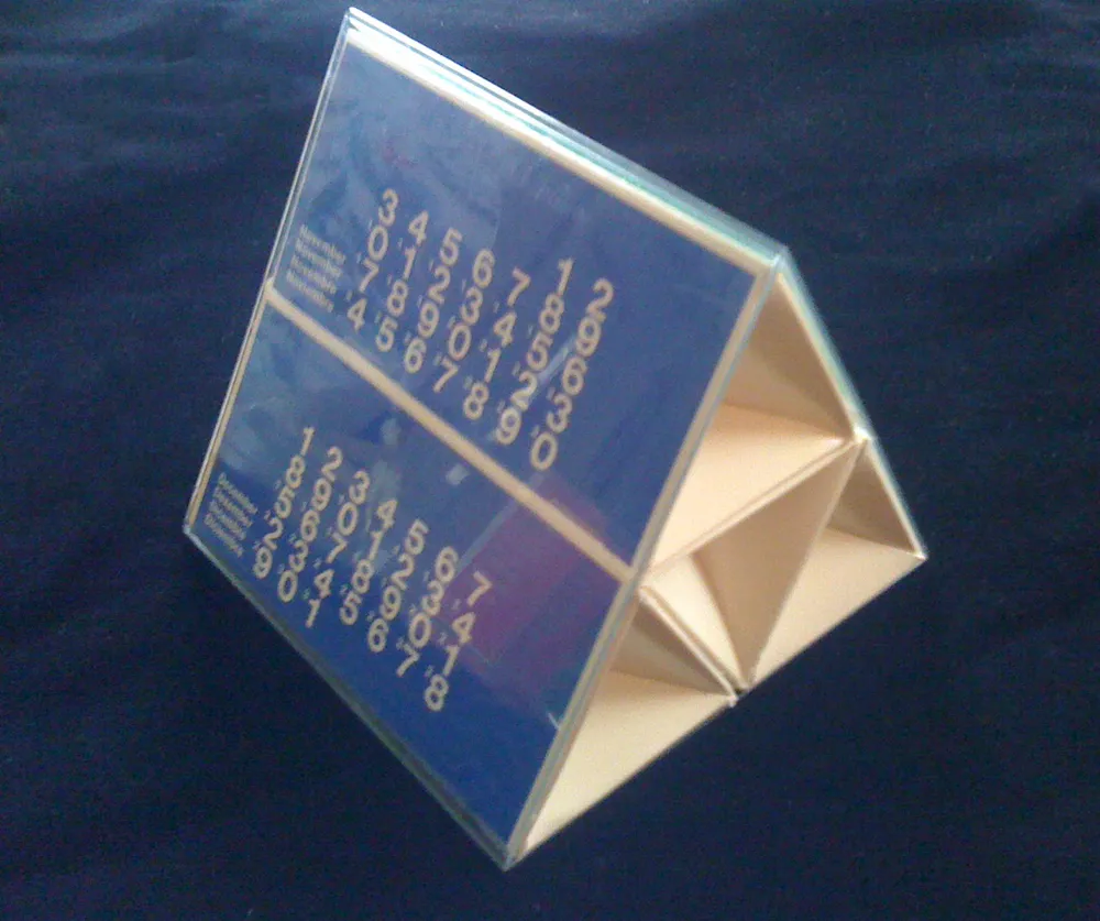
The clear plastic part fit snugly inside the can, and the triangular, paperboard calendar part fit inside that. When assembled, six months are visible on the outside. To see the other six, you slip it out, change the way it’s folded, and slip it back in.
It’s interesting that the ones-place digits are printed much larger than the tens-place digits. I wonder why this was done? To make it simpler and more elegant? It makes the numbers kind of hard to read, almost cryptic. Another case of form over function, I’d say. Overall, a good example of the minimalist way designers still tend to use Helvetica.
Knut doesn’t remember who designed it, but I found some similar calendars done for CCA in the seventies credited to a guy named Bill Bonnell. Maybe it was him. Too bad all the examples are in black and white. Probably scanned from an old design annual, printed back when color was expensive.
I was going through some old papers today and found this:
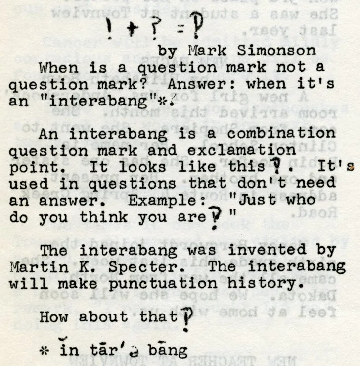
It’s a short article I wrote that appeared in the November 1967 issue of Town Views, the student newspaper at the elementary school I attended. I was 11 years old at the time.
As I recall, I heard about the interabang* from a newsletter my dad used to bring home from work. It was published by Falk, an industrial company that made forklifts or something. But always had interesting topics. I remember seeing M.C. Escher’s work for the first time in one issue.
Seeing this again I realized it’s probably the first type-related thing I ever wrote. I’m sure at the time I just thought it was interesting.
*This is an alternate and apparently older spelling that still appears in some dictionaries—usually it’s spelled “interrobang” today.