Last week I did a talk for Type Tuesday in Minneapolis where I did a live demo of early font editors on a real Macintosh Plus. I’ve uploaded a video recording of it on YouTube, or you can watch it here.
6/27/24 Update: I’ve also posted a video about the story behind the Mac Plus I used for my Type Tuesday talk:
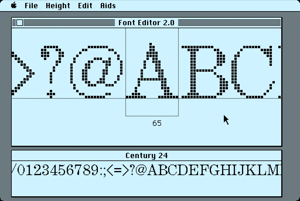
In 1984, I bought one of the original 128K Macs. A big draw for me was how it could display multiple fonts—proportional or fixed-width—anywhere on its screen. I desperately wanted to make my own fonts for it. This was before modern PostScript/TrueType/OpenType fonts, back when there were only “bitmap” fonts—fonts composed of discrete black and white pixels.
That summer, I read about an Apple developer tool called Font Editor 2.0 and sent for a copy of it. It was crude and crashed easily, but it allowed me to make my first Macintosh bitmap fonts. (A little later, AltSys released FONTastic, which was better in every possible way, including being less crash-prone.)
Recently, I fell down the rabbit hole investigating and reacquainting myself with Font Editor 2.0. I wound up making a user guide and a video demo and walk-through. I also prepared some disk images you can use with a real 128K or 512K Macintosh computer or an emulator, such as Mini vMac if you want to try it out for yourself.
I’m planning to make more videos about early font development on the Mac in the near future on my YouTube channel.
Before digital type and desktop publishing took over the world in the late 1980s, there was metal type and phototype. But if you were on a tight budget, you could set type yourself using various “dry transfer” products, Letraset being the most famous. But Letraset wasn’t the only one.
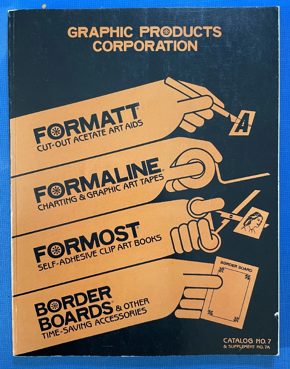
I used Formatt sheets a lot in the late 70s and early 80s. I’ve still got a few catalogs (No. 7 from 1981, No. 8 from 1986, and pages from what I believe is No. 6 from 1976) and a few sheets of type.
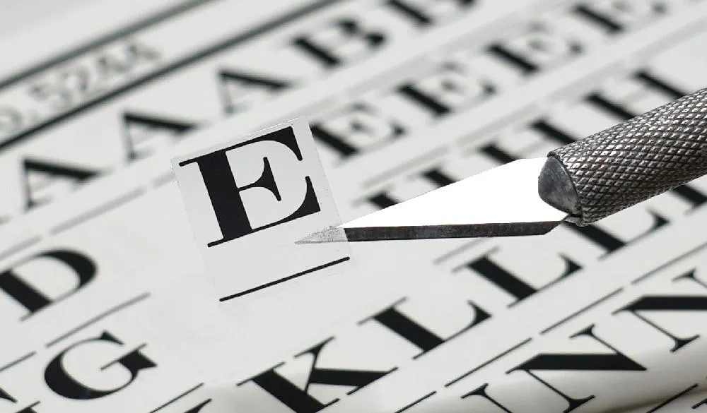
Unlike Letraset and other “rub down” type products, Formatt was printed on a thin, translucent acetate sheet with low-tack adhesive backing on a paper carrier sheet. To use it, you cut out the letters with a razor blade or X-acto knife and positioned them on a suitable surface and then burnished it down. I usually used illustration board and then made a photostat for paste up, but you could put it right on the mechanical if you wanted.
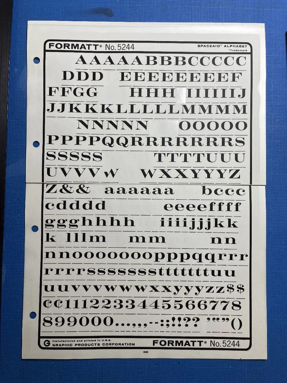
The sheets had guides below each character to aid in spacing and alignment. Although I always spaced it by eye, the guides were essential to keep the characters aligned to each other. I would draw a line for positioning the guidelines using a non-repro pen or pencil before setting the characters down and trim away the guidelines after.
Formatt was not as high in quality as Letraset, but it was cheaper and offered typefaces—especially older metal typefaces—not available from any similar product. But they also carried more recent faces, such as those from ITC. They carried about 250 different typefaces in the catalogs I have. I only bought Formatt type sheets in order to get certain typefaces that weren’t available elsewhere (other than from typesetting houses, which were not in my budget at the time).
In addition to type sheets, they also produced a whole range of pattern sheets, rule and border sheets and tape, color sheets, decorative material, etc. A lot of the graphic material seems to have come from old metal foundry sources. Besides the type sheets, I used their border sheets and tapes a lot, too.
I also made my own “Formatt” sheets sometimes back in the early 80s. I had access to a process camera, which could make high-quality photographic copies of black and white originals, colloquially known as “photostats” or “stats.” Normally you would use white RC (resin-coated) photographic paper with it, but it was possible to get clear acetate photostat material that had a peel-off adhesive backing. Using this, I made copies of pages from old metal type specimens, allowing me to set display type using otherwise unavailable typefaces.
In the late seventies, personal computers were starting to emerge and generate interest among some people. I was mildly interested, but I had no idea what I would do with one. Suggested uses were things like: storing recipes, an electronic address book, or maybe play computer games like Star Trek. Mostly it seemed to be about writing programs in BASIC to, say, store recipes. Anyway, none of this really got me excited enough about computers to actually buy one.
All that changed when I came across a copy of a book by Ted Nelson called Computer Lib / Dream Machines. He wrote the first edition in 1974. The copy I bought was the 1980 edition. In it, Nelson presented a vision of computers as tools to enhance and expand human intelligence and creativity. One of the big ideas he talks about in the book is hypertext, a term he coined. Hypertext is, of course, one of the foundations of the Web, as in HTML, or Hypertext Markup Language. When you click on a link, that’s a kind of hypertext.
But, to Nelson, hypertext was much more than simple links to other documents. He envisioned a new kind of non-linear, dynamic form of literature, with variable levels of detail and hierarchy, tailored to the variable needs of authors and readers, all made possible by computers, which could do things that would be impossible on the printed page. After reading Computer Lib, I had to have a computer. I wanted to be part of this future.
Of course, it didn’t happen right away, this vision of Ted Nelson. When the Mac came out, everyone (including me) was astounded by its point-and-click graphical user interface. However, as I recall reading in one of the computer magazines of the day, Nelson was unimpressed. While he agreed that it was a good start, he criticized the Mac’s WYSIWYG presentation of text and graphics as being too limited, too static and bound to the ink and paper media of the past. The desktop publishing revolution, as amazing as it was for the print publishing world, fell far short of what was possible with this new digital medium.
In a few years, we got the World Wide Web. But, as Gerry Lieonidas tells in his talk (below), we are still in many ways stuck in print-oriented concepts, just as Ted Nelson was complaining back in 1984. When I saw Gerry’s talk earlier this evening, it immediately made me think of Ted Nelson and these ideas that got me excited about computers in the first place.
Gerry, I think you’re onto something.
Above: Gerry Leonidas on The Newest New Typography from Clearleft on Vimeo.
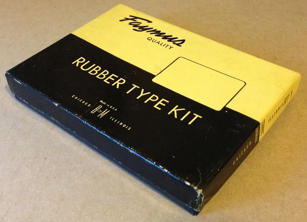
I ran across this today in my studio while searching for something else. Given today’s big Typekit announcement (with which I’m participating), I thought it would be fun to post a photo of it. With this Type Kit, you only got one font.
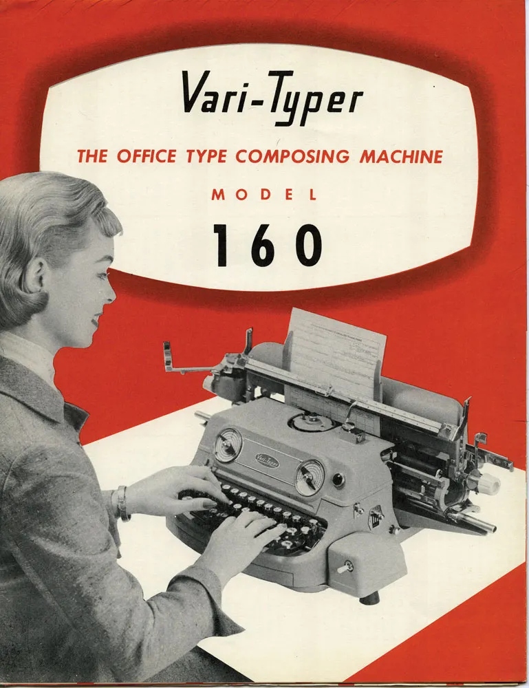
I was looking through my collection of old printing ephemera and found this lovely 1957 brochure for the Vari-Typer Model 160. Machines like this became practical with the spread of offset printing. Professionals pasted up proofs of hand-set metal type or output from a phototypesetting machine. But, if you were on a budget, the Vari-Typer offered a low-cost alternative.
It was essentially a fancy typewriter, but with proportional fonts, different type sizes and the ability to justify lines. It didn’t really look like professional typesetting, but it looked better than a typewriter, which was good enough for many purposes. It was desktop publishing before computers.
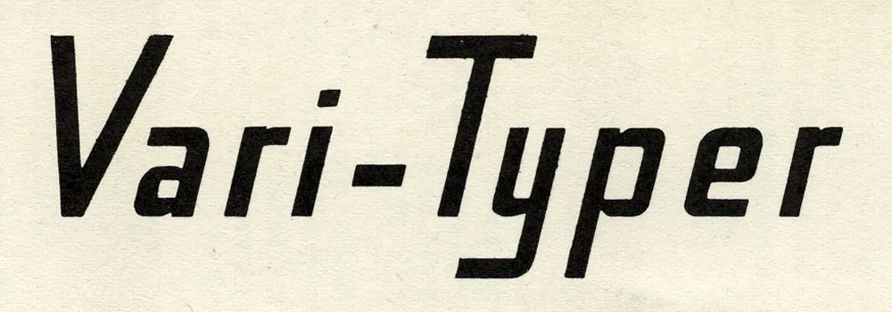
I really like the logo. But this is what made me want to post these scans:
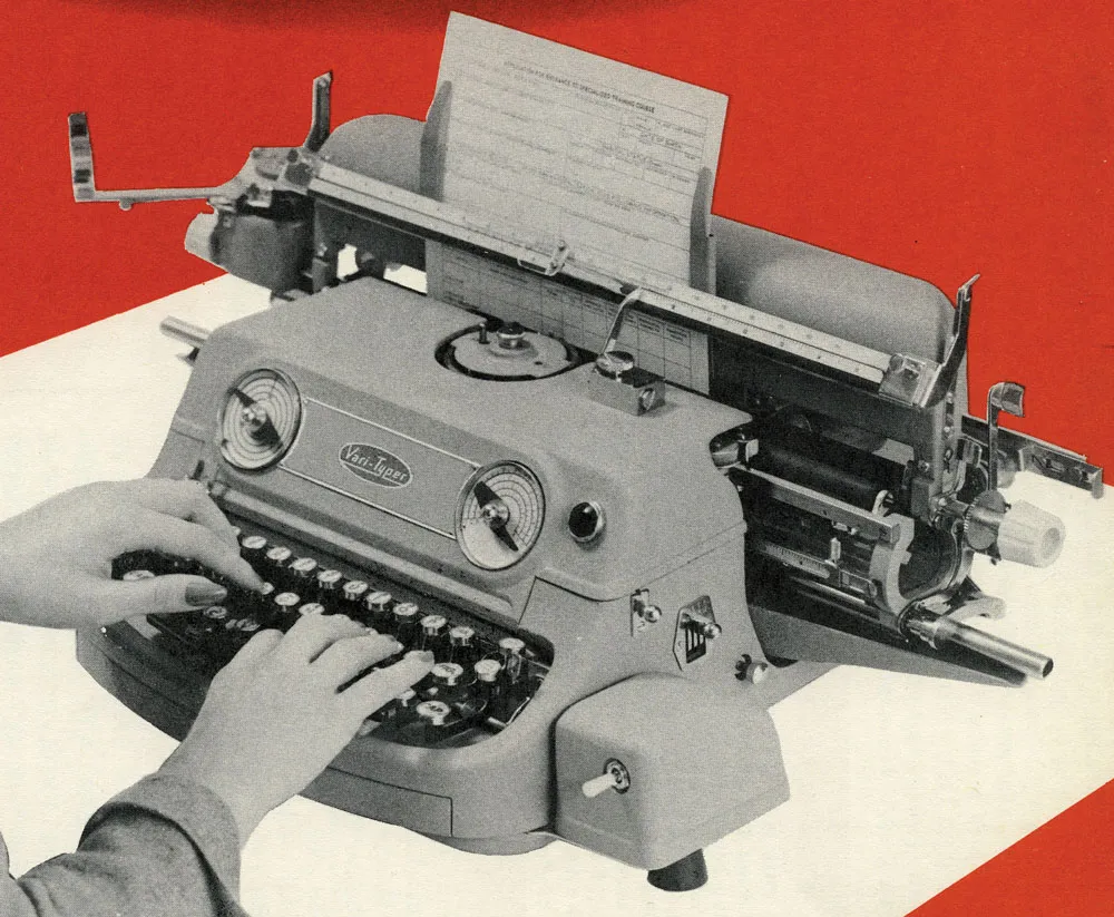
I really wonder what was going through the minds of the industrial designers who created this machine. Did they mean for it to look like a little grinning monster? So easy to use—just stick your fingers in its mouth and type!