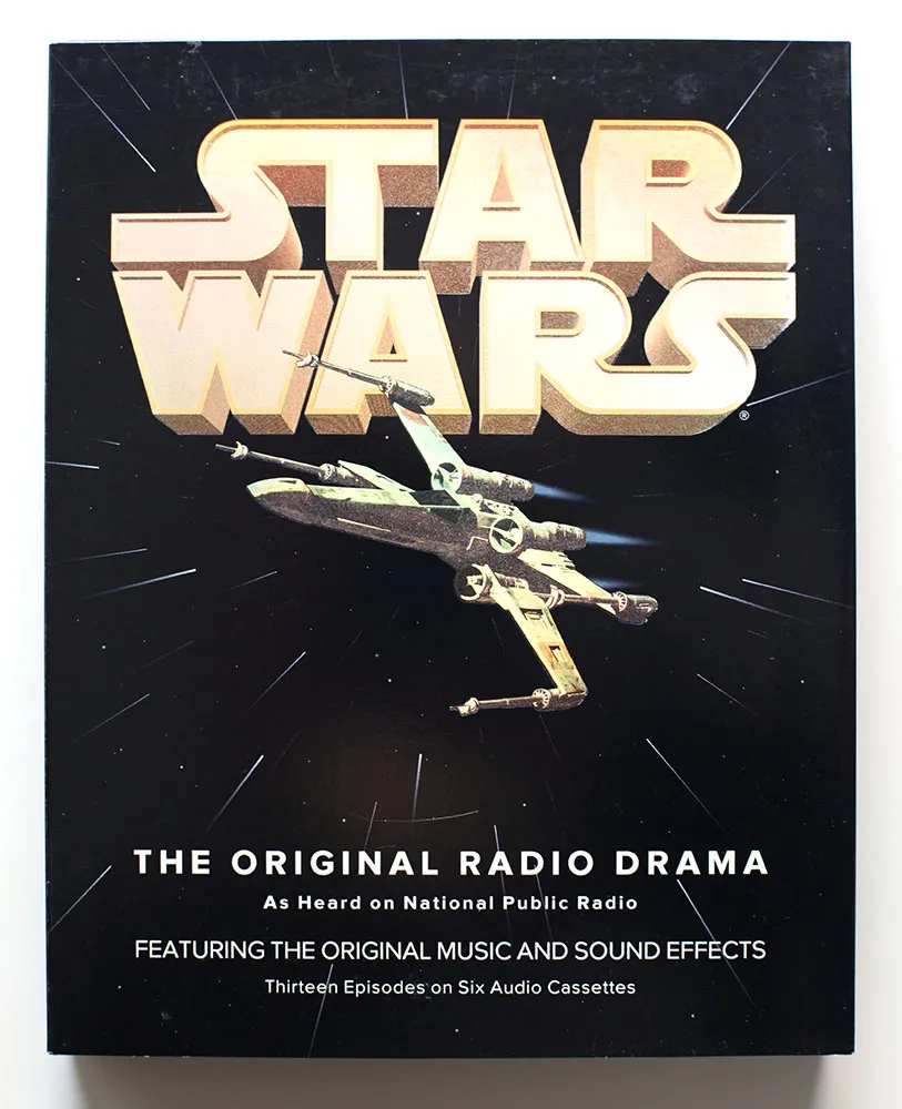
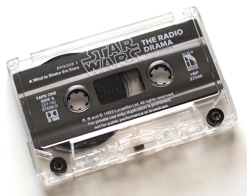
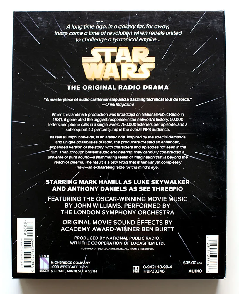
Back in 1993, I had just started a job at Rivertown Trading Company as a graphic designer. Part of that job was to design packaging for a division of the company called HighBridge Audio. One of the most interesting titles I got to work on was *Star Wars: The Original Radio Drama,*which had been broadcast on National Public Radio in the early eighties and was being released for the first time on audio cassette. (CD came later.)
It was one of the most elaborate packaging projects I ever worked on, with complicated die cutting and holographic foil embossing on the cover.
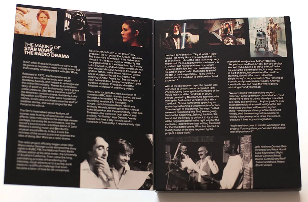
While working on the project, I was flown out to Skywalker Ranch near San Rafael, California, home of Lucasfilm, to rifle through file drawers of 35mm slides for possible use on the packaging. (My flight was delayed, so I missed out on having lunch in the same room as George Lucas.) Considering the rich visual imagery of Star Wars, it was surprising how little suitable photography they had for us to use. The complex visual effects only existed in the film, not in the publicity shots, which were taken on the set for the most part. The “stills” of, say, an X-wing fighter flying over the Death Star only existed as crudely retouched photos.
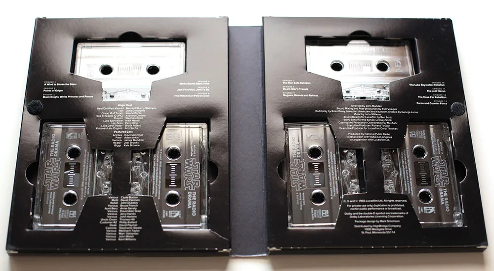
Back then I was also working an early version of Proxima Nova, which at the time I was calling Visigothic. I had tried some different fonts for the Star Wars packaging, including ITC Avant Garde Gothic and News Gothic, but nothing looked quite like what I wanted. On a whim, I tried Visigothic. It was plain (like News Gothic) and also a bit geometric (like Avant Garde). It felt a little weird using my unfinished type design for the project, but it seemed to work. I showed it to the other people I was working with and they thought so, too. So I used it.
I released the fonts about a year later as Proxima Sans. The version on the Star Wars packaging is fairly close the final version, although you can see from some of these images that the kerning was not quite finished. Also, the italic was just a simple slant of the roman, but with a modified lowercase “a”. Some other differences: the lowercase “y” has a longer tail and I hadn’t done the ligatures yet.
Someday, this font would become Proxima Nova, but this is the first time it was used publicly. It was exciting for me at the time to see how it performed in the real world, and it made me confident that it was worthy of releasing commercially.
If you ever wondered why Proxima Nova includes a ℗, now you know. On the CD version of the series, which I did in the late nineties, I used Proxima Sans, and I believe HighBridge has used Proxima Nova for more recent incarnations.
I created the 3D version of the Star Wars logo and the “hyperspace” star pattern in Adobe Illustrator and a program called addDepth. What I remember most about working on this project was how excruciatingly long it took to preview the artwork on the primitive Mac IIcx I had to work with at the time.
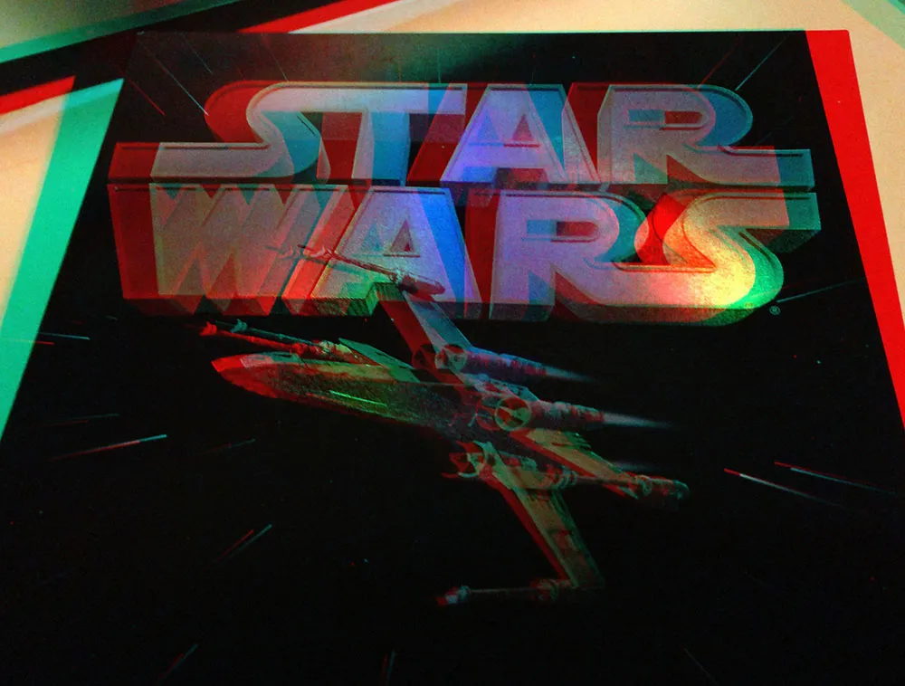
If you’ve got a pair of anaglyphic glasses (red/blue), this will give you a better idea how the holographic foil stamping looked.
Additional details If you’re interested in Proxima Nova and how it looks today, you can find more info, test and license the fonts, and download PDF specimens on the Proxima Nova page.
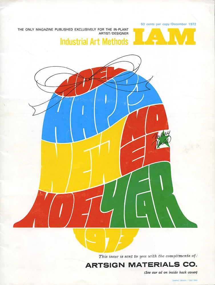
I don’t remember the details of how I got hold of this particular issue of Industrial Art Methods (“The Only Magazine Published Exclusively for the In-Plant Artist/Designer”), but it was one of the key things that sparked my interest in type design when I was a teenager.
I didn’t notice until years later that the lettering/illustration on the cover was by Tony Stan, designer of many faces for International Typeface Corporation, such as ITC Garamond, ITC American Typewriter, and ITC Cheltenham.
What caught my interest, though, was an article titled “How visual graphics develops new alphabets for the photo typositor”. By “visual graphics” they mean Visual Graphics Corporation (VGC), and by “photo typositor” they mean the Photo Typositor®, one of the most widely used headline setting machines of the phototype era. The article included this two-page spread:
I was already interested in type at this point, having purchased sheets of rub-down type for my high school newspaper. I didn’t know what a Typositor was, but here were a bunch of guys who had designed some really cool typefaces for it. I started imagining creating my own type designs and maybe getting them published, like these guys. Let’s take a closer look.
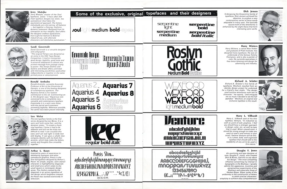
I have no idea what became of Jerry Matejka. His Soul family was one of my favorites in this article. It seemed very hip and cool. I’ve rarely seen it used, though. It’s funny how the description isn’t much different than what you still see in the marketing hype for fonts. As far as I know, this is Jerry’s only type design.
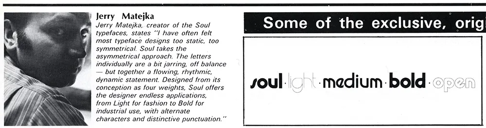
Sandi Governale’s description is even more hyperbolic—there’s nothing this typeface can’t be used for! Can’t say I ever did see it in use, though. I remember thinking this was one of the weaker designs in the article. Sandi also designed some typefaces for Photo-Lettering, Inc.
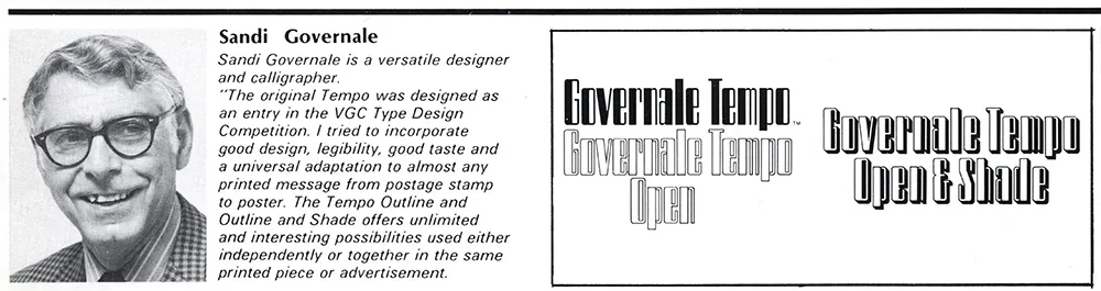
Ron Arnholm is still around. He is best known for designing ITC Legacy (1992), a “super family” with both serif and sans serif styles. I used to see Aquarius quite a bit on book covers back on the seventies. It always reminded me of the old 3M corporate typeface, but more stylish. Ron has attended the last few TypeCons, so I’ve gotten to know him a little bit. Nice guy. What I want to know is, whatever happened to Aquarius 1 and 3?
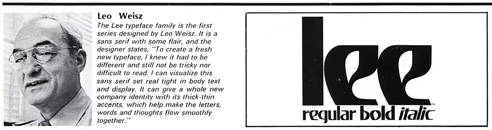
You wouldn’t expect that a guy who looked like Leo Weisz would have designed a weird-ass typeface like this, would you? It seems to be his only type design. You’ve see Lee in use on the VHS logo and the Charlie’s Angels logo. Leo is still around. He’s over 100 years old now, still paints, and even has a Facebook page.
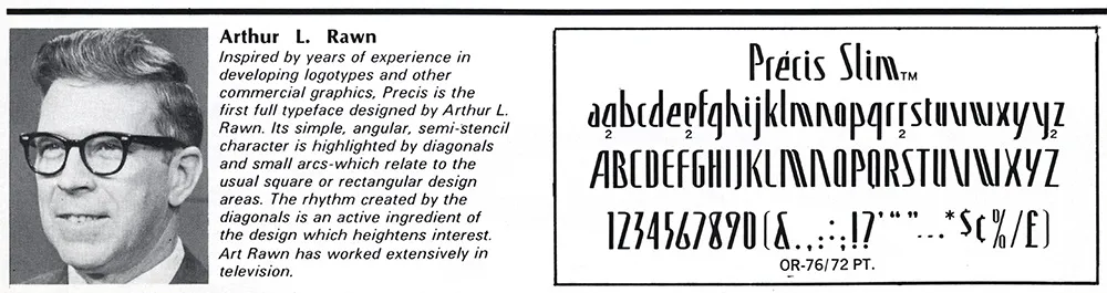
As far as I know, this is the only typeface Arthur Rawn is credited for. It seemed strange to me when I first saw it, even more so looking at it now. A very odd design, very uneven rhythm. I can see a little bit of Amelia and Peignot as possible influences. I don’t recall ever seeing it in use.
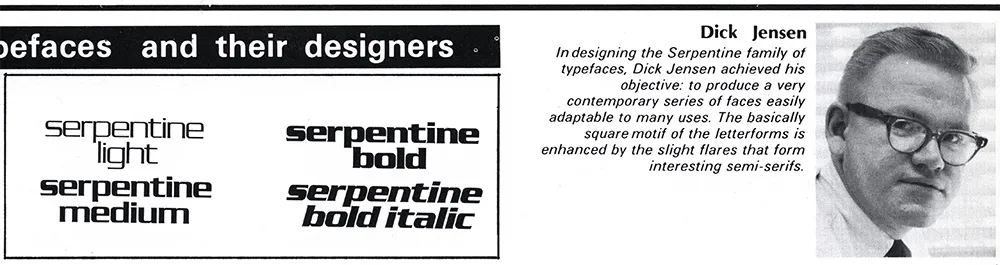
Serpentine is probably the most well-known typeface of the bunch, one of the few that made the transition to digital type fairly early on. I can’t explain why, but Dick Jensen looks like just the guy to design something like this. Turns out Dick was a Minnesota boy, born in Saint Paul (where I live now). As far as I can tell, this is his only type design. He died in 2000 at the age of 72.
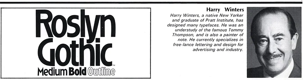
I remember liking this one a lot when I first saw it. It was fairly popular in the seventies. Looking at it now, it has a kind of Arts & Crafts look to it. Not sure what became of Harry Winters. He doesn’t seem to have been responsible for any other type designs.
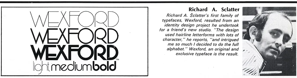
Richard Schlatter (his name was spelled wrong in the magazine) is still around and living in Michigan. Besides Wexford, he also designed a series called Glyphic, a very bold, high contrast sans serif. Wexford was another of my favorites from the article. A very seventies art deco face if there ever was one.
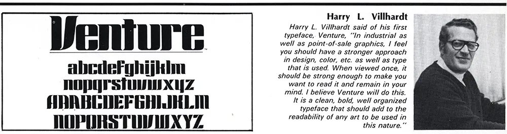
According to Canada type, which did a revival of Venture recently under the name Chopper, Harry Villhardt was a friend of Dick Jensen (above). I can’t remember this typeface having been used much, although it’s easy to picture it being used on 1970s science fiction paperback covers.
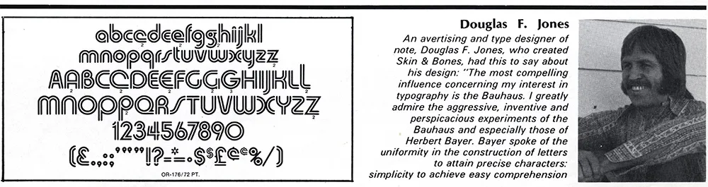
When I tried to do a web search of Douglas Jones and his Skin & Bones typeface, all I could find were references to a TV show called Fear Itself which had an episode called “Skin and Bones” starring an actor named Doug Jones. As for Doug Jones the type designer, Skin & Bones is the only published design of his I could find. I quite liked it back when I saw it in this article. Doug also gets my vote in the Sonny Bono Look-Alike Contest.
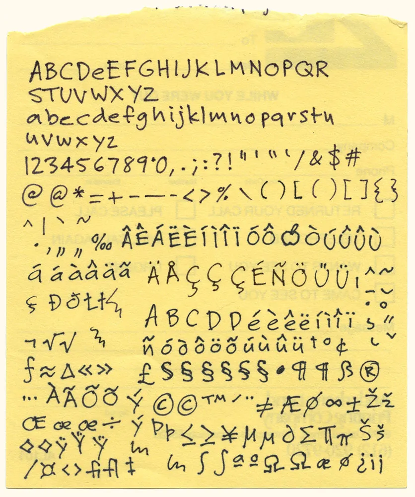
Here it is: The original artwork for one of my most popular fonts, Felt Tip Roman. I scribbled out all the characters needed in a typical font on the back of a phone message pad (about 4.128” x 5”) using a Pilot Razor Point felt pen. I deliberately tried not to be too neat or careful to try to capture the spontaneity of natural handwriting. Whether it would actually work as a font, I had no idea. That it would become a commercially successful font someday would have struck me as absurd at the time. I probably would have been a bit more careful and circumspect if I’d known. But perhaps then it would not have been as popular.
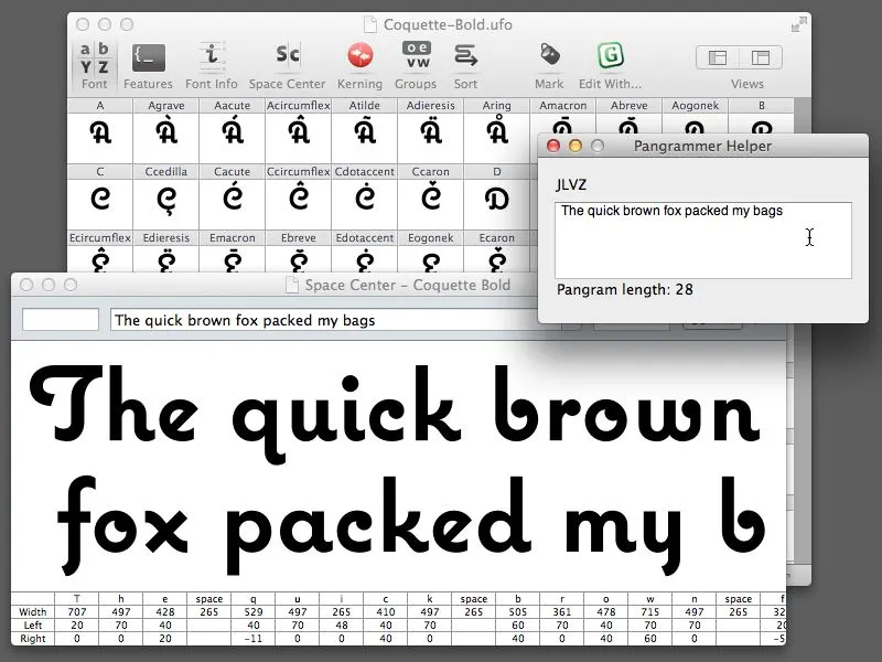
Almost ten years ago, I made a little program called Pangrammer Helper. It’s a little tool to help compose pangrams, which are sentences containing every letter of the alphabet. It was built in Flash and was designed to run in a web browser.
Type designers are especially enamored of pangrams, as you can imagine. Fellow type geek and friend, Craig Eliason, has been using it for several years to compose entries for his Daily Pangram site.
Recently, a new font editing app called RoboFont was released, and I’ve been starting to use it in my work. One of the neat things about it is that it’s fully extendable—that is, if you are willing to do a little Python programming, you can add features to it.
Last week, the Robothon 2012 conference was held in The Hague. It was all about type design and technology. I wasn’t able to attend, but videos of most of the talks have been made available on Vimeo, and I’ve been watching them the last couple days. Two of them in particular, one by Tal Leming about Building Stuff and another by Frederick Berlaen introducing RoboFont, inspired me to rewrite my Pangrammer Helper in Python so it could work inside RoboFont.
It took less than a day to do it, and it works great. You can use it by itself, and it works a lot like the old Flash version (a bit simplified), or, if you have RoboFont’s “Space Center” window open (the window were you work on your font’s spacing), the text also appears there as you compose it.
If you happen to be a RoboFont user, you can download version 1.2 of the script here. Just drop it into your scripts folder and you can run it right from the Extensions menu.
Update: Frank Grießhammer (currently working in Adobe’s type department) has contributed some improvements to my script, mainly adding the ability to add non-ASCII characters (as in “Grießhammer”) and an option for mixed-case pangrams. Thanks, Frank! The download link above will download this version (1.2).
Last Friday, I spent the afternoon frantically trading files with Peter Bruhn (of Fountain type foundry in Sweden) for an exhibition match of Layer Tennis. The basic idea is to pass a layered Photoshop file back and forth for ten “volleys”, about one every 15 minutes. The resulting “volley” image is displayed live for the world to see, with running commentary (in this case by the witty and capable Grant Hutchinson.
What may not have been obvious to some was that the Photoshop compositions were not where Peter and I were spending most of our time (well, maybe in some cases it was obvious). In fact, we were designing, building and generating fonts in FontLab, and then using them in Photoshop. With most of the volleys, we started from the font that had been built in the previous one.
Although the images created in Photoshop were the ultimate public face of the match, I thought it might be interesting to show what was going on behind the scenes with the fonts.
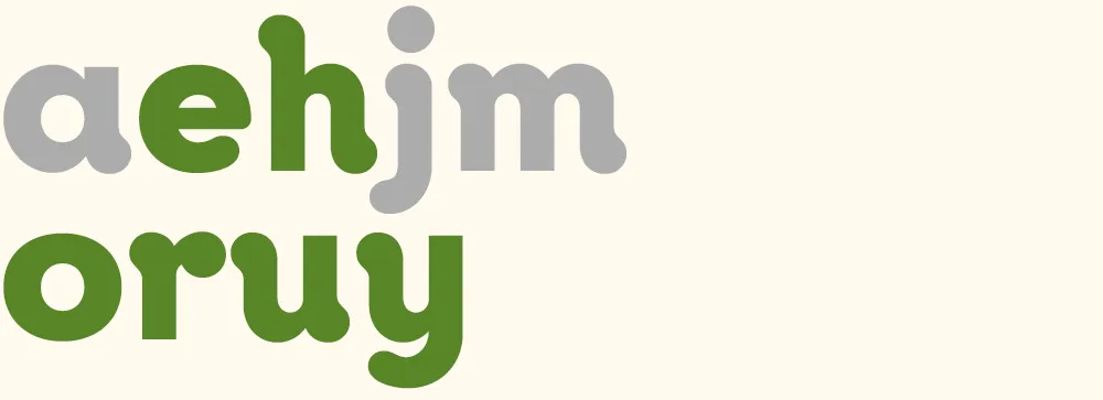
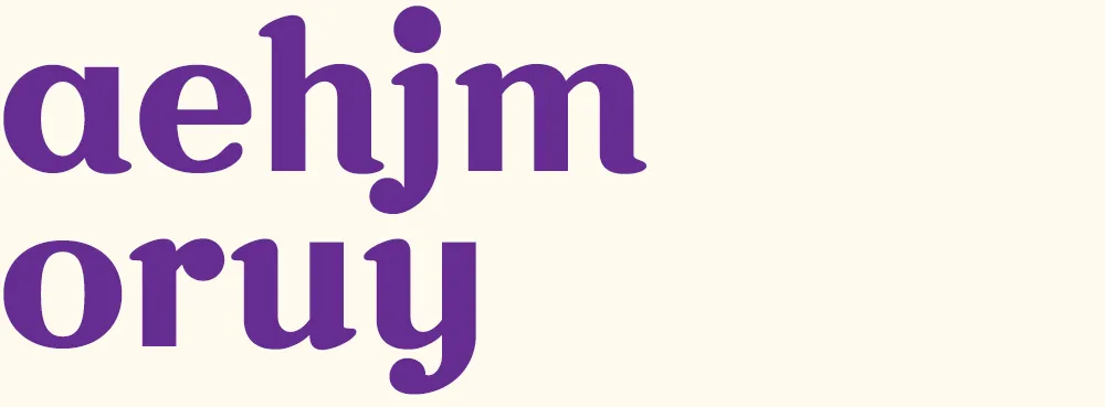
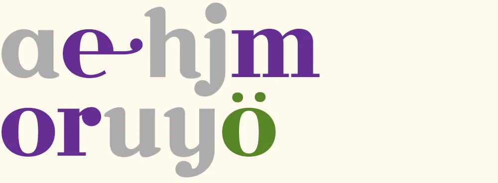
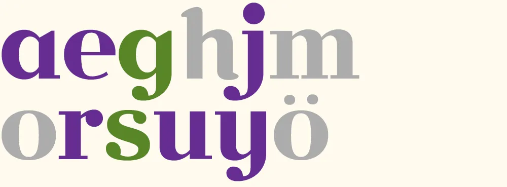
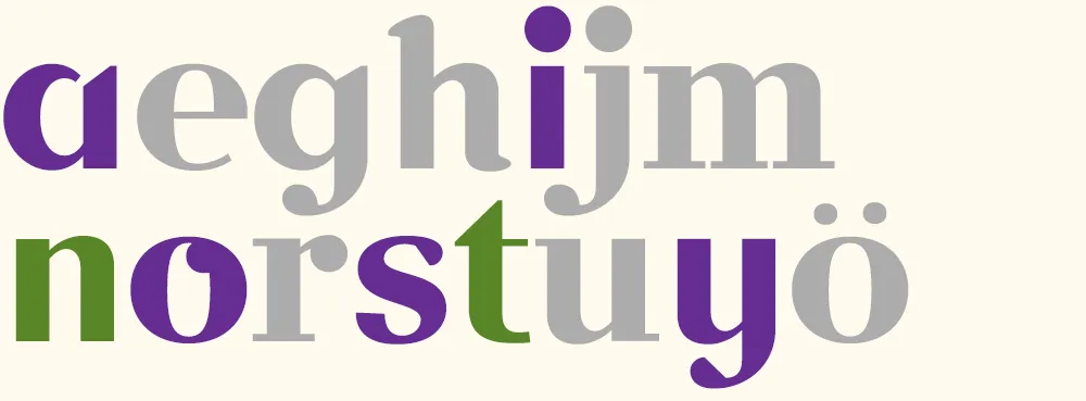
To make it easier to tell what was going on, I’ve color-coded the glyphs:
- Green = new glyphs
- Purple = modified glyphs
- Gray = unmodified glyphs.
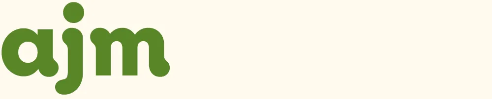
Volley 1: “jam” I got the coin toss, so I went first. I created a font with three simple glyphs in a sort of bloopy geometric style.
Volley 2: “your ham” Peter followed up by ably adding several more glyphs in the same style.
Volley 3: “more homey” I modified all the existing glyphs to create a higher-contrast semi-serif design. (You can see more clearly in this version that the basic construction is that of an upright italic.)
Volley 4: “möre” Peter takes it in a different direction, more like a Bodoni or Didot, and adds a whimsical swash and umlaut. He also takes advantage of the fact that he only really needs to change enough glyphs to spell the word he wants to use in the image, in this case “more”. Both of us adopt this strategy as the game progresses.
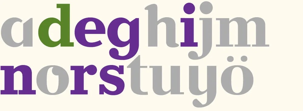
Volley 5: “major surgery” I continue the transformation to a Didone style, conforming several other glyphs and adding a g and an s.
Volley 6: “no sanity” Peter changes the direction, this time deconstructing several glyphs and doing a “serif-ectomy”. Note the nod to my Coquette in the o.
Volley 7: “faster!” I change the style again, albeit in an expeditious manner, by slanting all the glyphs. I add an f and a ! and tweak a few existing glyphs. (Merely slanted glyphs are shown in light purple.)
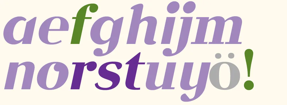
Volley 8: “aefghijm” Peter does something “meta” by printing out and critiquing an unslanted version of font.
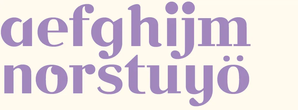
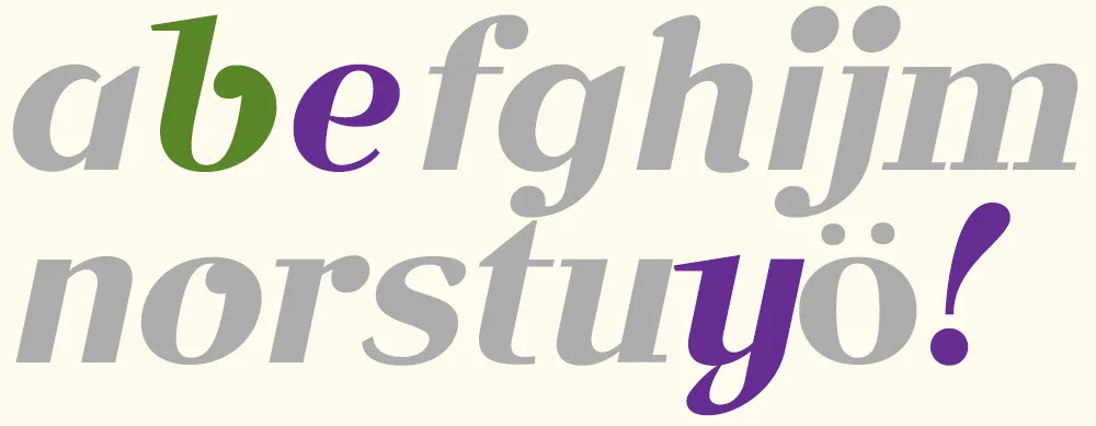
Volley 9: “redesign” I discard my cheap slanting trick from volley 7 and, starting from the font in volley 6, change it into a slab serif for my final volley.
Volley 10: “bye!” Peter takes my slanted font from volley 7 and gives it a more cursive flair, with a reprise of the Coquette reference. According to Peter, the “waving” exclamation point was a happy accident. Works for me.
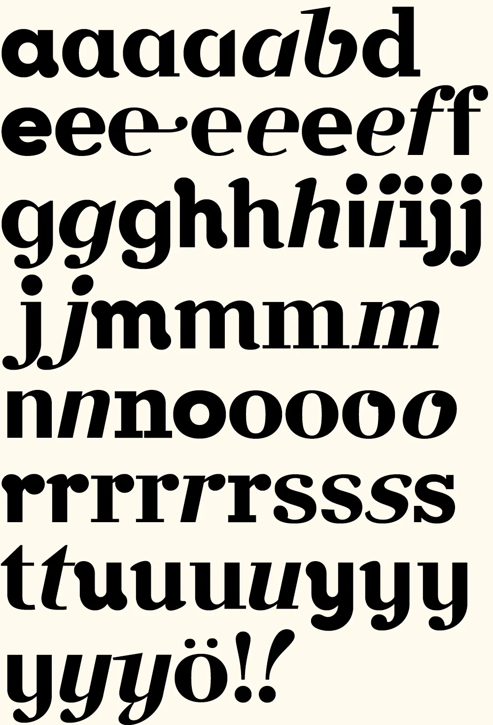
In the end, we had created ten new fonts in a few hours. Not complete, full-featured fonts, or the best-built fonts in the world, but good enough to set some type. I set them all together to show the sum of what we made:
Now comes the hard part: Coming up with a name for it….
(Thanks to Peter Bruhn, and Jim Coudal and Bryan Bedell of Coudal Partners.)

Probably more than you ever wanted to know, but it was fun rummaging through my old stuff to piece the story together.
(Thanks, Brian!)