Back in March, I mentioned that I was in the final stages of developing a new font family, Proxima Nova. It’s now about three months later and most of that time was taken up by doing the italic.
“What took so long?” you might wonder, “Isn’t it just a matter of slanting the roman version and saving it? That couldn’t take more than an minute or two.” As you may have guessed, it’s not that simple, especially if one wants to do it right. Allow me to illustrate.
Here is a sample set in Proxima Nova Bold:

Here it is simply slanted:

Notice how the curves have become distorted. The subtle modulation of the stroke weight is thrown completely out of whack, getting thinner in some places and thicker in others. This is especially noticeable with the S, O and P. Notice how the O looks kind of squashed. The A is also affected, but the difference is less obvious: the left stroke has become slightly thinner while the right stroke has become slightly thicker.
Characters like E and H, with only vertical and horizontal strokes, are virtually unaffected by slanting. However, any characters which are composed of curves or angled strokes must be optically corrected in a high quality font.
Here is the same sample set in Proxima Nova Bold Italic:

Much better, isn’t it? It takes a lot longer to make all those optical corrections, but the result—a font that simply looks right—is definitely worth it.
I expect to release Proxima Nova by the end of June. It’s available now.

One of the font projects I’m working on is the revival of some of Phil Martin’s display typefaces from the 1970s. These were originally distributed as 2-inch film fonts for the VGC Typositor headline setting machine. The master negatives exist in the form of small spools of 2-inch wide negative film around 50 feet long. They are in very good condition, considering they are up to 35 years old, and I wanted to make sure they stayed that way when it came to scanning them.
The film could pass through a standard film holder on the scanner, but I needed a way to hold up the feed and take-up spools on either side. I pondered this for a long time, and when it came time to actually start scanning, it hit me: Legos!
I am a life-long Lego® fan and, while they are certainly a fun toy, I have sometimes found practical uses for them. As you can see from the photo, I constructed “towers” on either side of the scanner to support the film spools. Gear pieces from an old (and probably collectible) Lego Technics set fit perfectly inside the spools, holding them firmly on axles. Cranks fashioned out of wheel pieces allow the film to be moved back and forth.

Here’s the really clever bit: To keep the film spools in tension (so they stay where I want them and don’t unravel), I devised a simple ratchet mechanism which allows the spools to turn freely in only one direction—away from the other spool. It can be easily flipped out of the way when I want the spools to roll free.
It could look nicer, but a lot of our Lego pieces are otherwise engaged in other projects built by my daughter and me, so I had to scrounge for pieces among the dregs that met the bare minimum requirements.
It occurs to me that if I had the Lego Mindstorms system, which allows you to add motors, light sensors, etc., I could control the whole thing from my computer and completely automate the process. Sounds fun, but this is simpler and gets the job done.
Now all I have to do is scan all the fonts (only about seven or eight hundred more characters to go) and then I’ll be all set to start building the fonts.
I wonder if I should add mini-figures…?
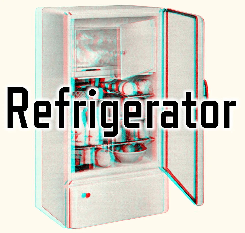
I’ve used the image above to promote Refrigerator, and once in a while I am asked how it was done. Technically it’s called a stereo anaglyph. When you view it using special glasses with a red filter on the left eye and a blue filter on the right eye, the image appears to be three-dimensional. Here’s what the glasses look like:
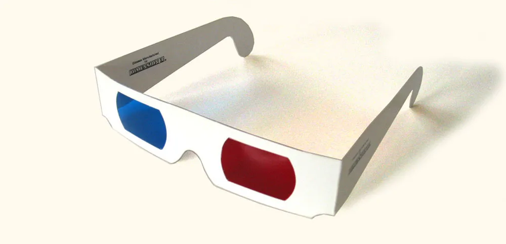
You can get these for free at 3D movies, and sometimes they show up in books or magazines. You can also buy them like this, but you usually can’t buy just one pair. In a pinch, pieces of red and blue clear plastic or cellophane will do.
I’ve seen descriptions of how to make anaglyphic images like this on a computer, but they’re usually presented at a pretty rudimentary level, or make it more complicated than it needs to be. I actually discovered this trick on my own years ago, back when I had a Mac II and the first version of Photoshop. Photoshop was a key since it allowed access to RGB channels separately. (In other software from that time, like PixelPaint or Studio8, you couldn’t do it.)
It’s actually not that hard, once you understand two basic ideas:
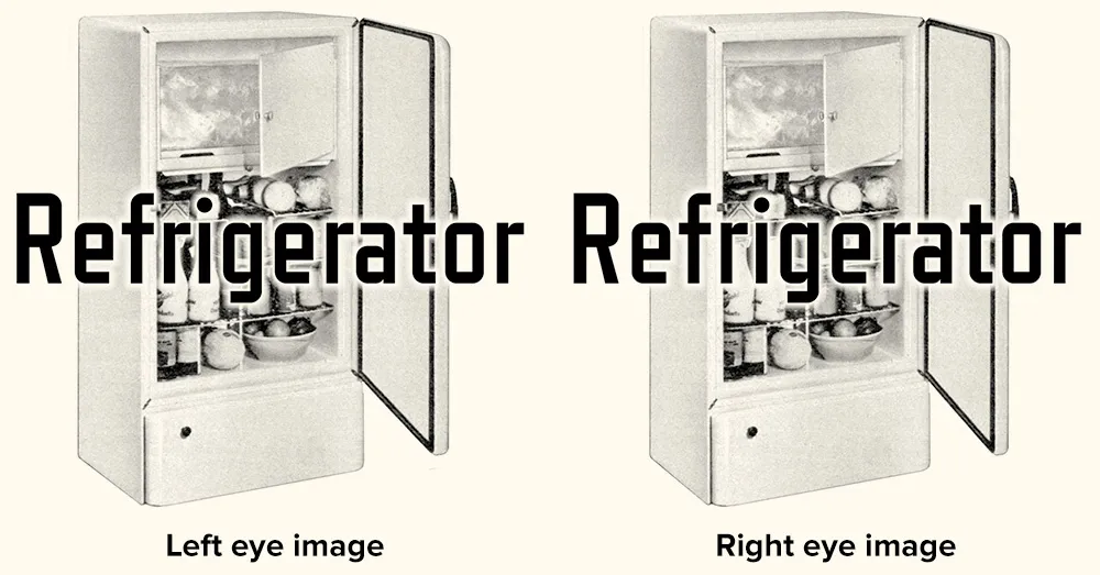
1. Your right and left eye see slightly different images. If you alternately shut your left and right eye, you can get a pretty good idea how to the two images differ. For the right eye, closer objects are more to the left and distant objects are more to the right. The opposite is true for the left eye. You can produce these two images lots of different ways including photography, 3D rendering software, or by simply shifting layers in Photoshop. In the case of the fridge, I used a scan of a refrigerator from an old catalog, and did it all in Photoshop by scaling the sides of the fridge either wider or narrower to approximate what each eye would see.
2. The red/blue stereo effect works by overlaying the two images, one in red and the other in cyan. When you put on the glasses, the red lens causes the cyan image to appear in shades of gray and the red image to vanish. The opposite happens with the blue lens. Thus, each of your eyes sees a different image creating the illusion of depth.
This double red/cyan image can be created easily in Photoshop by starting with the left- and right-eye images as grayscale (like the two above) and a blank RGB image. Paste the left eye image into the red channel and the right eye image into both the blue and green channels. When you view all the channels at once, you will see the overlaid images in a form that will work perfectly with anaglyphic (3D) glasses.
An image created in this way seems to work best when viewed on-screen. Color print-outs don’t work as well. I think this has to do with the way color is produced on a video screen vs. ink on paper. It’s also possible to do full-color images, but they don’t work very well if they have strong colors in them—especially red.
That’s the basic technique. There are lots of little tricks and subtleties of course, but if making anaglyphic images interests you, this should get you started.
I wish there was more need for this kind of image. I’ve sometimes thought about doing a whole 3D website, or seeing if there is a way to get this to work in Flash. Hmm…
Flash application featuring Raster Gothic Condensed.
How it works: A “pangram” is a sentence or phrase that uses every letter of the alphabet at least once. Type your pangram in the box. Pangrammer Helper will tell you which and how many letters you haven’t used and how long your pangram is. It will also tell you how many of each letter has been used. It’s a real challenge to get them down to or near 26 letters without resorting to nonsense.
First released in 2003; 2.0 version released in 2008.
Note: Flash 8 or later plug-in required to run from the Web.
You can use Pangrammer Helper here in your Web browser, or download a standalone version (which doesn’t require the Flash Player plug-in) for your Mac or PC:
Mac Version (4.5mb)
Windows Version (1.8mb)
July 2020 Update: Now that we live in a virtually Flash-free world, someone has fortunately taken the trouble to build a web-based version called Pangrammer. Even better, it works on any modern web browser, whether on a computer, tablet, or smartphone. Created by Tory Anderson of Brigham Young University.