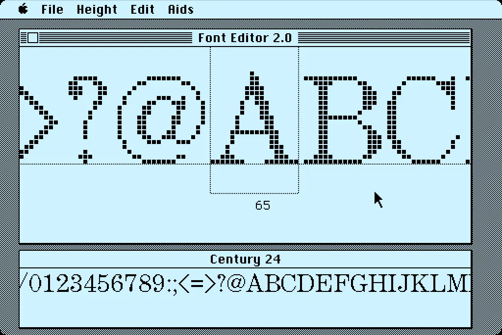
In 1984, I bought one of the original 128K Macs. A big draw for me was how it could display multiple fonts—proportional or fixed-width—anywhere on its screen. I desperately wanted to make my own fonts for it. This was before modern PostScript/TrueType/OpenType fonts, back when there were only “bitmap” fonts—fonts composed of discrete black and white pixels.
That summer, I read about an Apple developer tool called Font Editor 2.0 and sent for a copy of it. It was crude and crashed easily, but it allowed me to make my first Macintosh bitmap fonts. (A little later, AltSys released FONTastic, which was better in every possible way, including being less crash-prone.)
Recently, I fell down the rabbit hole investigating and reacquainting myself with Font Editor 2.0. I wound up making a user guide and a video demo and walk-through. I also prepared some disk images you can use with a real 128K or 512K Macintosh computer or an emulator, such as Mini vMac if you want to try it out for yourself.
I’m planning to make more videos about early font development on the Mac in the near future on my YouTube channel.
Before digital type and desktop publishing took over the world in the late 1980s, there was metal type and phototype. But if you were on a tight budget, you could set type yourself using various “dry transfer” products, Letraset being the most famous. But Letraset wasn’t the only one.
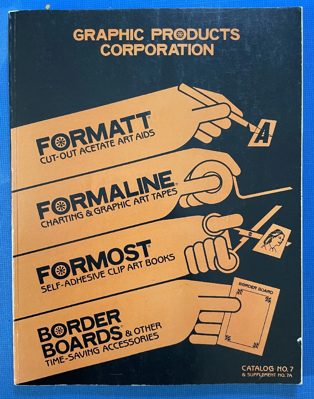
I used Formatt sheets a lot in the late 70s and early 80s. I’ve still got a few catalogs (No. 7 from 1981, No. 8 from 1986, and pages from what I believe is No. 6 from 1976) and a few sheets of type.
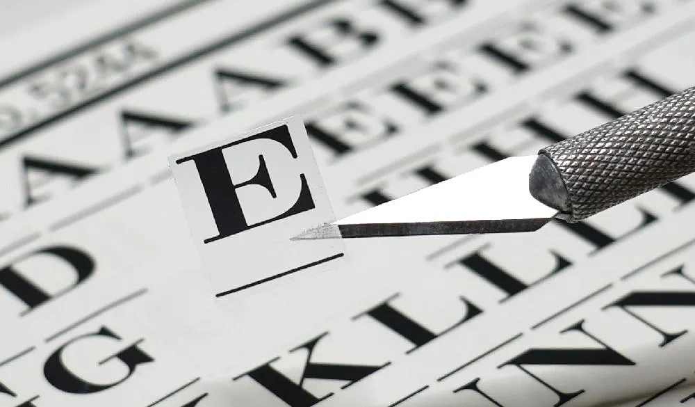
Unlike Letraset and other “rub down” type products, Formatt was printed on a thin, translucent acetate sheet with low-tack adhesive backing on a paper carrier sheet. To use it, you cut out the letters with a razor blade or X-acto knife and positioned them on a suitable surface and then burnished it down. I usually used illustration board and then made a photostat for paste up, but you could put it right on the mechanical if you wanted.
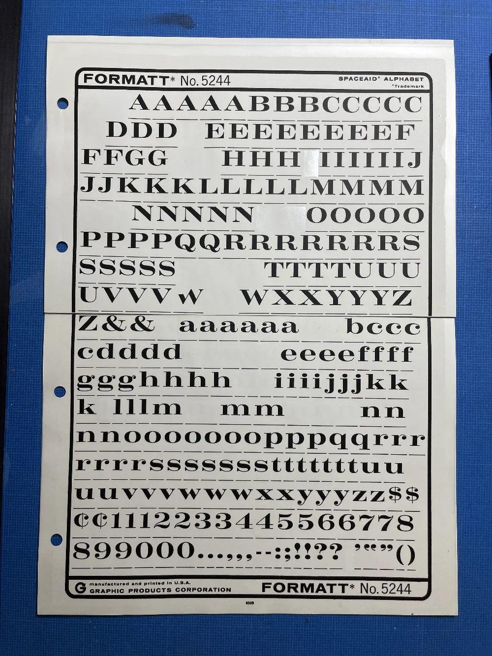
The sheets had guides below each character to aid in spacing and alignment. Although I always spaced it by eye, the guides were essential to keep the characters aligned to each other. I would draw a line for positioning the guidelines using a non-repro pen or pencil before setting the characters down and trim away the guidelines after.
Formatt was not as high in quality as Letraset, but it was cheaper and offered typefaces—especially older metal typefaces—not available from any similar product. But they also carried more recent faces, such as those from ITC. They carried about 250 different typefaces in the catalogs I have. I only bought Formatt type sheets in order to get certain typefaces that weren’t available elsewhere (other than from typesetting houses, which were not in my budget at the time).
In addition to type sheets, they also produced a whole range of pattern sheets, rule and border sheets and tape, color sheets, decorative material, etc. A lot of the graphic material seems to have come from old metal foundry sources. Besides the type sheets, I used their border sheets and tapes a lot, too.
I also made my own “Formatt” sheets sometimes back in the early 80s. I had access to a process camera, which could make high-quality photographic copies of black and white originals, colloquially known as “photostats” or “stats.” Normally you would use white RC (resin-coated) photographic paper with it, but it was possible to get clear acetate photostat material that had a peel-off adhesive backing. Using this, I made copies of pages from old metal type specimens, allowing me to set display type using otherwise unavailable typefaces.
I’ve been using a Mac for all my design, illustration, lettering, and type design work since the mid-1980s. I embraced it fully and enthusiastically, before it was really even ready sometimes. It made so many things easier and faster. Why would you ever go back once you had experienced the power of “undo”?
I grew up in the analog world, the time before ordinary people had access to computers and digital technology. The most high-tech things in my life were television and the space program (which I saw mainly on television).
The kid who could draw
When I was young, I drew a lot. I had my first piece in a public art show when I was in kindergarten. Sometimes, my first-grade teacher would let me stay inside and draw instead of going outside for recess. When I was in 4th grade, all five of my entries in a Post Cereal drawing contest won prizes. That year, I also started taking oil painting lessons. By the time I was in high school, I was very good at drawing, cartooning, and painting. I consistently got A’s in art class, won awards, and was clearly heading for some kind of career in art.
I majored in art and graphic design in college and initially had ambitions to become a commercial illustrator, given my talent for drawing. But graphic design, lettering—and even type design—also appealed to me. In my first job out of college, I was hired as a graphic designer at a small advertising art studio. I also did illustration jobs on the side for local magazines and newspapers in Minneapolis. My career soon veered into magazine art direction, where I hired illustrators, and my illustration career never really took off.
The digital world
After I bought a Macintosh in 1984 and started using it for creative work, I found myself using the analog tools I grew up with less and less. All the tricks and techniques I’d learned as a young artist were becoming obsolete very quickly. I was drawing less, painting less, and, without realizing it, taking those skills for granted. I could still do it if I wanted to, I told myself.
I tried using graphic tablets, attempting to transfer some of those skills into making art on a computer. Whatever the reason was, drawing on a tablet has never felt the same to me. The immense flexibility and power of computer graphics software has always has felt impoverished and ephemeral next to the richness of physical art tools and media.
Even so, I turned my back on the old ways and embraced the digital.
Admittedly, this has worked out very well for me. I wouldn’t have succeeded as a type designer any other way.
But, as time went by, not just my work, but more and more of my life (and almost everyone’s life) became centered on the digital world, especially with the rise of the internet, and the always-on internet. And with the iPhone, the always-with-you internet. And now they want to put it right in your field of vision with VR/AR, and ultimately a chip in your head. The digital world seems hell-bent on supplanting the physical world.
This used to sound “cool” to me. It seemed like the logical path in human-computer interaction. But I’m not so sure anymore.
We’ve been accepting all this, little by little, because of the convenience. Each step of the way, it’s “so much easier” than the old way. Everything in the world at your fingertips. All the music, all the movies, all the shows, all the art, all the time. Make a mistake? Undo! Change your mind? Redo! Dropped your laptop in the lake? No problem. It’s in the cloud!
But at what price?
I’ve become increasingly skeptical of the digital world as a healthy or desirable place to spend time. Not to mention all the tracking and surveillance that has crept in, the psychological damage of social media, and the rise of “subscription” models where you have to pay for an app indefinitely to maintain access to your documents.
I’ve also grown wary of how much time I spend sitting in front of a computer screen, even for doing creative, useful things (as opposed to YouTube, social media, or other time-wasters). As I get older, time is getting more precious to me. Do I really want to spend it sitting and staring at a screen?
Reconnecting
Getting back into drawing has been on my to-do list for a while. Maybe 20 years. I felt like I was letting my drawing talent waste away, rarely using it anymore. I was spending more time watching videos or reading books about drawing than actually drawing. I tried different things over the years (including joining a group that gets together once a month to draw cartoons), but nothing seemed to work in any sustained way. It’s almost like I’d given up, but didn’t want to admit it to myself.
But recently, I heard about a book called *The Artist’s Way,*by Julia Cameron. One of the things she recommends is to write “morning pages” first thing every day. Most of the rest of the book didn’t really seem to apply to my situation, but this “morning pages” thing got to be a habit, and got me thinking more deeply (through the writing) on improving my relationship with “screens” and getting back to drawing regularly.
1979
One of these insights revolved around the year 1979. In my mind, that year signifies the twilight of the analog world, just before the dawn of the digital era. Things in my 1979 world were entirely analog.
I was 23 years old. The tools of my craft were T-squares, rubber cement, ink, Zip-a-Tone, technical pens, X-acto knives, ellipse templates, markers, illustration board, dividers, Letraset, photostat cameras, and phototypesetting. I listened to music on a Pioneer turntable and a JVC AM/FM receiver. I watched TV on a 13” Panasonic. Cable TV and VCRs weren’t really a thing yet. My telephone was connected to the wall. If I was away from my apartment, I was unreachable. My apartment was filled with inexpensive furniture I’d made myself (thanks to the books Instant Furniture and Nomadic Furniture). I designed and built my own desk/drawing table. I had a 35mm camera and a Polaroid SX-70. I had books and magazines to educate and entertain myself. And a guitar. If I need a photo reference in order to draw something, I’d go down to the picture section at the Minneapolis Public Library.
It might sound terrible to someone who has never known life without the internet, but I miss it. I miss not being surrounded by things trying to get my attention. I miss the simplicity of the way things used to work. You learned to find your way around. You didn’t need GPS. Doing art was a physical, direct, visceral experience—even commercial art.
Don’t get me wrong, I wouldn’t actually want to live that way now. I love technology and gadgets, and all the things they can do for me. But thinking about what things were like in 1979 reminds me that life is perfectly possible without all our modern “conveniences” and their hidden costs and unseen consequences. For instance, my old drawings and artwork could be lost in a fire or flood. But they may well still be around hundreds of years from now, and they won’t need any special device or software to be seen. Whereas my PageMaker files from 1995 are already virtually inaccessible (I have ways, but you get the point). Not to mention degradation of digital media over time, rendering the contents of disks, hard drives, and SSDs unreadable sooner or later.
I’ve come to realize the value of making physical things, the richness of analog art vs. the weightless, scaleless, ephemeral nature of digital art. I’m obviously not the first person to think this. There are books about it. But the trade-offs of the digital world have been growing larger in my mind.
Drawing again
Another insight from my “morning pages” has been discovering a way to trick myself into drawing again. I have a habit of listening to podcasts or videos. Basically, draw at the same time—piggyback on that habit. It’s so simple, I don’t know why it never occurred to me before. I guess I had in my mind that I needed to devote time to do draw, and only draw. And I could never quite make the time. Something else would always seem more important or easier.
But it worked, and now I’m drawing again every day. The old confidence is back (which I didn’t even realize had gone) and it’s been very satisfying. Lack of undo actually increases the enjoyment. Things are at stake. Getting to the end of a drawing without undo is immensely rewarding.
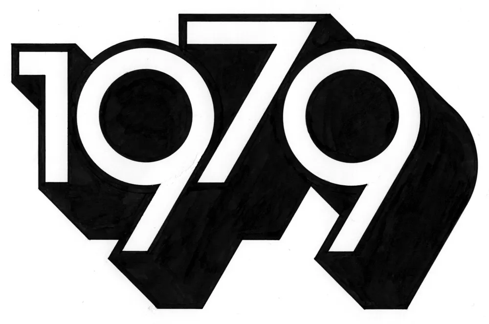
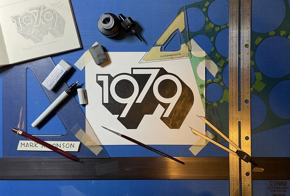
And I’m spending less time staring at screens. In fact, I thought of a way to remind myself to get into “1979 mode.” During my drawing session the other day, I designed and lettered the year “1979” in a style similar to lettering I was doing back around 1979. And I did it only using tools that were available to me in 1979 (yes, I still have them): pencils (for the sketch and the under-drawing), erasers, illustration board, masking tape to hold the board down, circle template, dividers, ruler, triangles, Ulano Glide-Liner (like a T-square, but attached to the table), Higgins Black Magic ink, a Koh-I-Noor Rapidograph, a fine sable brush, and a bit of white water color paint to fix some mistakes.
It took about two hours in all—10 minutes to do the sketch and the rest to render it. On my Mac, I could have done the whole thing in a couple of minutes—and with no mistakes. But it would have been much less satisfying when I was finished. And I’d be tempted to fiddle with it endlessly.
So, now I have this little bit of lettering tacked up on my wall to remind me to keep things real, to get my head out of cyberspace once in a while and connect with reality. To remind me I don’t need a computer to draw a picture. I just need some paper and a pencil.
The digital world has its place. You can do amazing things in it (like publishing a blog post). But don’t spend all your time there. It’s not the real world.
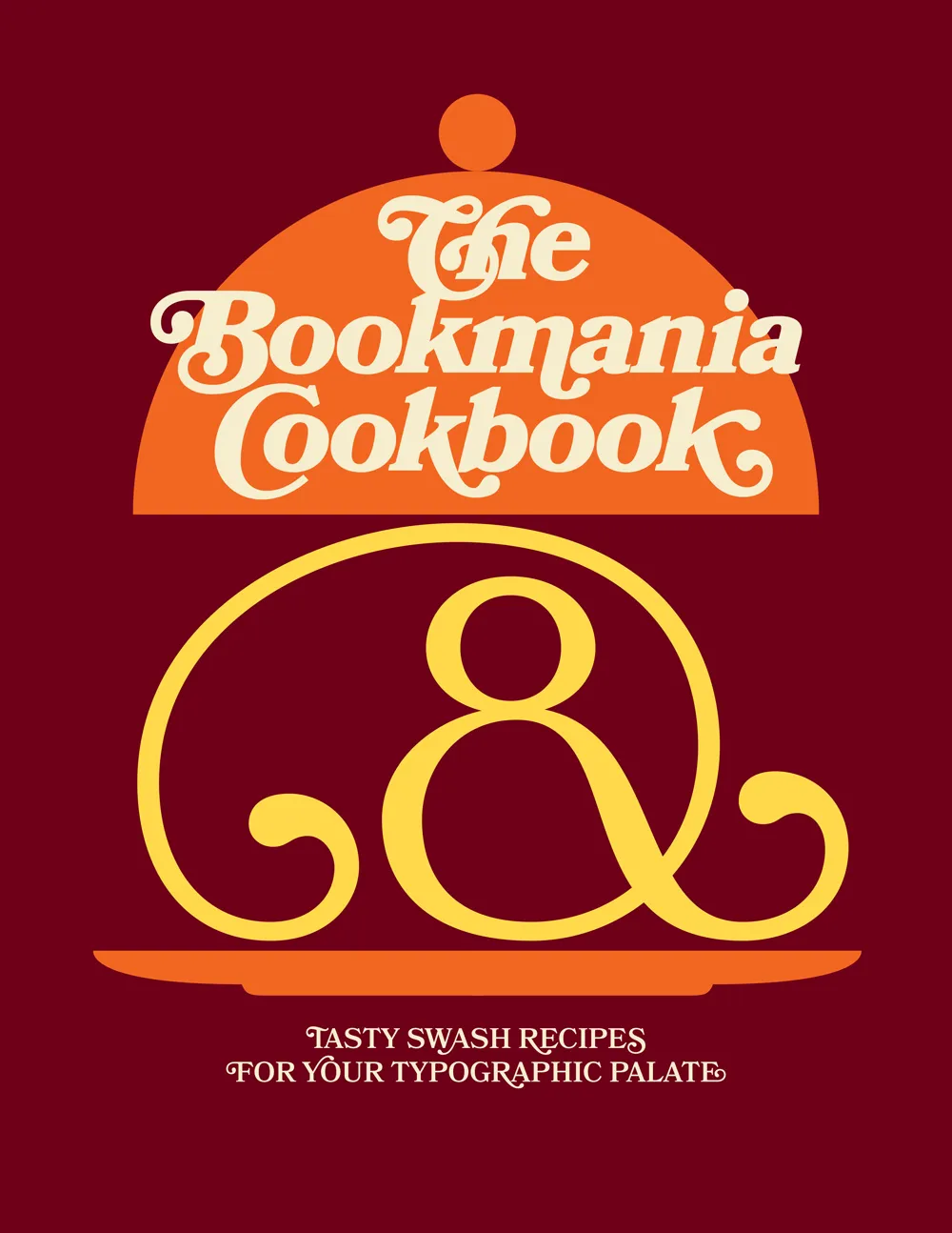
Ten years ago, when I first released Bookmania, I mentioned in the specimen book that there would be a user guide showing how to take advantage of the hundreds of swash and alternate characters. While the concept was clear in my mind from the start, it became one of those projects that were perpetually on the back burner, the kind of project I procrastinate about in order to get other things done.
But recently, after getting yet another email from a user asking how to access Bookmania swashes, I finally found the time and energy to finish The Bookmania Cookbook.
It starts with an overview on how to access swash and alternate characters in desktop apps and in CSS for the web. It then goes over some of the do’s and don’ts of using swashes.
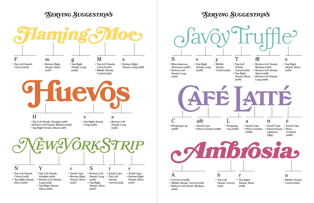
This is followed by a “serving suggestion” section where I prepared over a dozen examples of Bookmania swashes in use to give you some ideas and inspiration for your own designs.
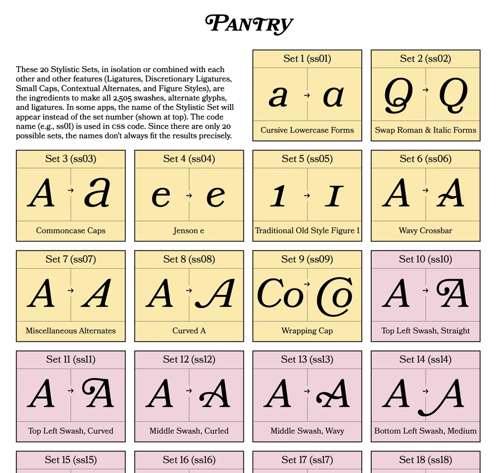
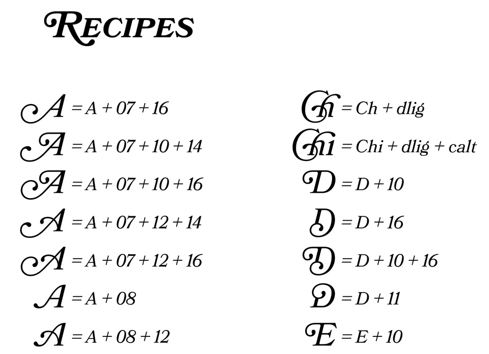
Finally, there is a reference section which includes a table of Stylistic Sets and a complete “recipe” section that shows you how to produce every swash and alternate character using Stylistic Sets and other OpenType features, which is especially useful on the web.
Sorry it took so long to put this together. If you’re a Bookmania user, I hope you will find this “cookbook” helpful. You can download it here.

Most of the calligraphy I’ve done was way back in college when I was studying graphic design, and very little since then. I’m just not that into it, which may seem strange coming from a type designer, but to me they are completely different things. Being good at one doesn’t necessarily make you good at the other; sometimes quite the opposite, I think.
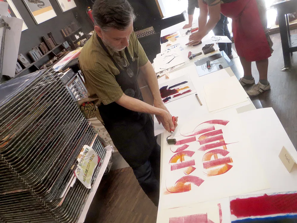
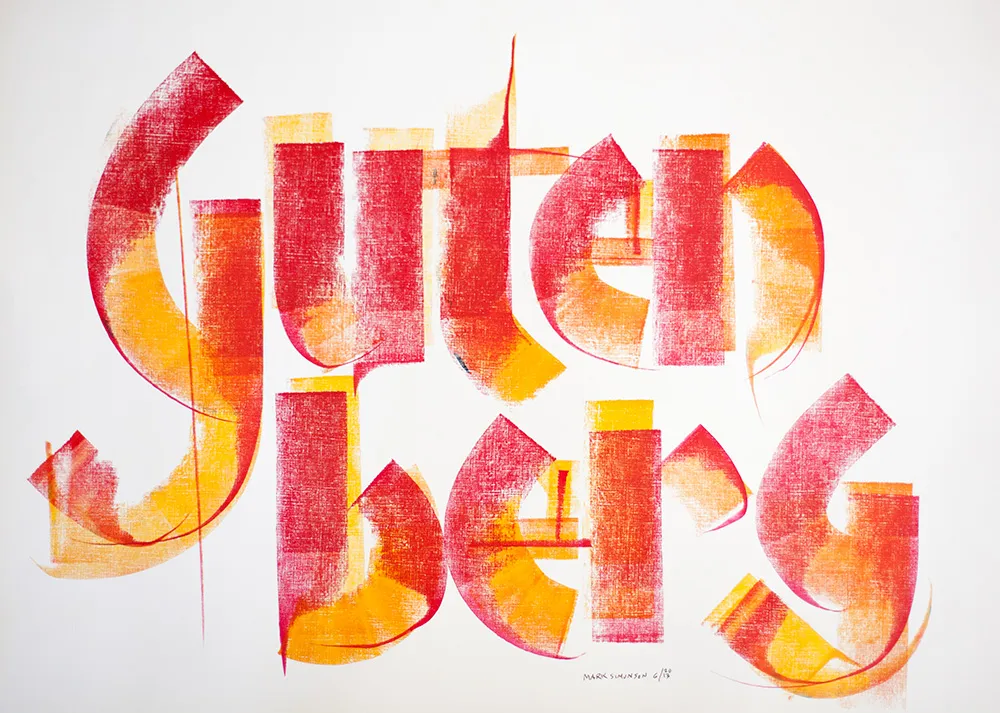
In spring of 2013, I went on a tour through Europe with about a dozen other type and printing geeks called Travels In Typography. When we visited Mainz, Germany, home of Johannes Gutenberg, father of movable type, we had the pleasure of meeting Gundela Kleinholdermann (pictured above), who is a volunteer at the Gutenberg Museum’s Druckladen (“print shop”). Her specialty is what she calls roller calligraphy. Instead of the usual brush or pen, she uses inking rollers, the kind you use to ink a letterpress proofing press.
Inking rollers come in all widths, but what they have in common is that only a narrow strip of ink across the width of the roller touches the paper at any one time, not unlike the edge of a broad-nib calligraphy pen. But instead of inking plates or type, Gundela makes letters. And she’s amazingly good at it. With some of the examples she showed us, it was hard to believe they were made with such an unlikely tool.
The technique involves manipulating the roller as you move it across the paper, turning it, dragging it and—this is the tricky part—lifting one end of the roller to get a tapered effect. You can also touch the paper without rolling to create a line. There are no rules, just whatever works. You can tell that Gundela has been practicing and experimenting with this for a long time. She’s a virtuoso roller calligrapher.
After showing us the basic techniques, we got a chance to try it ourselves. As I said, I was a bit reluctant at first, but it started coming back to me. For someone who was “not into” calligraphy, I really had a lot of fun with it.
A version of this article appeared on the Hamilton Wood Type & Printing Museum website in April, 2014. Thanks to Bill Moran for encouraging me to get off my ass and write this.
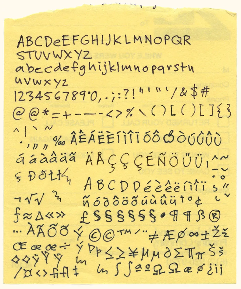
Here it is: The original artwork for one of my most popular fonts, Felt Tip Roman. I scribbled out all the characters needed in a typical font on the back of a phone message pad (about 4.128” x 5”) using a Pilot Razor Point felt pen. I deliberately tried not to be too neat or careful to try to capture the spontaneity of natural handwriting. Whether it would actually work as a font, I had no idea. That it would become a commercially successful font someday would have struck me as absurd at the time. I probably would have been a bit more careful and circumspect if I’d known. But perhaps then it would not have been as popular.