I’ve always had a rather vague grasp on the history of New York City. So, before taking a trip there this last summer, I rented Gangs of New York (Miramax, 2002), hoping to learn some of it. I realize the film is not perfectly historically accurate, but I really enjoyed watching it. Scorsese did a wonderful job with the story, the characters, and the setting, making me feel like I had stepped into New York City of the 1860s. However, as I’ve come to expect with Hollywood movies, the typography was a bit off base.
For the most part, the type choices in Gangs of New York are plausible in terms of general feel. In many cases, common 19th century wood type designs are used, especially on posters, appropriately enough, though some of these look a bit too distressed, as if they were enlarged from microfilm copies or something. Most of the signs on buildings were right on the money. I thought this one was pretty good:

On the other hand, the movie is riddled with anachronistic type choices. Here are some examples from posters:

Here we see Bernhard Antique (1937) with two overly-distressed-looking 19th century wood types. Notice the straight apostrophe in the bottom line. Straight apostrophes and quote marks did not exist in typefaces until the advent of digital type in the 1980s. It’s a computer thing, not a typographic thing.

More wood type, but the second line (“Harry Watkins”) is set in Aachen (1969).

This one is set in URW Egyptienne (1950s) and ITC Benguiat (1977). Benguiat is a particularly poor choice since it is based on the Art Nouveau style of around 1900. Benguiat shows up on a couple more posters in the movie.

This is better, but not 100% historically correct. The bold font next to the pointing finger is Rockwell (1930s).

Here we have some artificially condensed Americana (1967) with Memphis (1930s). You couldn’t distort type by condensing it like this back then. It was made of wood or metal, after all.

Now this is interesting. Avenir (1988) carved in marble. Few typefaces say “1860s” less than Avenir, which means “future” in French. It would actually be quite an evocative choice for a film set in the early 2000s. It’s very popular these days.
On to the printed ephemera, starting with newspapers:

Good old (actually not so old) Memphis, again, paired with Caledonia (1940). I should point out that the way they set the type here looks right; it’s just the font choices that are wrong. There were typefaces back then that looked generally similar to these to the untrained eye, but not exactly like these. (9/5/13 Update: Eagle-eyed reader Anton Sherwood also spots Windsor (1905) in the small bold text on the left.)

The same comments go for this one. The sans serif is Helvetica (1957) and the serif font is Egyptienne (1956).

This one I love. It’s a civil war draft registration ticket. The heading is set in Futura (1927) and the text is set in Garamond (c. 1920). Now, you might say Garamond should be okay because the original Garamond types were from the 1500s, which predates the 1860s. The fact is, they were only used in the 1500s and similar types were not seen again until they were revived around 1920. I’m not sure about that handwriting at the bottom, either.
So. A great movie, but a bit flawed in the typographic department. Three out of five stars for use of type.
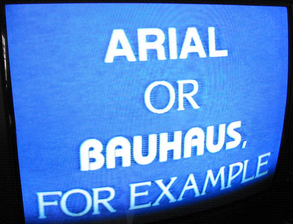
Eagle-eyed type nerds watching a recent broadcast of the Jeopardy game show will have fallen off their chairs at this font faux pas.
The correct response to this clue was “What is a font?” but note that the font used for the word ARIAL is in fact Helvetica. Oops. And it was such a clever idea to set the clues in the named fonts.
Quite a few people have written me to ask about the type in The Royal Tenenbaums (2001). The type isn’t anachronistic so much as idiosyncratic. Director Wes Anderson seems to have a thing, bordering on obsession, for Futura. The credits are set in Futura Bold—nothing strange about that. But it doesn’t stop there. The Tenenbaums seem to exist in a world dominated by Futura (mainly Futura Bold):
On buses:

At the hospital:


More buses (slanted this time):

For a cruise line (notice it’s called Royal Arctic):

At the museum (Medium weight instead of Bold):

On posters (Margot Tenenbaum seems to favor Medium):

Yet, as much as Futura is used in the movie, a few other typefaces make their appearances. Interestingly, it is usually in connection to someone or something outside the Tenenbaum family and is usually Helvetica:
On Raleigh St. Clair’s books:


On Henry Sherman’s book:

A curious (and possibly significant) exception to this pattern is on the cover of a book supposedly written in the 1970s by Royal Tenenbaum’s wife, Etheline. The typeface is Milano, a quintessentially 1970s choice:

I give The Royal Tenenbaums five out of five stars for its use of type, not because it’s perfectly chosen for the period it depicts (though, as far as that goes, it is), but because Anderson has used type in such an integral way in the film. (I also happen to like Wes Anderson films a lot.)
The 1999 made-for-TV movie The Pirates of Silicon Valley is a fictionalized account of the rise of Apple and Microsoft in the early days of the personal computer industry. In one scene, Steve Jobs and Bill Gates are in a heated match of ego-wrestling after Steve has given Bill a sneak peek at the Macintosh. It’s 1983, a year before it will be introduced. The top-secret prototype is shown housed in a typically Apple, design-conscious white enclosure, which reveals and conceals the Mac at the push of a button—like one of those spinning secret doors in a Hollywood movie haunted mansion. On the panel behind the Mac, the Macintosh logo is displayed—or is it?
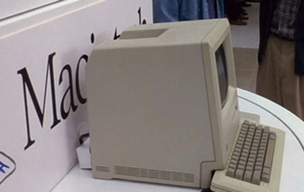
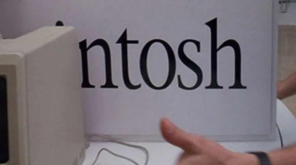
Eagle-eyed typophiles will be appalled to note that this is not the ITC Garamond Light (condensed 80%) that Apple used for 20-odd years on the Macintosh logo, but is, in fact, New York (also condensed 80%), one of the Mac system fonts—the TrueType version, to be exact, which was released in 1991. See if you can spot the differences here:
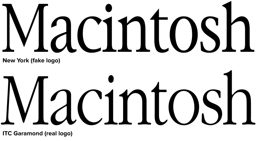
Clearly, New York is indirectly related to ITC Garamond. The bitmap version of New York, which was included on the original Mac, bore a strong resemblance to ITC Garamond, the typeface Apple used as a central part of its corporate identity. The TrueType version of New York, done by Bigelow and Holmes, differs in almost every detail with ITC Garamond, but shares a similar look and feel. So similar that it fooled the people who made Pirates.
This one is incredibly nerdy, but I think it fits my standards for anachronistic use of type in a movie. Besides, I just love it.
In The Terminator (MGM, 1984), a cybernetic assassin from the year 2029 is sent back in time to 1984 to kill the mother of the rebel leader who will eventually lead humans in victory in a war against the cyborgs, thereby preventing the rebel leader from being born and ensuring the cyborgs’ victory instead. Whatever. As we follow this killing machine on his relentless rampage, we are given short glimpses of what it’s like to see through the eyes of a cyborg:
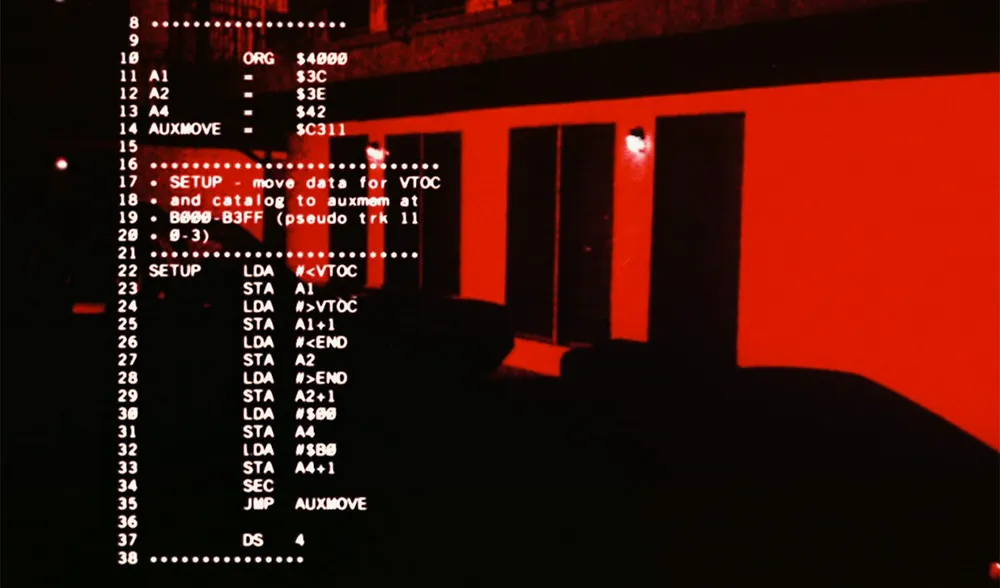
In case you don’t recognize it (and, unless you are a regular Slashdot reader, why would you?), the highly technical looking computer readouts in his vision display are actually source code printouts for an Apple II+ program that ran in a computer magazine (Nibble) in the early 1980s. Plus, it looks like it was printed on a daisywheel printer. Also used were listings of COBOL programs. COBOL was once a popular computer language for writing accounting software.
I remember noticing the out-of-place computer code when I watched the movie for a second time back in 1984, but I always thought it was source code from the Atari Operating System (Atari used the same microprocessor as the Apple II series). A quick check with Google turned up the correct info. This bit of trivia seems to be well-known in certain circles.
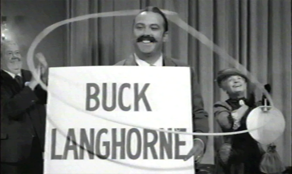
Alastair Johnston alerted me to this one. In the 1962 John Ford movie The Man Who Shot Liberty Valance, there are several shots of the print shop and close ups the town newspaper, The Shinbone Star. Here’s one of them:

The film is presumably set in the 1880s, but the newspaper’s nameplate is set in Cooper Oldstyle, introduced in 1918. I also thought this mid-20th-century style “sho-card” lettering looked out of place:
