I started watching the critically-acclaimed series Mad Men on DVD over the summer, and I am enjoying it a lot. I was a little kid in the early 1960s. Watching it is like stepping back in time. People really did used to smoke and drink like that. Of course, the show is set in the early 1960s, so I had to write a “Typecasting” piece about it.

Considering that the show is about an advertising agency, there isn’t as much type on Mad Men as I would expect. When there is, it’s usually used they way it would have been in the early Sixties, except it seems the type choices are limited to whatever happens to be loaded onto the computer.

The show starts out with stylish opening titles featuring glimpses of real ads from the period—and a clinker: What’s Lucida Handwriting (1992) doing here? I usually consider the titles to be outside the world of the story, but considering all the period cues in these titles, this typeface, which was designed specifically for computer screens, is out of place.


Then there is the Gill Sans (c. 1930) problem. Gill is used quite a lot in the series, mainly for Sterling Cooper Advertising’s logo and signage. Technically, this is not anachronistic. And the way the type is used—metal dimensional letters, generously spaced—looks right. The problem is that Gill was a British typeface not widely available or popular in the U.S. until the 1970s. It’s a decade ahead of its time in American type fashions.


This is not to say that they never get it right. Here we see signage similar to what they have at the agency, but in this case using a more plausible Futura-like style.

This grocery store interior is also quite good. Some casual brush style lettering and Futura again, not feeling out of place at all.

This beer label caught my eye: Was there really a Fielding beer brand that had labels exactly like Hamm’s beer, but with green instead of blue? (By the way, the beer cans in the show are opened with can openers. No pop-tops here. Nice detail.)

Then there are the ad layouts, supposedly produced by the art department at Sterling Cooper. You can tell the layouts are done with markers and pencils, as they would be, although they seem too sketchy. Perhaps this is to help them “read” as marker layouts on TV. The ad designs feel flat-footed and mediocre, but we also know that Sterling Cooper is not in the vanguard of advertising—they scoff at this clever and now-famous Doyle Dane Bernbach Volkwagen ad—so maybe that’s intentional. On the other hand, they are way ahead of their time when it comes to type, using faces that didn’t even exist yet.

These lipstick ads feature Fenice (1980) with Balmoral (1978) for the script caps. Amazone (1958) for the script lowercase is fine here, but the outline looks too much like a modern computer graphics effect (which is what it is).

Here is some hand-drawn ITC Kabel (1975) and, I’m pretty sure, Bookman Old Style (1989), one of Monotype’s ITC stand-ins.

Whoops—Zapfino (1998). I guess they use Macs.

Gill Kayo did exist at the time, but wasn’t in style yet and feels out of place on this church flyer. Gotham (2002) is just wrong. The blown up vintage clip art seems odd here, too. The whole layout has a Kinko’s feel to it.

There is also this curious American Airlines ad featuring Helvetica several years before Massimo Vignelli famously redid their corporate identity using… Helvetica.

The church bulletins are a bit problematic, partly because they are typeset (the ones I remember were mimeographed). Palatino (1950) existed, but didn’t really catch on in popularity in the U.S. until around 1970. And Snell Roundhand (1966) is definitely premature. This feels more like desktop publishing than early Sixties ephemera.

Speaking of which, the sets of Mad Men are filled with actual artifacts and ephemera from the early Sixties—magazines, books, packaged goods, furniture, art, record jackets, typewriters. This is great (and it must be a lot of fun to scrounge for props), except that sometimes you can tell this stuff is really old, especially anything made of paper. I can almost smell the mildew when Betty Draper is reading her yellowing copy of Family Circle.

The ad writers listening to a then-new Bob Newhart comedy album was a nice touch, except that it looks like they got their copy at a Goodwill store.

Alert fans have noted that Seventies-era IBM Selectric II typewriters are used on the show, but even these have visible signs of age, such as the yellowed plastic shield you can see in this shot. I wish they would figure out a way to make these props look less aged. I sometimes feel like these characters are living in a retro museum instead of 1960s New York.

I don’t mean to be so hard on Mad Men. I dearly love this show. If it were a two hour movie instead of a season and a half (so far) of one-hour TV shows, this would be a much shorter article. And the fact that the shows are broadcast in HD makes it all too easy to scrutinize the props. But, I have to admit, scrutinizing the props is part of the fun of watching Mad Men.
(Special thanks to reader Michelle U. for reminding me I needed to watch this series and look at the type.)
Update: I forgot to mention the (I hope) thoughtless choice of Arial for the closing credits. Happily, this territory was nicely covered recently by Andrew Hearst.
The Back to the Future series is a long-time favorite of mine. And they did a good job with their period-specific props—lots of hand-painted signs in the parts set in the 1950s and 1880s, just as there would be. Nary a font in sight where fonts should not be. Or so I thought.
Yves Peters (of Unzipped and elsewhere) was recently watching the third installment in the series on TV when he spotted this and alerted me:
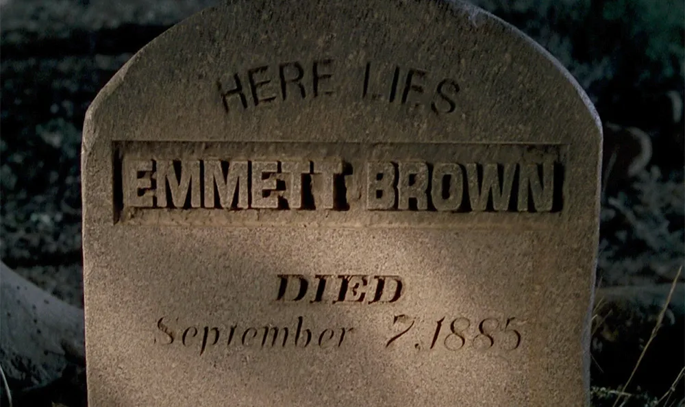
Great Scott!, indeed. It goes by pretty fast and I had to adjust the brightness to see it clearly, but there it is. How did Helvetica (1957, top) and Eurostile (1962, middle) end up on a tombstone in the year 1885? I guess we’ll have to wait for a fourth Back to the Future movie to find out.
In Indiana Jones and the Last Crusade, there is a funny scene in which Indy’s father breaks a vase over Indy’s head. As soon as he does it, he looks horrified—not because he’s mistakenly attacked his own son, but because he notices that it was a priceless Ming vase. Upon closer examination, he is relieved to discover the vase is a fake.
Now that the fourth (and last?) Indiana Jones movie is out, I made a similar examination of the use of type in the series, but I was not quite as relieved. For the most part, the type usage in each of the movies is correct for the period depicted. With one exception: The maps used in the travel montages.
Whenever Indy is traveling great distances, which happens in all the films, there is a montage of the airplane or boat superimposed over an animated map showing the route. It’s an old-fashioned convention, an homage to the movies of the Thirties and Forties. Unfortunately, the typefaces would be more at home a few decades later.
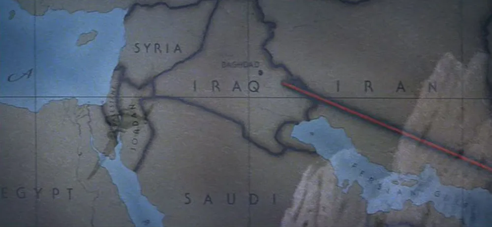
In Raiders of the Lost Ark (1981) which is set in 1936, we see ITC Serif Gothic (designed in 1972). The wide spacing feels right, and it does have an art deco feel, but it’s 1970s art deco.
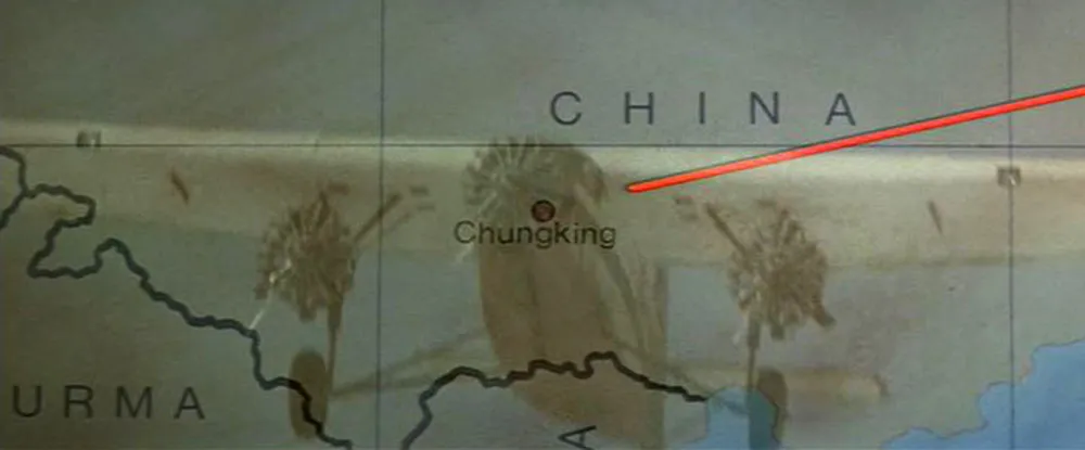
Indiana Jones and the Temple of Doom (1984) strays even further in the anachronistic type department by using Helvetica (1957), which looks even less plausible than Serif Gothic.
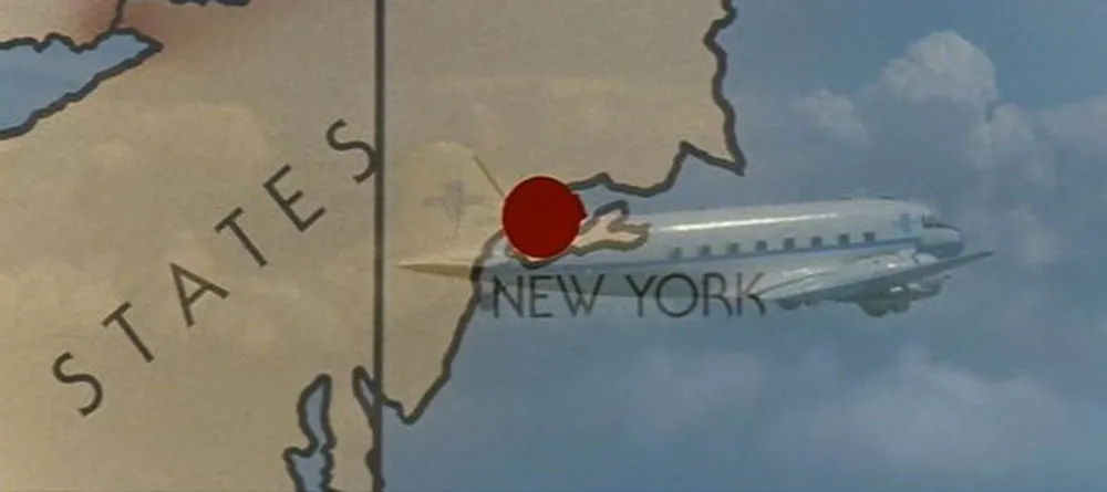
The third installment, Indiana Jones and the Last Crusade (1989), goes back to the formula used in the first film in many ways, including the use of ITC Serif Gothic again on the map. Not appropriate for a film set in 1938, either.
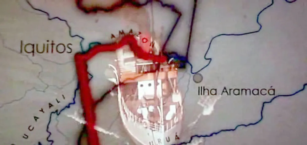
Did they finally get it right in the fourth film, Indiana Jones and the Kingdom of the Crystal Skull (2008)? Not quite. They didn’t use Serif Gothic this time, or even Helvetica (which would just have been released in 1957, the year in which the film is set). Instead, they used Century Gothic, a font that didn’t exist until 1989. This wouldn’t necessarily be a problem since Century Gothic’s caps are very similar to Futura, which would be perfectly appropriate for 1957. Unfortunately, Century Gothic is also a clone of Avant Garde (1970), a typeface with very large lowercase letters, a quintessentially Seventies characteristic. (More about Century Gothic here.) So, not the best choice.
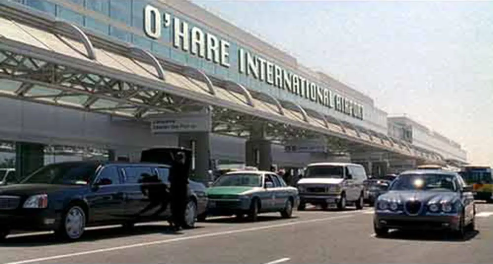
I wish I could claim credit for finding this gem, but I haven’t even seen this movie (I hear it’s very funny, though). The font shown in the airport sign is the old Macintosh system font Chicago. Historically speaking, it’s possible, but an extremely unlikely font choice for a major airport, even one located in Chicago. Matt Soar spotted this and wrote about it on his blog. He also has written about typographical oddities in HBO’s Deadwood and the movie Paycheck. Good eye, Matt! (Update: Matt Soar seems to have deleted those entries from his blog.)

I was very happy to be included in a short article in today’s New York Times Good Film, Shame About the Helvetica about designers who notice anachronistic font choices in films, but I was a bit taken aback when I received an email first thing this morning from the art director of Good Night, And Good Luck. She pointed out that Helvetica was not used in the film, contrary to what was claimed in the article. She said, rather, that the sign shown in the example frame was set in Akzidenz Grotesk, a face which predated (and in fact was the basis for) Helvetica, and that this choice was based on extensive research of CBS’s graphic design during the period depicted in the film.
This is no skin off my nose since I have not made any comments (yet) about the use of type in Good Night, And Good Luck. The comment was made by graphic designer and fellow font flub finder Michael Bierut, who, along with Scott Stowell and myself, is quoted in the article. Judging from the still shown in the article, I might have come to the same conclusion. As it happens, I missed the film when it was in theaters and will have to wait for the DVD release to see for myself.
If what she says is true (and she was very adamant about it), it is very unfortunate that Good Night, And Good Luck was chosen as the lead example in the article. Especially since its art director appears to be one of the rare people working in film who cares about getting the type details right.
Update: Thanks to some detective work by Stephen Coles, as reported at The Design Observer and Typophile.com, it has been confirmed that Good Night, And Good Luck really does use Akzidenz Grotesk.
In my Typecasting article and Son of Typecasting here in the Notebook section, I hold films under the spotlight and (sometimes) make fun of their use of type. But what about the dedicated few who go that extra mile to create historically accurate typographic props—books, tickets, posters, newspapers, drivers’ licenses, legal documents, and so on—for movies?
Shortly after posting Typecasting on my website a few years ago, I heard from Andrew Leman (www.ahleman.com) who has made a career of forging printed ephemera for movies. He also makes and sells digital fonts based on historical references, many of which were created for use in props. Although it’s not exactly a movie prop, I really love his ElectriClerk which looks like something out of Brazil, and it actually works.
My friend David Steinlicht recently brought to my attention the work of Ross MacDonald (ross-macdonald.com). I’ve known of his work as an illustrator for years, but I had no idea he made props. Turns out, Ross is a letterpress aficionado and actually prints and binds some of his props using traditional printing and bookmaking techniques. Aging is one of his tricks and it’s shocking to read how he abuses some of his beautiful creations to make them look convincingly old and worn.