Have you ever wondered what serif font would work best with Proxima Nova? I’ve often been asked this question, and I never really had a good answer.
That’s about to change.
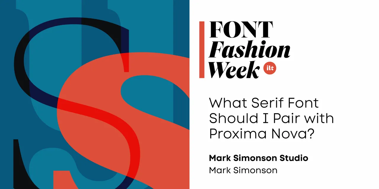
I’ve been working on something new and I’m going to be talking about it for I Love Typography’s inaugural Font Fashion Week which celebrates the latest trends in type design today. I will be giving a 30 minute online talk on April 5, 2022 to showcase what I’ve been working on and the process that went into its creation, and I invite you to attend (click here to attend). The talk is free and you may share this link with friends and colleagues if you think they would be interested.
Hope to see you there!
Update: It’s Proxima Sera. You can watch the talk on Youtube now or read it alongside my slides.
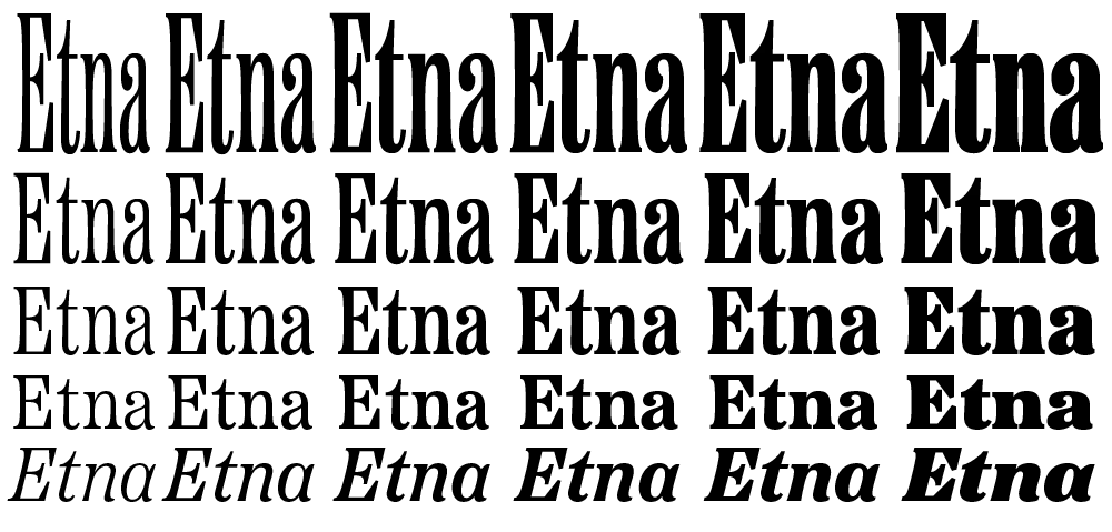
I’m very excited to introduce a brand new typeface family that’s been on my back burner for decades: Etna.
It was inspired mainly by the Aetna style of wood type from the 1880s. Etna tames this quirky Victorian design transforming it into a complete family suitable for modern use, adding a full range of six weights and italics, allowing it to work equally well for both text and display.
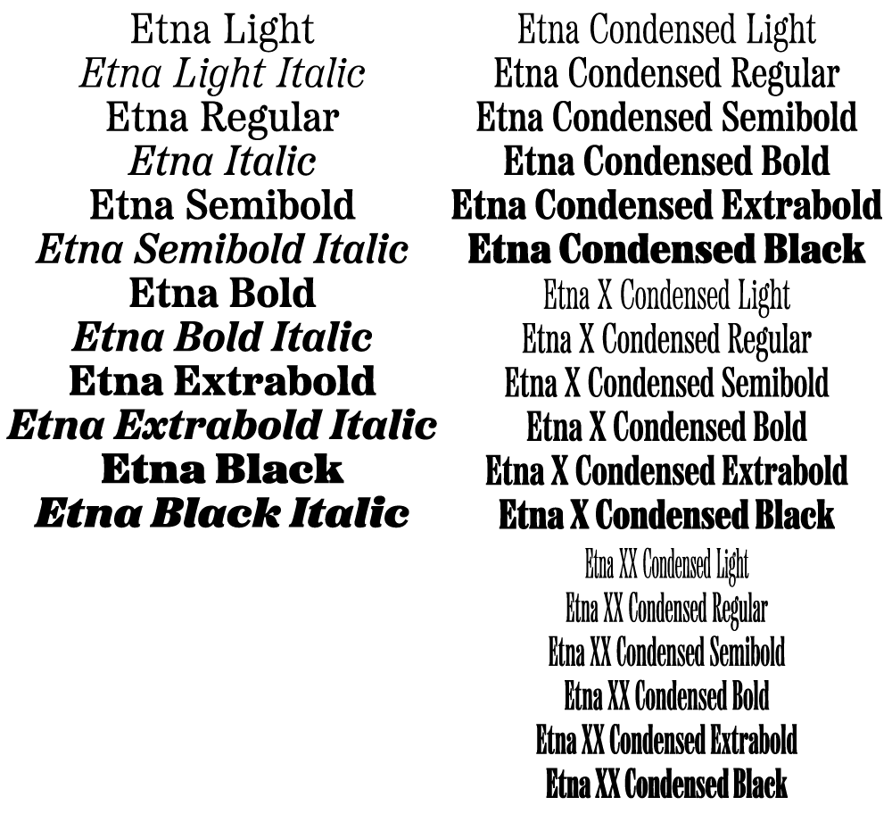
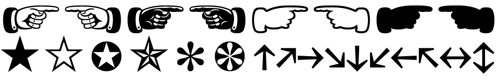
The Etna family also includes three different condensed widths in all six weights intended for display use. These are meant to be used LARGE.
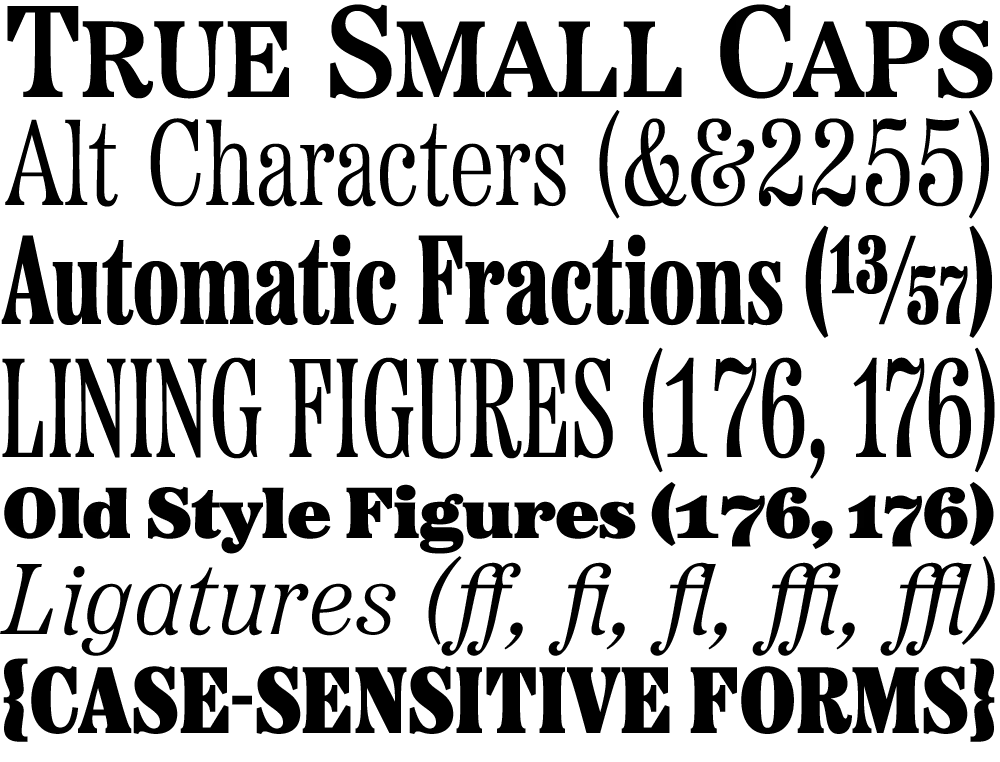
All 30 styles include four different figure styles, alternate characters, true small caps, and a selection of dingbats, including arrows, stars, asterisks, and manicules (pointing hands).
Etna is just rolling out starting today. You’ll find a list of places where you can buy a desktop, web, app, or ebook license on the main Etna page on my site. There is also a nice Etna mini-site that tells the complete story of Etna and the history of the Aetna genre.
Thanks to Nick Sherman for designing and coding the mini-site and to David Shields for writing the history section. Also thanks to Nick for suggesting that I add the manicules and many other features. Finally, thanks to Schriftlabor for technical assistance in developing the fonts.
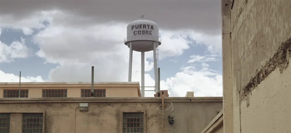
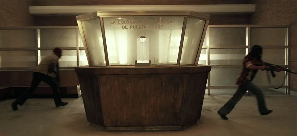
I don’t normally plug movies here, but I had a small part to play in this one as a technical advisor. It’s set in 1972. My job was to advise about typographic details so they would be correct for the period. (See Typecasting and Son of Typecasting.)
I haven’t seen the movie yet, or even all the shots that have typography in them, but you can see some of the results in the trailer. They first contacted me about it in 2008. It’s really cool to see it finally coming to theaters this fall. Congrats to Justin and his crew!
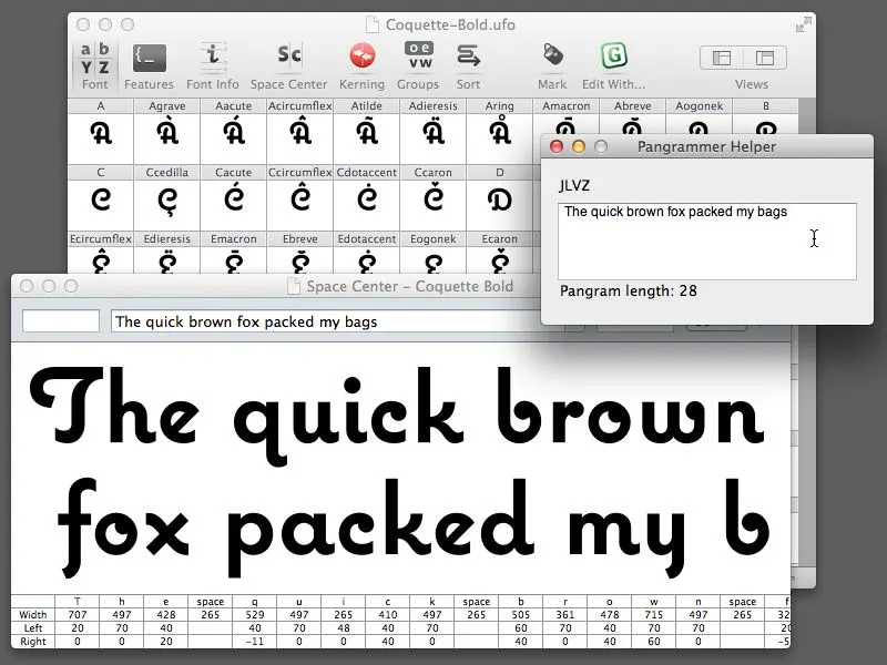
Almost ten years ago, I made a little program called Pangrammer Helper. It’s a little tool to help compose pangrams, which are sentences containing every letter of the alphabet. It was built in Flash and was designed to run in a web browser.
Type designers are especially enamored of pangrams, as you can imagine. Fellow type geek and friend, Craig Eliason, has been using it for several years to compose entries for his Daily Pangram site.
Recently, a new font editing app called RoboFont was released, and I’ve been starting to use it in my work. One of the neat things about it is that it’s fully extendable—that is, if you are willing to do a little Python programming, you can add features to it.
Last week, the Robothon 2012 conference was held in The Hague. It was all about type design and technology. I wasn’t able to attend, but videos of most of the talks have been made available on Vimeo, and I’ve been watching them the last couple days. Two of them in particular, one by Tal Leming about Building Stuff and another by Frederick Berlaen introducing RoboFont, inspired me to rewrite my Pangrammer Helper in Python so it could work inside RoboFont.
It took less than a day to do it, and it works great. You can use it by itself, and it works a lot like the old Flash version (a bit simplified), or, if you have RoboFont’s “Space Center” window open (the window were you work on your font’s spacing), the text also appears there as you compose it.
If you happen to be a RoboFont user, you can download version 1.2 of the script here. Just drop it into your scripts folder and you can run it right from the Extensions menu.
Update: Frank Grießhammer (currently working in Adobe’s type department) has contributed some improvements to my script, mainly adding the ability to add non-ASCII characters (as in “Grießhammer”) and an option for mixed-case pangrams. Thanks, Frank! The download link above will download this version (1.2).
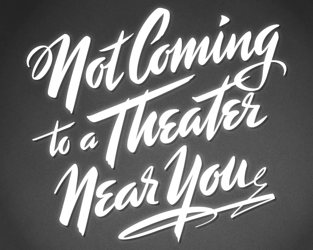
Last year, I did a logo design for Not Coming to A Theater Near You, a website devoted to movies off the beaten path. The designer, Rumsey Taylor, who was redoing the look of the entire site, wanted the logo to look like a title card from a film noire feature. What I came up with is based mainly on the title card from “Mr. Arkadin” (1955).
In spite of appearances, I don’t usually use an actual brush in my lettering designs, but in this case I did. The final art is vector-based, but I worked out the construction of the letters with brush and ink. (I’m not skilled enough at brush lettering to do the final art that way.)
The image above is a “treatment” I did to make it look like an actual title card from an old film, sort of a “serving suggestion.” On the wesite, Rumsey chose a simpler approach. The site redesign looks great, and I was happy to see that he’s using Metallophile Sp8 as a webfont (via Typekit).
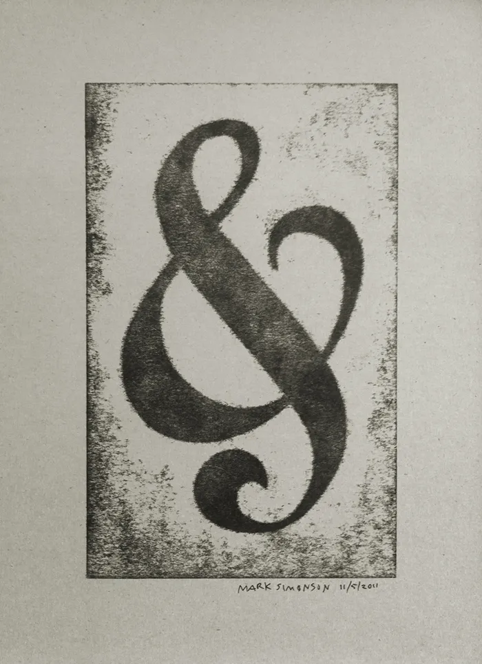
I’ve attended all three of the Hamilton Wood Type and Printing Museum’s annual “Wayzgoose” events so far. Last year’s, held in early November, was enjoyable as always, but I think I prefer the mix of presentations and hands-on workshops of previous years over having only workshops.
Still, it was great how they tied all the workshops around a common purpose—creating a portfolio of prints (including the portfolio itself). You can see one of my prints above, a pressure print from a hand-cut plate based on a free-form ampersand design.
I highly recommend the Wayzgoose if you are a type fanatic like me, into letterpress printing, or both. It’s held in the Fall in Two Rivers, Wisconsin. Attendance is limited, and it fills up quick, so you might want to get on their mailing list to be notified regarding when the next one will be held.