
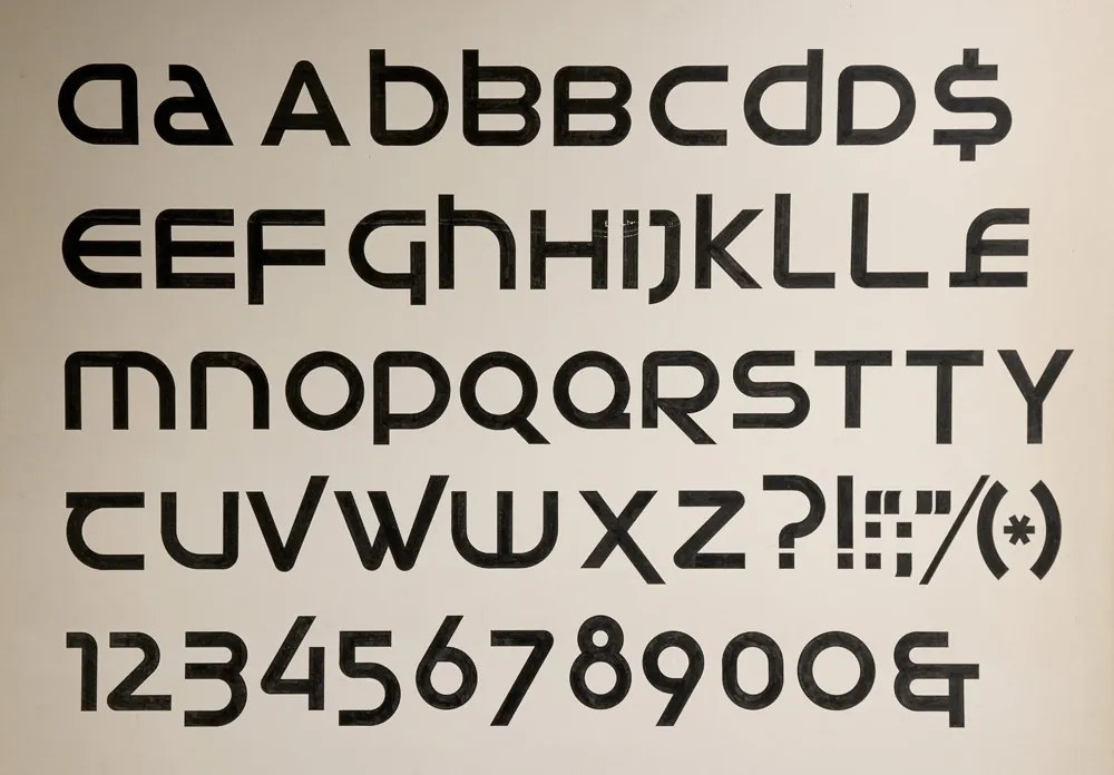
My first attempt at designing a typeface, from March 1976.
My interest in type design traces back to a type design project I did in college as an art student 50 years ago. I wrote about it here last March and shared it on social media. A commenter on Instagram asked if I was planning to release it, something I hadn’t seriously considered before.
One thing led to another, and I decided to do just that. The result is Neotype, a display font family based on that project.

My 2026 revision, fifty years later.
The design is a hybrid of uncial script—the basis for our modern lowercase alphabet—and modern, geometric sans serif, especially seventies designs such as ITC Avant Garde Gothic, Motter Textura, or Handel Gothic. The line between the upper and lowercase is gone, with both cases sharing the same height. The upper and lowercase forms may be mixed and matched for different effects.

Neotype combines upper and lowercase into a single case that can be mixed and matched for a variety of effects.
In a way, it’s a revival of an unreleased 1970s typeface.
Naturally, I applied my years of experience as a type designer to correct the flaws in the original—and there were a lot. It was my first attempt at designing a typeface, after all. I also added more alternate characters, to increase the design possibilities.
The original design was just a single style. That seemed too limiting, so I expanded it to six weights—Thin, Light, Regular, Semibold (the original weight), Bold, and Heavy.

The six weights of Neotype.
Expanding the character set was a lot of fun. It meant trying to imagine how my 20-year-old self would have done it if I’d had the necessary skills back then, using the same design logic.
The original project only had 62 characters—just letters, numbers, and some basic punctuation and currency symbols. To bring it up to modern standards, in terms of language support, standard punctuation, symbols, and more, the character set ballooned to 552.

The full character set.
Beyond the basics and all the alternate characters, I included a set of arrows and dingbats, something I’ve been doing for all my fonts starting with Etna in 2020.

Arrows and dingbats.
Neotype features automatic OpenType fractions. I designed small lining figures for that, rather than just scaling down the normal size figures, since the old style forms don’t really work for fractions.

Regular and small figures, with fraction support.
There are five OpenType Stylistic Sets—Extended Strokes, Uncial Forms, One-story a, Round Zero, and Alternate Index, which gives you the option to flip the pointing hand to show the back side.
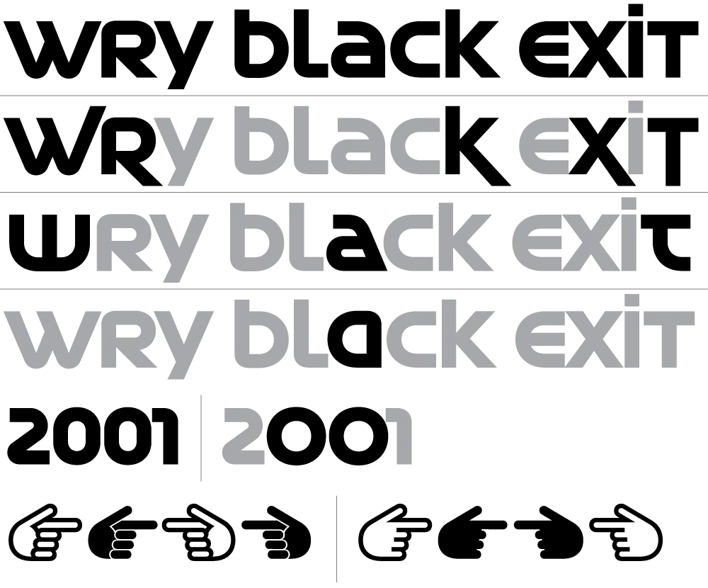
Five Stylistic Sets.
I never thought I would I would finish my first typeface fifty years later. But thanks to a comment by Tobi Herz on Instagram and the encouragment and support of The Type Founders, it actually happened. The result is a retro-futuristic seventies design that I think my younger self would have loved.
And it’s available now. More information here.
 Permalink
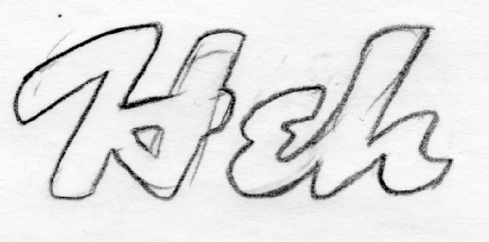
My 2005 t-shirt concept sketch.
Heckle is a family of display fonts that began as a tiny sketch on a notepad in 2005. I had this big idea to try to make money selling lettering-based t-shirts at CafePress.com (remember that?). One of the designs I came up with was the word “Heh” in a brush script with a 1940s/1950s feel. It was one of those styles that came out of the subconscious inventory of lettering styles I’d soaked up like a sponge in my youth. It wasn’t based on any particular piece of lettering or typeface.
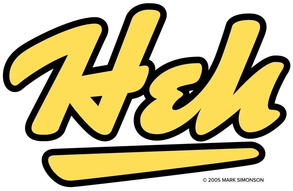
The final t-shirt design, drawn in Adobe Illustrator and sold on CafePress.com.
I didn’t sell many t-shirts, but I did end up with some neat lettering designs that could potentially be expanded into typefaces. Such was the case with the “Heh” shirt design. In 2017, I did a draft of the caps and lowercase in my font editor. It looked promising, but I didn’t get back to work on it until October 2025.

“Heh Script” draft from 2017 vs. Heckle’s final 2026 design.
Over the next five months, I expanded it to a family of six weights, from Light to Black. Refinements from the original lettering included tilting the stroke endings forward and using sharp corners on the insides of curved strokes, giving the design a crisp, energetic appearance. I honestly am not skilled at doing brush lettering. My method is to build letters by abstracting what I see, creating shapes that could be made with a brush, if that makes sense. That said, it’s a completely intuitive process. I stop when it looks right.

Alternate “e” and simplified caps for all-caps settings.
Once I got the basic design worked out, I filled out the rest of the character set, adding an alternate lowercase “e,” contextual alternates for all-caps settings (intended more for acronyms and abbreviations rather than extended text), my usual set of dingbats (featuring a manicule inspired by cartoonist Preston Blair), and—even though they may not get much use—the standard math and symbol characters, which are all but required in digital fonts. Heckle supports most Western and Central European Latin-based languages.

Heckle dingbats, including a Preston Blair-inspired manicule.
I never imagined back in 2005 that this silly t-shirt design would turn into a complete font family, but I’m really happy with how it turned out.

The basic Heckle character set (Extrabold style).
Heckle is suitable for any kind of display use—book covers, packaging, signage, advertising, magazines, websites, branding—where a lively, vintage hand-lettered look is desired.

The complete Heckle family.
Heckle is available today. More information here.
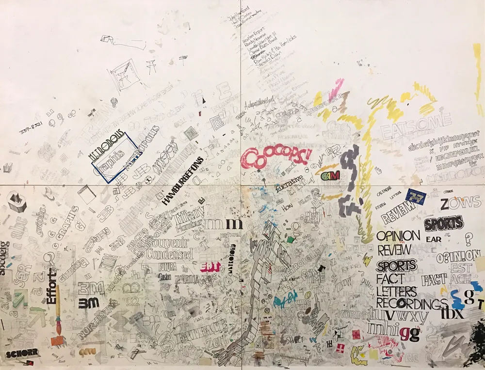
The “desk protector” from my first job in 1976. I was a bit obsessed about type.
In 1976, I dropped out of college to take a job at a small advertising art studio in Minneapolis. I was there only five months. I quit to take another job, this time as production manager and designer at Metropolis, a weekly newspaper in Minneapolis. Until it went out of business nine months later. My third job was another small advertising art studio started by two people who had left the place where I’d worked my first job.
Thanks to a project I did in college, I’d become hooked on the idea of designing typefaces. In idle moments at these jobs, you would often find me sketching and doodling ideas for typefaces. They were mostly not very good, but the more I did it, the better they got.
In 2016–2017, I scanned and catalogued all the type idea sketches I’ve made (and saved) over four decades. Most of the early stuff was not great, but a few ideas were promising. One was a very minimal idea from about 1978, drawn in felt pen on a sheet of layout paper, where I (incorrectly) spelled out the word “Tarifs.” (I ran out of space, plus, why draw the same letter twice?)

My sketch from 1978.
I don’t recall exactly what I was thinking when I drew it. I was probably bored, avoiding whatever it was I was supposed to be working on. When I’m doodling letters, I don’t usually have any conscious plan. Things just spill out from my brain, which collects things I’ve seen like a magpie in my subconscious. Looking at it now, it most likely came from the kind of slick lettering you would see on book covers in the seventies. I often spent my lunch breaks hanging out in bookstores, so, it could be. I think there are bits of Times New Roman and Arrow there, too.
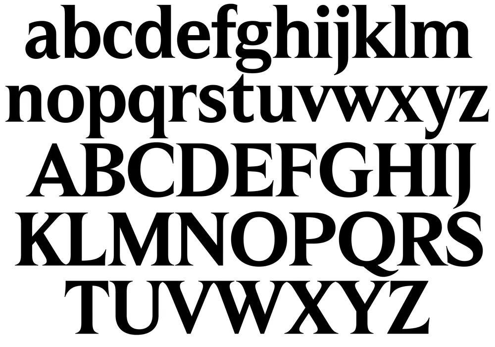
My draft of caps and lowercase from 2017, interpreting my nearly 40-year-old sketch.
I did a draft of it in 2017, extrapolating from these six letters. Of the roughly 30 “backburner” ideas I did drafts of back then, this “Tarifs” idea got a lot of positive reactions when I showed it to people.
In February this year, I decided to do it for real. This meant expanding the range of weights and then expanding the character set (the draft was just the basic alphabet in caps and lowercase).

Expanded range of weights from the Semibold starting point.
As I did this, the design became more disciplined than my original sketch. I dropped the cupped serifs (a case of naive excess), but tried to preserve the basic idea, with its sharp, deeply bracketed serifs and graceful curves.
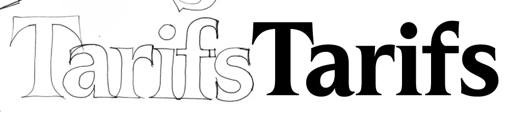
The 1978 sketch vs. the final design.
Unlike similar faces like Times or Arrow, it features head serifs that are flat rather than angled, and generally mirror the construction of the capitals as much as possible, avoiding things like ball terminals.
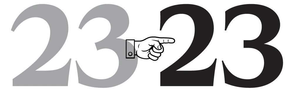
Initial figures concept and final.
When it came to the figures, my first inclination was to give them an angled stress (just because I like that style), but I quickly realized they needed to have the same vertical stress as the caps and lowercase.
The original concept didn’t include an italic, but I didn’t like the idea of releasing it without one. By April, I was already working on one. Leaving out elements like ball terminals made the design of the italic more challenging, but I think my solution works well.

The matching italics.
One of the trickier parts was coming up with a name. It was never going to be “Tarifs” (the working name, after the original sketch). After trying out a few different ideas, I settled on Hardcover, which is a nod to my likely inspiration back in 1978. It also indicates how this face is intended to be used: Large, like on the cover of a 1970s bestseller. (It does also work for text, but I wouldn’t set a book in it.)

Hardcover comes in seven weights, from Extralight to Black, in both roman and italic. All styles include small caps, tabular and proportional figures in both lining and old style, support for Western and Eastern European languages, and a set of matching dingbats.

Hardcover is available now. More information here.

Sketch from about 1981.
Synergy started as an idea I had about 1981. I found a couple of sketches in my collection of typeface ideas going back to the seventies, which I started scanning and organizing in 2009. I don’t remember a lot about this particular idea except that I was aiming for a “Scandinavian” feel (whatever that meant to me at the time) and that the 1970s Allstate logo was an influence.

Early drafts.
I thought it was a promising idea and did a draft of the lowercase in a couple of weights in 2012, then another draft in 2018, which included capitals and a full range of weights from very thin to very bold, using three “masters.” (Masters are used in modern type design to generate intermediate weights automatically from a small set of key drawings.)

Weights and styles of Synergy.
Then, in 2024, I decided to complete the design, adding a set of italics for all weights and features such as small caps and old style figures.
Synergy is basically a neo-grotesque along the lines of Swiss faces such as Univers, but with a two-story “g” more characteristic of British and American models. This wasn’t a deliberate decision, but I think the constraints I gave myself—even somewhat narrow proportions, squarish curves, squared-off stroke endings—steered me in that direction. I think I succeeded in giving it more warmth than this type of design usually has, thanks to some subtle details in the curve endings, and the two-story “g” relieves the monotony in text.

The two-story “g” and subtle details in the curved stroke endings are reminiscent of British grotesques.
I was careful to make sure Synergy works well in text in the middle range of the weights. It also works for display use, and the extreme weights (Hairline, Thin, and Ultra) are intended exclusively for that.

A text sample.
Synergy has nine weights. If that’s not enough, there is also a variable version. It features small caps (with matching punctuation) and old style figures in all styles. It has support for most Latin-based languages and currencies, arbitrary fractions, and a set of matching dingbats.

A small sampling of the character set.
Synergy is available now. More information here.
When I decided to sell the rights to my library of fonts to The Type Founders in 2021, one of the big reasons for me was the ever-growing burden of maintaining and developing that library.
As a one-person studio, there was only so much I could do. Proxima Nova had become very popular since I released it in 2005, and I regularly got requests to expand its language coverage.
At first, I did this task myself, adding support for Greek and Vietnamese in 2009 and Cyrillic in 2010. Even though I can’t read languages that use these writing systems, they were close enough to the Latin alphabet that I felt sufficiently confident to design them. But I’ve always felt out of my depth as a type designer even thinking about designing non-Latin fonts.
Still, I could see that adding even more language support would make a lot of sense for such a popular type family. Theoretically, I could hire other designers and production people to help, either as employees or as contractors. But that would mean managing those people, something I know I’m not very good at.
I like working by myself, and I would rather spend my time working on new typefaces.
It was around the time I was thinking about these problems back in 2019 that I was approached by Paley Dreier (now Managing Partner of The Type Founders) about selling my font library. It was something I’d never thought about before, but I eventually realized that it would be a neat solution to my problems. I would be relieved of the burden of maintaining and expanding my existing fonts, giving me time to focus on designing and releasing new fonts—which is what I’ve been doing for the last few years, with the release of Proxima Sera, Dreamboat, Proxima Nova Wide and Extra Wide, Viroqua, Cheesecake, Madcap, Gertie, and Skin & Bones. In fact, I’m currently working on a new sans serif family, the first since Proxima Nova, if you don’t count display faces.
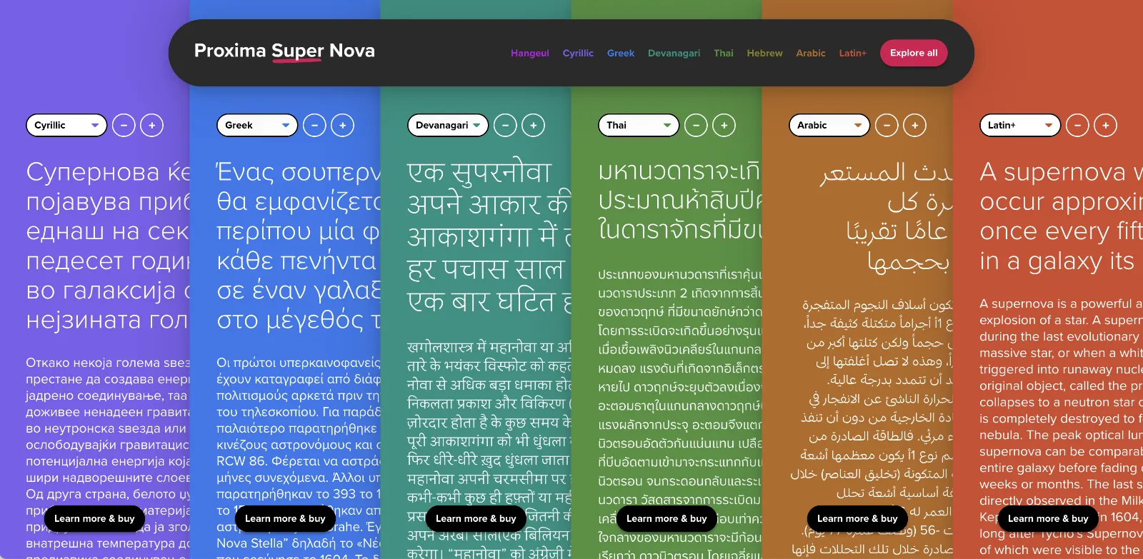
In the meantime, The Type Founders has been working to expand language support for Proxima Nova, with the aid of some really talented type designers from around the world. We’ve dubbed the fruits of this effort Proxima Super Nova.
In addition to most Western and Eastern European Latin, Greek, Vietnamese, and Cyrillic, Proxima Nova now supports Arabic, Devanagari, and Thai (both looped and loopless). More writing systems are in the works, including Hebrew and Hangeul.
Check out the Proxima Super Nova mini-site to find out all about it.
If you have any questions, are interested in extended or enterprise licensing, or need additional language support or customizations, get in touch! Send a note to info@marksimonson.com
A big thanks to the following people:
Proxima Nova Thai: Smich Smanloh of Cadson Demak
Proxima Nova Devanagari: Vaibhav Singh and Alessia Mazzarella of Typeland
Proxima Nova Arabic: Khajag Apelian and Wael Morcos
The mini-site: Elliot Jay Stocks (site design and content development) and Roel Nieskens (site development)
Project management and production support: Glenda Bellarosa and Dyana Weissman
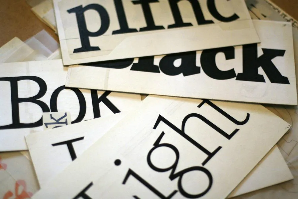
Viroqua’s ancestor, Excalibur, hand inked.
I released Kandal in 1994. It’s one of my earliest typeface designs, going all the way back to an earlier design in 1978, which I submitted it to International Typeface Corporation (ITC) under the name “Excalibur”. It went through a couple of iterations before the one I submitted, variously influenced by the work of Hermann Zapf and Jim Parkinson. I honestly had very little idea what I was doing—a case of overestimating what I knew and underestimating how much was left to know. By a large margin. Excalibur was understandably rejected by ITC. It had lots of problems and I resolved to improve my knowledge and skills before trying to submit something to them again.

Fast-forward to 1990. I never did submit any more typefaces to ITC, but I did have lots of ideas and sketches and practice drawing letters. I also got a Mac in 1984 and Fontographer in 1987 and started trying to make PostScript fonts. One of my ideas was to revisit Excalibur, simplifying the design and addressing its many flaws. This became Kandal. I was also working on Proxima Sans, the predecessor to Proxima Nova, around the same time, and a few other ideas, some of which are still on the drawing board.
Kandal has never been one of my popular typefaces. It’s not surprising, given that it was such an early design, made when I had very little experience making fonts. I probably should have pulled it from my library, but I kept thinking I would come back to it and fix it, like I did with Proxima Sans.
Thirty years later, it’s finally happened. The new version is reworked from the ground up, so I decided to give it a completely different name, instead of something like Kandal Nova. “Kandal” was my paternal grandmother’s maiden name and the town in Norway her family was from. The new name, “Viroqua”, is the town in Southwestern Wisconsin where she was born and raised.

Viroqua is an improvement over Kandal in every way I could think of, while retaining its core design concept: A hybrid combining modern proportions, Jenson-like details, and a bit of slab serif DNA. Nearly every character has been reworked or refined. The original italic especially suffered from my lack of experience as a type designer. I basically started over. I’ve got three more decades of experience and I hope it shows.

Viroqua also has a wider range of weights, seven in all, going from Thin to Black.

Viroqua features many typographical niceties missing from Kandal, such as small caps, old style and lining figures (both proportional and tabular), superscript and subscript figures, fractions, and dingbats. Viroqua also supports most Latin-based Western and Eastern European languages, plus Vietnamese.
Viroqua is available now. More information here.