Last Friday I attended the opening of a show at the Minneapolis College of Art and Design showcasing the work of illustrator Mary GrandPré. I hadn’t seen Mary since the mid-eighties when I was the art director at Minnesota Public Radio and she was at the beginning of her career as an illustrator.
Mary is best known now for illustrating the Scholastic editions of the Harry Potter books. Her success as an illustrator is even greater than I had realized—she also did concept drawings for Antz and character designs for Ice Age.

The illustrations she did for me were always wonderful, and not all that different from the much more refined style she’s known for now. (She did the cover for the first Wireless catalog for me in 1983, shown above.)
She asked me for advice back then about whether she should develop a definite style or try to diversify and do many different styles. I urged diversification. Thank goodness she ignored my advice.
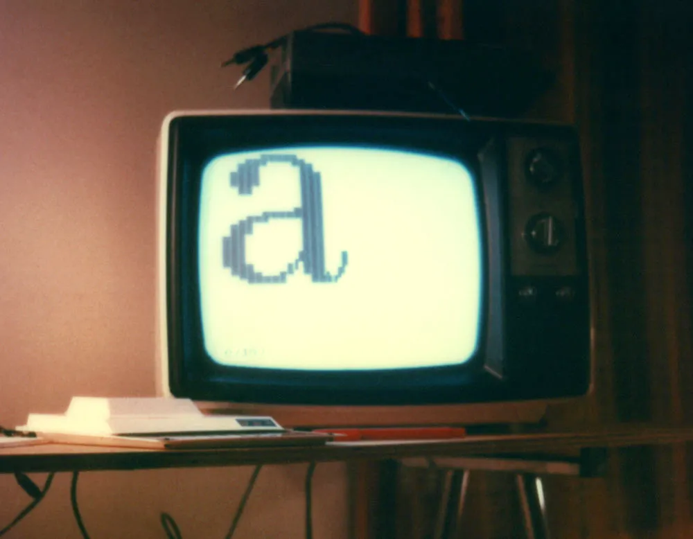
This photo shows my first attempt to create type on a computer screen. It is from about 1980.
The computer is that tiny white horizontal shape in the lower left, a Sinclair ZX80, which I bought mail order for $200. It had a 1mhz processor, 1k of memory, and built-in BASIC. The display is an old black and white television (not included). Programs and data were stored on a cheap cassette recorder (also not included).
The “a” image on the screen was created by programming the computer to display several lines of space and “block” characters in a certain order (which I worked out beforehand on graph paper). This is about as basic as a BASIC program can get.
Unfortunately, it took a good share of the computer’s memory just to do this. I didn’t investigate it further.
Update: I remember now. The thing on top of the TV is the cheap cassette recorder I used to store data. Yet more details: The “table” is made from a piece of plywood (which I still have) and a Crumar electric piano stand (which was sold with the piano to a guy who is now in prison for murder). (Not that it matters.)
Flash animation designed to promote my typeface Mostra. Move your mouse over it to mix and match the different weights and alternate characters of Mostra in a playful way. You can also think of it as a puzzle: Scramble the letters up and then try to get them back the way they started. If you give up, just reload the page. Created in 2001.
Note: Flash 5 or later plug-in required for animation.
Flash animation designed to promote my typeface Sharktooth. Note that there are some working links visible under the glass. Like the Coquette Clock, the entire file shown here is very small at just over 11k. Created in 2001.
Note: Flash 5 or later plug-in required to use loupe.
Flash animation designed to promote my typeface Coquette. Amazingly, the entire file shown here weighs in at just over 8k through the magic of ActionScript. Created in 2001.
Note: Flash 5 or later plug-in required for clock to run.