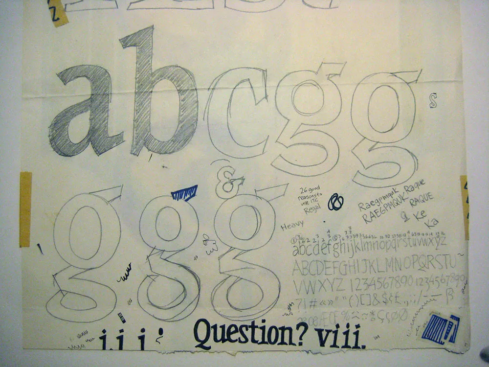
MyFonts has been doing interviews of typeface designers for the last year or two in their Creative Characters series. Yesterday, they posted one featuring yours truly.
A fellow type designer, the talented James Edmondson (Ohno Type), started doing a podcast recently called Ohno Radio. Like everything James does, it’s very well done. It features interviews with people in the font world and covers font-related topics. Naturally, I was excited when James invited me to be interviewed for the show. He was well prepared and had good questions. It was a lot of fun and we had a great conversation.
You can listen to it here: https://ohno-radio.simplecast.com/episodes/mark-simonson
You can subscribe to the podcast in the usual ways. James also makes fantastic fonts. Both are highly recommended.
Back in 1991, I designed a series of packages for the American release of London Weekend Television’s Poirot series on VHS. (My design is above on the left.) As part of the design, I drew the name “POIROT” in a geometric Art Deco style, which I thought was fitting for the series.
The other day, I happened to see the latest incarnation of the series packaging (above on the right) and noticed that the designer had set the title in one of my fonts, Mostra, which I never noticed before is pretty similar to my 1991 lettering design.
I wonder if they knew?
Popeye was my favorite cartoon when I was four or five years old. The ones I remember best—and love most—are the early one’s made by Max Fleischer Cartoon Studio. These are the ones in which Popeye wears a black shirt and the characters all mumble a lot.
The drawings have a solid feel to them, like they’re three-dimensional, but everything is stylized in very a cartoony way, including the movement. You can see a similar sort of style in the Beatles’ Yellow Submarine.
I’ve been making my way through the “Popeye The Sailor: Volume One, 1933-38” DVD set (which, coincidentally, uses my Mostra fonts on the package). Here are some things that have crossed my mind while watching these classic cartoons:
- “A Dream Walking” is one of the cleverest animated cartoons ever. Popeye and Bluto fight over who will save Olive as she sleepwalks through an under-construction skyscraper. There is a lot of complicated timing and tricky animation in this, and the humor comes out of it.
- The dance scenes in “Morning, Noon, and Nightclub”, in which Popeye and Olive Oil are nightclub performers, are beautifully cartoony—and funny. I also love the way Bluto walks in this one.
- “Popeye the Sailor Meets Sinbad the Sailor”, the earliest of the three two-reel Popeye color cartoons, has to be my all-time favorite. It’s too bad the Fleischers didn’t do any feature-length Popeye cartoons in this style.
-
Several of the cartoons in this period (including “Sinbad”) utilize three-dimensional set for backgrounds. They are built to look like the usual painted backgrounds—until the camera moves, and the characters seems to be walking through a three-dimensional world.
-
When I was in kindergarten, Olive Oyl was my dream girl. I’d forgotten about that.
-
I was so into Popeye when I was little, I asked my mom to buy canned spinnach for me, which I ate—it was actually kind of good if you put enough butter on it. Had to be the first time I ate something because I heard it made you healthy.
- Every one of the title cards is beautifully hand-lettered. This was routine back when these shorts were made. It was much easier to use lettering than type for movie title cards, and less expensive. It affords much more variety of treatment as well, including illustrated effects.
Before digital type and desktop publishing took over the world in the late 1980s, there was metal type and phototype. But if you were on a tight budget, you could set type yourself using various “dry transfer” products, Letraset being the most famous. But Letraset wasn’t the only one.
I used Formatt sheets a lot in the late 70s and early 80s. I’ve still got a few catalogs (No. 7 from 1981, No. 8 from 1986, and pages from what I believe is No. 6 from 1976) and a few sheets of type.
Unlike Letraset and other “rub down” type products, Formatt was printed on a thin, translucent acetate sheet with low-tack adhesive backing on a paper carrier sheet. To use it, you cut out the letters with a razor blade or X-acto knife and positioned them on a suitable surface and then burnished it down. I usually used illustration board and then made a photostat for paste up, but you could put it right on the mechanical if you wanted.
The sheets had guides below each character to aid in spacing and alignment. Although I always spaced it by eye, the guides were essential to keep the characters aligned to each other. I would draw a line for positioning the guidelines using a non-repro pen or pencil before setting the characters down and trim away the guidelines after.
Formatt was not as high in quality as Letraset, but it was cheaper and offered typefaces—especially older metal typefaces—not available from any similar product. But they also carried more recent faces, such as those from ITC. They carried about 250 different typefaces in the catalogs I have. I only bought Formatt type sheets in order to get certain typefaces that weren’t available elsewhere (other than from typesetting houses, which were not in my budget at the time).
In addition to type sheets, they also produced a whole range of pattern sheets, rule and border sheets and tape, color sheets, decorative material, etc. A lot of the graphic material seems to have come from old metal foundry sources. Besides the type sheets, I used their border sheets and tapes a lot, too.
I also made my own “Formatt” sheets sometimes back in the early 80s. I had access to a process camera, which could make high-quality photographic copies of black and white originals, colloquially known as “photostats” or “stats.” Normally you would use white RC (resin-coated) photographic paper with it, but it was possible to get clear acetate photostat material that had a peel-off adhesive backing. Using this, I made copies of pages from old metal type specimens, allowing me to set display type using otherwise unavailable typefaces.
I’m the featured guest on episode #6 of the typography and design podcast Read Between the Leading.