I’m known as a type designer—and fonts are pretty much what it’s all about here on my website, and in my life in general. But I haven’t always been making fonts. At various points of my career (which goes back to 1976) I’ve been a graphic designer, art director, web designer, package designer, product designer, lettering artist, and—very early on—illustrator.
Learning to Do Caricatures
My most active period as an illustrator was for Metropolis, a weekly newspaper in Minneapolis (1976-77). Patrick JB Flynn was the art director. Fairly soon after I started working for them, he asked if I could do caricatures. Caricature was something I dabbled in going back to middle school, mostly in a simple cartoon style. My inspiration came mainly from artists like Mort Drucker (Mad) and Rick Meyerowitz (National Lampoon). But I’d never done a full caricature before. Not really. But, I thought, how hard could it be?
And so I started doing caricatures for Metropolis. I wasn’t that good at first, but I got better. I was actually kind of surprised I could pull it off. Caricature is not the easiest skill—even when you can draw well. And some of my caricatures were better than others.
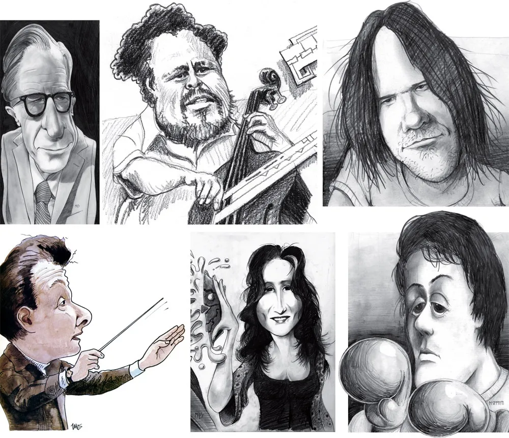
Above, some of my early caricature work. Clockwise f**rom the top left: economist John Kenneth Galbraith, Jr.; jazz bassist Charles Mingus; a “stoned out” Neil Young; Sylvester Stallone as Rocky with “puppy-dog eyes.”; singer Bonnie Raitt; and orchestra conductor Sir Neville Mariner.
After Metropolis, I kind of stopped doing it. I’d also dropped the idea of being an illustrator. It was easier to be an art director, think up the concepts, and let someone else do the drawing. Plus, I didn’t think my caricature style was “in.” It wasn’t the sort of thing I was seeing in the illustration annuals. I associated it with “kid’s stuff” (Mad especially) and felt almost embarrassed by it.
Getting Back Into It
Earlier this year, I made an effort to get back into drawing and other creative pursuits, and get away from staring at a computer screen all day (see my “1979” post from February). I filled up several sketchbooks over the next few months, drawing nearly every day. And then in July, I started doing daily drawings in Procreate on my 12.9” iPad Pro—quick caricature sketches of people I saw on YouTube while watching videos.
Drawing digitally—that is, drawing on a tablet or screen with a stylus—has always been problematic for me, in spite of all the money I’ve spent on Wacom tablets and Cintiqs and iPads over the years. For some reason, I just never took to it, no matter how much I wanted to. It didn’t feel as fluid and natural to me as drawing on paper. So I never did much but doodle, rarely doing a full drawing.
But I had a breakthrough while doing these quick studies. I figured out a technique for doing full caricatures that works for me, like the ones I used to do for Metropolis. In fact, it works even better.
The trick is to keep things really simple. I use the 6B Pencil brush for the line work on one layer, and the Tamar brush—sort of like painting with a sponge—for shading (and color) on a second layer. I’m careful not to change the size of the pencil brush (~60%). I try to draw at actual size as much as possible and stay loose. It all finally clicked for me.
And of course, working digitally is great for drawing caricatures compared to drawing on paper. It’s so easy to fix problems, like when proportions are off or positions of the features aren’t quite right. I’m able to work very quickly, knowing that if I make a mistake, I can immediately fix it. (Although, I might try redoing some of these using analog media now that I’ve worked out the likeness and everything digitally.)
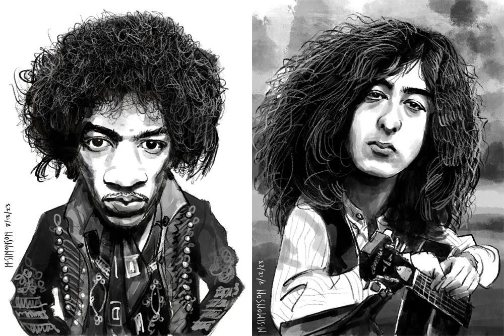
Jimi Hendrix and Jimmy Page.
It takes me anywhere from an hour to three hours to do one of these. I’m working in both black and white and color, depending on the source photo. And, yes, these are based on specific photos, or several photos in some cases. Some of them may be recognizable—even iconic.
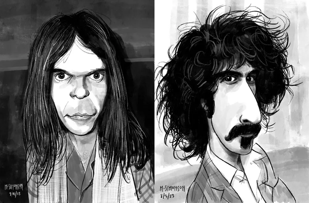
Neil Young and Frank Zappa.
By the end of July, I was doing a full caricature every day. This went on for almost two weeks. Since then, I’ve been doing several a week. I’ve done almost 30 of them now. Mostly rock musicians so far, but I have a long list of possible subjects in other areas, too.
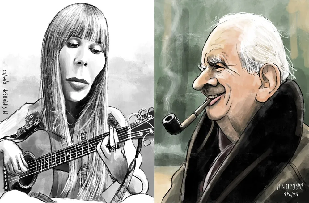
Joni Mitchell and J.R.R. Tolkien.
Rediscovering Myself
I can’t believe how good it feels to reconnect with this. As an artist, knowing that you’re capable of doing something yet not doing it for years—decades even—is painful. It feels like a waste. Of course, I’m doing other things, like making fonts, which is also creatively fulfilling. In fact, I’ve often wondered if getting so busy making fonts was the reason I wasn’t drawing as much. Apparently not.
In my “1979” article, I cast a dim eye on the digital world—the world of screens and pixels—and advocated a return to doing physical things, like drawing on paper. And I have been doing that. But, ironically, getting back into drawing on paper—specifically the habit of drawing daily—led directly to finally getting some use out of my iPad Pro and Apple Pencil. In hindsight, it was all about getting back to drawing, regardless of whether it’s on a screen or not.
Anyway, all of this is a roundabout way of saying that I’m going to start sharing my caricature work online. To be clear: I’m just doing this because I enjoy doing it. It’s a side project. I’m not looking to start a new career or anything like that. Fonts are still my main gig. I just want to share something else I enjoy doing, and I hope others will enjoy seeing it.
If you’re interested, I’ll be posting the work on my secondary Instagram account (not my regular Mark Simonson Studio account, which is for official, font-related stuff). Update: I’ve also created a new website to showcase my non-type-related work: marksimonson.art.
A few weeks ago, I went with my family to the Minneapolis Institute of Arts (a.k.a. MIA) to see the Delacroix show. While we were there, we took in another exhibit about Japanese woodcuts from the 20th century. The Delacroix show was pretty great, but the woodcut exhibit made more of an impression on me.
It was a rather small exhibit and not a lot of people were there. Part of what I liked about it was that they had Japanese popular music from the twenties and thirties playing in the background. It wasn’t traditional Japanese music, more like western jazz music with a Japanese flavor. It felt like stepping into another world, giving a bit of context to the prints.
One print in particular caught my eye.
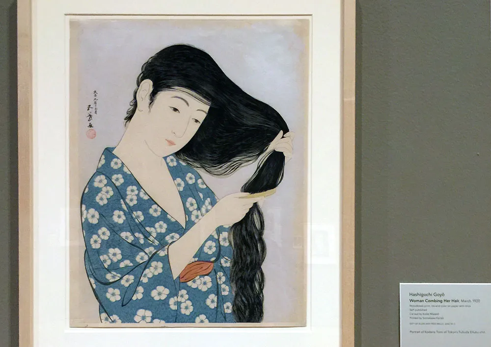
This was “Woman Coming Her Hair”, a print from 1920 that many will recognize as an image Apple used in early promotional materials for the Macintosh. Here’s the MacPaint manual (which I still have) that came with my first Mac in 1984:
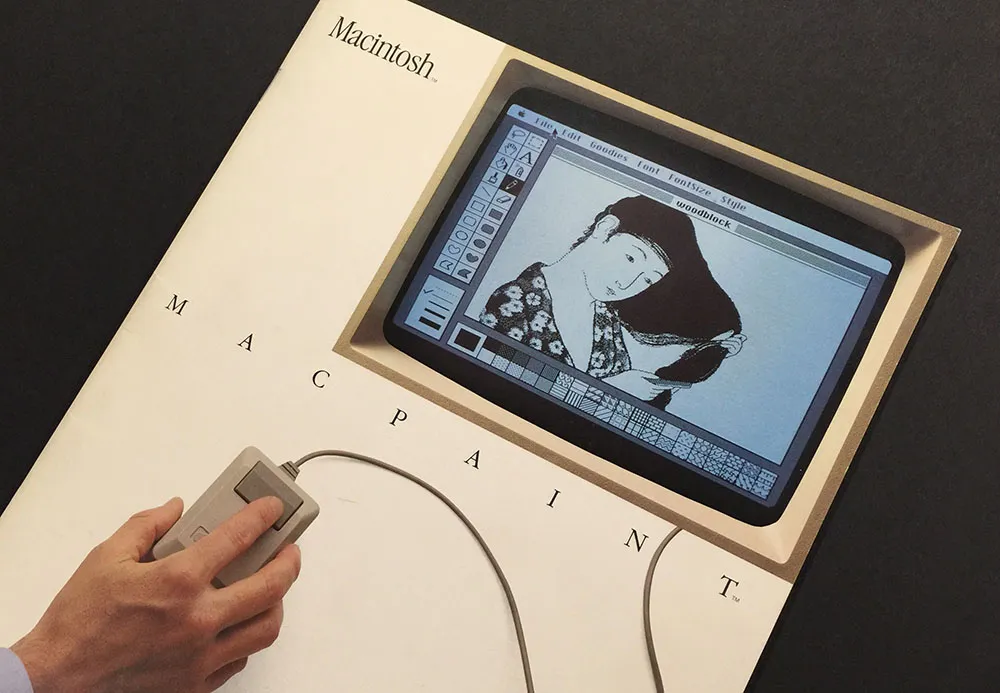
Susan Kare, the artist who created graphics and fonts for the original Macintosh, gave a talk at the Layers Design Conference last year and the video of it was made available recently. Among other things, she tells the story of how that Japanese woodcut was chosen and recreated in MacPaint.
Oh, and—what do you know?—today is the 32nd anniversary of the Macintosh. Happy birthday, Mac!
Earlier today I watched this wonderful presentation by Jeremy Keith that he gave at the Build conference. He touches on something I’ve thought about for a long time, going back even before personal computers: The long term prospect of the media we record things on—paper, records, magnetic tape, film, video tape, floppy disks, compact disc, DVDs, hard drives and servers.
I had almost the same thought as Jeremy: I picture archaeologists in the distant future studying what remains of our culture and finding lots of documents and records right up until around the end of the twentieth century—and then almost nothing that can be read or decoded.
Printed books, artwork, typed and written manuscripts, photos on film and paper, with all of these media, you can either read and decode it directly with your eyes. It may be faded or fragile, but if it survives, whatever is recorded on it will survive. Even movies on film and phonograph records could be reverse-engineered just by using observations and common sense, even if some of the nuances may be lost.
Then you get to magnetic tape. If you’ve never seen it before, it’s not obvious what it is, and even if you guessed correctly, the magnetic signals on the tape fade over time and the tape itself deteriorates.
Things start getting really bad when you go to analog video tape. To even make sense of what’s on the tape—assuming you figure out that it’s some kind of motion picture medium—you would need to reinvent the television and video tape player. Very difficult, but conceivable.
All bets are off when you get to digital storage, which Jeremy gets into in detail in his presentation. To me, it seems that it would be nearly impossible to recover anything stored digitally if, in some cataclysm, the knowledge of computer technology was lost.
Even things from the recent past are getting difficult to access. I switched to digital tools for most of my design and artwork in the late 1980s. Some of the work I did—in the form of PageMaker files, for example—I would have a difficult time retrieving. Yes, technically, much of this stuff can be accessed if you have old enough hardware and software. But hardware doesn’t last forever, and what about more recent software that requires internet activation?
When I look back through my old artwork, I have less and less in the form of physical objects—drawings, photos, printed samples. Physical objects get old, faded, and damaged, but you can still hold them, and look at them. Digital stuff never gets old or faded, but if even a few bits of data are corrupted, an entire file or disk can be lost forever, even if you still have something to read the media.
Then I think, who cares, other than pack rats like me? I thought the same thing watching Jeremy’s talk. Sure, huge amounts of digital culture may be—probably will be—lost to the future. But remember, there are many things from the past that are lost to us now because they happened before sound and picture recording—musical performances, theatrical performances and speeches, historical events. But lots of stuff did survive and will survive. We still print tons of books and magazines (so far). People still keep journals and diaries, and artists still keep sketchbooks.
Ultimately, culture is for the living. If it survives to be studied and appreciated by people in the future, great, and I hope it does. If not, I’m sure they’ll be busy making their own anyway.
Craig Eliason has been writing a pangram almost every day for over two years on his site The Daily Pangram. For the last week, they’ve been about me or my fonts, which is quite an honor.
Pangrams are tricky enough to write without having to keep track of all the letters, so Craig uses my Pangrammer Helper so he can focus on the creative part of the task. He’s gotten quite good at it.
Craig and I both work in St. Paul, so we see each other from time to time, traveling in similar circles (he teaches art history at the University of St. Thomas and is learning to design type).
I should really just end this with a pangram, except I can’t quite think of any words that fit that have a z. Hmm…
We have a fair number of ginkgo trees in our neighborhood. I don’t pay much attention to them most of the year, except in the Fall. That’s when, in their curious way, they drop nearly all their leaves in one go, not even waiting until they change from green to yellow. That happens after they’ve been lying on the ground a few days. And when they fall, each tree is surrounded by a rich, green carpet of ginkgo leaves.

Unfortunately, some (not all) of them also drop hundreds of yellow, cherry-sized seeds. Or maybe they’re fruits. Or nuts. Doesn’t matter. Very soon, the sidewalks are covered with them and they get trampled on. The mess is bad enough, but the smell is revolting. I wish people who have these trees would at least sweep the seeds off the sidewalk. I guess they don’t go for walks around the neighborhood like me. They probably do it on a treadmill at a health club. Grr.

Pretty leaves, though.
Pangrammer Helper 2.0 is a new version of the pangram-making utility I created in 2005. The new version adds the ability to keep track of how many times each letter of the alphabet is used in your pangram. (Thanks to Scot Ober for the suggestion.)
In case you don’t know, a pangram is a phrase or sentence that uses every letter of the alphabet at least once. The most common one in English is “The quick brown fox jumps over the lazy dog.” Here are a few pangram links for more examples and information:
P22’s 2004 Pangram Contest Winners
The Pangram Page (dead link)
Pangram Discussion on Typophile.com
NPR Sunday Weekend Edition 2002 Pangram Contest Results