Typedia (typedia.com), a shared, online encyclopedia of typefaces, just launched today.
It’s the brainchild of Jason Santa Maria, who invited me to contribute when it was in its early planning stage. I helped mostly with the classification system. (I actually have mixed feelings about classification systems in general and I think the tags will be ultimately more useful. But the classifications will at least provide a starting point.)
I’m very excited about Typedia. I’m hoping it will be the online equivalent of resources like Matt McGrew’s American Metal Typefaces of the Twentieth Century or Jaspert, Berry & Johnson’s Encyclopeadia of Type Faces, two books I rely on when I want to know the history of a typeface (see my Son of Typecasting series).
However, unlike a printed book, Typedia will be continuously updated and will grow in its usefulness as more and more people contribute to it.

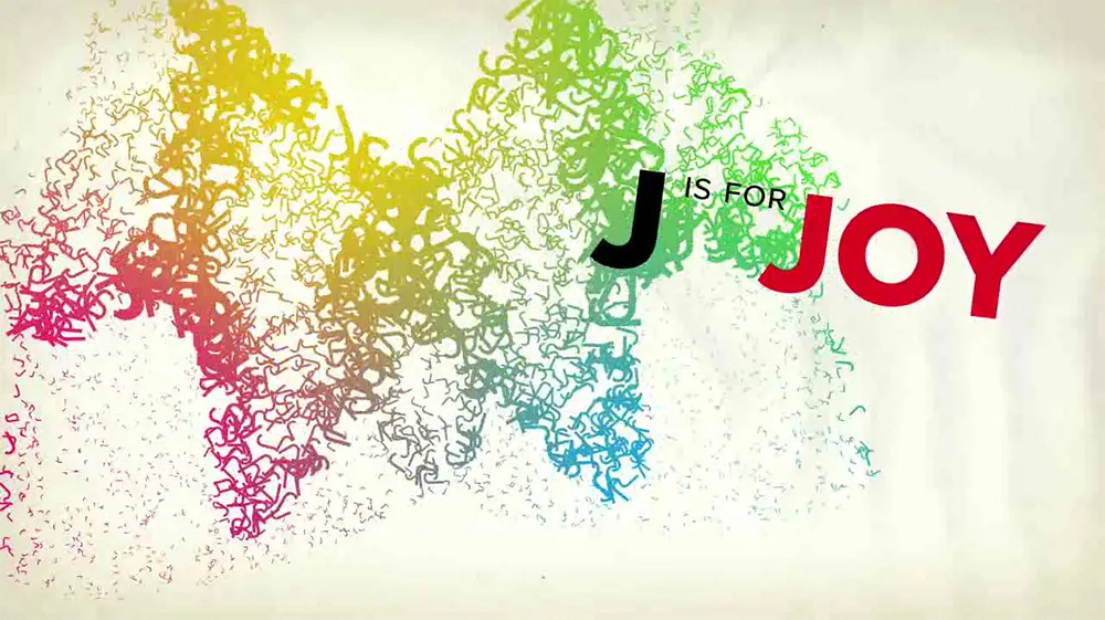
Proxima Nova stars in a new animated short film by Brent Barson, sponsored by Veer: “F is for Fail” (and co-starring Adobe’s Arno Pro). The still from the film (above) sums up my reaction. Well done, Brent! (And thanks to Veer, too.)

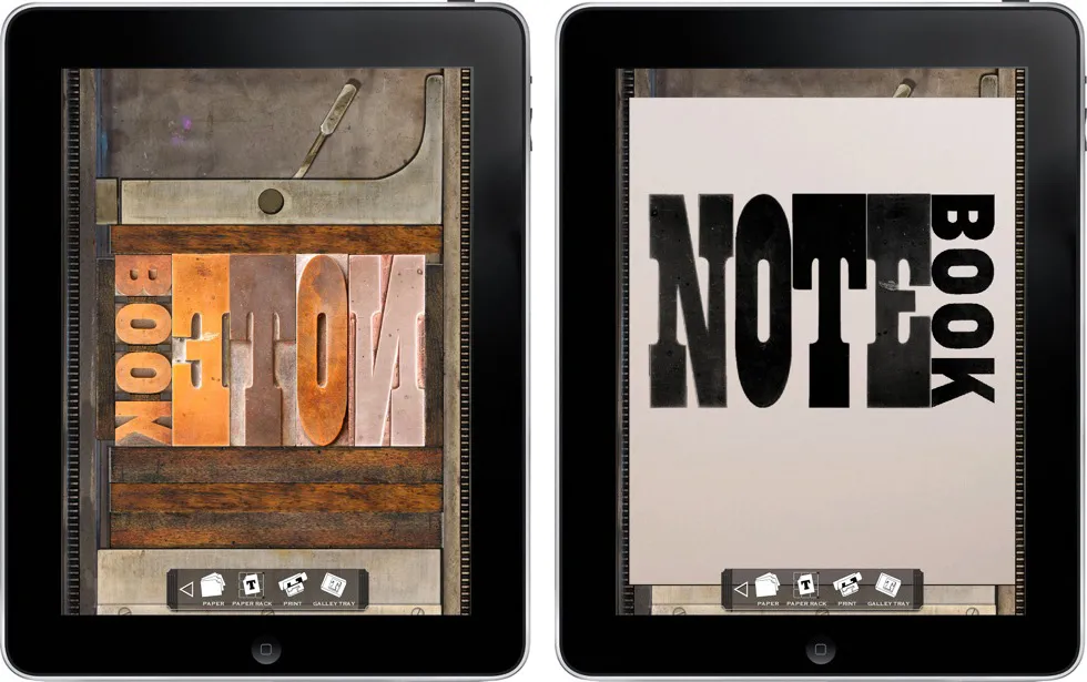
LetterMPress is a virtual letterpress app for the iPad—at least that’s the idea. The project is using Kickstarter to raise funds to complete the app and to acquire wood type fonts to include (virtually) in the app. More info on Kickstarter.
I think it’s a neat idea. Not only will you be able to make compositions on a virtual press bed with virtual wood type, mix and apply virtual ink, and make virtual prints, if all goes according to plan, you will be able to send them your design and have it all done for real, with real wood type, ink, and paper.
Some letterpress purists may scoff, but I think it has the potential to introduce the joys of letterpress printing to a much wider audience.
The results of a survey on the meanings of the words typeface and font among both “type industry professionals” and graphic designers, conducted by Thomas Phinney. My opinions on the matter fall squarely with the “type industry professionals” for the most part.
(via Typophile.com.)
Fellow type geek Yves Peters gets in on the fun of spotting typographic anachronisms at FontShop’s FontFeed blog today with a post about some odd props on the TV series Dexter.(Update: FontFeed went offline in 2015.)
