wwword, a website about words, did an interview with me [Update: wwword appears to be no longer operating, unfortunately, but here is a copy of the page on the Internet Archive’s Wayback Machine], where I talked about some of my favorite lettering pieces and how I did them.
The images that accompany the article are a bit small, so I’ve put larger versions up here….

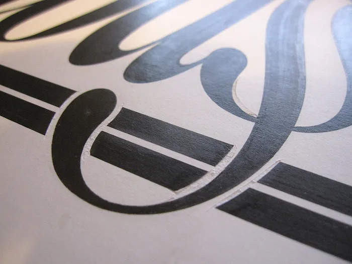
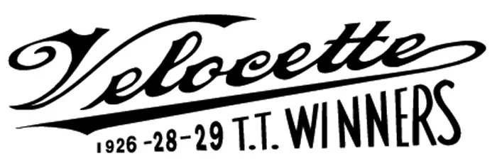
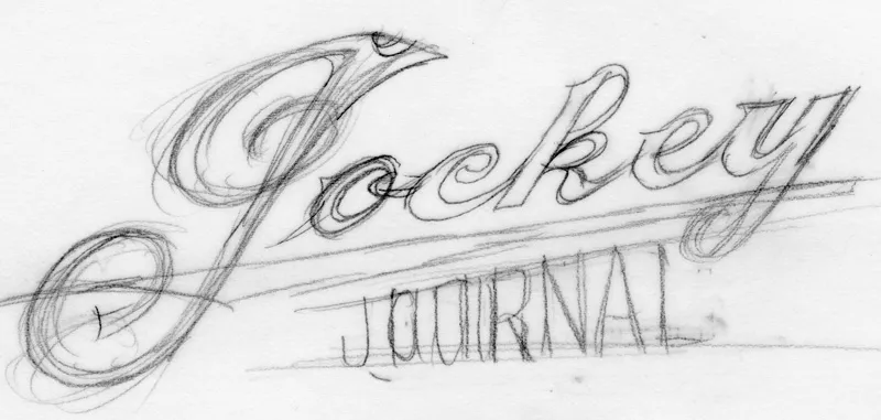
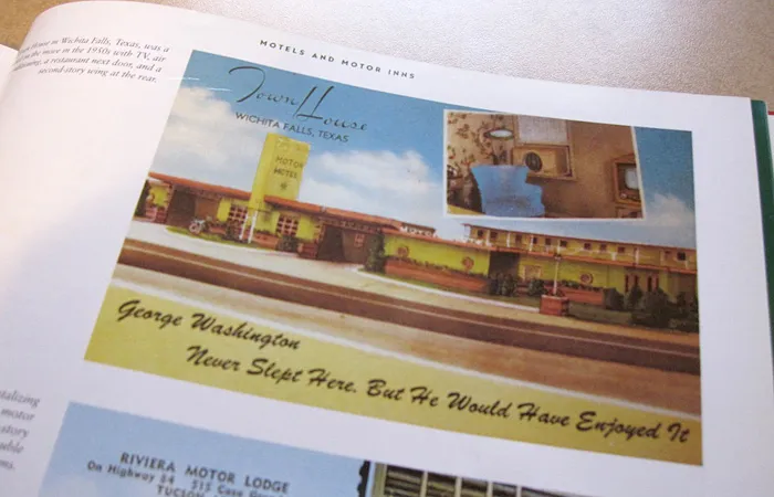
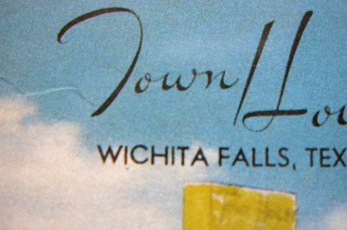
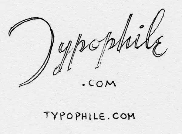

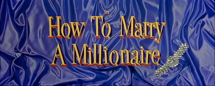
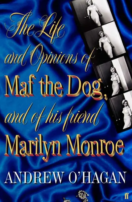
I spend a fair amount of time (too much, probably) helping to identify fonts at Typophile.com’s Type ID Board. One thing that comes up over and over is when someone offers a photo or sample of a sign or advertisement from before the 1960s or 1970s, and they want to know what font it is. Except it’s not a font, it’s lettering or sign painting or some other sort of custom-made letters.
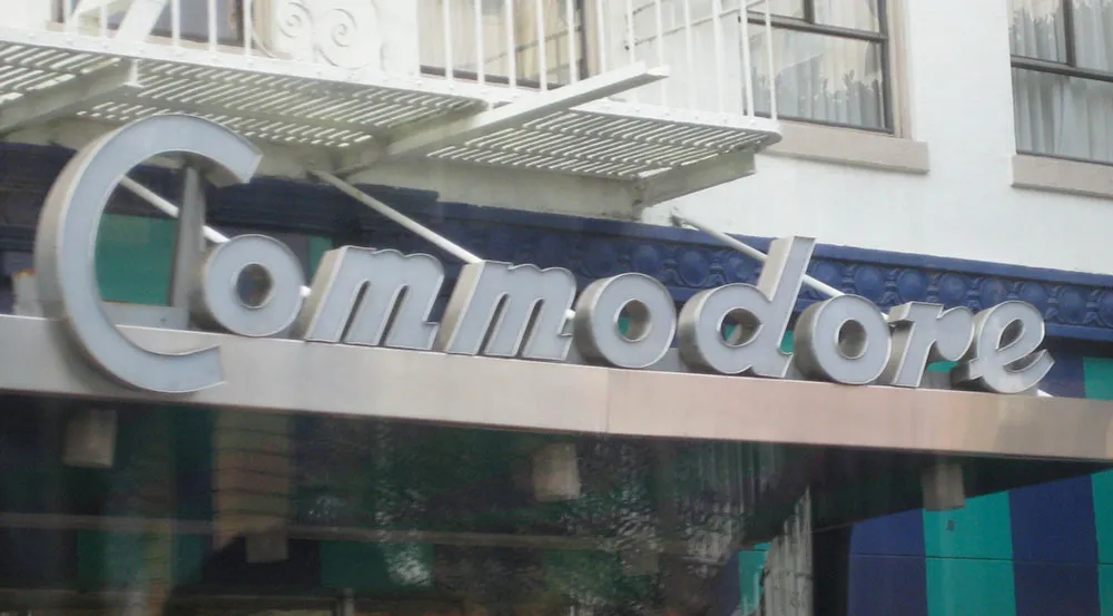
Handmade sign in San Francisco, photographed April 2, 2008.
It’s not surpising that most people (including younger designers) assume that any letters they see out in the world were made using some sort of font. In the modern world, they are usually right. Computers have made it possible to set type at any scale, from the tiniest footnote on the back of a credit card to letters several stories tall on the side of a building. This was not always so.
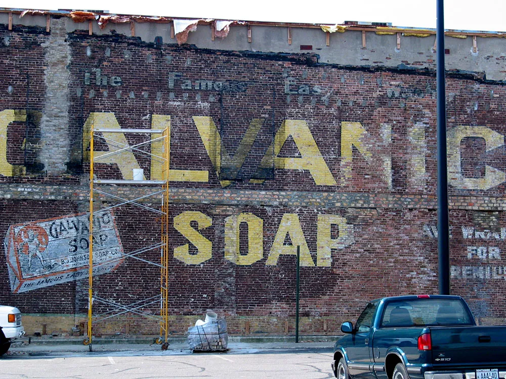
Vintage painted sign on the side of a building during restoration, Beloit, Wisconsin, August, 8, 2004.
Type did not used to be so flexible. It existed as raised images on small bits of metal (or sometimes wood). It came only in certain sizes. The number of styles available was small—a few thousand at the most, and most typesetting houses offered only a dozen or two of the most popular typefaces. You couldn’t reverse it, change its size, print it over a photograph, make it multi-colored, change its porportions, distort it, make it follow a curve or a wavy line, or even set it at an angle.
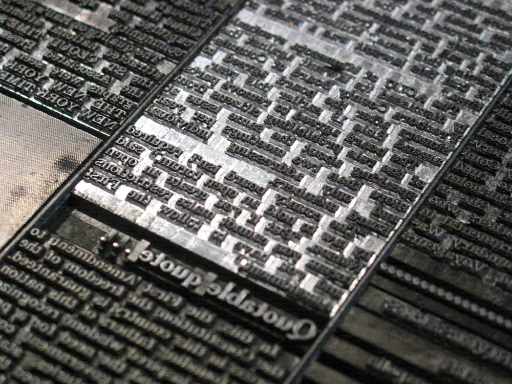
Machine-set metal type for a newspaper page.
However, there was a simple solution: The lettering artist.
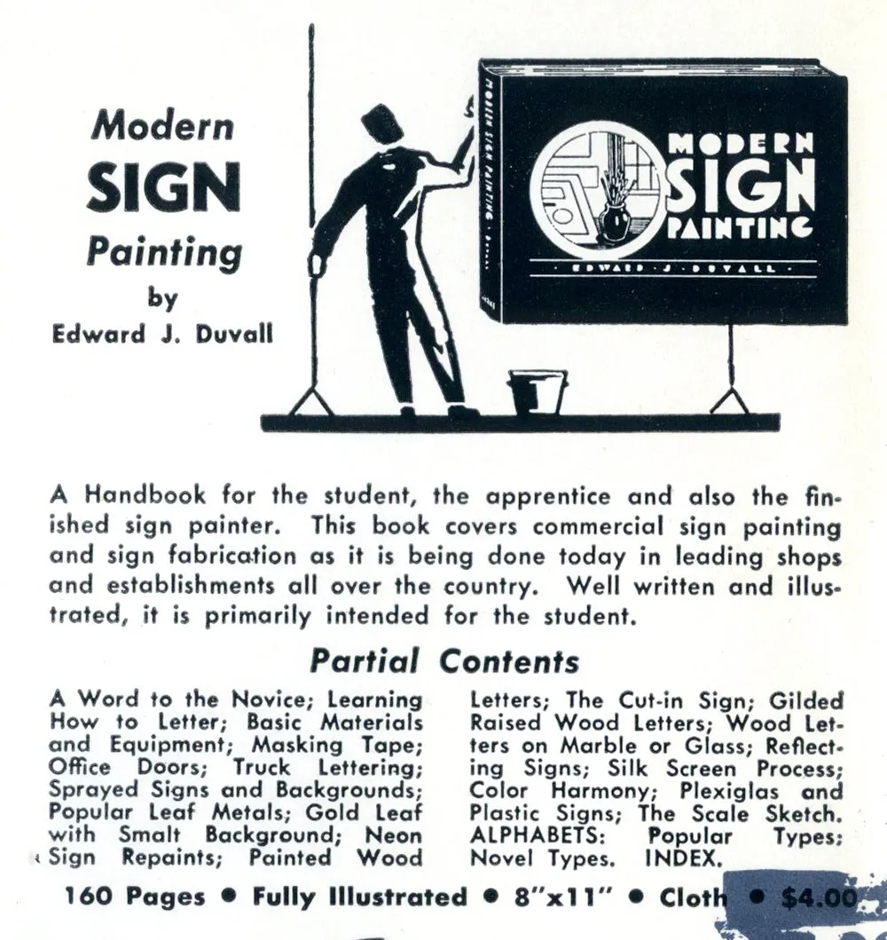
Ad for sign painting how-to book, 1957.
Because of the inflexibility of type, sign painters and lettering artists flourished. Lettering could go where type could not: Large signs and posters, over photographs and illustrations in magazines and advertisements, on windows and billboards, on the sides of automobiles and appliances, on clocks and watches, on packages and movie titles. Lettering was ubiquitous because it was practical. It was easier, cheaper and more flexibile than trying to do the same thing with type.
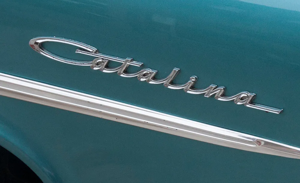
Nameplate on an automobile.
As phototypesetting began to replace metal type in the 1950s, type started getting more flexible. It was no longer limited to fixed sizes. With cheap photo-based headline setting machines, the number of styles available exploded in the 1960s, and demand for lettering began to decline. By the mid-1970s, type had become so flexible, the role of lettering was greatly reduced. Digital type and large-output devices in the 1980s all but killed it.
Today, lettering is very much a specialty area, used mainly when a unique design solution is desired, or when the few remaining limitations of type are still encountered.
But, the next time you see a “font” in an old movie or on the cover of an old magazine, remember: It’s probably not a font.
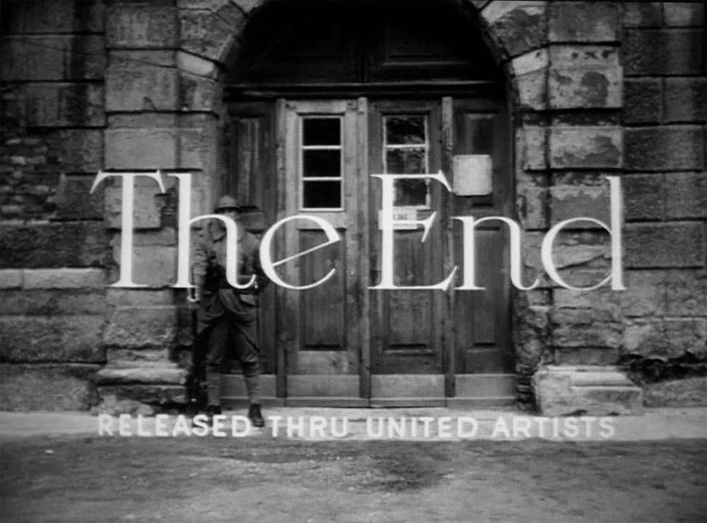
Hand-lettered title from Paths of Glory, 1957.
Postscript: The topic of this item was suggested by San Francisco sign painter Bill Stender, who has created hand-lettered signs and other props for period movies. Bill pointed out that, in my discussion of the use of Helvetica in the movie Tucker, not only would Helvetica not have been available in 1949, type would not have been used for such a large sign. It would have been designed and built by hand.
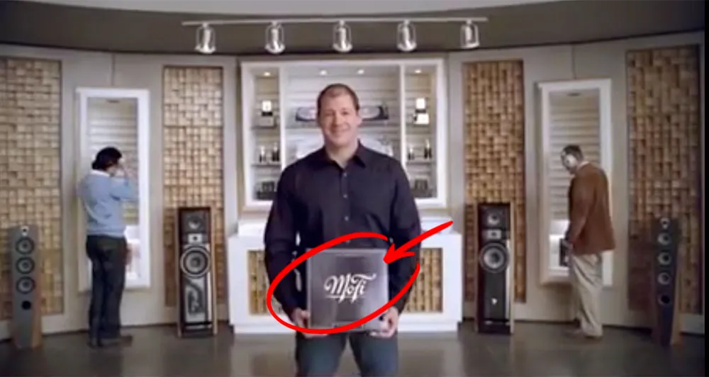
A year or two ago I lettered a logo for a company called Mobile Fidelity — MoFi for short. They do high-end recordings for audiophiles. I got a tip from the designer whom I worked with on the job that MoFi was featured in a recent American Express ad, and that the logo shows up near the end of the ad. Here’s a better look at the logo:
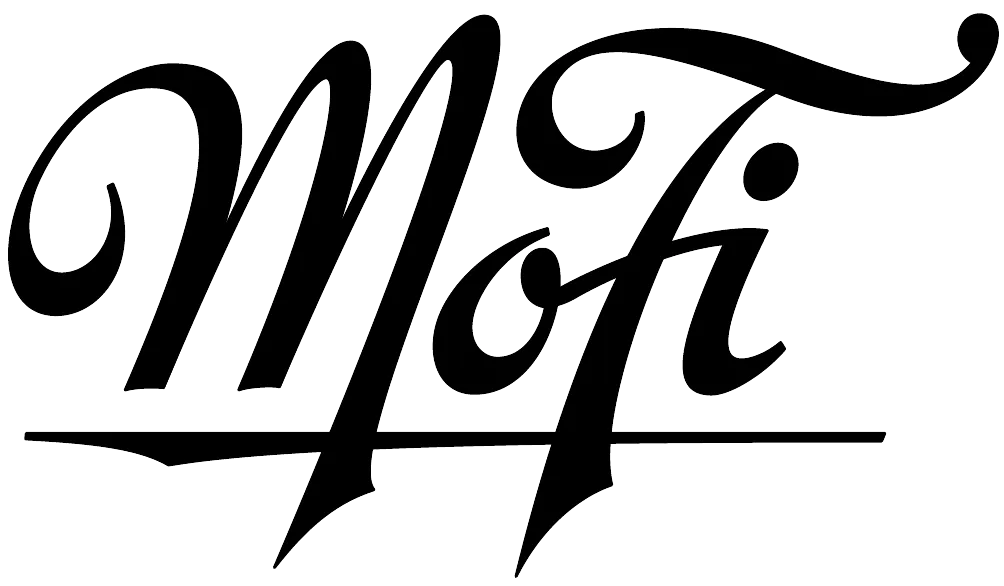
(Thanks to David Collins for the tip.)
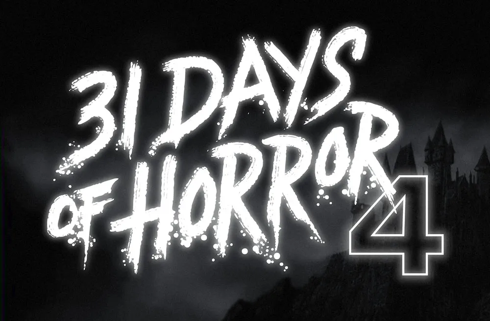
This was a fun one. Rumsey Taylor of Not Coming to a Theater Near You asked me to create lettering for a splash page graphic for the site’s fourth annual horror film festival.
The idea was to emulate classic horror film title screens. Thanks to Steven Hill’s Movie Title Screens Page I was able to find loads of reference. At first I was thinking I would use some kind of blackletter style, but it turns out almost no horror films use that style, unless they involve Dracula or Frankenstein. (More often it’s used for pirate movies.)
In the end I decided to go with the classic scrawled-in-blood look. To get the effect, I wrote out the letters freehand using a Wacom Cintiq and Corel Painter. It took a lot of experimentation and “takes” to get the right look. Once I had the basic lettering, I enhanced it in Illustrator and Photoshop to get the look of an old black and white movie title, complete with light-spill on the brightest areas.
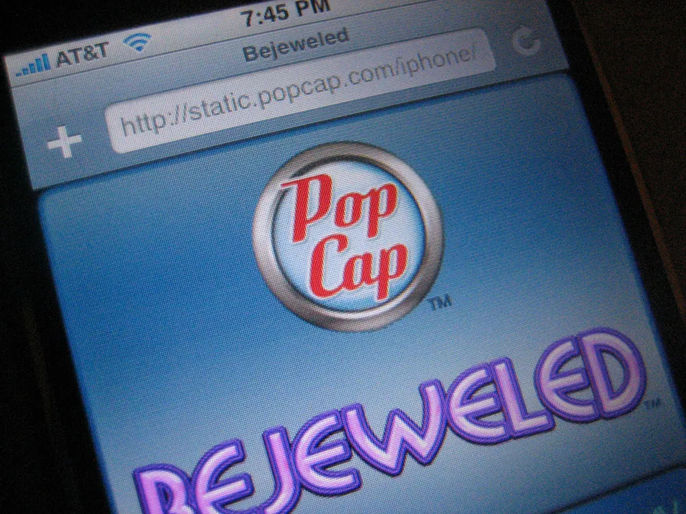
Okay, so I admit it. I bought an iPhone about three hours after they went on sale a month ago. I didn’t have to wait in line or anything. I walked in, bought it, and walked out. Like nearly everyone else who has one, I’m very happy with it.
So, I was a bit tickled today when I unexpectedly saw some of my recent work on it: the new PopCap Games logo, which appears on Bejeweled, the first game designed specifically for the iPhone.
I did the job last spring. Here is a comparison of the old version and the new version:
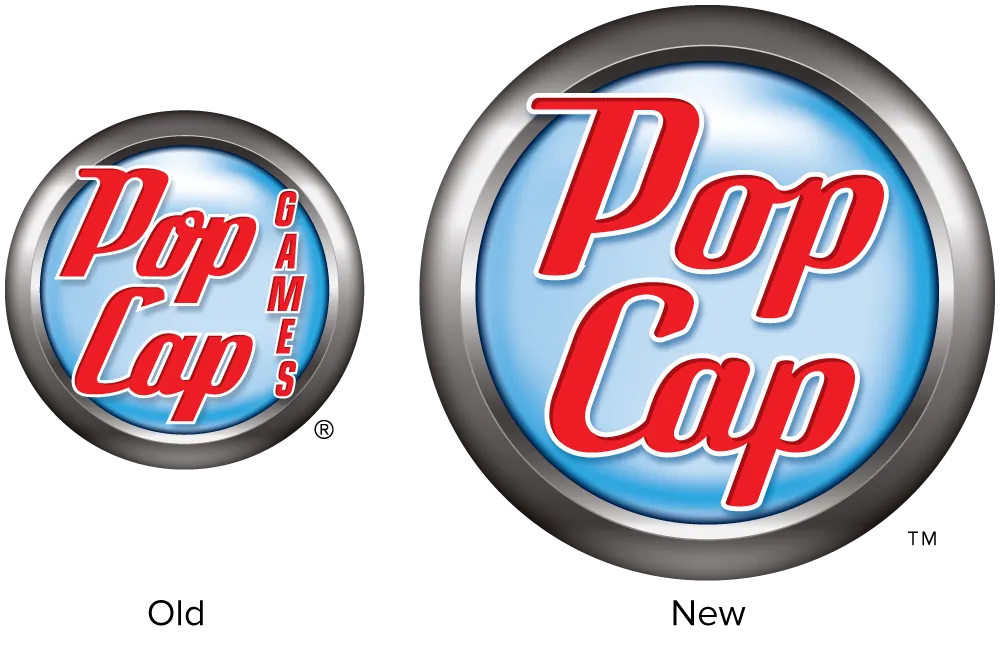
The idea was to make the logo cleaner and smarter without making it noticeably different to PopCap’s customers. Except for the background emblem, practically every detail of the lettering was changed. It would have been fun to completely redo it, but I’m happy with how it turned out.
If you have an iPhone and want to play Bejeweled, fire up Safari and head over the PopCap website. The game will automatically load when you visit the site using an iPhone.
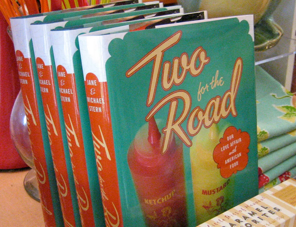
Here’s a fun lettering job I did for the cover of “Two for the Road” by Jane & Michael Stern. The book is a bunch of recipes collected from roadside diners all over the U.S. Art director Martha Kennedy asked me to make the lettering look like something you might see on a sign for a diner. In fact, it’s somewhat based on the sign from a famous diner called Rosie’s.
(This work is actually not that recent, but just I realized that I never posted anything about it here when the book was published last year.)

