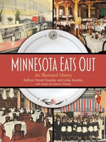
Minnesota Eats Out, by Kathryn Strand Koutsky and Linda Koutsky, was published recently by the Minnesota Historical Society Press. This really enjoyable book features two of my fonts: Blakely is used on the cover and for running heads inside, and Coquette is used throughout for initial caps.
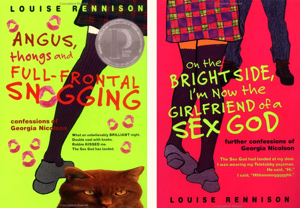
Felt Tip Roman is being used very effectively on this series of young adult novels by British writer Louise Rennison. There are at least five of them, but these two are my favorites.
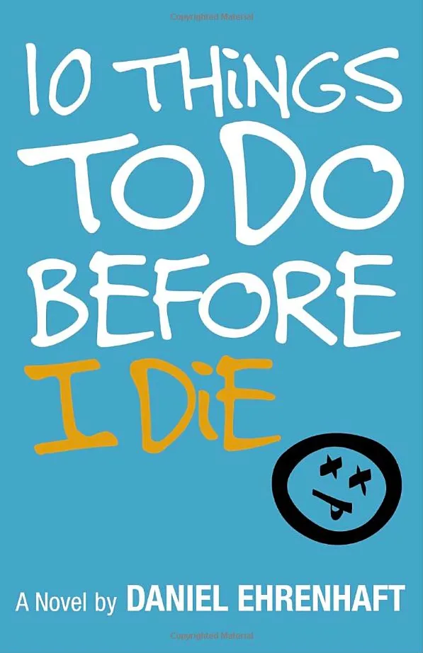
There must be something very “teen angst” about Felt Tip Roman. It keeps showing up on teen fiction titles like this. Looks good, although I see they didn’t like my cap I.
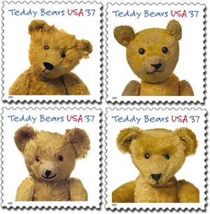
Imagine my surprise when I saw my face at the Post Office. Typeface, that is. A very prominent use of Felt Tip Roman.
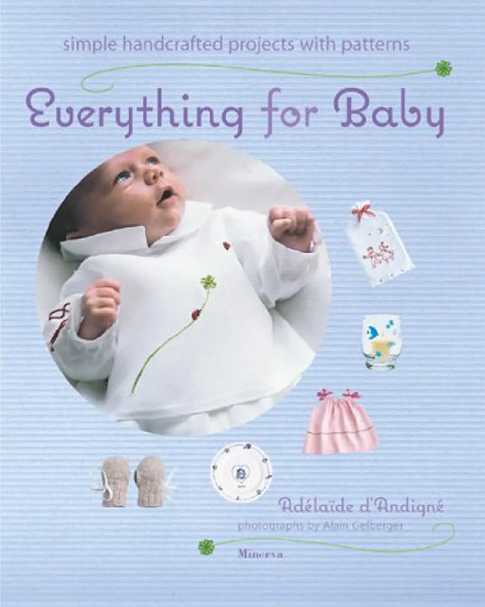
I recently noticed Coquette used extensively in the book “Everything for Baby” by Adélaïdé D’Andigné and Alain Gelberger, published by Stewart, Tabori & Chang last year. Notice how the baby in the photo seems very interested in the font. Obviously, a budding typophile.