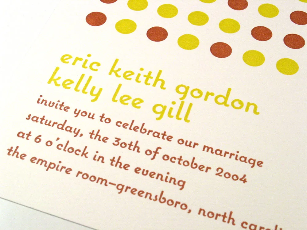
While I was at TypeCon in New York, one of the attendees walked up to me and handed me a copy of this wedding invitation on which he had used Coquette. (I think this was the first time I have been recognized in public by someone who had used one of my fonts. Oh, wait, I was wearing a name tag.) Anyway, what is really cool about the invitation is that it was printed letterpress.
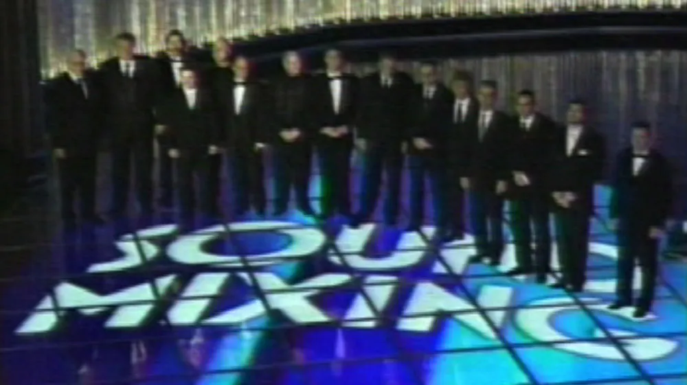
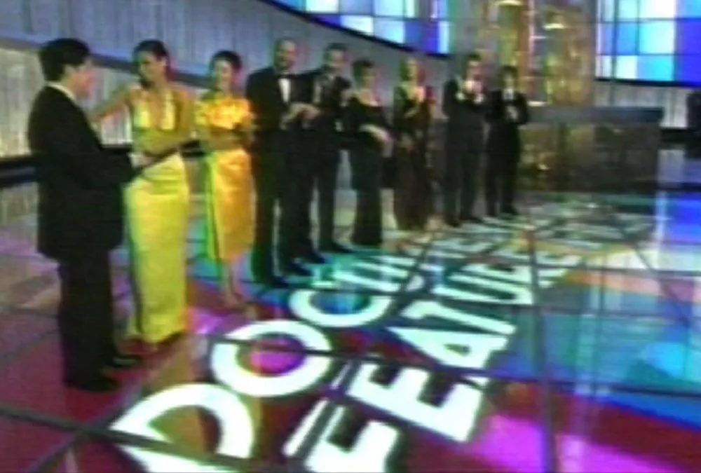
I’d like to thank the Academy for using my font Mostra on last night’s broadcast of the 77th Academy Awards. There were so many other great fonts under consideration to be displayed on the stage floor of this year’s ceremony, and… I’d also like to thank TiVO, Apple Computer, Adobe, FontLab… and all the little people… (music starts to play)… Thank you, everyone!
Designer David Nix used Coquette on a promotion created for duty-free shops in Los Angeles and San Francisco airports.
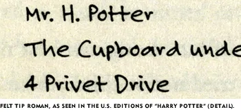
As noted on the sample page, Felt Tip Roman has been used in the U.S. editions of the Harry Potter books to represent the handwriting of the character Hagrid. I’ve always thought this was kind of cool, and it makes a nice example when trying to talk about type design with people who have never thought about where fonts come from.
Over the weekend, I was shocked to learn that there is a free font, distributed by many of the Harry Potter fan sites, purporting to be “Hagrid’s handwriting.” After checking it out, I was relieved to discover that it is not a pirated copy of my Felt Tip Roman, but a rather poor imitation.
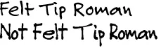
As you can see, it looks more or less similar, but is clearly not Felt Tip Roman. Looking at it more closely, it appears that the person who did it must have copied the letters with a pen by eye (making up the ones she didn’t have samples of), scanned them in and had the computer autotrace them. (Felt Tip Roman was hand digitized, not autotraced.)
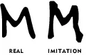
I guess I don’t mind fans using this imitation font. At least they are not passing around bootleg copies of the real thing. But if you do want the real thing, remember: It’s not a free font, and never has been.
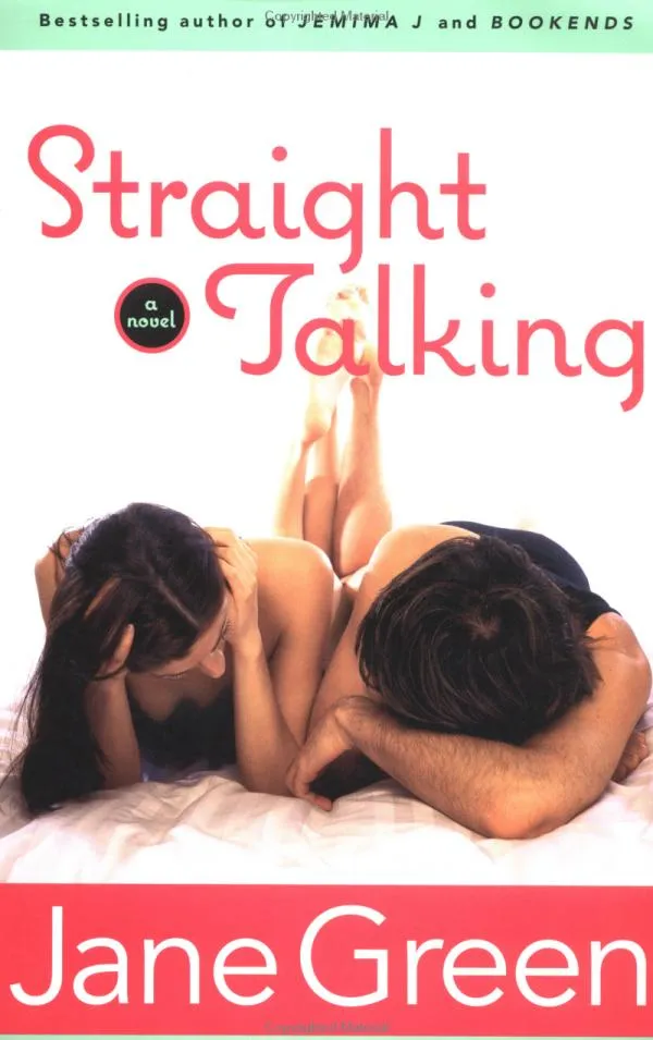
Talk about typecasting: Coquette is used rather coquettishly on the cover of this Jane Green book.
Nelson & Bainbridge picture framing products have been sporting Proxima Sans on their logo for a while now (with custom diamond-shaped “i” dots).