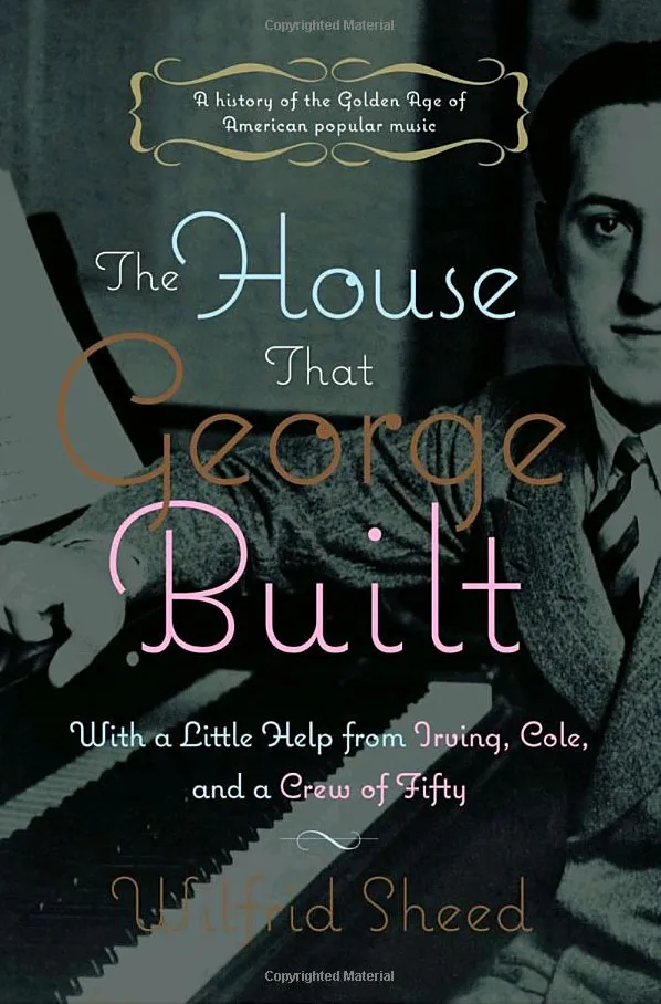
The cover of this book about George Gershwin is one of the nicer uses of Coquette that I’ve seen. (Thanks to Jeff.)
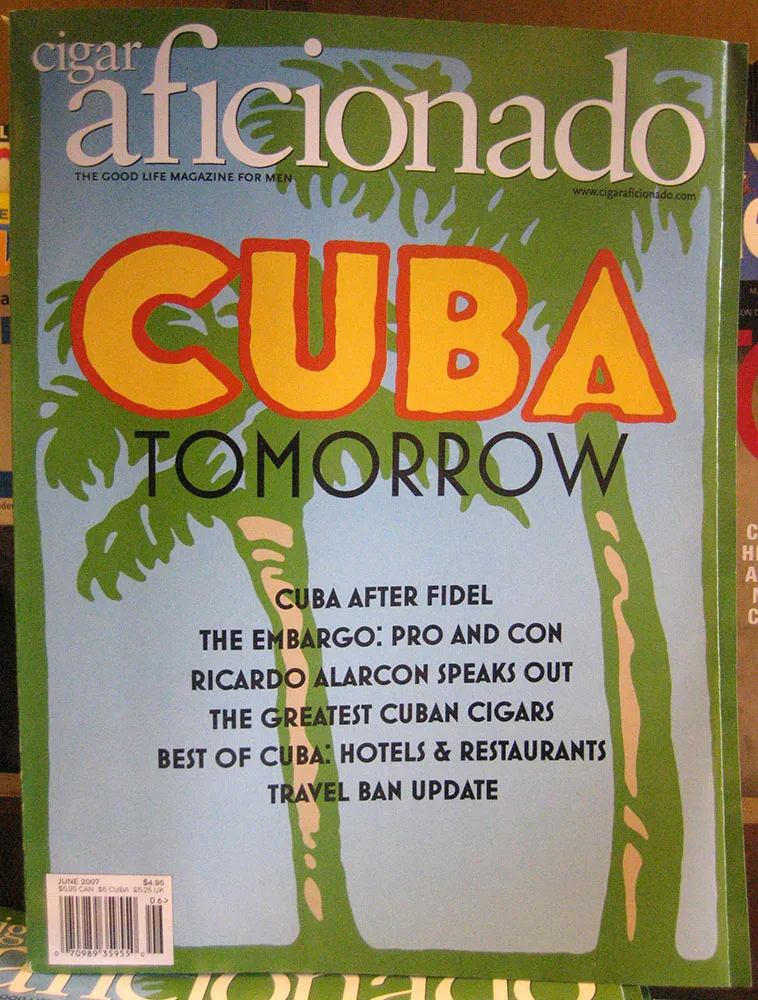
I’ve been seeing more of these two typefaces lately. Here are some sightings I found in the last few days.
The first is Mostra all over the cover of Cigar Aficionado magazine:
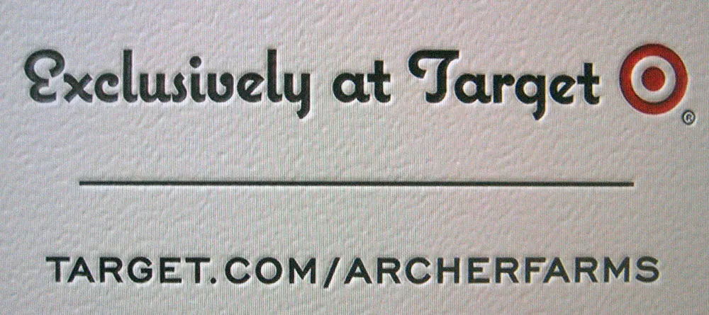
And here are two recent sightings of Coquette, the first on a television commercial for Archer Farms (Target), where they have used a neat letterpress effect:
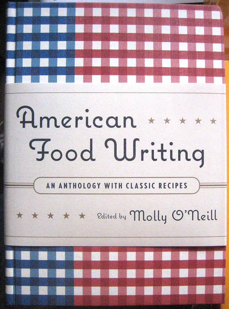
The last is another use of Coquette on the beautifully designed cover of the new book American Food Writing:
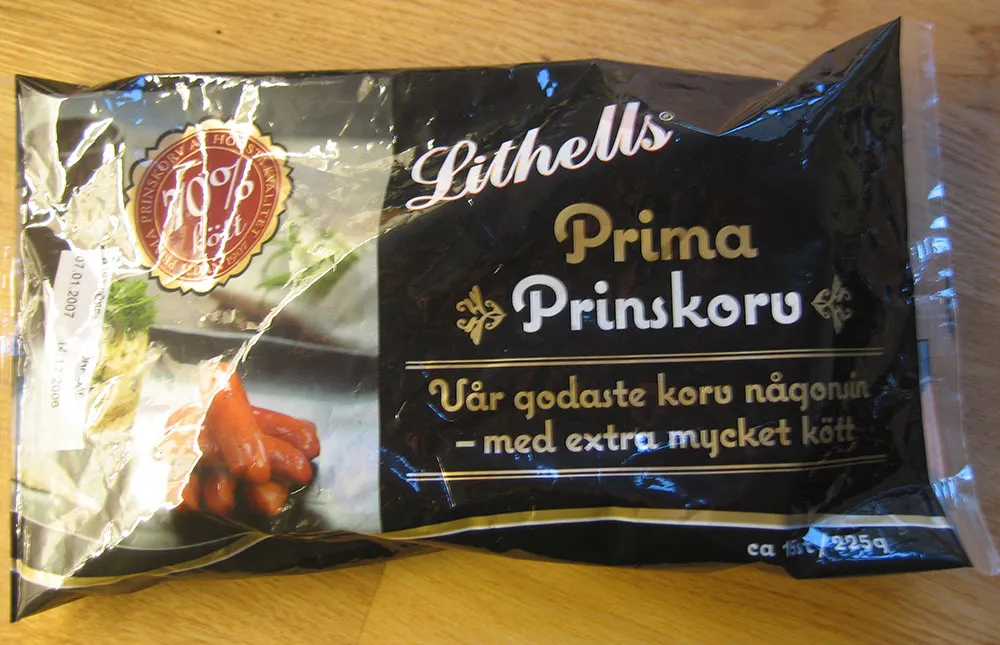
A line of meat products in Sweden is sporting Coquette on its packages. (Thanks to Peter at Fountain type foundry for the tip and the photo.)
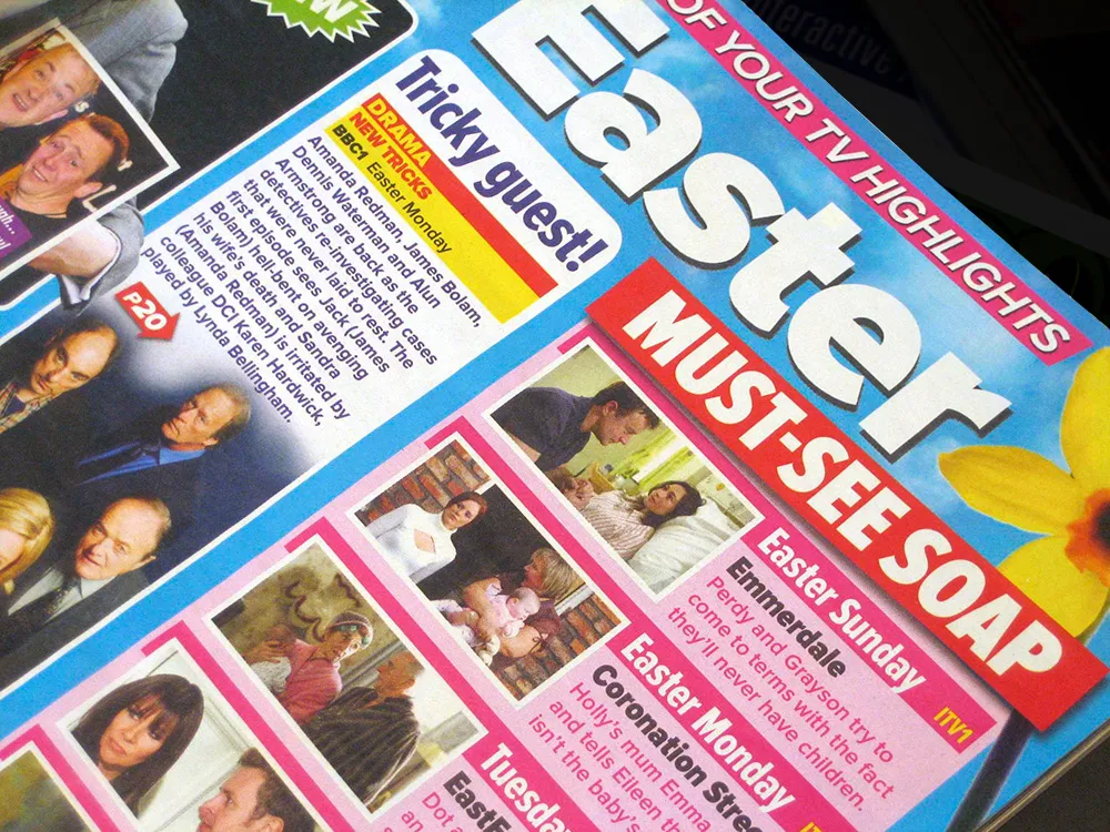
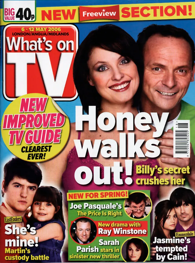
The 42 members of the Proxima Nova family get a real workout in What’s On TV, the best-selling magazine in the UK. Virtually all the type in the magazine is set in Proxima Nova, from the headlines on the cover to the tiny, densely-packed text in the radio and TV listings section. It’s all part of a recent redesign of the magazine, and, according to one of the designers, the reaction from readers has been positive. The magazine also requested a new weight—halfway between Regular and Semibold—which I may release to the public at some point.
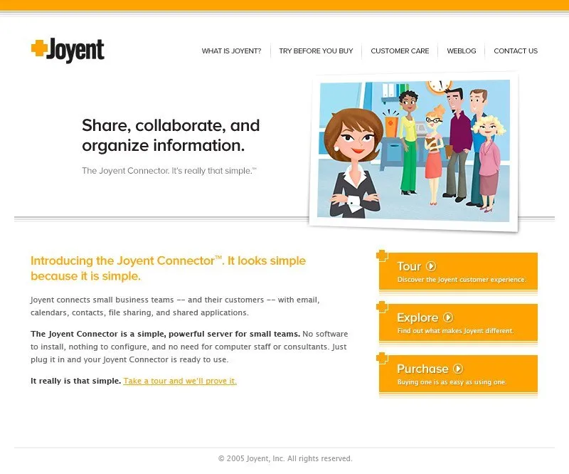
One of the first prominent uses of my recently released Proxima Nova is at Joyent.com where it is part of their corporate identity. Notice they are using the alternate lowercase a.
(Thanks to Stephen Coles for telling me about this.)
Okay, I was originally going to post one or two more detailed reports about the conference. But it’s kind of old news now. Suffice it to say, I had a blast and met lots of interesting type people I hadn’t met before—Chester (Thirst & Village), Yves Peters (Typographer.org, etc.), Steve Jackaman (International Type Founders), David Berlow (The Font Bureau), Akira Kobayashi (Linotype), Mario Feliciano (a very talented type designer from Portugal), Peter Bain (Incipit), Gerry Leonidas (Reading/UK), Stephan Hattenbach (MAC Rhino Fonts, Sweden), Carol Wahl, (Type Directors Club), Rodrigo X Cavazos (Psy Ops), Dan Reynolds (Linotype), and too many others to mention—as well as catching up with previous acquaintances again.
Several cool things happened that I have to mention:
The weekend before TypeCon started, I was mentioned in an article about small type foundries in the Sunday New York Times Magazine. I knew this article was coming out because, of course, the reporter talked to me a few weeks before. There wasn’t much about me in the article, but I think I gave the writer some good leads.
My new Proxima Nova was reviewed in a “keepsake” limited edition booklet put together by Typographer.org. (More about it here.)
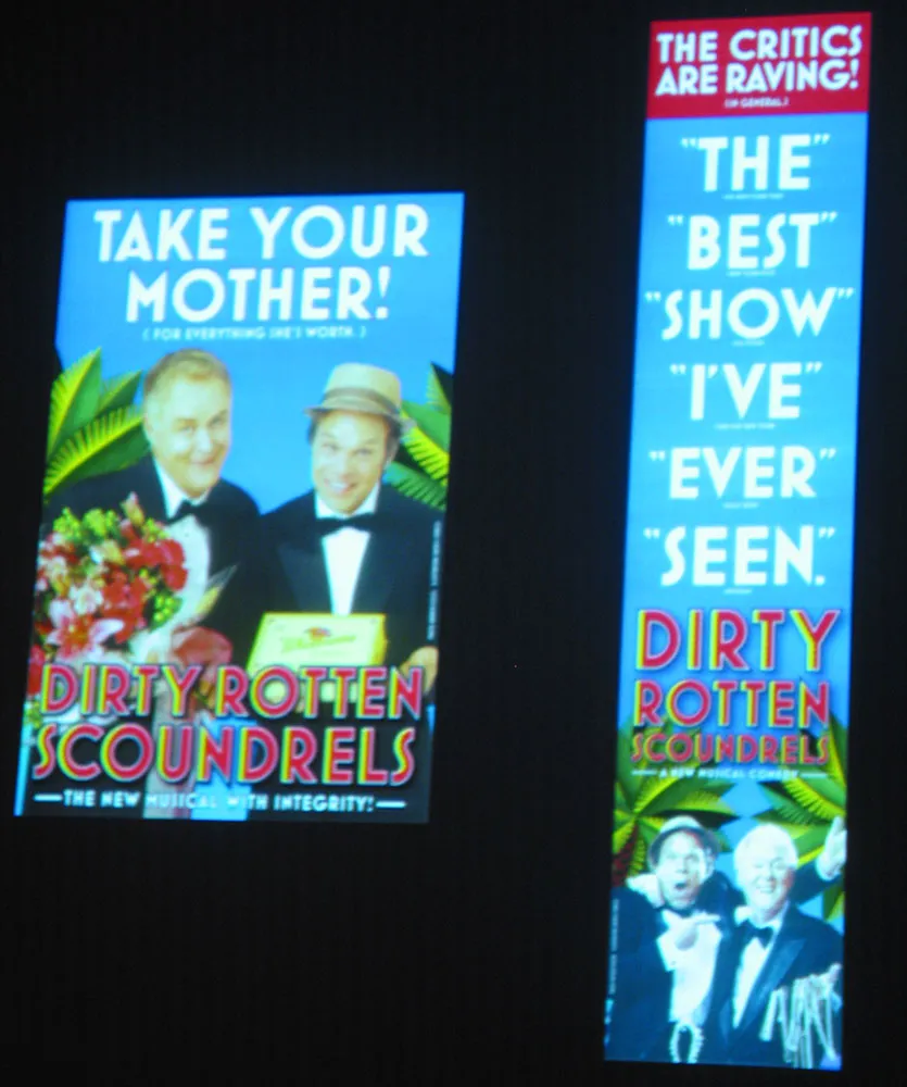
Finally, on Friday morning there was a presentation by SpotCo, a design/advertising studio in New York that does nothing but Broadway publicity work. I hadn’t heard of them before, but recognized some of their work (most famous of which is probably their campaign for “Rent” in the mid-90s). All very nice work. But I did a double-take in the middle of it when they showed the slide shown at right. Mostra Bold on Broadway. How cool is that? I’m not the only one: They used Eric Olson’s Bryant for the Lennon show.
So, that’s it for TypeCon2005. Now back to our regular programming…