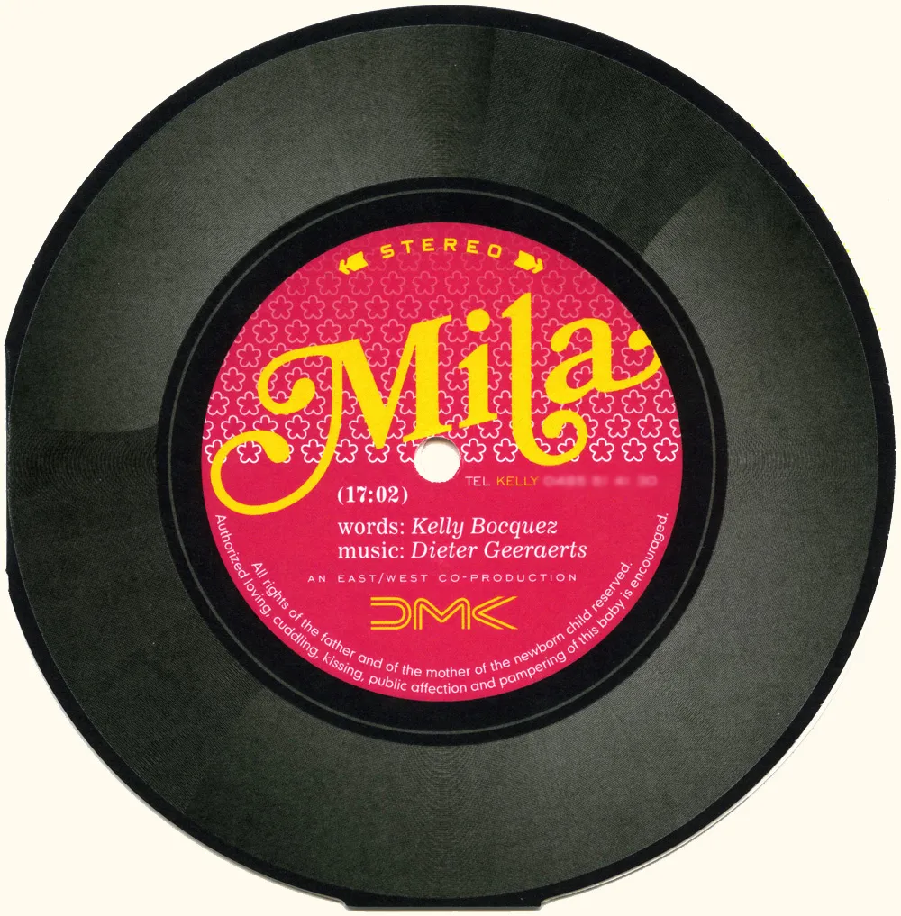
I got this birth announcement in the mail (all the way from Belgium!) that features Bookmania prominently. Designed by Yves Peters (of The FontFeed and elsewhere). Nice!
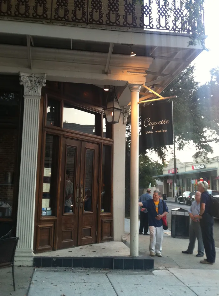
I had one of those moments that only a type designer can have last summer during TypeCon 2011 in New Orleans. After attending a gallery reception at Mystic Blue Signs, a group of us headed on foot in search of a particular recommended restaurant that was about six blocks away. When we were almost there we spotted this:
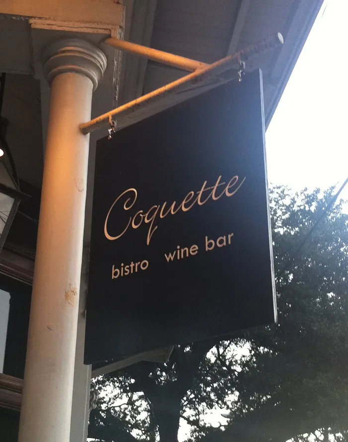
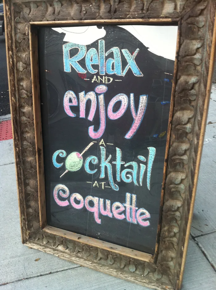
John Downer, who was with us, immediately went inside and got us a table. Normally, we would need a reservation, but apparently the idea that the designer of the typeface Coquette had stumbled onto upon the Coquette Bistro Wine Bar amused them as much as it did us.
The other diners (besides John) were Petr van Blokland, Roger Black, Delve Withrington, Ronald Arnholm, and William Berkson. The meal was excellent, which shouldn’t have surprised us. We learned later that it was one of the top-rated restaurants in New Orleans. Anyway, it made my day.
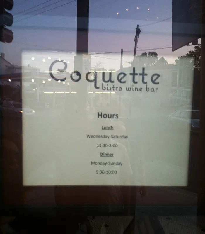
This hand-drawn chalk sign outside was cool:
I was surprised and delighted to see Mostra Nuova playing a supporting role in JibJab’s latest “Year In Review” video.

I know I’ve been lax in posting items to Notebook lately. Somehow, between Twitter, Typophile, and making fonts (mostly), I forget it’s here.
Anyway, a really cool thing happened last Wednesday: Lost World’s Fairs. It demonstrates the support of web fonts in the new Internet Explorer 9 for Windows, but it works equally well in most other desktop web browsers (not on mobile phone browsers yet, as far as I can tell). You can read about how it was put together on Jason Santa Maria’s blog.
The big surprise for me was that all three of the demo pages feature fonts designed by me, served via Typekit. Many of my fonts have been available for web use through Typekit for a while, but recently also through Extensis’ WebINK service, Fontspring, and Fontdeck. Note: WebINK and Fontdeck ceased operation in 2015 and 2016 respectively.
I saw the new Star Trek movie this last night and was thrilled to spot one of my fonts, Changeling, in a supporting role. Here are some examples from a couple of high resolution publicity stills for the movie:
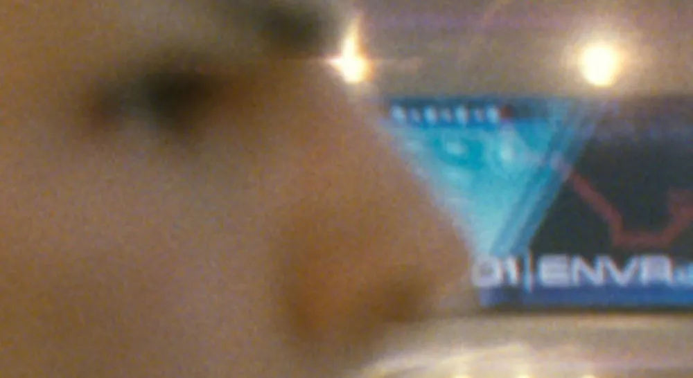
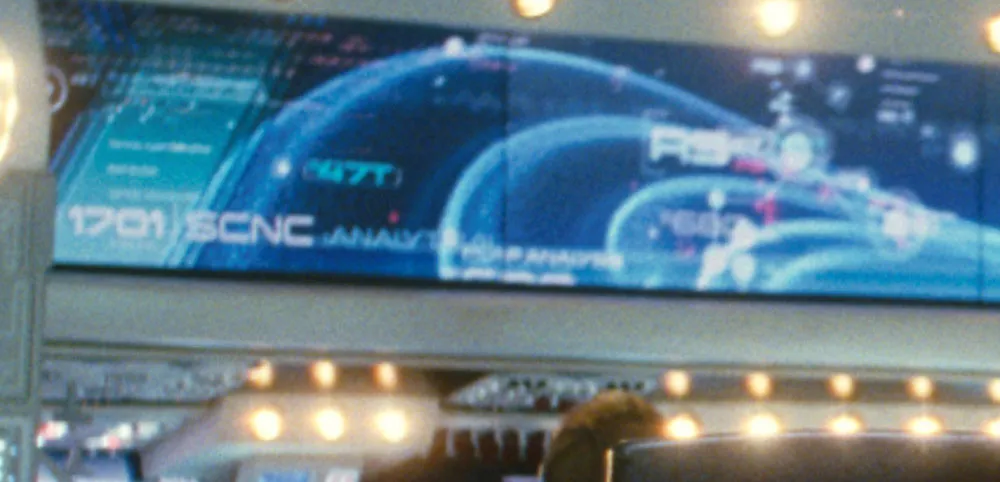
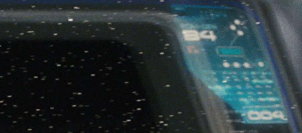
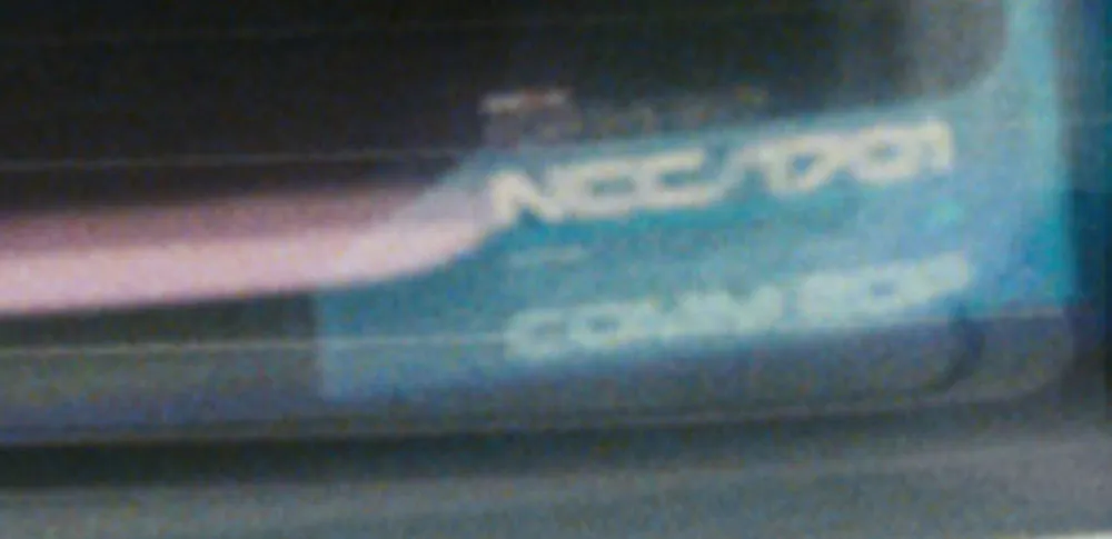
Changeling was a redesign and expansion of an old film font from the seventies called China. I added more weights, more styles, and more characters, as well as modifying the design as I saw fit. One of the more noticeable things I changed was the “4”, which is how I know it’s Changeling that was used in the film.
What’s funny about all this has to do with my choice of the name “Changeling”. It contains all the letters in the name “China” (I added things to it, get it?). A “changeling” refers to something that comes back in a different form, and this was a font coming back in a different form. It’s also the title of an episode from the original Star Trek t.v. show, something I was aware of when I chose the name—the sci-fi connection made me like the name even more, because of the way the font looks. Finally, that particular Star Trek episode was the basis for the first Star Trek movie.
Needless to say, I was in several kinds of geek heaven last night.
Ever since I started Notebook, I’ve been occasionally posting “font sightings” and I even have a special category for them. It worked okay, but the samples I’ve posted here have been kind of small, and I thought it would be really neat if, somehow, all the Coquette sightings could appear on the Coquette page, for example.
For a while I’ve had this idea of using Flickr as part of a new and improved Font Sightings system. I finally stopped thinking about it and did it. It was actually pretty easy, if a bit tedious.
I already had about a bunch of photos of font sightings in Aperture, and I picked about a hundred of the best ones. After spending some time naming and tagging them, I used the Aperture Flickr upload plug-in to get them all up on Flickr.
The second step was to add some special code (from Flickr) to the font pages and Notebook to display a set of three random sighting and provide a link to the appropriate photos on Flickr (see the top of the column to the right).
So far, I’ve only uploaded what I already had in Aperture. I still need to add all the stuff people have sent me over the years (thanks to all who have), plus all the stuff I don’t have photos of yet. Some fonts aren’t yet represented mostly because I didn’t have sightings of them in Aperture. These will be coming soon. Some of them, like the newer ones and poor old Sharktooth, I’ve just never seen used yet.
From now on, new font sightings will appear on Flickr and (randomly) on the right-hand column of Notebook and the font pages. The “Font Sightings” category for Notebook is basically dead. Long live Font Sightings!
If you have seen any of my fonts out in the wild, or maybe have created designs using them, feel free to send photos or scans to mark@marksimonson.com.