
 Christmas came early for me this year when I received the latest issue of Entertainment Weekly and saw my Mostra Nuova all over the cover. It’s always a big deal as a type designer to see my fonts in use, but this was a special treat. Not only was it the primary font on the cover, they also used it extensively on the big feature section inside.
The feature section starts out with a full page that uses nothing but type. Mostra Nuova is used both large and small, and not just all-caps. The first version I released in 2001 had only caps and I added lowercase in 2009. It’s still mostly used all-caps, so it always makes me happy to see the lowercase get some play.

EW’s designers also made extensive use of Mostra Nuova’s alternate characters, sometimes even in the same block of text. They used the Regular, Semibold, Bold, and Extrabold weights. Adding Semibold and Extrabold earlier this year was a good move. If I hadn’t, I imagine that Mostra Nuova might not have been chosen here. (Thanks to Matt Smith at Louise Fili Ltd. for suggesting I add Semibold.)

The section is comprised of spreads highlighting a particular entertainer (or entertainers) featuring a full-page photo and title page followed by a page of text. Sandwiched between these highlight articles are pages of shorter pieces featuring other individuals, two per page. (I’ve included a detail of the type treatment on the right.)

I thought it was really cool that they even used Mostra Nuova in the folios (page numbers).

The section closes with several pages about entertainers who died in 2020.

All in all, this is one of the most extensive uses of Mostra Nuova I’ve seen in a magazine. Unfortunately, Entertainment Weekly doesn’t print a staff listing, so I don’t know who to credit with the design and art direction. To whomever you are, nice work!
For some reason, a high percentage of sightings of Acme Gothic in use have been in science fiction movies and TV shows. Not what I would have expected at all for what I admit is a somewhat “retro” typeface. Then again, Bank Gothic, released in 1930, is super popular for futuristic sci-fi uses.
Here are the examples I’ve spotted so far:

In a brief shot in the HBO series Watchmen, Acme Gothic Wide Regular can be seen on the side of a Saigon police car it its alternate timeline of 2019 where Vietnam is the 51st U.S. state. Lucky thing I included Vietnamese diacritics.

Acme Gothic Extrawide Regular as seen very widely spaced in the first trailer for Tenet. The rotated palindrome concept was dropped for a straight treatment after it was discovered that there was a bicycle company called Tenet that had already used the same idea in their logo. Happily for me, they kept the Acme Gothic for the revised branding.

In what appears to be a spin-off of the Mandalorian Disney+ series, the logo for Star Wars: Rangers of the New Republic features Acme Gothic Extrawide Regular like Tenet, but much more tightly spaced with a brushed metal treatment.

As a type designer, it’s hard to anticipate how the fonts you make will be used. When I designed Coquette, I had only vague use scenarios in mind. I was thinking about traditional French scripts and Art Deco sensibilities primarily in terms of formal qualities. Coquette is not a connecting script, but it has many characteristics of connecting scripts. One of these details is the little blob on the inside of the lowercase “o”. It is an extreme simplification of a looping stroke that leads to the next character.
To me, things like this are purely formal when I’m making the font. I’m only thinking about how it looks. But once a font is in the hands of a graphic designer, other aspects may emerge.
Book designer Margot Boland sent me a cover she designed featuring Coquette with this story:
A Little Mormon Girl by Eva Hunter is autobiographical and deals with delicate subject matter of sexual abuse in the family. When I set up the word ‘Mormon’, the two o’s were designed to flutter coquettishly, and I had to advise the author of this. At first, she was against using the font, then suddenly came around, and said that it fully expressed some hard to get at nuances in the book.
I could claim that I meant for those o’s to look like coquettish eyes and, thus the name of the font, but I can’t. I honestly never really thought of those o’s that way. It’s almost too perfect. Like they say, hindsight is 20/20.
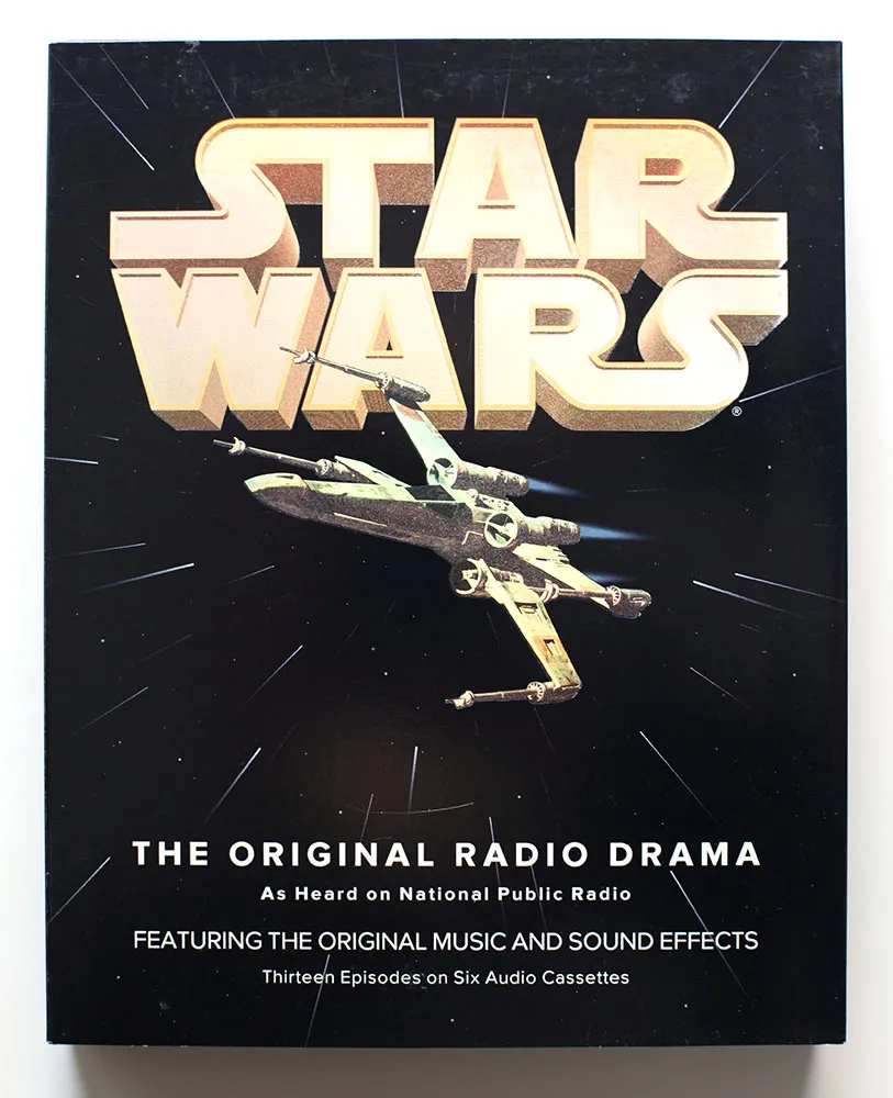
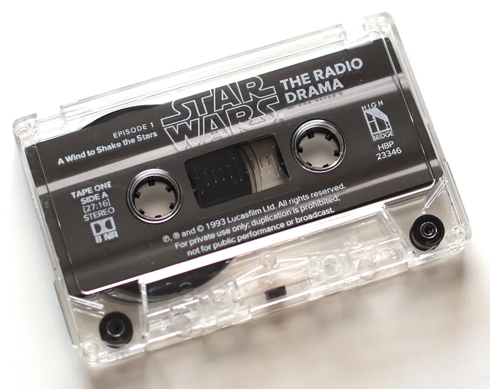
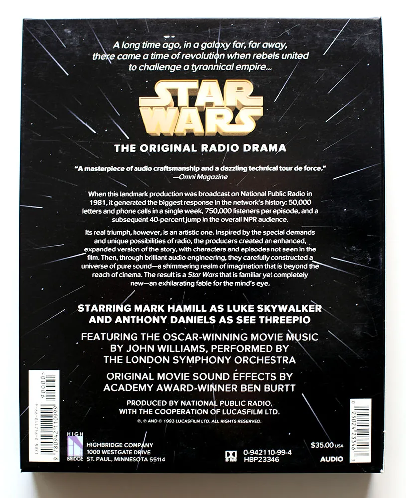
Back in 1993, I had just started a job at Rivertown Trading Company as a graphic designer. Part of that job was to design packaging for a division of the company called HighBridge Audio. One of the most interesting titles I got to work on was *Star Wars: The Original Radio Drama,*which had been broadcast on National Public Radio in the early eighties and was being released for the first time on audio cassette. (CD came later.)
It was one of the most elaborate packaging projects I ever worked on, with complicated die cutting and holographic foil embossing on the cover.
While working on the project, I was flown out to Skywalker Ranch near San Rafael, California, home of Lucasfilm, to rifle through file drawers of 35mm slides for possible use on the packaging. (My flight was delayed, so I missed out on having lunch in the same room as George Lucas.) Considering the rich visual imagery of Star Wars, it was surprising how little suitable photography they had for us to use. The complex visual effects only existed in the film, not in the publicity shots, which were taken on the set for the most part. The “stills” of, say, an X-wing fighter flying over the Death Star only existed as crudely retouched photos.
Back then I was also working an early version of Proxima Nova, which at the time I was calling Visigothic. I had tried some different fonts for the Star Wars packaging, including ITC Avant Garde Gothic and News Gothic, but nothing looked quite like what I wanted. On a whim, I tried Visigothic. It was plain (like News Gothic) and also a bit geometric (like Avant Garde). It felt a little weird using my unfinished type design for the project, but it seemed to work. I showed it to the other people I was working with and they thought so, too. So I used it.
I released the fonts about a year later as Proxima Sans. The version on the Star Wars packaging is fairly close the final version, although you can see from some of these images that the kerning was not quite finished. Also, the italic was just a simple slant of the roman, but with a modified lowercase “a”. Some other differences: the lowercase “y” has a longer tail and I hadn’t done the ligatures yet.
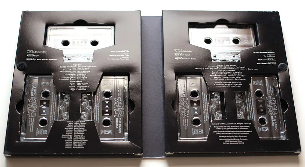
Someday, this font would become Proxima Nova, but this is the first time it was used publicly. It was exciting for me at the time to see how it performed in the real world, and it made me confident that it was worthy of releasing commercially.
If you ever wondered why Proxima Nova includes a ℗, now you know. On the CD version of the series, which I did in the late nineties, I used Proxima Sans, and I believe HighBridge has used Proxima Nova for more recent incarnations.
I created the 3D version of the Star Wars logo and the “hyperspace” star pattern in Adobe Illustrator and a program called addDepth. What I remember most about working on this project was how excruciatingly long it took to preview the artwork on the primitive Mac IIcx I had to work with at the time.
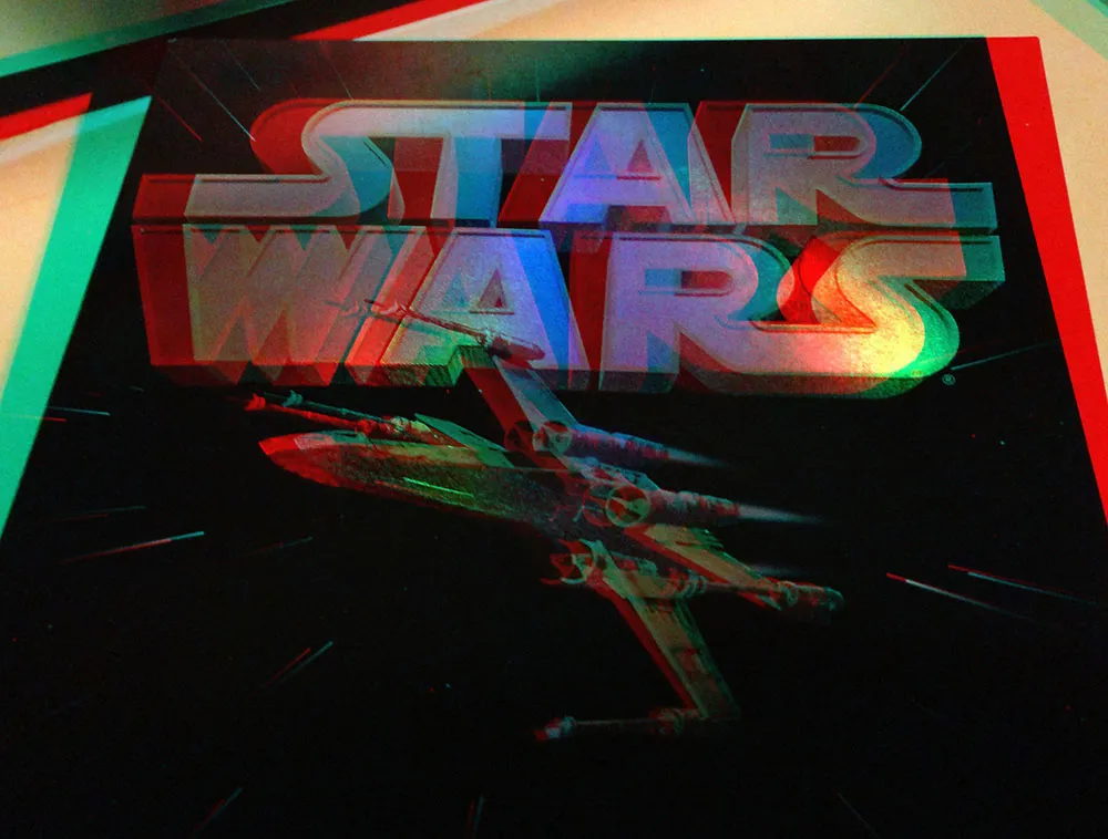
If you’ve got a pair of anaglyphic glasses (red/blue), this will give you a better idea how the holographic foil stamping looked.
Additional details If you’re interested in Proxima Nova and how it looks today, you can find more info, test and license the fonts, and download PDF specimens on the Proxima Nova page.
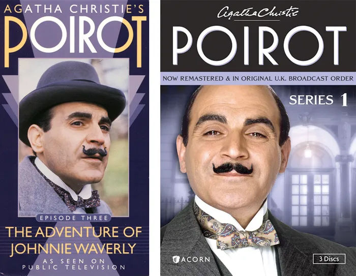
Back in 1991, I designed a series of packages for the American release of London Weekend Television’s Poirot series on VHS. (My design is above on the left.) As part of the design, I drew the name “POIROT” in a geometric Art Deco style, which I thought was fitting for the series.
The other day, I happened to see the latest incarnation of the series packaging (above on the right) and noticed that the designer had set the title in one of my fonts, Mostra, which I never noticed before is pretty similar to my 1991 lettering design.
I wonder if they knew?


Clark Kellogg, a furniture maker and letter carver in Houston, recently completed a commission for a sign for a friend and fellow cabinetmaker. He writes, “I was excited to do it, as it finally gave me a chance to carve something with your epic Goldenbook font. The client flipped out when he saw the sign, and liked the font so much he ended up using it for his business cards.”
Very nicely done!
(Photos by Clark Kellogg.)