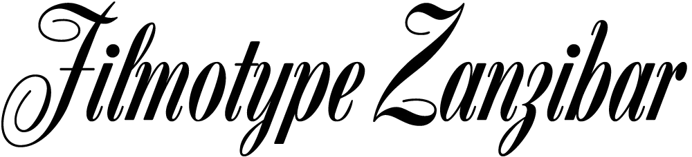
Zanzibar is the second Filmotype font I’ve digitized. (The first was Glenlake.) At first glance, I didn’t think much of it. But when I started looking more closely, I realized I’d never seen anything quite like it and decided I needed to do it.

That “Zanzibar” is nearly an anagram of “bizarre” seems fitting. The surviving people from Filmotype (later Alphatype) have not been able to tell us who designed this gem, so we have no record of the designer’s intentions. Released in the early 1950s, it seems somewhat inspired by the work of Lucian Bernhard (Bernhard Tango, 1934) and Imre Reiner (Stradivarius, 1945). At first, it appears to be a formal script, but there are no connecting strokes. It would be better described as a stylized italic, similar to Bodoni Condensed Italic or Onyx Italic, with swash capitals.
About those capitals: If they were plans for roller coaster tracks, they would either be unsafe or very exciting to ride. I have rarely seen such a whimsical combination of spirals and angles. Perhaps the happy result of one too many martinis?
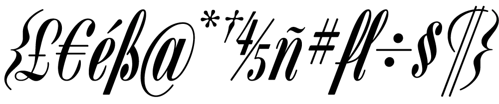
The overall effect—a mix of hairlines, swelling strokes, and dots—reminds me of musical notation. I kept this in mind as I filled out the missing characters. Film font designers had it easy. The original design included only caps, lowercase, numbers, and a minimal set of punctuation and currency symbols—about 70 characters. The digital version contains over 400 characters, including support for most Latin-based languages, math symbols (you never know), user-defined fractions (OpenType support required), and all the usual characters you expect in a modern font.
I also added a few alternate characters to address a design flaw in the original. The lowercase b, h, and k all have a little hook at the top that goes to the left. Unfortunately, when one of these characters follows an f or l, it causes an unsightly collision. Moving them apart only makes it worse. To address this, I created hookless versions of all three that come into play automatically when you enable the OpenType Contextual Alternates feature in your layout or graphics program.
I haven’t been posting much to Notebook lately because I’ve been, well, busy. The thing I’ve been busy with is this:
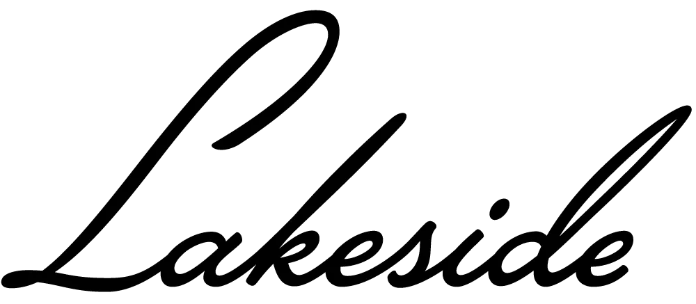
Lakeside is a script face I’ve been working on for the past two years. It was initially commissioned by an independent filmmaker for use in some film titles. It’s based on the hand-lettered titles of the classic 1944 film noir classic “Laura.”
An unusual feature of Lakeside is that it has three styles of capital letters suited to different uses:
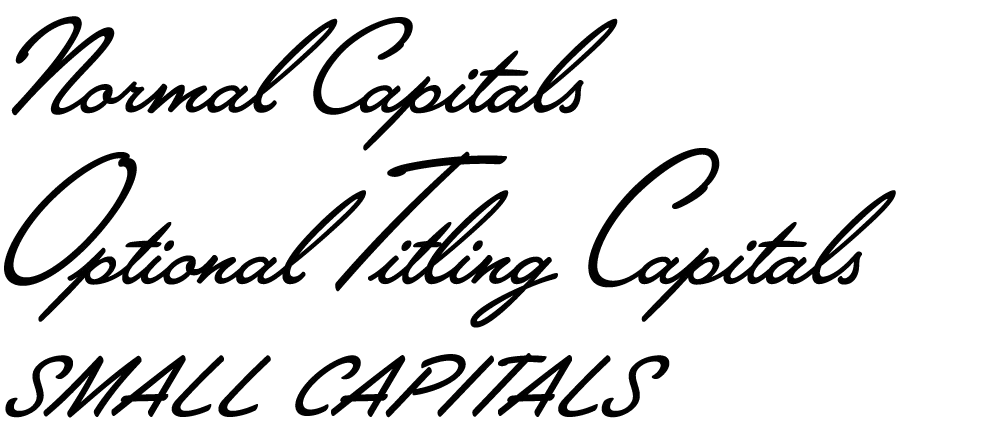
There are normal caps for, er, normal use; over-sized caps for a fancier appearance; and smaller, plainer caps for all-caps settings—something not normally possible with a script font like this.
Lakeside takes advantage of the OpenType format to put a virtual lettering artist at your fingertips. Here is the font with OpenType Contextual Alternates turned off and then on:
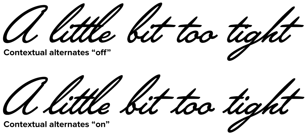
Notice how each letter tailors itself to its position within a word, using a different form depending on whether it comes at the beginning, middle or end. Notice also how the crossbar on the lowercase “t” seems to “know” about adjacent letters and adjusts its width appropriately. (It’s not actually “a little bit too tight,” it’s just that those words are good for showing how the magic works.)
For more information, see the Lakeside Specimen Sheet (496k PDF) and the Lakeside User Guide (1mb PDF).
Licenses for Lakeside can be purchased at Font Bros. Other venues will be added soon.
(Note: Last year I mentioned this font on Notebook when it was still under development. At that time, it was to be called “Launderette.” Unfortunately, that name was taken—twice—so I chose the name “Lakeside” instead.)
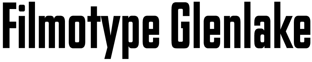
You could say I’m a Tim Burton fan. I’ve written elsewhere about some of the typographic anachronisms in his film Ed Wood, but I also think the titles in that film are wonderfully, typographically evocative—pitch perfect for the period in which the film is set. For a long time, though, I couldn’t figure out what the bold, condensed sans serif typeface was that they used in the titles.
I’m not easily stumped identifying typefaces, but this was one of only two times I’ve posted a query to the Typophile Type ID Board. In the end, I found it myself: Glenlake. (After I found it, I wondered if the Ed Wood title designers chose it because of the name—as in Ed Wood’s film Glen or Glenda… Could be.)
Still, Glenlake was something of a mystery. It popped up here and there in old film font catalogs, sometimes with a different name, but where did it come from? The more I looked at it, the more distinctive it seemed… a kind of Fifties precursor of Compacta or Helvetica Compressed (both Sixties designs).
So last year, when Stuart Sandler invited me to help digitize the classic Filmotype library, and I saw Glenlake was part of the library, I had to say yes. There are more of these funky/cool Filmotype faces to come—perhaps even more weights of Glenlake (it had only one)—including some really cool scripts that I’m working on.
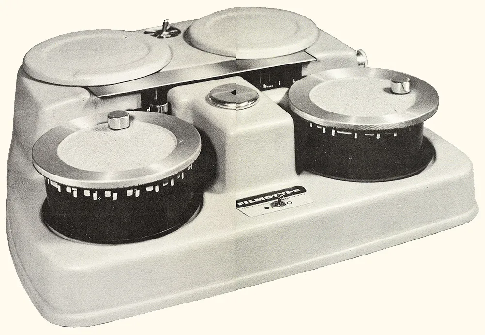
Above: One of the original Filmotype film font machines.
Of course, the old Filmotype fonts were made mostly in the Fifties, and they pretty much only did the basic character set—caps, lowercase, numbers, and some punctuation. The digital version is being released in the oh-so-modern OpenType format and includes a complete, modern character complement, suitable for setting type in most Latin-based languages. I even threw in alternate designs for the “a” and “y”—something that didn’t exist in the original Glenlake design, but was common in Filmotype’s other sans serif fonts.

So, there you have it. Filmotype Glenlake, a digital revival of a classic Filmotype font from the Fifties, available for online purchase from Font Bros. I think it’s a heck of a font, and one that I’m proud to have helped bring back from obscurity. (Be sure to check out the other new release, Filmotype MacBeth, a bouncy, casual serif design.)
Proxima Nova is now up to version 1.2 with a couple of new features:
-
It now includes supplemental fonts (in OpenType format) containing small caps/old style figures (ScOsf) and alternate characters (Alt) in place of the normal lowercase, figures, etc. This allows programs that don’t yet have proper OpenType support (Flash, Word, etc.) to access small caps, old style figures and alternate characters.
-
Previously unencoded glyphs have been encoded (private use area) to make it easier to access glyphs via Unicode in situations where OpenType feature support is lacking.
Customers needing either of these new features who purchased Proxima Nova licenses from my site (www.ms-studio.com) may contact me at mark@marksimonson.com for a free upgrade. Please include your DigiBuy order number.
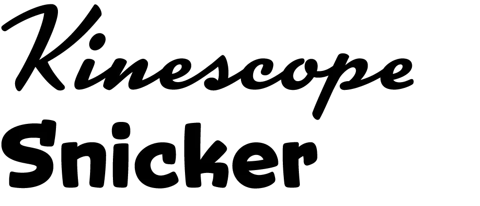
I’m proud to announce the release of two new display fonts: Kinescope and Snicker. Both fonts were inspired by hand-lettered titles in the old Fleischer Brothers’ animated Superman cartoons from the 1940s.
Kinescope uses advanced OpenType magic to choose the most pleasing character shapes as you type and features extended language support. (An application with advanced OpenType support required for the magic stuff.) To find out more, check out the Kinescope User Guide (1.6mb PDF).
Advanced OpenType support is not required by Snicker, but it has some tricks up its sleeve, including case-sensitive punctuation, automatic fractions, and extended language support. To find out more, check out the Snicker User Guide (1.2mb PDF).
For the first month, Kinescope and Snicker will be available as low as $29 each exclusively from Font Bros. Follow these links for more details:
June 1 Update: Kinescope and Snicker are now available here at Mark Simonson Studio as well.