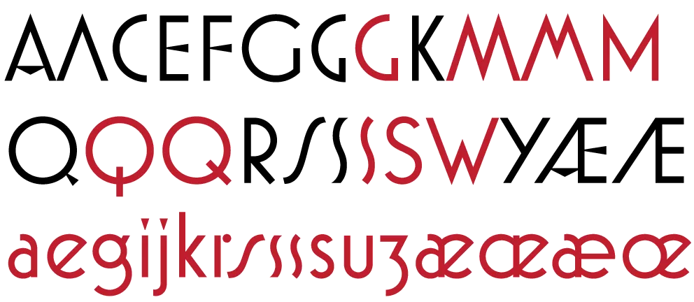
For the last four years, I’ve been working on a revival of the classic ATF Bookman Oldstyle and the Bookmans of the 1960s. But it’s not a slavish replica. It’s my own idea of what Bookman could be. It’s the revival I always wished someone would do.
I thought about doing a cursive italic, like others have tried, but in the end I decided that the original slanted roman should be preserved. Bookman has always been known for its swashes, so I also made a superset of the dozens of swash characters that have been added to Bookman over the years.
I wanted to go beyond its past and make something new. I added things that Bookman never had like small caps, old style figures, alternate characters, ligatures, stylistic sets, extensive language support, and more.
The family is composed of five weights—Light, Regular, Semibold, Bold, and Black, plus italics.
It’s my love letter to the classic Bookman: Bookmania.
Coming soon to all the places you can get my fonts.
Follow @marksimonson on Twitter for updates on availability.
Update: Now available at Fontspring. Other distributors to follow.
I’ve also updated my website and added a page for Bookmania here where you can download a PDF specimen booklet.
One of my favorite bloggers, Jason Kottke, posted an item and link today about a story on the NPR site about “the longest word in the English language”.
This piqued my interest. When I was a kid I used to watch the Mike Douglas Show every afternoon after school. One time he had some sort of word expert on the show who revealed what the longest word was. I was impressed and taught myself to pronounce it correctly (still can).
Was it still the longest word? Sure enough, it was in the article:

Well… not the longest word anymore, if it ever was.
But then I noticed that all the “long words” in the article were set in one of my fonts—Felt Tip Woman! (My partner, Pat, whose handwriting was the model for Felt Tip Woman, loves words and language, not to mention NPR, and thought this was pretty cool, too.)
So I memorized a word that’s not really as special as I thought it was. On the plus side, NPR is using one of my fonts, so I’m happy anyway.
If you pay close attention, you may notice two additions to the list of fonts over on my site: Diane Script and Filmotype Honey. I’ve been meaning to add these for a while (a long while in the case of Diane Script).
Diane Script (and Diane Script Première) were released in late 2008 through FontHaus, who commissioned me to digitize them. More about Diane here.
Filmotype Honey is my latest contribution to the Filmotype project and was released on the Font Bros site back in February.
Mozilla announced today that it is going to include support for WOFF fonts, a font format designed for use on the Web, in Firefox version 3.6. I support this format and plan to allow my distributors to license WOFF fonts to customers.
At this point, Firefox is the only browser to support this format, so it’s not quite ready for prime-time yet. But there is a lot of support for this in the font industry, and hopefully the other major browser makers, Apple and Microsoft, will join in soon.
I’m pleased to announce the release of Anonymous Pro Version 1.001. This version contains mostly user-requested tweaks and fixes, including:
- The comma and the comma part of the semicolon have been moved down about a pixel (depending on the size) to improve clarity.
- The design of the “quotesinglbase” and “quotedblbase” match the look of the “straight” quotes (the earlier designs didn’t match anything).
- The periods and other “dot” punctuation elements are a bit bigger in some bitmap sizes/styles.
- Fixed the hinting problem that caused the tops of the caps to vary in height a certain sizes on Windows (hard to figure out the reason, but easy to fix once I knew).
- Corrected the 13ppem bitmap glyph for the Greek character “omicrontonos” (which, embarrassingly, sported an umlaut).
And last, but not least:
- I dropped my old DIY license and switched to the SIL Open Font License, which should make a lot of users in the open source community happy.
Small note to Windows users: I haven’t updated the sample that shows what Anonymous Pro looks like in text sizes on Windows with ClearType enabled. It looks better than that now. I’ll update it soon.
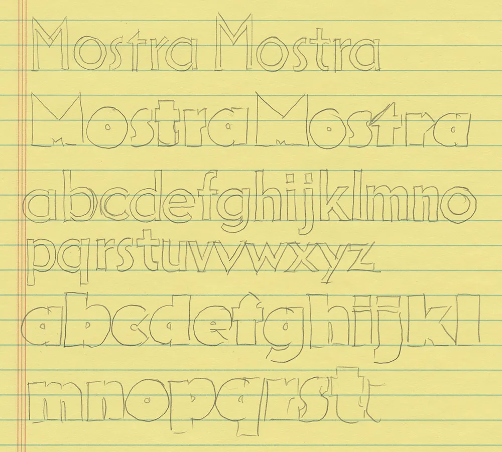
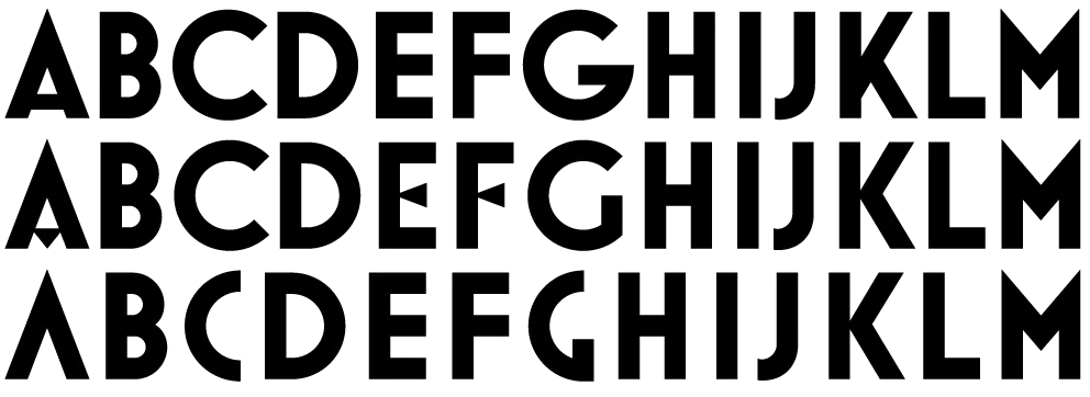
Mostra (2001) was originally conceived as a caps-only font. The source for its inspiration, lettering on Italian Art Deco posters from the 1930s, rarely included lowercase letters. Nevertheless, not long after I released it, I started thinking about what a lowercase for it might look like.
As OpenType fonts grew in popularity and acceptance, an OpenType version of Mostra, with its many alternate characters, seemed inevitable. Separating the alternates across three fonts for each weight was the only practical solution back in 2001. This worked okay, until you wanted to combine alternates from the separate fonts. It’s simply not possible to provide kerning pairs between characters in different fonts. And I did intend for the fonts to be used in this way, not only as separate fonts.
When it came time to develop an OpenType version of Mostra, combining the three fonts into one was the main idea, and it would have been simple enough to go that route, but then I remembered the idea of adding a lowercase. After making some trial designs, I decided it was worth the extra effort.
Of course, it takes time to add all those new characters, and the mind tends to wander. Before I finished designing the lowercase, I had thought of even more alternate characters for the uppercase. And, of course, many of these required analogs for the lowercase as well. Upshot: Lots of new characters.
And then I decided to add a sixth weight. I’d been looking at some hairline fonts for some reason and I suddenly thought, wouldn’t it be great if Mostra Nuova had a hairline weight? Yes, it would.
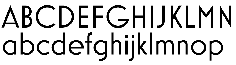
Mostra had 26 capital letters plus 15 alternates. Mostra Nuova has 52 upper- and lowercase letters plus 40 alternates. In the original version, the number of possible letter pair combinations was 650. The number of letter pair combinations for Mostra Nova is 8372. This meant that the number of kerning pairs needed would increase by more than ten fold. Times six weights. This didn’t quite sink in until I was well into kerning. Did I mention that I thought I expected to be done last April? But it was worth it in the end.

Of course, Mostra Nuova has much better language support, covering most Latin-based languages in Western and Central Europe. It also has a special feature so that when you change something to all-caps, things like hyphens and bullets are automatically centered on the height of the caps rather than the lowercase.
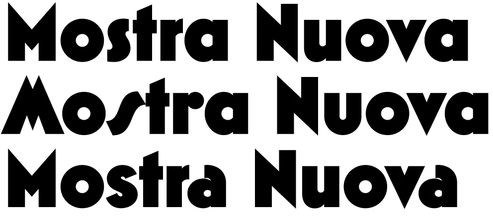
All in all, Mostra Nuova is a much more versatile font than its predecessor. Available now.