Viroqua’s ancestor, Excalibur, hand inked.
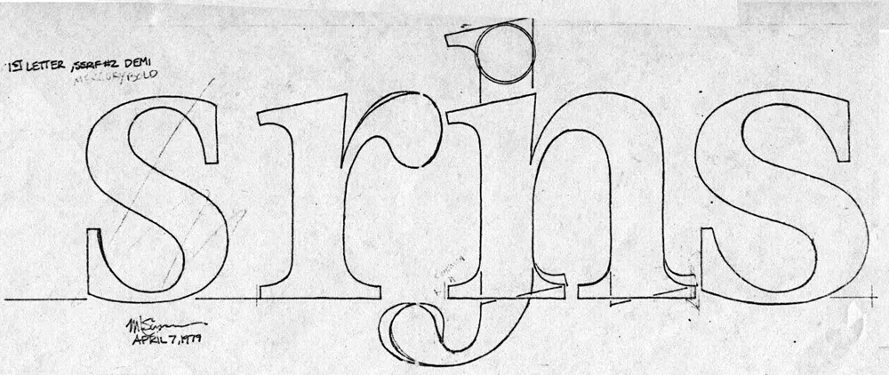
I released Kandal in 1994. It’s one of my earliest typeface designs, going all the way back to an earlier design in 1978, which I submitted it to International Typeface Corporation (ITC) under the name “Excalibur”. It went through a couple of iterations before the one I submitted, variously influenced by the work of Hermann Zapf and Jim Parkinson. I honestly had very little idea what I was doing—a case of overestimating what I knew and underestimating how much was left to know. By a large margin. Excalibur was understandably rejected by ITC. It had lots of problems and I resolved to improve my knowledge and skills before trying to submit something to them again.

Fast-forward to 1990. I never did submit any more typefaces to ITC, but I did have lots of ideas and sketches and practice drawing letters. I also got a Mac in 1984 and Fontographer in 1987 and started trying to make PostScript fonts. One of my ideas was to revisit Excalibur, simplifying the design and addressing its many flaws. This became Kandal. I was also working on Proxima Sans, the predecessor to Proxima Nova, around the same time, and a few other ideas, some of which are still on the drawing board.
Kandal has never been one of my popular typefaces. It’s not surprising, given that it was such an early design, made when I had very little experience making fonts. I probably should have pulled it from my library, but I kept thinking I would come back to it and fix it, like I did with Proxima Sans.
Thirty years later, it’s finally happened. The new version is reworked from the ground up, so I decided to give it a completely different name, instead of something like Kandal Nova. “Kandal” was my paternal grandmother’s maiden name and the town in Norway her family was from. The new name, “Viroqua”, is the town in Southwestern Wisconsin where she was born and raised.

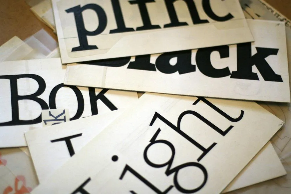
Viroqua is an improvement over Kandal in every way I could think of, while retaining its core design concept: A hybrid combining modern proportions, Jenson-like details, and a bit of slab serif DNA. Nearly every character has been reworked or refined. The original italic especially suffered from my lack of experience as a type designer. I basically started over. I’ve got three more decades of experience and I hope it shows.

Viroqua also has a wider range of weights, seven in all, going from Thin to Black.

Viroqua features many typographical niceties missing from Kandal, such as small caps, old style and lining figures (both proportional and tabular), superscript and subscript figures, fractions, and dingbats. Viroqua also supports most Latin-based Western and Eastern European languages, plus Vietnamese.
Viroqua is available now. More information here.
One of the ideas on my back burner for a long time has been to add wide styles to Proxima Nova. Condensed and Extra Condensed have been there since the very beginning, but it was missing styles wider than the normal width. It was an obvious thing to add and would make the family even more versatile.
I did some rough preliminary work in 2012 and 2015, but didn’t put serious effort into it until last September, after I finished Dreamboat. The good thing about setting a typeface aside is that, when you come back to it, you can see the problems much more clearly. One of the things I learned when I was a graphic design student is that it’s easier to redesign something than to design something, and that was definitely the case with Proxima Nova Wide.
One of the things I changed was to make it even wider so that I could add two wider widths—Wide and Extra Wide, just as there are two narrower widths. Including the italics, this adds 32 new styles to Proxima Nova (16 for each width).

Naturally, the new styles include all the features and characters of the existing styles of Proxima Nova. I’ve also made a few improvements and tweaks to the existing styles. All of this amounts to a major release: Proxima Nova 4.0. It’s currently available for sale here or for activation in Adobe Fonts.
You can find more info, test and license the fonts, and download PDF specimens on the Proxima Nova page.
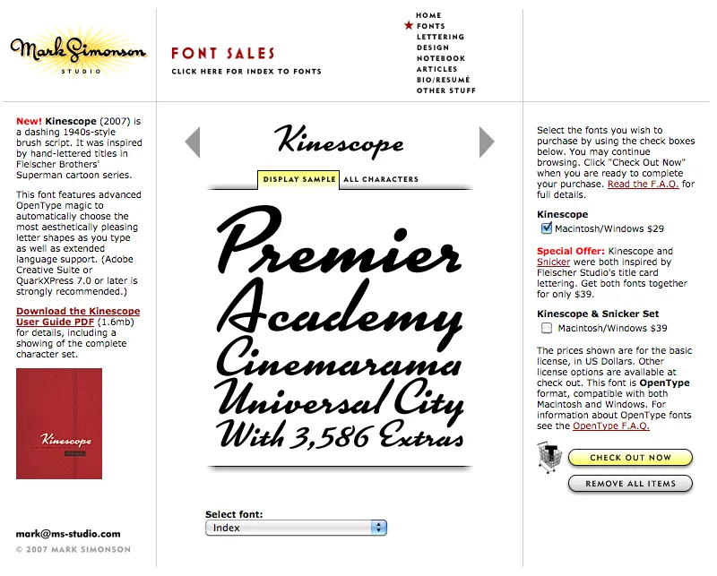
Party like it’s 2007. Note the shopping cart on the right side.
At one time, early in the history of Mark Simonson Studio, I sold fonts directly from my website. This was back in the early 2000s when there weren’t a lot of options.
I started selling fonts on the web in 2000 using third-party sites, first through Makambo (which closed its doors not long after I signed up), followed by MyFonts (2001), FontHaus (2001), Agfa/Monotype (2004), FontShop (2005), and Veer (2005).
In 2004, I decided to also sell fonts directly, using a service called DigiBuy, letting me get a bigger part of the retail font price, but also to simplify the purchasing experience for customers.
It was good while it lasted. Quite often, my site brought in more income than my best distributors for a given month. But in 2007, DigiBuy was shut down. The alternative they offered was tailored for selling shareware software, and was a poor fit for selling fonts. At the time, my distributors were doing well enough for me, so I made the hard decision to stop selling fonts directly and sell only through third parties.
Fortunately, my distributors soon took up the slack. And, to be honest, I was glad to have the burden lifted from my shoulders. When you sell direct, that means doing customer support. As a one-person business, this was taking a lot of my time. The new arrangement let me spend more time working on fonts. It was a fair trade-off.
Fast forward to 2021, and Mark Simonson Studio is now part of The Type Founders. TTF has the resources to bring direct sales back, and that’s just what they’ve done. If you have a favorite vendor, by all means use them. But if you want to get your fonts direct from the source, now you have that option.
The way it works is, each font page has various “buy” buttons. Click on any of these and a slide-over will appear that lets you select license types, term or other options (if applicable), and which fonts you wish to purchase. Note: Click on the styles to add them. Once you’ve made your selection, click on the “Add to cart” button. You can check out immediately or close the slide-over if you want to select other fonts before checking out. Once you’re ready to check out, just follow the instructions.
If you’re not sure what kind of license to choose, this page should help. My standard licenses for desktop, web, and apps can be seen here.
And if the kind of license you want is not one of these standard ones, drop an email to info@marksimonson.com.
Pretty simple. (Well, as simple as it can be.)
But that’s not all: Remember the static style previews I’ve had on my site for the last ten years? Gone, replaced with live, editable font previews for each style. This makes it easy to see if a font will work for, say, a company name or a headline.
Note: A few of the typefaces listed on my site are not available for direct sales, because I did them for another type foundry who own the fonts. These include Diane Script (Fonthaus), the Filmotype fonts, and HWT Konop (Hamilton Wood Type/P22). Links to where you can purchase are provided. And of course, you can’t buy Anonymous Pro because it’s free to use.
Finally, the list of fonts is now in alphabetical order, instead of newest releases first, which should make it easier to find the fonts you’re looking for.

I’ve been interested in the classic script style of the early 20th century for as long as I’ve been drawing letters. It was commonly used in logos and trademarks, meant to convey the idea of a signature. Think: Ford. Coca-Cola. Coors. Blatz. Schlitz. Rainier. Campbells soup. Any number of baseball clubs. The style was revived in the 1960s, sometimes evolving into psychedelic or pop-art forms.
There have been fonts from time to time based on this script style, but quite often they have more of a sixties or seventies look. I decided to try my hand, hoping to get closer to the early 1900s feel.
In 2004, I pitched the concept to House Industries. They liked idea, and we made a deal to develop the script, along with a sans and a serif, all with a “sports” theme.
Working with Ken Barber, I was impressed with his commitment to quality and detail. I thought I was an okay type designer at the time, but my experience with Ken significantly raised my standards on all the fonts I’ve done since then. Unfortunately, the project languished due to other priorities at House and was eventually put on hold.
Around 2012, I decided to resume work on the script on my own. At that point, only the lowercase and a few caps had really been drawn, and I was really itching to design the rest of the caps.
In 2017, I showed Ken what I’d been up to with the script. I asked if he thought House was ever going to get the project going again, and, if not, could we amend the agreement to allow me to release it myself? Long story short, House agreed.

With the script fully in my hands, I stepped up the pace to finish it. Five years later, the result is Dreamboat.

Back when I was working on it with House, there was only a single bold weight. To provide more flexibility for designers, I expanded this to six—Light, Regular, Semibold, Bold, Extrabold, and Black. (Dreamboat might be the only script in its genre with such a wide weight range.)

One of the things that bug me about a lot of script typefaces is lack of a solution to situations where you need to set something in all caps, such as roman numerals or acronyms. For that I added small caps.

There is also a stylistic set which raises the cross-bar of the lowercase “t” and extends it for more of a custom look.

To top it off, Dreamboat includes three styles of tails—an element quite often used with bold scripts.
Check out the User Guide to see how it all works. Tip: Many of my vendors have type testers where you can type your own text and see how it looks. The tails work by typing one or more underscores at the end of a word. Just make sure that ligatures are enabled on the site (sometimes they are not).
I never dreamed when I started that it would take nearly 20 years to finish Dreamboat. But, to be honest, I’m glad it did because it was really beyond my skills when I first started working on it. It’s been one of the most enjoyable typefaces to design, and I’m excited to see what people will do with it.
Dreamboat is available at all the usual places for desktop, web, and other uses.
Not long after I released Proxima Nova in 2005, people started asking me: “What serif font would work best with Proxima Nova?” It’s very common to combine serif and sans serif typefaces, usually a serif face for text and sans serif for larger sizes or for emphasis or change of tone in text. I usually suggested a modern, such as Century Schoolbook, or a slab serif, such as Rockwell. None of my suggestions felt like a satisfying answer to me, so I started thinking about designing a serif sibling to Proxima Nova.
After some false starts over many years, trying to add serifs to Proxima Nova somehow, I decided instead to create a serif companion—a face that is not simply a seriffed version of Proxima Nova, but a serif typeface designed to harmonize with Proxima Nova, while having its own structure and identity, similar to the way that Morris Fuller Benton’s Century faces harmonize with his Franklin Gothic and News Gothic.
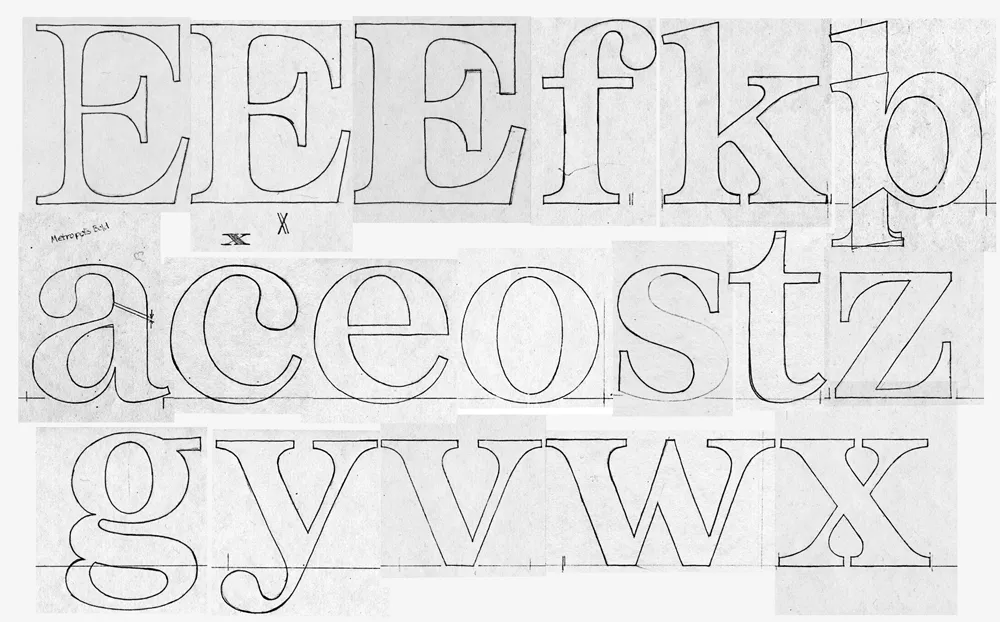
Back in 1979, when I was first dreaming about making typefaces, and around the same time I had the earliest ideas for what would become Proxima Nova, I did some sketches based on the concept of combining the characteristics of several popular serif typefaces—Times, Plantin, Century, and Baskerville—but with proportions similar to Helvetica. The working name was “Metropolis.” Proxima Nova was based on a similar hybrid concept, but with sans serif typefaces. The idea of using something that came out of the same period and the same thinking as my concept for Proxima Nova made sense.

In 2020, I went to work and adapted “Metropolis” as a companion to Proxima Nova, changing some of its details and proportions to harmonize better with its sans serif counterpart. The overall style falls more squarely in the modern category than my 1979 concept, but it retains some old style elements, such as the spurless serifs on the C, G, and S and the structure of the numerals.
The result is Proxima Sera.

Proxima Sera 1.0 contains a subset of the Proxima Nova character set (Greek and Cyrillic are still to come), but it has all the same features—small caps, old style figures, alternate characters, etc. There also is only the regular width. Condensed and Extra Condensed will come later. It has all the same weights, from Thin to Black, plus one more—Extralight.
Proxima Sera works beautifully with Proxima Nova. But, of course, like Proxima Nova, it can stand on its own or play nice with other fonts.
Proxima Sera is available immediately for licensing at most of the usual places.
Have you ever wondered what serif font would work best with Proxima Nova? I’ve often been asked this question, and I never really had a good answer.
That’s about to change.
I’ve been working on something new and I’m going to be talking about it for I Love Typography’s inaugural Font Fashion Week which celebrates the latest trends in type design today. I will be giving a 30 minute online talk on April 5, 2022 to showcase what I’ve been working on and the process that went into its creation, and I invite you to attend (click here to attend). The talk is free and you may share this link with friends and colleagues if you think they would be interested.
Hope to see you there!
Update: It’s Proxima Sera. You can watch the talk on Youtube now or read it alongside my slides.