
Yes, I know. I haven’t been posting a lot on Notebook lately. There’s a good reason for this: Proxima Nova. That’s what I’m tentatively calling the new improved version of my ten-year-old Proxima Sans, one of the most ambitious font projects I’ve ever undertaken. Here’s how it looks so far:


Ever since I released it in 1994, I’ve had in the back of my mind larger plans for Proxima Sans. Small caps. More weights. Condensed styles. After some potential customers asked about such possibilities early last year, I decided it was time.
The new version will have more than new weights and features. I went over every character, refining and retooling the design, adjusting, perfecting, cleaning up. In short, this is completely new set of fonts.
Proxima Sans
Released: 1994
3 weights, 2 styles
6 fonts total
PostScript Type 1, TrueType
Basic Western Latin
245 characters
Proxima Nova
To be released: Soon
7 weights, 2 styles, 3 widths
42 fonts total
OpenType
Extended Latin (including CE)
699 characters
699 characters? You read that right. Take a look:

All the characters from Proxima Sans are still there (even the dingbats). But there’s loads of new stuff, and every weight has all this in it, all in one font. No separate “expert” fonts needed.

In order to keep these hundreds of characters under control, Proxima Nova will be released in OpenType format. Using popular graphics software like Adobe’s Creative Suite and (real soon now) QuarkXPress, you will be able to tap into sophisticated typographic effects such as:
- True small caps
- Lining and old style numbers
- Proportional and tabular numbers
- Automatic “f” ligatures
- Alternate character designs for some characters
- Automatic fraction creation
- True superscript and subscript characters
- Automatic ordinal formatting (e.g., 1st, 2nd, etc.)
- Case-sensitive alternate forms for parentheses, brackets, etc.
- Alternate forms of certain characters to match small caps and old style numbers
- Cross-platform compatibility
As to how soon Proxima Nova will be available, it’s difficult to say. The roman styles shown here are in the final stages of completion. It mostly depends on how long it takes for me to finish the italics. Sure, I could just hit the “slant” button and be done with it. But, it’s not so simple to do it right. Best guess: Spring 2005.
6/24/05 Update: If all goes as planned, Proxima Nova will be released by the end of June 2005. I’ve updated the graphic above showing the various weights and styles to include the italics. Also, the weight and style names are slightly different than what I originally announced here in March.
6/30/05 Update: It’s available now.
 Permalink

For over ten years, Grad has been trapped inside Phil Martin’s old DOS computer. Now it’s out.
Phil Martin designed over 400 typefaces from the late 1960s through the 1980s, most of them released as film fonts for the VGC Typositor and licensed exclusively to franchised typesetting houses. Grad is Phil’s first and only foray into digital type. He designed it around 1990 for his own use. He conceived it as a redesign of the classic Century Schoolbook. Unfortunately, Grad only existed in an old and obsolete font format.
In early 2004, Phil approached me with the idea of doing an outline version of Grad for general release. I set to work using laser prints of Grad provided by Phil and samples of the original ATF Century Schoolbook. The result is a family of three OpenType fonts with advanced typographic features such as real small caps, ligatures, old style numerals, swash alternates and more.
See more info about it here.
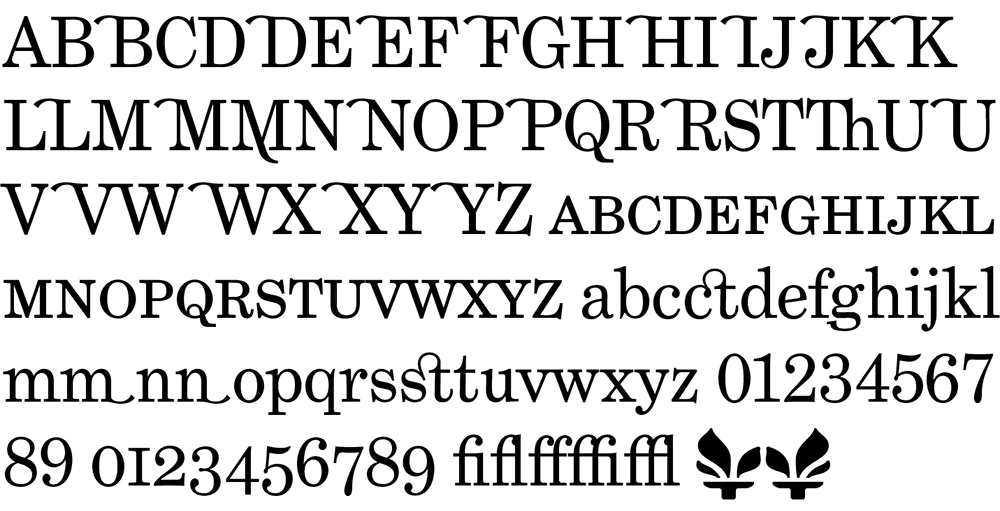
In case anyone’s wondering why I’ve been posting items less frequently lately, it’s because I’ve been working on fonts. The family closest to completion is Phil Martin’s Grad. It consists of just three fonts (plain, italic, bold), but I’ve been getting a little carried away and have added small caps, ligatures, old style figures, swash characters, and even a few dingbats (see above). All of these existed in Phil’s original private version of this face which he used for a couple of newsletters he published in the 1990s. If one had a mind to, one could recreate Re:Language, Millenium Memorandum, or even Phil’s personal stationery. Yes, some of the characters in Grad are…unusual. But that’s Phil for you. Ever the iconoclast.
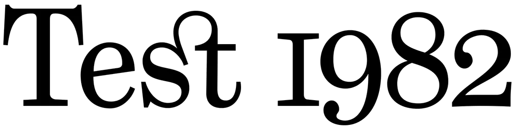
Some might say that Grad is nothing but Century Schoolbook in drag. There is some truth to that. And I think Phil would even agree. But looking over Phil’s output from the late sixties through the eighties, this is the kind of thing he does best. I have come to the conclusion that Phil is the George Barris of type designers. Phil’s best-known faces were redesigns, customizations, or hybrids of existing—often classic—faces. In the type world, such an approach to type design is sometimes looked down upon. Yet Phil is very good at it. He considers Grad one of his best.
Grad is an unusual font for me to develop. It’s not a design I would have conceived myself. Nevertheless, it’s turning out very nicely. I’m putting everything I know into making it a well-tuned machine that works as well for text as for headlines. In order to accommodate all the extra characters Phil designed, I’m planning to release it in OpenType format. This will mean that things like the real small caps and alternate characters will be accessible from a single font in each style. I plan to also do Grad Condensed at a later date, completing the family.
In the mean time, I have other fonts in the works, including a re-release of Proxima Sans. The new version will have more weights (lighter, bolder, and more in-between) as well as condensed and semi-condensed styles. Plus small caps and other typographic niceties. More information on this as it develops.
For more about Phil Martin, see my interview with him on Typographica or visit his personal website. [Update: Phil died in 2005 and his original site is long gone, but I’ve linked to an archived version on archive.org.]
2. Mostra
3. Coquette
4. Changeling
5. Proxima Sans
6. Refrigerator
7. Goldenbook
8. Kandal
10. Blakely
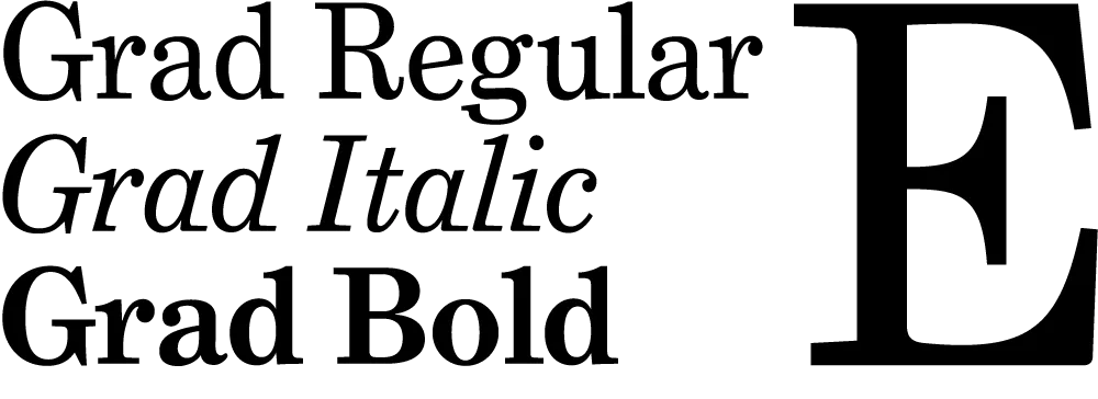
One of the fonts I’m getting close to finishing is Grad, the most recent type design of Phil Martin. Phil designed it in the early 1990s for use in a newsletter he published called Re:Language. Until I started work on it earlier this year, it only existed as a set of bitmap fonts on Phil’s old DOS computer, and it only worked with the old desktop publishing/word processing program XyWrite.
Grad is essentially an enhanced and augmented version of Century Schoolbook. While Phil did his version by modifying bitmaps of the Bitstream version of Century Schoolbook, I went back to original American Type Founders specimens, creating my own version of Century Schoolbook, rather than relying on existing digital versions. My Century Schoolbook fonts won’t be released, but were used as the basis for the new Grad.
Stylistically, Grad is similar to late nineteenth century faces like Ronaldson or Bookman, with other touches that could only come from the mind of Phil Martin. In the initial release, there will be three styles: Regular, Italic, and Bold (as shown above). There is also a condensed style planned for later release.
If you want to see it in action in text, here is a PDF from Phil’s website (a chapter of his on-going autobiography) which is set in the final PostScript Type 1 versions of the fonts. [Update: Phil’s website no longer exists.]
I’m doing Grad at Phil’s request, but I will be marketing it in the usual venues and splitting the revenues with Phil.