Mark’s Notebook - Page 23
If you pay close attention, you may notice two additions to the list of fonts over on my site: Diane Script and Filmotype Honey. I’ve been meaning to add these for a while (a long while in the case of Diane Script).
Diane Script (and Diane Script Première) were released in late 2008 through FontHaus, who commissioned me to digitize them. More about Diane here.
Filmotype Honey is my latest contribution to the Filmotype project and was released on the Font Bros site back in February.
Craig Eliason has been writing a pangram almost every day for over two years on his site The Daily Pangram. For the last week, they’ve been about me or my fonts, which is quite an honor.
Pangrams are tricky enough to write without having to keep track of all the letters, so Craig uses my Pangrammer Helper so he can focus on the creative part of the task. He’s gotten quite good at it.
Craig and I both work in St. Paul, so we see each other from time to time, traveling in similar circles (he teaches art history at the University of St. Thomas and is learning to design type).
I should really just end this with a pangram, except I can’t quite think of any words that fit that have a z. Hmm…
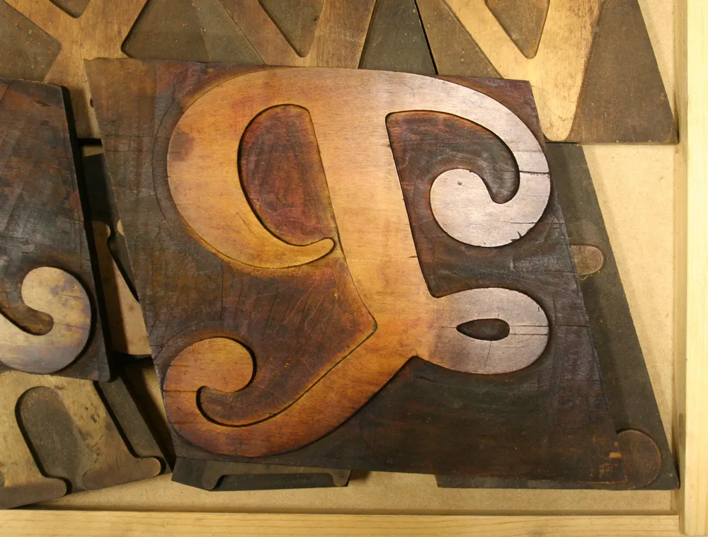
Large (about 6 inches tall) wood type “P”, seen at the Hamilton Wood Type & Printing Museum, Two Rivers, Wisconsin, on March 31, 2009.
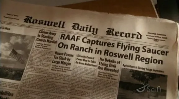
Reader Ivan Philipov sent me this still from Steven Spielberg’s 2002 science fiction television series “Taken”. The newspaper is supposed to be from 1947, but the headline font, Adobe Myriad, didn’t exist until 1992.
Last Friday, I spent the afternoon frantically trading files with Peter Bruhn (of Fountain type foundry in Sweden) for an exhibition match of Layer Tennis. The basic idea is to pass a layered Photoshop file back and forth for ten “volleys”, about one every 15 minutes. The resulting “volley” image is displayed live for the world to see, with running commentary (in this case by the witty and capable Grant Hutchinson.
What may not have been obvious to some was that the Photoshop compositions were not where Peter and I were spending most of our time (well, maybe in some cases it was obvious). In fact, we were designing, building and generating fonts in FontLab, and then using them in Photoshop. With most of the volleys, we started from the font that had been built in the previous one.
Although the images created in Photoshop were the ultimate public face of the match, I thought it might be interesting to show what was going on behind the scenes with the fonts.
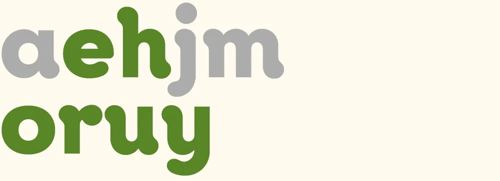
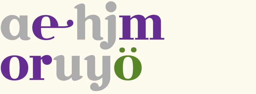
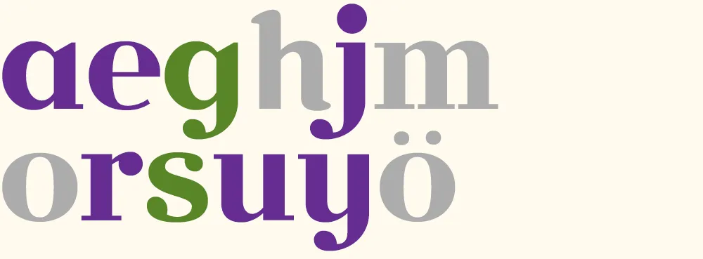
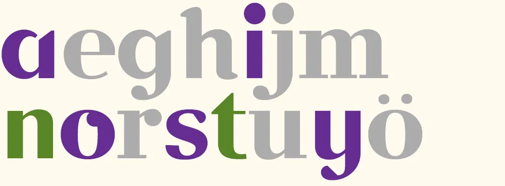
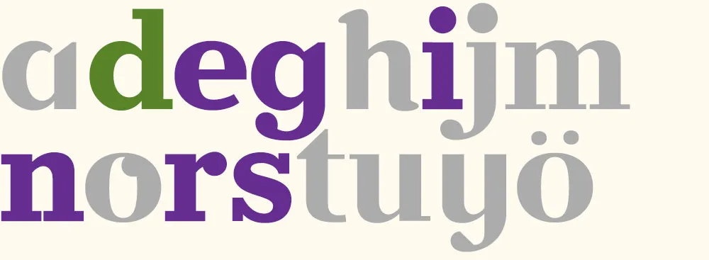
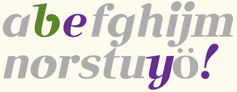
To make it easier to tell what was going on, I’ve color-coded the glyphs:
- Green = new glyphs
- Purple = modified glyphs
- Gray = unmodified glyphs.
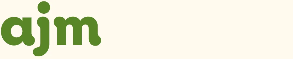
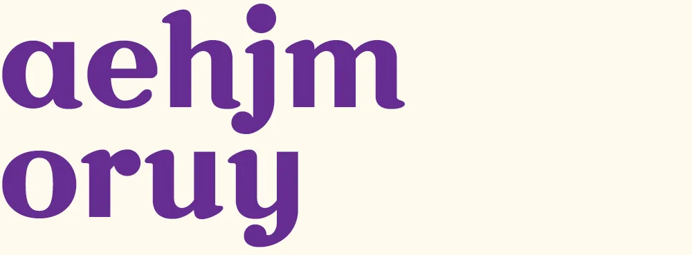
Volley 1: “jam” I got the coin toss, so I went first. I created a font with three simple glyphs in a sort of bloopy geometric style.
Volley 2: “your ham” Peter followed up by ably adding several more glyphs in the same style.
Volley 3: “more homey” I modified all the existing glyphs to create a higher-contrast semi-serif design. (You can see more clearly in this version that the basic construction is that of an upright italic.)
Volley 4: “möre” Peter takes it in a different direction, more like a Bodoni or Didot, and adds a whimsical swash and umlaut. He also takes advantage of the fact that he only really needs to change enough glyphs to spell the word he wants to use in the image, in this case “more”. Both of us adopt this strategy as the game progresses.
Volley 5: “major surgery” I continue the transformation to a Didone style, conforming several other glyphs and adding a g and an s.
Volley 6: “no sanity” Peter changes the direction, this time deconstructing several glyphs and doing a “serif-ectomy”. Note the nod to my Coquette in the o.
Volley 7: “faster!” I change the style again, albeit in an expeditious manner, by slanting all the glyphs. I add an f and a ! and tweak a few existing glyphs. (Merely slanted glyphs are shown in light purple.)
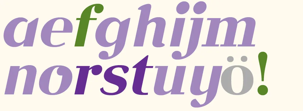
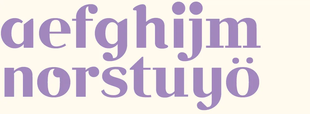
Volley 8: “aefghijm” Peter does something “meta” by printing out and critiquing an unslanted version of font.
Volley 9: “redesign” I discard my cheap slanting trick from volley 7 and, starting from the font in volley 6, change it into a slab serif for my final volley.
Volley 10: “bye!” Peter takes my slanted font from volley 7 and gives it a more cursive flair, with a reprise of the Coquette reference. According to Peter, the “waving” exclamation point was a happy accident. Works for me.
In the end, we had created ten new fonts in a few hours. Not complete, full-featured fonts, or the best-built fonts in the world, but good enough to set some type. I set them all together to show the sum of what we made:
Now comes the hard part: Coming up with a name for it….
(Thanks to Peter Bruhn, and Jim Coudal and Bryan Bedell of Coudal Partners.)
[ ]
]
Just a note to say, this Friday afternoon, I’ll be pitting my type chops against (with?) fellow type designer Peter Bruhn for a “exhibition” game of Layer Tennis. I expect this to be a friendly match, more improvisational than competitive. But we’ll see.