Mark’s Notebook - Page 22
Love this whole idea. This is how I set headlines when I was a young graphic designer. No way would I use a pencil, though. Too much risk of warping the sheet. I had a nylon-tipped burnisher, specially designed for the job of rubbing down transfer type. (Via Draplin)
Field Notes: Dry Transfer Edition Instructions from Coudal Partners on Vimeo.
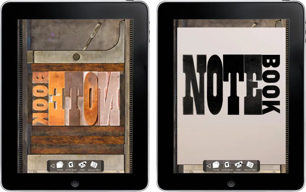
LetterMPress is a virtual letterpress app for the iPad—at least that’s the idea. The project is using Kickstarter to raise funds to complete the app and to acquire wood type fonts to include (virtually) in the app. More info on Kickstarter.
I think it’s a neat idea. Not only will you be able to make compositions on a virtual press bed with virtual wood type, mix and apply virtual ink, and make virtual prints, if all goes according to plan, you will be able to send them your design and have it all done for real, with real wood type, ink, and paper.
Some letterpress purists may scoff, but I think it has the potential to introduce the joys of letterpress printing to a much wider audience.
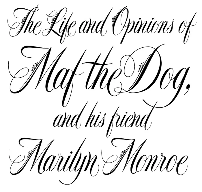
wwword, a website about words, did an interview with me [Update: wwword appears to be no longer operating, unfortunately, but here is a copy of the page on the Internet Archive’s Wayback Machine], where I talked about some of my favorite lettering pieces and how I did them.
The images that accompany the article are a bit small, so I’ve put larger versions up here….
![]()
One of my favorite bloggers, Jason Kottke, posted an item and link today about a story on the NPR site about “the longest word in the English language”.
This piqued my interest. When I was a kid I used to watch the Mike Douglas Show every afternoon after school. One time he had some sort of word expert on the show who revealed what the longest word was. I was impressed and taught myself to pronounce it correctly (still can).
Was it still the longest word? Sure enough, it was in the article:

Well… not the longest word anymore, if it ever was.
But then I noticed that all the “long words” in the article were set in one of my fonts—Felt Tip Woman! (My partner, Pat, whose handwriting was the model for Felt Tip Woman, loves words and language, not to mention NPR, and thought this was pretty cool, too.)
So I memorized a word that’s not really as special as I thought it was. On the plus side, NPR is using one of my fonts, so I’m happy anyway.
I was surprised and delighted to see Mostra Nuova playing a supporting role in JibJab’s latest “Year In Review” video.

I know I’ve been lax in posting items to Notebook lately. Somehow, between Twitter, Typophile, and making fonts (mostly), I forget it’s here.
Anyway, a really cool thing happened last Wednesday: Lost World’s Fairs. It demonstrates the support of web fonts in the new Internet Explorer 9 for Windows, but it works equally well in most other desktop web browsers (not on mobile phone browsers yet, as far as I can tell). You can read about how it was put together on Jason Santa Maria’s blog.
The big surprise for me was that all three of the demo pages feature fonts designed by me, served via Typekit. Many of my fonts have been available for web use through Typekit for a while, but recently also through Extensis’ WebINK service, Fontspring, and Fontdeck. Note: WebINK and Fontdeck ceased operation in 2015 and 2016 respectively.