Mark’s Notebook - Page 19
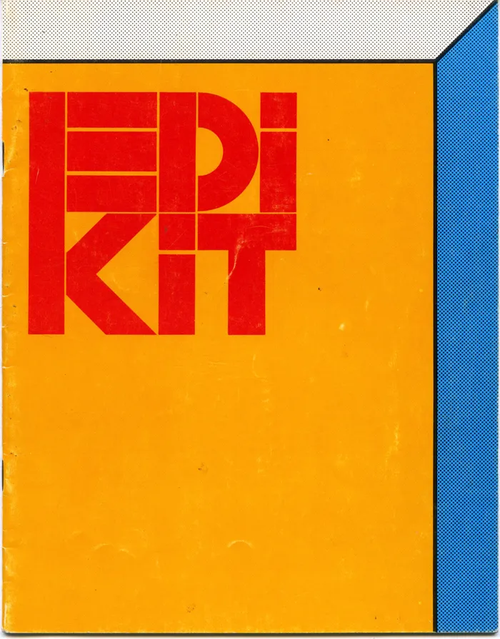
That “Edikit” image I posted yesterday was just one piece of the whole kit, the only part I still have that’s intact. It’s the cover of a 28-page booklet of half-size layout grids printed on one side of each page in non-photo blue (light blue) ink. The only text is printed on the inside front cover in 24-point Century Schoolbook, centered, capitalization as shown:
**put your ideas
down here because
this is where you
begin.**
And that’s how I actually used it. I did a thumbnail layout on every available page, and sometimes a drawing or doodle on the reverse side, including these typeface ideas, drawn with a red Sharpie on the inside back cover:
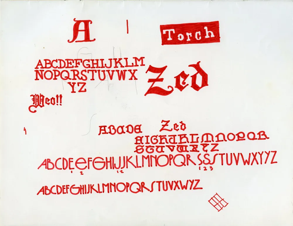
The one near the bottom was probably inspired by seventies art deco faces like Washington or Epic. It even has tiny numbers indicating alternate characters, just like in the specimen books.
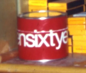
Regarding the CCA calendar, I contacted my uncle, Knut Simonson, who I mentioned was a designer at CCA in the sixties. He doesn’t have the red can that the 1968 CCA calendar came in anymore, but he does still have the calendar itself. He shot these two photos of it for me:
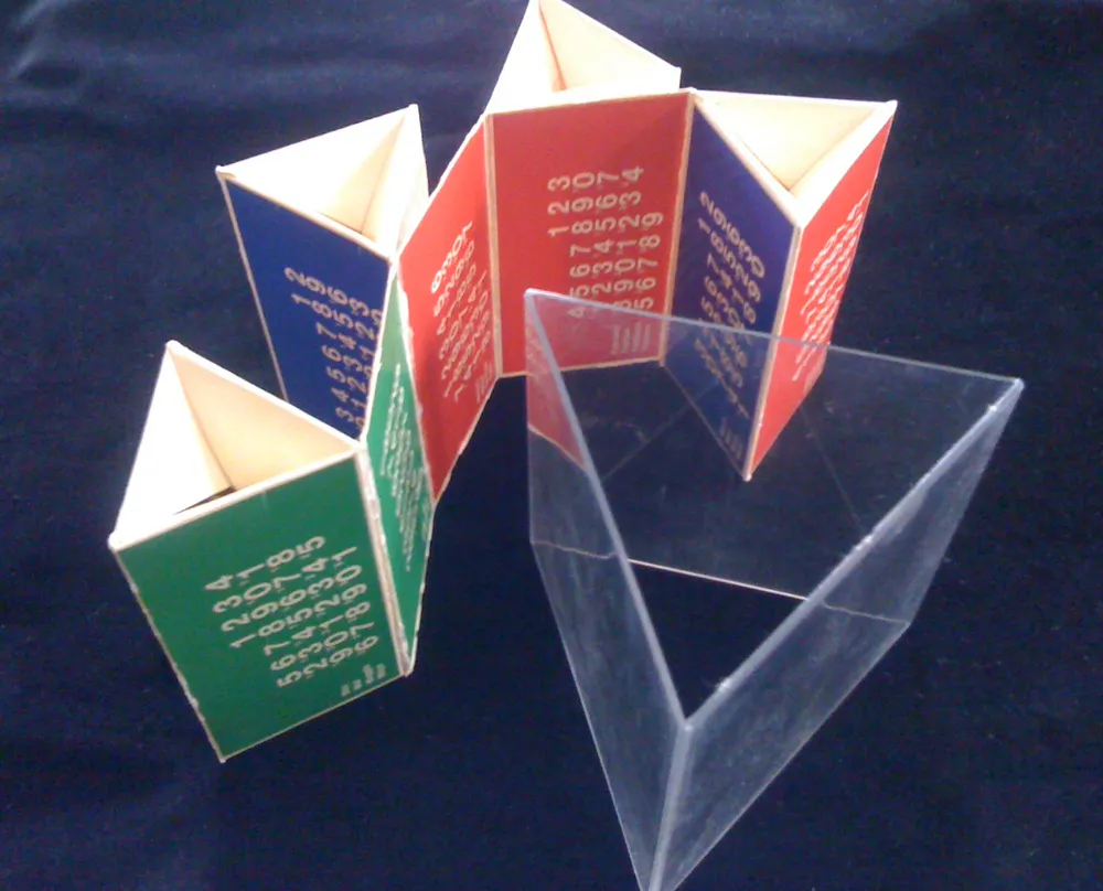
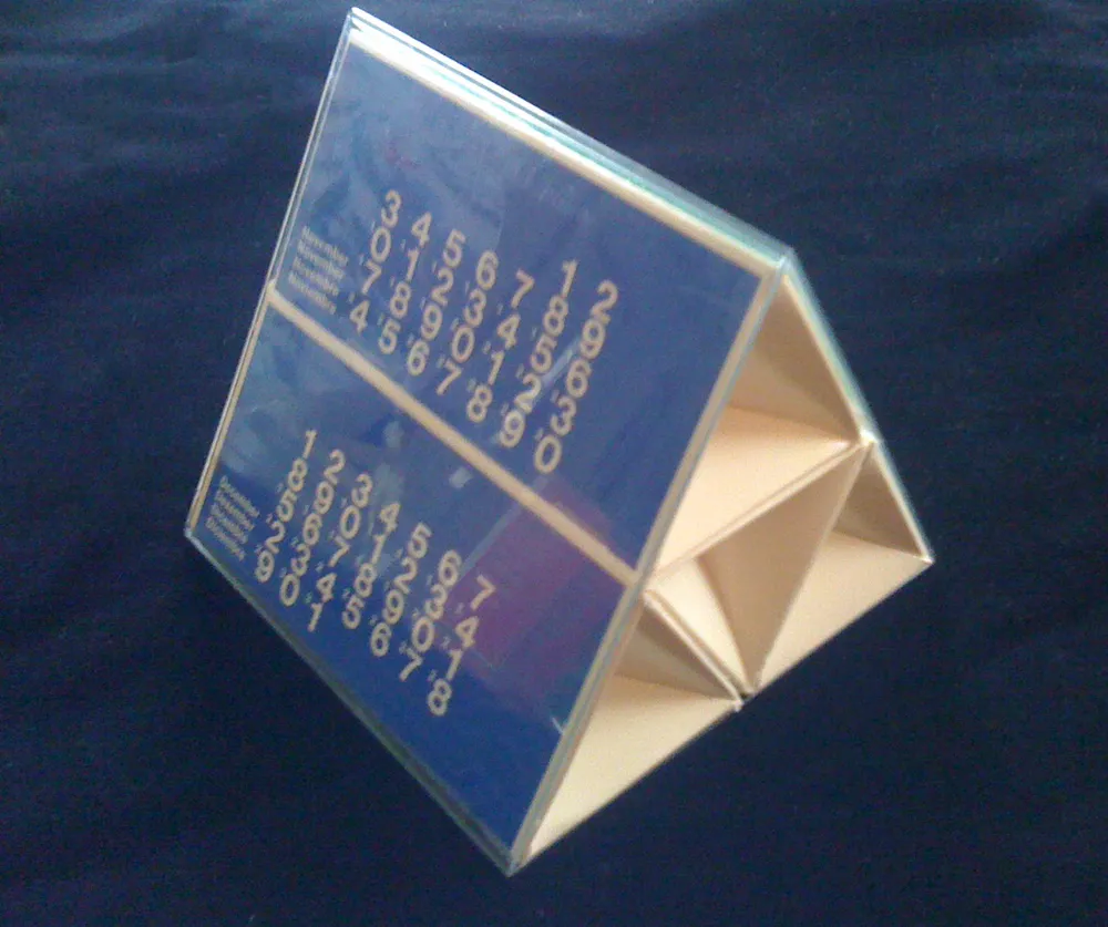
The clear plastic part fit snugly inside the can, and the triangular, paperboard calendar part fit inside that. When assembled, six months are visible on the outside. To see the other six, you slip it out, change the way it’s folded, and slip it back in.
It’s interesting that the ones-place digits are printed much larger than the tens-place digits. I wonder why this was done? To make it simpler and more elegant? It makes the numbers kind of hard to read, almost cryptic. Another case of form over function, I’d say. Overall, a good example of the minimalist way designers still tend to use Helvetica.
Knut doesn’t remember who designed it, but I found some similar calendars done for CCA in the seventies credited to a guy named Bill Bonnell. Maybe it was him. Too bad all the examples are in black and white. Probably scanned from an old design annual, printed back when color was expensive.
I suppose I had an excuse: I had no formal training yet, but I was possessed by the romance of graphic design.
In my senior year of high school, I was the editor of the yearbook. I’d been on staff in previous years, but now I was in charge. Even at 17, I knew what good graphic design looked like. My uncle was a graphic designer in Chicago, where he worked at one point for Container Corporation of America, designing stuff like the original Tab soft drink can and the Keebler Rich ‘n Chips cookie package. His aesthetic and way of looking at the world rubbed off on me at an early age.
American Yearbook Company sent us a large, beautifully designed yearbook production kit that they cheekily called an “Edikit”. Clearly, they had some talented people working on it, hoping to impart some sense of good design on hapless teenagers. I could see what they were doing and took it to heart.
One of the things that influenced my budding sense of graphic design were the calendars that CCA did every year, which my uncle would send to me. There was one in particular for the year 1968 that came inside a large, bright red paperboard can with “nineteensixtyeight” wrapped around it in large, white Helvetica letters. Here’s the only photo I could find of it:
So, in my 12-year-old mind, I associated spelling out numbers (all lowercase) with cool, sophisticated graphic design.
Fast forward to 1973, and I had my first big design project, my high school yearbook. And I wanted to use every design trick I’d learned so far. I was not so much into Helvetica. It already seemed a little passé. My favorite typeface at the time was Times New Roman, which had been used to great effect in National Lampoon magazine. The NatLamp design influence is pretty obvious on some of the pages:
So, as I was developing the format for the yearbook, one of my “clever” design choices was to have all the page numbers spelled out (in lowercase, of course):


So far, so good. But it does this on every page, all the way to the end:
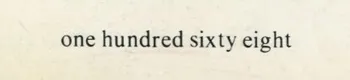
They must have thought I was insane. Keep in mind that this was back when typesetting machines, as far as I know, had only rudimentary ways to store keystrokes. At best, some sort of paper tape system. It horrifies me now to think how much work I made them do, just so I could have my fancy page numbers. Yet, I don’t recall the American Yearbook Company rep objecting to it.
Today, you could easily write some sort of script to get numbering spelled out like this, but back then it probably meant that some poor typesetter had to type it all in manually. And proofread it. I’d like to think that they somehow captured the keystrokes in case some other idiot had the same idea. Or maybe some other idiot already had and so it was really no trouble for them to run the job again for me.
All that aside, it was not a very good design idea anyway. Sure, it looked cool, but page numbers are meant to be read at a glance, not seen. I just shake my head, now. What a dumb idea.
I attended two events tonight.
The first was (nominally) a Type Tuesday event, but really a Minneapolis Institute of the Arts / AIGA Minnesota event: “What Fonts Say” featuring Craig Eliason, talking about where type designers get their ideas, going back to Gutenberg, and Chank Diesel, talking about where he gets his ideas. Which was fine and enjoyable.
Afterwards, we headed to the Minnesota Center for the Book Arts in Minneapolis (after stopping for gas) and attended a reunion of people who have worked for the Utne Reader, which was founded almost 30 years ago.
Not everyone who ever worked there attended, but a lot more than I expected. Some I hadn’t seen since the late 80s, when I parted ways with the magazine. Eric Utne was there, of course, but I was surprised and delighted to see so many people from the early years, when I was freelancing as its designer/art director.
Eric managed to get a bottle of 30-year-old scotch for the old-timers. First time I’ve tasted scotch in at least that long, and I’m glad he got it. I might change my mind in the morning.
I’ve got mixed feelings about my time with the Utne Reader for reasons I won’t get into, but I met the love of my life there and worked with a lot of really great people. It was a blast to see them again.
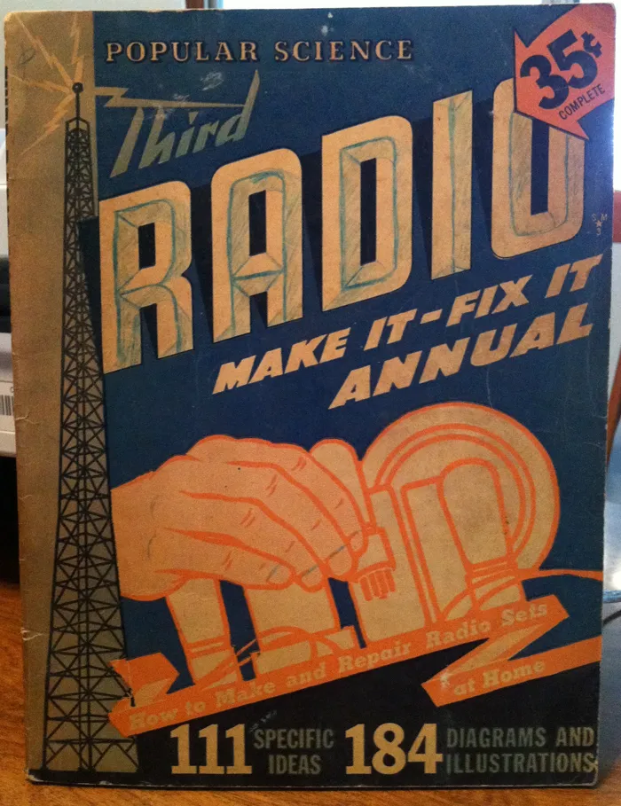
Photo taken on July 11, 2011 in Newark Valley, New York. Notice the custom 3-D effect added by the owner of this book.
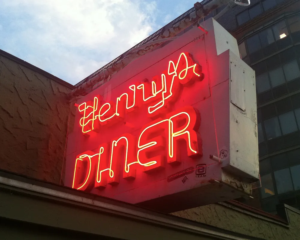
Photo taken on July 17, 2011 in Burlington, Vermont. This photo has been on the lock screen of my phone pretty much since I snapped it.
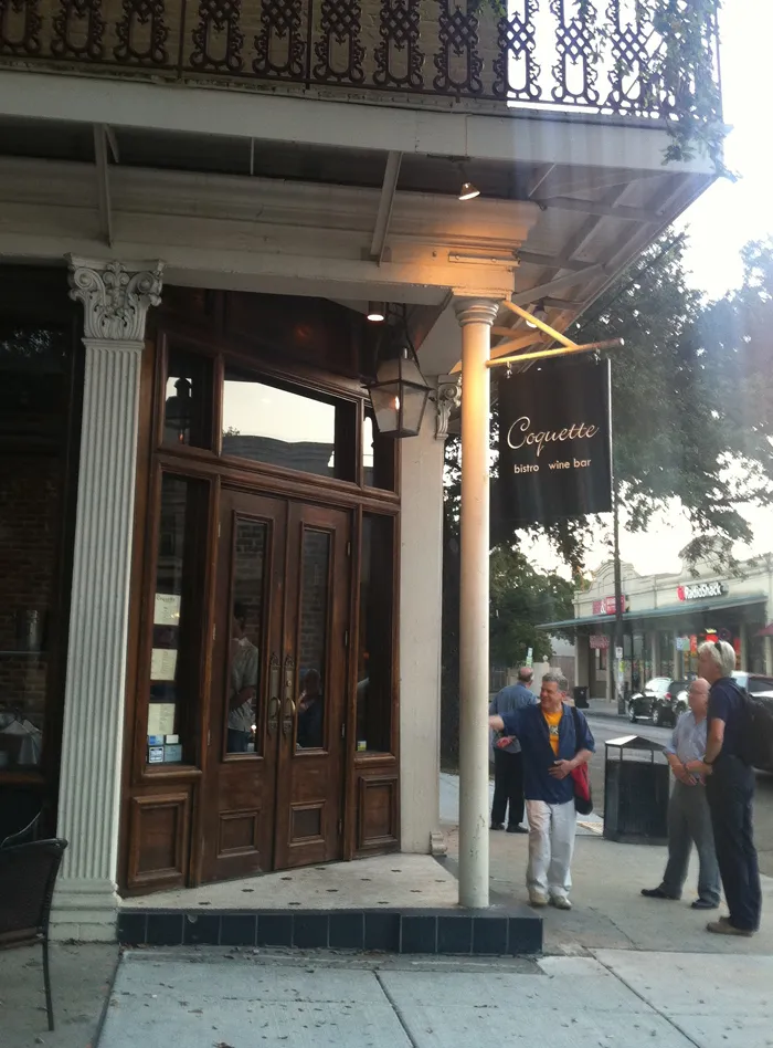
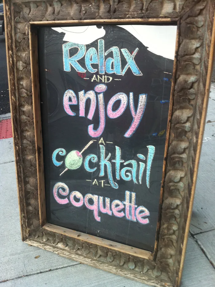
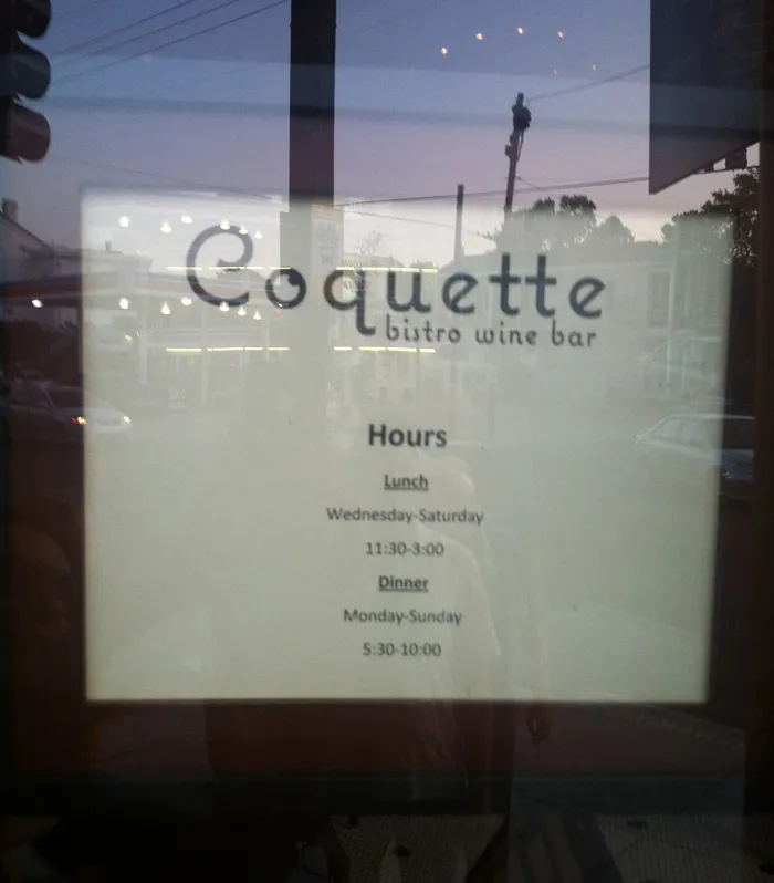
I had one of those moments that only a type designer can have last summer during TypeCon 2011 in New Orleans. After attending a gallery reception at Mystic Blue Signs, a group of us headed on foot in search of a particular recommended restaurant that was about six blocks away. When we were almost there we spotted this:
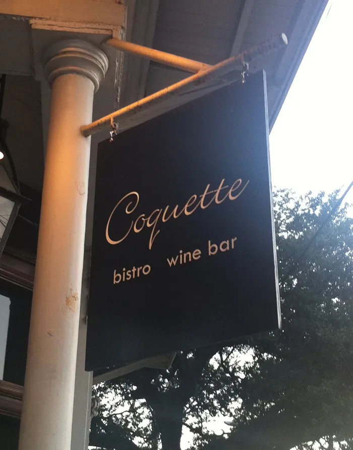
John Downer, who was with us, immediately went inside and got us a table. Normally, we would need a reservation, but apparently the idea that the designer of the typeface Coquette had stumbled onto upon the Coquette Bistro Wine Bar amused them as much as it did us.
The other diners (besides John) were Petr van Blokland, Roger Black, Delve Withrington, Ronald Arnholm, and William Berkson. The meal was excellent, which shouldn’t have surprised us. We learned later that it was one of the top-rated restaurants in New Orleans. Anyway, it made my day.
This hand-drawn chalk sign outside was cool: