Mark’s Notebook - Page 17
Earlier today I watched this wonderful presentation by Jeremy Keith that he gave at the Build conference. He touches on something I’ve thought about for a long time, going back even before personal computers: The long term prospect of the media we record things on—paper, records, magnetic tape, film, video tape, floppy disks, compact disc, DVDs, hard drives and servers.
I had almost the same thought as Jeremy: I picture archaeologists in the distant future studying what remains of our culture and finding lots of documents and records right up until around the end of the twentieth century—and then almost nothing that can be read or decoded.
Printed books, artwork, typed and written manuscripts, photos on film and paper, with all of these media, you can either read and decode it directly with your eyes. It may be faded or fragile, but if it survives, whatever is recorded on it will survive. Even movies on film and phonograph records could be reverse-engineered just by using observations and common sense, even if some of the nuances may be lost.
Then you get to magnetic tape. If you’ve never seen it before, it’s not obvious what it is, and even if you guessed correctly, the magnetic signals on the tape fade over time and the tape itself deteriorates.
Things start getting really bad when you go to analog video tape. To even make sense of what’s on the tape—assuming you figure out that it’s some kind of motion picture medium—you would need to reinvent the television and video tape player. Very difficult, but conceivable.
All bets are off when you get to digital storage, which Jeremy gets into in detail in his presentation. To me, it seems that it would be nearly impossible to recover anything stored digitally if, in some cataclysm, the knowledge of computer technology was lost.
Even things from the recent past are getting difficult to access. I switched to digital tools for most of my design and artwork in the late 1980s. Some of the work I did—in the form of PageMaker files, for example—I would have a difficult time retrieving. Yes, technically, much of this stuff can be accessed if you have old enough hardware and software. But hardware doesn’t last forever, and what about more recent software that requires internet activation?
When I look back through my old artwork, I have less and less in the form of physical objects—drawings, photos, printed samples. Physical objects get old, faded, and damaged, but you can still hold them, and look at them. Digital stuff never gets old or faded, but if even a few bits of data are corrupted, an entire file or disk can be lost forever, even if you still have something to read the media.
Then I think, who cares, other than pack rats like me? I thought the same thing watching Jeremy’s talk. Sure, huge amounts of digital culture may be—probably will be—lost to the future. But remember, there are many things from the past that are lost to us now because they happened before sound and picture recording—musical performances, theatrical performances and speeches, historical events. But lots of stuff did survive and will survive. We still print tons of books and magazines (so far). People still keep journals and diaries, and artists still keep sketchbooks.
Ultimately, culture is for the living. If it survives to be studied and appreciated by people in the future, great, and I hope it does. If not, I’m sure they’ll be busy making their own anyway.
One more follow up on the item I posted last week, in which I mentioned my uncle Knut who worked as a designer at Container Corporation of America…. After I posted that, Knut sent me a photo of the cookie package he designed:
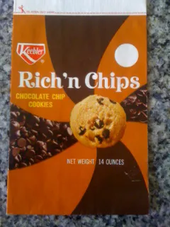
This was (I believe) one of the first packages for Keebler chocolate chip cookies, and my uncle’s first printed package design. It debuted in July 1967. It seems so tasteful and restrained compared to the modern equivalent.
I was very impressed by this as a budding artist. It put into my mind the notion that, if you were good, your work could be seen by millions of people. Definitely something I was attracted to very early on, and probably something a lot of artists and designers can relate to.
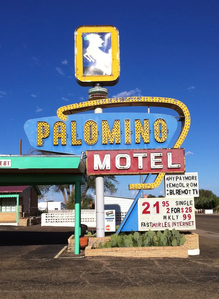
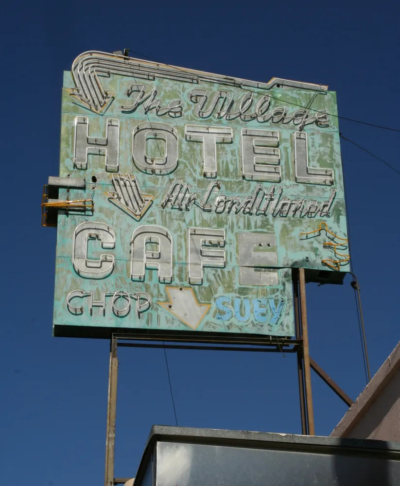
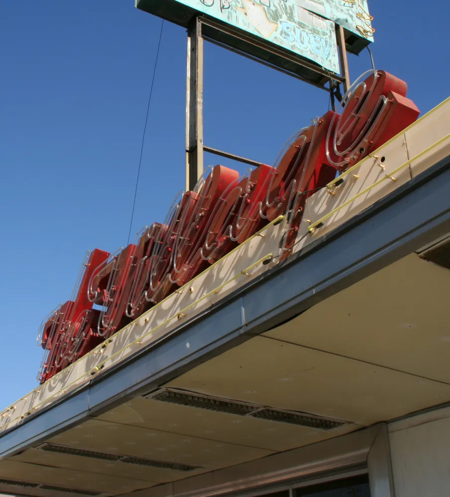
We actually stayed in this motel along historic Route 66 on our way to TypeCon when it was in Los Angeles in 2010. The sign was definitely part of the appeal. Not the best place I’ve ever stayed. But really, what can you expect for $26 per night? On the other hand—free WiFi!
Shot in Tucumcari, New Mexico, on August 14, 2010.