
Introducing Synergy
Introducing Synergy, a modern grotesk I’ve been working on since 1981...


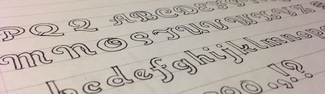
Introducing Synergy, a modern grotesk I’ve been working on since 1981...
When I decided to sell the rights to my library of fonts to The Type Founders in 2021, one of the big reasons for me was the ever-growing burden of maintaining and developing that library....
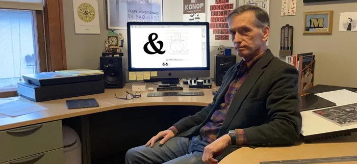
You might wonder: Where does a type designer like me spend his days? Do I have a fancy office in a skyscraper in downtown Saint Paul? Do I have a receptionist? An H.R. department? Interns? An espresso bar? None of that. I work by myself out of a repurposed back bedroom in a modest 1920s-era bungalow in the quiet residential Saint Paul neighborhood of Saint Anthony Park. Let me show you around...
Read More